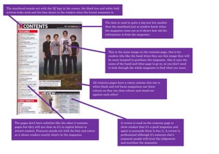
The masthead stands out with the ‘Q’ logo in the corner, the black box and white bold
writing looks good and the logo shows to the readers what the brand magazine is.


                                                                          The date is used in quite a big text but smaller
                                                                          then the masthead just so readers know when
                                                                          the magazine came out so it shows how old the
                                                                          information is from the magazine.


                                                                            This is the main image on the contents page, this is for
                                                                            readers who like the band when they see this image they will
                                                                            be more tempted to purchase the magazine. Also it says the
                                                                            name of the band and what page to go to, so you don’t need
                                                                            to look through the whole magazine to find what you want.


                                                                 All contents pages have a colour scheme this one is
                                                                 white black and red (most magazines use these
                                                                 colours as they are clear colours and stand out
                                                                 against each other)


      The pages don’t have subtitles like the other 2 contents                          A review is used on the contents page to
      pages but they still are clear as it’s in capital letters to                      show readers that it’s a good magazine and
      attract readers. Features stands out with the font and colour                     again to persuade them to buy it. A review is
      as it shows readers exactly what’s in the magazine.                               professional although it’s someone else’s
                                                                                        comment people will trust the judgement
                                                                                        and purchase the magazine.

Contents 3

  • 1.
    The masthead standsout with the ‘Q’ logo in the corner, the black box and white bold writing looks good and the logo shows to the readers what the brand magazine is. The date is used in quite a big text but smaller then the masthead just so readers know when the magazine came out so it shows how old the information is from the magazine. This is the main image on the contents page, this is for readers who like the band when they see this image they will be more tempted to purchase the magazine. Also it says the name of the band and what page to go to, so you don’t need to look through the whole magazine to find what you want. All contents pages have a colour scheme this one is white black and red (most magazines use these colours as they are clear colours and stand out against each other) The pages don’t have subtitles like the other 2 contents A review is used on the contents page to pages but they still are clear as it’s in capital letters to show readers that it’s a good magazine and attract readers. Features stands out with the font and colour again to persuade them to buy it. A review is as it shows readers exactly what’s in the magazine. professional although it’s someone else’s comment people will trust the judgement and purchase the magazine.