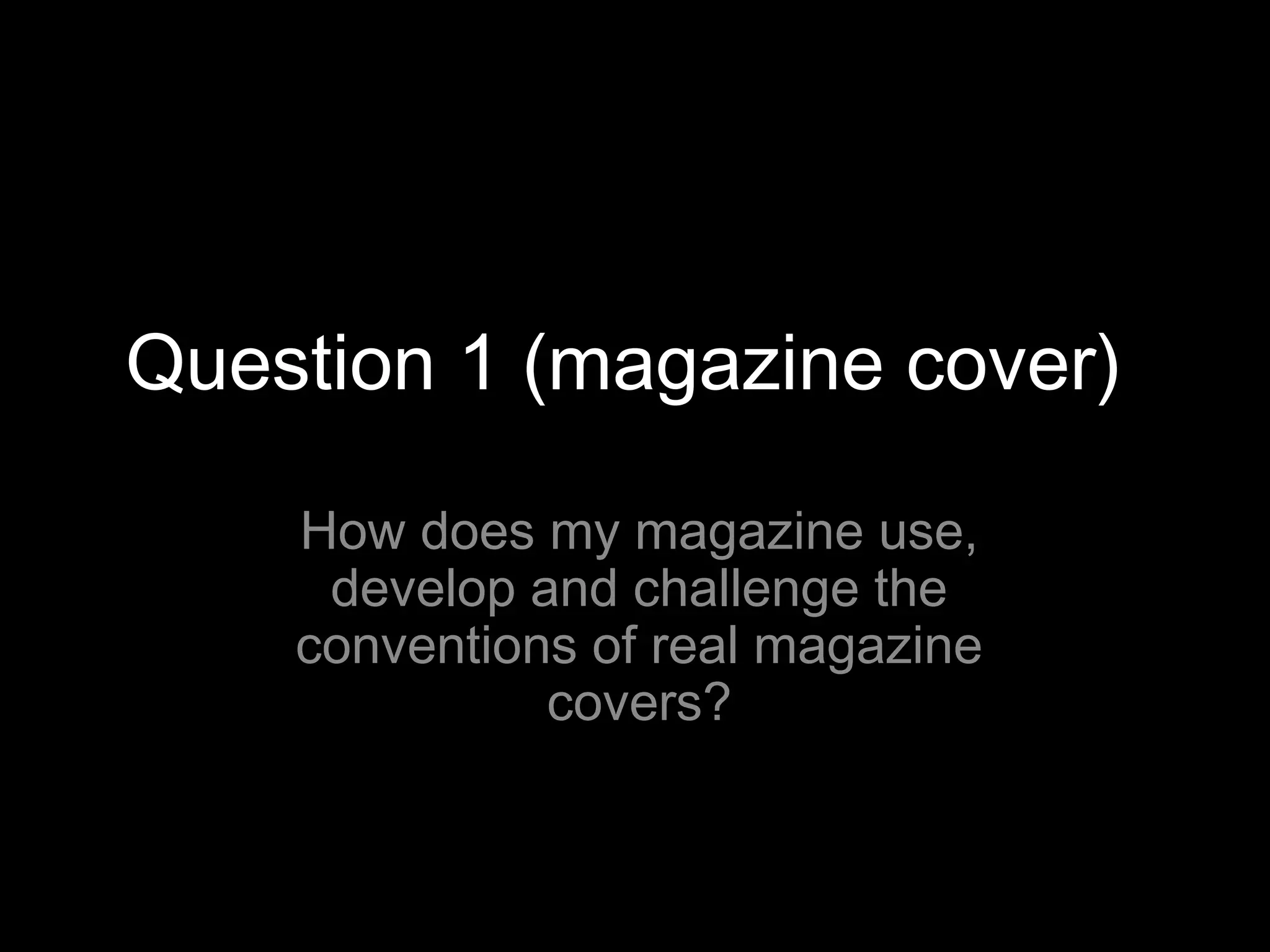
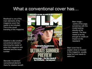
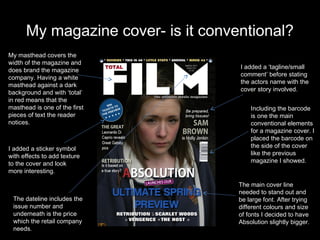
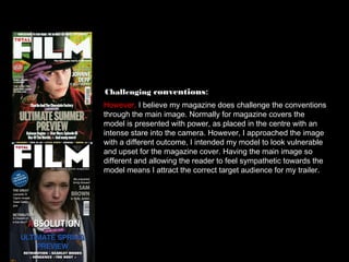
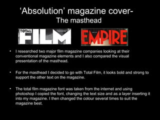
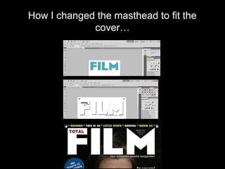
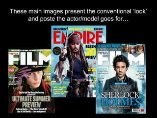
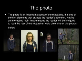
Question 1 (magazine cover)

    How does my magazine use,
     develop and challenge the
    conventions of real magazine
              covers?
What a conventional cover has…

Masthead is one of the
main elements of the                       Main image –
magazine cover that                         centre of the page,
needs to be included.                      sometimes with the
This is the visual                         model looking
branding of the magazine                   directly at the
                                           camera. The face
                                           needs to be big
                                           enough to create an
                                           impact on the
Dateline is also another                   newstand
conventional element,
informing the reader of
when the magazine was                Main cover line to
released and the issue               explain what is included
number                               in the magazine, usually
                                     large font and needs to
                                     stand out

Barcode- A standard
conventional element
there for retailers benefit
My magazine cover- is it conventional?
My masthead covers the
width of the magazine and
                                    I added a ‘tagline/small
does brand the magazine
                                    comment’ before stating
company. Having a white
                                    the actors name with the
masthead against a dark
                                    cover story involved.
background and with ‘total’
in red means that the
masthead is one of the first            Including the barcode
pieces of text the reader               is one the main
notices.                                conventional elements
                                        for a magazine cover. I
                                        placed the barcode on
I added a sticker symbol                the side of the cover
with effects to add texture             like the previous
to the cover and look                   magazine I showed.
more interesting.

                                    The main cover line
                                    needed to stand out and
 The dateline includes the          be large font. After trying
 issue number and                   different colours and size
 underneath is the price            of fonts I decided to have
 which the retail company           Absolution slightly bigger.
 needs.
Inspiration for my magazine cover

      Using conventions:
      I mainly used this magazine cover to design mine. The conventional
      elements were evident and I thought the main image worked well with
      all the text around it. I used the same masthead and used a similar
      banner across the top with other films in the magazine.


      Developing conventions:
      I decided for my magazine to have the name of the film I was
      analysing larger than the main cover line ‘film preview text.’ This is
      developed from the conventional large bold font that stands out before
      the reader even knows the name of the film. I decided the name of the
      film needed to be more prominent than the fact it was a film preview.
Challenging conventions:
However, I believe my magazine does challenge the conventions
through the main image. Normally for magazine covers the
model is presented with power, as placed in the centre with an
intense stare into the camera. However, I approached the image
with a different outcome, I intended my model to look vulnerable
and upset for the magazine cover. Having the main image so
different and allowing the reader to feel sympathetic towards the
model means I attract the correct target audience for my trailer.
‘Absolution’ magazine cover-
                           The masthead


•   I researched two major film magazine companies looking at their
    conventional magazine elements and I also compared the visual
    presentation of the masthead.

•   For the masthead I decided to go with Total Film, it looks bold and strong to
    support the other text on the magazine.

•   The total film magazine font was taken from the internet and using
    photoshop I copied the font, changing the text size and as a layer inserting it
    into my magazine. I then changed the colour several times to suit the
    magazine best.
How I changed the masthead to fit the
             cover…
These main images present the conventional ‘look’
      and poste the actor/model goes for…
The photo
• The photo is an important aspect of the magazine. It is one of
  the first elements that attracts the reader’s attention. Having
  an interesting main image means the reader will be intrigued
  to read the rest of the magazine. Here are some of the photos
  I took: t
The photo
• The photo is an important aspect of the magazine. It is one of
  the first elements that attracts the reader’s attention. Having
  an interesting main image means the reader will be intrigued
  to read the rest of the magazine. Here are some of the photos
  I took: t

Question 1 (magazine cover)

  • 1.
    Question 1 (magazinecover) How does my magazine use, develop and challenge the conventions of real magazine covers?
  • 2.
    What a conventionalcover has… Masthead is one of the main elements of the Main image – magazine cover that centre of the page, needs to be included. sometimes with the This is the visual model looking branding of the magazine directly at the camera. The face needs to be big enough to create an impact on the Dateline is also another newstand conventional element, informing the reader of when the magazine was Main cover line to released and the issue explain what is included number in the magazine, usually large font and needs to stand out Barcode- A standard conventional element there for retailers benefit
  • 3.
    My magazine cover-is it conventional? My masthead covers the width of the magazine and I added a ‘tagline/small does brand the magazine comment’ before stating company. Having a white the actors name with the masthead against a dark cover story involved. background and with ‘total’ in red means that the masthead is one of the first Including the barcode pieces of text the reader is one the main notices. conventional elements for a magazine cover. I placed the barcode on I added a sticker symbol the side of the cover with effects to add texture like the previous to the cover and look magazine I showed. more interesting. The main cover line needed to stand out and The dateline includes the be large font. After trying issue number and different colours and size underneath is the price of fonts I decided to have which the retail company Absolution slightly bigger. needs.
  • 4.
    Inspiration for mymagazine cover Using conventions: I mainly used this magazine cover to design mine. The conventional elements were evident and I thought the main image worked well with all the text around it. I used the same masthead and used a similar banner across the top with other films in the magazine. Developing conventions: I decided for my magazine to have the name of the film I was analysing larger than the main cover line ‘film preview text.’ This is developed from the conventional large bold font that stands out before the reader even knows the name of the film. I decided the name of the film needed to be more prominent than the fact it was a film preview.
  • 5.
    Challenging conventions: However, Ibelieve my magazine does challenge the conventions through the main image. Normally for magazine covers the model is presented with power, as placed in the centre with an intense stare into the camera. However, I approached the image with a different outcome, I intended my model to look vulnerable and upset for the magazine cover. Having the main image so different and allowing the reader to feel sympathetic towards the model means I attract the correct target audience for my trailer.
  • 6.
    ‘Absolution’ magazine cover- The masthead • I researched two major film magazine companies looking at their conventional magazine elements and I also compared the visual presentation of the masthead. • For the masthead I decided to go with Total Film, it looks bold and strong to support the other text on the magazine. • The total film magazine font was taken from the internet and using photoshop I copied the font, changing the text size and as a layer inserting it into my magazine. I then changed the colour several times to suit the magazine best.
  • 7.
    How I changedthe masthead to fit the cover…
  • 8.
    These main imagespresent the conventional ‘look’ and poste the actor/model goes for…
  • 9.
    The photo • Thephoto is an important aspect of the magazine. It is one of the first elements that attracts the reader’s attention. Having an interesting main image means the reader will be intrigued to read the rest of the magazine. Here are some of the photos I took: t
  • 10.
    The photo • Thephoto is an important aspect of the magazine. It is one of the first elements that attracts the reader’s attention. Having an interesting main image means the reader will be intrigued to read the rest of the magazine. Here are some of the photos I took: t