2. Masthead Selling Line
Large and noticeable enough for the Adds extra
reader to see and know the name of interest for the
the magazine. Sometimes covered by
reader.
the main picture but still recognisable
because it is a big name. Always stays
the same from magazine to magazine Main picture
creating a house style of magazines. We know that this
picture will relate
Banner to the main article
Explains the because it
magazine name Plug dominates the
to the reader Promotes an
and also informs
whole of the page.
article to a reader
of the issue by saying the Headline
number. Also article or content Bold enough to
includes the date is only available in attract the reader’s
to show the that attention and informs
reader that it is magazine, making then on the main
the latest edition the consumer article of the
of the magazine. want to buy it. magazine
Anchorage
Gives a very brief over Barcode
view of what will be in Displays the price, issue
the main article Buzzwords number and of course
Coverlines Used to include barcode. Usually found
Graphic feature Adds interest for the the reader and in the right hand corner
Interest the reader with a reader as it shows more so it doesn’t block the
make them feel
visual clue to what is in the content that is included main image.
excited or special
magazine. in the magazine
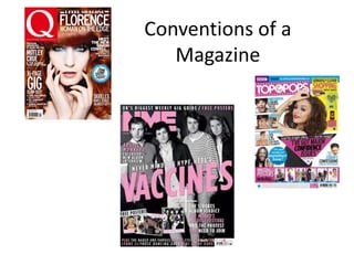
3. Masthead: Buzz
The masthead appeals to the Words
target audience because it is
bright pink that it associated
with young teen girls. It is also in
a cool, doodle like font that will
be familiar to the audience and
will associate the magazine with
being cool. Main Picture:
The model or ‘celebrity’ in the
main image represents a
Kickers and graphic young woman who is carefree
and having fun doing the job
features she loves. This relates to the
There are more kickers and
target audience as she is the
graphic features in this
kind of person that the girls
magazine as to pull the reader
that read the magazine want
of a young teen target
to be.
audience, there needs to be
more quick fired information to
quickly engage their attention. Headline:
The celebrities on the cover The headline is
represent the pop music that bright drawing the
the magazine is known for but reader in. It is also
also that they are happy and the same colours of
having fun which inspires the the masthead, tying
audience. This differs from a the whole magazine
magazine with an older target colours scheme
audience as it would be too together and again
crowded because their associating with the
attention does not need to be audience.
caught so quickly and
continuously.
4. Rule of Thirds Anchorage
Masthead Headline
Not in the lower thirds as
now the magazine is balance
and doesn’t look cluttered.
Banner The model’s
eye line sits
on the first
Kickers horizontal
A short phase that third
introduces other
articles . They can also because it is
be used to identify naturally
regular features.
Usually found in the 1st where the
and 3rd columns of human eye
thirds so the main
image is central for focuses on
attention. when
someone is
Buzz words speaking
Barcode Kickers
5. Masthead Date
Contains the same title and content every Informs the reader that it is
week (this is their house style) and the most recent issue.
highlights that this is where you will find the Usually found on the
contents. Bold enough for a title and to be banner.
seen straight away.
Main Article and Image
The main article image in usually the
biggest and in the middle or right
Page
hand of the page. It gives the reader Number
most of an indication of what will be Bold enough for
in the ain article. Underneath is a the reader to
brief introduction of what is in the easily navigate
article to entice the reader more. around the
magazine to find
the image and
article
Pull Quote
Found below the
picture, it is in a large font Subscription box
size to pull the reader into Advertises offers for the
reader the article to magazine subscription so
explain what the quote is the reader will by the
about. subscription and
therefore more copies.
List of Contents The Colour Scheme Usually thing on the
A short list of other stories The colour scheme fits with page, leaving the reader
in the magazine and what the target of sophisticated something to think about.
page to find them on. people and the colour are not
too bright but stick to
black, white and blue as these
are sophisticated colours.
6. Banner: Date, title Colour Scheme
, issue number Generally dark to suit with the
rock/metal music that the
magazine covers. Some bright
colours are used to draw
Graphic attention.
features
Page Numbers and
Band Names
Quickly informs the reader of
where to find the feature on
their favourite band.
Buzz
Words
Note from the Editor
Gives a brief outline of the
features in the magazine. Has a
personal message to the reader
and the states a topic for the
reader to think about,
sometimes a topic that has
something loosely to do with
the contents of the magazine. Subscription
Box
List of
contents
7. Banner
Page
Numbers
Colour
Scheme
Bright, ‘feminine’
colour so that the
contents page is
attract and keeps the
interest of the young
teen girls
Buzz Words Graphic
and personal features
pronouns
Makes the reader
think that the writer is
talking directly to
them and will give
them what they want
to know