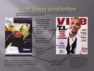
The document provides an evaluation of a college magazine cover and contents page created by the author for an assignment. It compares the author's work to examples from real magazines. The summary highlights how the author's cover uses conventions like prominent images and cover lines but challenges conventions through a darker color scheme. The contents page also uses conventions like separating text into boxes but challenges conventions by making information the focal point rather than images. The author learned about considering camera angles and lighting when taking photos and using software like Photoshop for editing and layout. Comparing to real magazines helped with design but making the magazine original was challenging.


