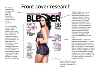
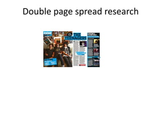
This skyline
conventionally
                            Front cover research
runs across the
                                                               The Masthead is conventionally
top of the
                                                               at the top of the page, and
page, and
                                                               stretches across the top of the
informs the
                                                               magazine. It is clear that this is
reader about a
                                                               an established magazine, as the
special attraction
                                                               entire masthead is not shown
– ‘free
                                                               due to the model placed in the
downloads!’
                                                               middle. The masthead is bold and
                                                               written in a capitalized black font,
The cover lines are
                                                               this creates simplicity and makes
written in a range of
                                                               the magazine look professional.
sizes and differs
                                                               The size of the masthead was
between boldness and
                                                               effective, as it is eye-catching
colours (black and pink)
                                                               without being too big, which
– this would attract
                                                               would allow the magazine to look
readers, by making the
                                                               cheap.
magazine eye-catching.
The cover lines give us a                                      The main image is a longshot of a
sneak-peak of the                                              popular musician ‘Katy Perry’ - this may
content of the magazine                                        have been chosen as she appeals to a
, by keeping the                                               large, commercial audience, and would
information short and                                          help to increase sales of the magazine.
sweet. Also, references                                        The main image overlaps the masthead
to artists and their                                           of the magazine to highlight the central
record labels have been                                        attraction of the magazine. The main
mentioned. This might                                          image is presented conventionally, the
suggest that it aimed at                                       long shot is big and eye-catching – with
fans who are familiar                                          the model making full eye contact to
with current pop artists.                                      engage the audience.

                                           There is no bar code clear on
                                           the magazine, this could be
                                           allocated at the back of the
                                           magazine.
Front cover research   The cover lines are
                                                       placed under each
This masthead is unique as it                          other , this creates an
breaks conventions due to                              organised structure
the slanted angle it is                                and professional
presented on. The bold font                            appearance.
and bright colours of pink                             However, the colour
and yellow makes the                                   scheme of pink, white
magazine eye-catching. This                            and yellow – evokes
gives the magazine an                                  the attention towards
overall fun and informal                               girls rather than boys.
appearance , which could                               The cover lines are
indicate it is aimed at a                              neatly placed beside
young audience.                                        the main image
                                                       without detracting
                                                       from it too much –
                                                       adding to the
                                                       professional quality of
                                                       the magazine.


                                                       The main cover line
                                                       is very large and a
                                                       mixture of white and
                                                       yellow coloured
                                                       font, this
                                                       immediately grabs
                                                       the audiences
                                                       attention . The
                                                       content is a feature
                                                       based on the
 The bar code is clear                                 popular artist (main
 and conventionally at                                 image) Rihanna.
 the bottom. The price is
 printed in rather small
 font which could
 indicate the magazine
 is not cheap.
The masthead is
                          written in a white bold
                          capitalized font – this
                          provides clear branding
                          for the audience . The
                          ‘s’ is written in a curly
                          italic font , this make s
                          the magazine look
                          more fun, which could
                          suggest it is for a
                          younger audience.


                          The main image is of a
                          popular singer ‘Selena
                          Gomez’ she is very
                          appealing to the
Main cover line
                          girly, teen market - which
                          is the target audience of
                          this magazine.


                                 Cover lines


 The bar code is clear
 and conventionally at
 the bottom. The price
 is printed in rather
 small font which could
 indicate the magazine
 is not cheap.
The masthead
Contents page research
The title ‘contents’
is written on three
lines
Double page spread research
Media research
Media research
Media research

Media research

  • 1.
    This skyline conventionally Front cover research runs across the The Masthead is conventionally top of the at the top of the page, and page, and stretches across the top of the informs the magazine. It is clear that this is reader about a an established magazine, as the special attraction entire masthead is not shown – ‘free due to the model placed in the downloads!’ middle. The masthead is bold and written in a capitalized black font, The cover lines are this creates simplicity and makes written in a range of the magazine look professional. sizes and differs The size of the masthead was between boldness and effective, as it is eye-catching colours (black and pink) without being too big, which – this would attract would allow the magazine to look readers, by making the cheap. magazine eye-catching. The cover lines give us a The main image is a longshot of a sneak-peak of the popular musician ‘Katy Perry’ - this may content of the magazine have been chosen as she appeals to a , by keeping the large, commercial audience, and would information short and help to increase sales of the magazine. sweet. Also, references The main image overlaps the masthead to artists and their of the magazine to highlight the central record labels have been attraction of the magazine. The main mentioned. This might image is presented conventionally, the suggest that it aimed at long shot is big and eye-catching – with fans who are familiar the model making full eye contact to with current pop artists. engage the audience. There is no bar code clear on the magazine, this could be allocated at the back of the magazine.
  • 2.
    Front cover research The cover lines are placed under each This masthead is unique as it other , this creates an breaks conventions due to organised structure the slanted angle it is and professional presented on. The bold font appearance. and bright colours of pink However, the colour and yellow makes the scheme of pink, white magazine eye-catching. This and yellow – evokes gives the magazine an the attention towards overall fun and informal girls rather than boys. appearance , which could The cover lines are indicate it is aimed at a neatly placed beside young audience. the main image without detracting from it too much – adding to the professional quality of the magazine. The main cover line is very large and a mixture of white and yellow coloured font, this immediately grabs the audiences attention . The content is a feature based on the The bar code is clear popular artist (main and conventionally at image) Rihanna. the bottom. The price is printed in rather small font which could indicate the magazine is not cheap.
  • 3.
    The masthead is written in a white bold capitalized font – this provides clear branding for the audience . The ‘s’ is written in a curly italic font , this make s the magazine look more fun, which could suggest it is for a younger audience. The main image is of a popular singer ‘Selena Gomez’ she is very appealing to the Main cover line girly, teen market - which is the target audience of this magazine. Cover lines The bar code is clear and conventionally at the bottom. The price is printed in rather small font which could indicate the magazine is not cheap.
  • 4.
  • 5.
  • 7.
    The title ‘contents’ iswritten on three lines
  • 9.