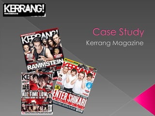
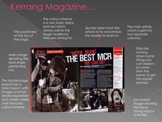
The document analyzes Kerrang magazine as a case study for a rock magazine the author wants to produce. Some key points:
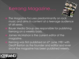
- Kerrang focuses on rock music and targets a teenage audience, publishing weekly since 1981.
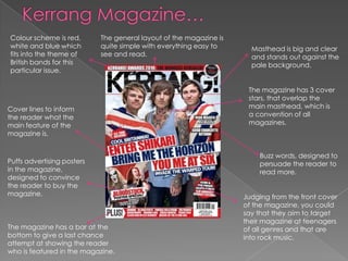
- The magazine has conventions like a simple layout, masthead on the cover, and sections divided by genre.
- Features include cover stars, editor's notes, and ads to convince readers to buy.
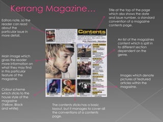
- The author wants to take inspiration from Kerrang's accessible photo shoots, vibrant colors, and busy yet simple covers that appeal to their target audience.