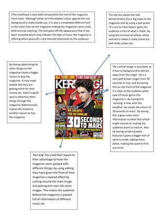
1. The masthead is very bold compared to the rest of the magazine The sky line above the title
front cover. Although white isn’t the boldest colour against the red demonstrates this is big news to the
background it really stands out. It is also a completely different font magazine and by using a pull quote
to the other font on the magazine making the magazine name really ‘it’s nice to have haters’ gives the
bold and eye catching. The text gives off the appearance that it has audience a hint of what’s inside. By
been smashed which may indicate the type of music the magazine is using the contrast of yellow, white
offering which gives off a rock themed impression to the audience. and red it makes it really stand out,
and really jumps out.
By having advertising for
The central image is very bold, as
other things on the
it has no background to detract
magazine create a bigger
away from the singer. He is a
reason to buy the
very well-known singer from 30
magazine. It may make
seconds to mar, and by having
people feel they are
him on the front of the magazine
getting more for their
it is clear to the audience what
money etc. And it a good
type of music genre this
way to advertise other
magazine is. By having him
things through the
‘saluting’ it links with the
magazine (Advertorials),
headline ‘we salute the return of
it gives the audience
30 seconds to mars’. By having
another reason to buy
this it gives even more
the magazine.
information to what that article
might consist of, making the
audience want to read on. Also
by having smaller graphic
features it gives a bigger hint of
what is inside, adding more
detail, making the want to find
out more.
‘Kerrang’ has used their layout to
their advantage to have the
magazine seem packed with
different things, by using editing
they have given the front of their
magazine a layered effect by
cutting around the main image
and placing him over the other
images. This makes the audience
believe the magazine is packed
full of information of different
music etc.