
More Related Content
What's hot
What's hot (19)
Viewers also liked
Similar to Print screens of my magazine
Similar to Print screens of my magazine (20)
Print screens of my magazine
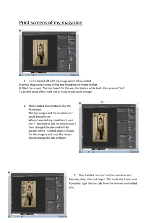
- 1. Print screens of my magazine 1. First I started off with the image which I then edited In photo shop using a sepia effect and enlarging the image so that It fitted the screen. The tool I used for this was the black n white tool I then pressed ‘tint’ To get the sepia effect. I did this to make it look quite vintage. 2. Then I added basic features like the Masthead, The top images and the strapline so I could basically see Where I wanted my coverlines. I used the ‘T’ text tool to add my information I then changed the size and font for greater effect. I added original images for the imagery and used the resizer tool to change the size of them. 3. Then I added the short article coverlines and barcode, date, title and slogan. This made the front cover Complete. I got the barcode from the internet and added it in.
- 2. 1. I first started off with a contents page base. Ordering where I wanted the information to go. I used the rectangle shape to underline the subtitles. 2. I then added three pictures along the side to make it more visually pleasing and musical, the pictures I added were original and were then added in and I changed the contrast aswell. 3. I then ended up with this. I added information and detail to my contents page and in the end I was happy with the final result. I used the ‘T’ text tool to add information. This was to make it look like a contents page
- 3. 1. I started off with the title and image set it out in a mo town style following a professional magazine. MOJO motown magazine. To give me the idea. I used the polygon lasso tool to delete the background of the image. I then used the black n white tool to make my picture black and white this is so it blended in with the background. 2. Next I added the article in, with the dropcap to start it off, I found writing an article quite challenging at first but when I had a good plan I found the challenge to be quite rewarding. The ‘T’ text tool enabled me to add text the I used the coloumn tool to add coloumns so that it looked like a typical double page spread. 3. I then added a few extras like the big quotation in the middle of the article and a smaller image of one of the members. I used the resizer tool to make my image smaller.