Download to read offline

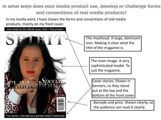
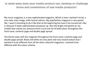
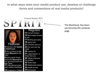


The document summarizes the design elements of a music magazine front cover created by the author. Key elements included a large dominant masthead making the title clear, a sophisticated main model image suited to the magazine, and banner cover stories standing out at the top and bottom. Neutral black and white colors were used throughout the front cover, contents page, and double page spread to make the design sophisticated, grown up, and different from other colorful magazines. The consistent black and white color scheme and repetition of the masthead carried the theme throughout the magazine.


