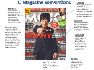
SlideShare a Scribd company logo
1 of 20
Strapline
                                                                      Often a catchy strapline to
                                                                      compliment the
                                                                      masthead, typically situated
     Masthead                                                         underneath/in close
     The masthead is                                                  proximity to the masthead.
     typically set at the top                                         Can be more simplistic like
     of the page in most                                              this one, depending on the
     magazines, bar a few.                                            genre and target audience.
     It is displayed in
     large, eyecatching
     font; to capture the                                        Pull quote
     attention of the reader                                     A short extract from text
                                                                 which will be included in a
                                                                 main feature inside the
Central image                                                    magazine, used to entice
The central image is a                                           the reader into reading the
predominant feature of any                                       whole feature.
magazine front cover. This is
a good example of how                                              Cover lines
most central images are
                                                                   Cover lines are
deliberately set out to
                                                                   included as a way of
address the audience; in
                                                                   highlighting the
this case, similarly to most
                                                                   various features of
others, through direct eye
                                                                   the magazine, while
contact. This is topped off
                                                                   catching the reader’s
by the point of the finger
                                                                   eye by following the
towards the reader.
                                                                   colour scheme of the
                                                                   rest of the cover.


                                                             Bar code
                                                             A typical feature of
                                Main cover line              every magazine sold.
                                Compliments the main         Most commonly found
                                image: advertises the main   in the bottom right
                                feature.                     hand corner.
Masthead                               Strapline
Conventionally displayed in            Situated below the
                                       title as expected.
large font, in a colour which          Blends nicely with the
contrasts the                          rest of the cover
background, whilst                     through the colour
complimenting the colour               scheme and personally
scheme of the magazine. Both           addresses the reader
of the aforementioned                  through the pronoun
techniques are used to capture         “your”.
the attention of the reader. I
have however, challenged the                   Main coverline
conventions of Q magazine, by                  Using conventional
                                               magazine features by
spreading the masthead across                  clearly representing the
the whole top of the page, as                  main image through its
opposed to being in one                        location on the page.
corner, like Q. I decided to lay               Again, a contrasting and
my masthead out like this to                   eye catching font/colour
differentiate between other                    is used to catch the
magazines of the same genre                    audience’s eye.
and maximise the appeal of my
magazine to the target                     Pull quote
                                           Compliments the main
audience.
                Coverlines                 coverline and follows
                Features of the            the colour scheme of
                magazine displayed         the magazine. Selected
                clearly on the front       particularly to entice
 Banner         cover.                     onlookers to want to
                                           buy the magazine, to
 I have challenged the
                                           read the featured
 conventions of my style model             article.
 magazine by placing the banner
 at the bottom of the page. This       Bar code
 acts as a selling point by            Conforming to the
 advertising an extra feature of       conventions of real
 the magazine, while appealing         magazines by including a
 to the target audience by             barcode. Typically
 highlighting something that they      situated in the bottom
 are likely to be interested in        right, particularly in my
 pursuing.                             style model magazine.
Masthead
Typical to this                                                                            Central image
magazine, the masthead                                                                     The central image
is displayed in the top                                                                    clearly displays the
left hand corner. The                                                                      subject of the main
Banner, which also                                                                         feature of this edition
contains the word                                                                          of the magazine. It is
‘contents’, is coloured                                                                    displayed larger than
black to ensure it stands                                                                  everything else on
out from the plain white                                                                   the page, to ensure
background; making it                                                                      that the image
clear to readers what                                                                      captures the
page they’re on.                                                                           attention of the
                                                                                           reader.
Features column
                                                                                           Main coverline and
Conventionally set out in
a column                                                                                   pull quote
                                                                                           The main coverline is designed
layout, depicting each                                                                     to highlight the theme/subject
segment of the                                                                             of the main feature of the
magazine. Follows the                                                                      magazine and is placed close to
                                                                                           the central image to make it
red, white and black                                                                       clear that they go hand in hand.
colour scheme of the                                                                       The pull quote gives the reader
magazine and stands out                                                                    an insight into the main article
                                                                                           and entices them to read more.
clearly to the reader. Every month
                        Can be seen to create and maintain the magazine’s own house style and identity, by
                        highlighting what readers can expect from the magazine in each edition.
Features column
Similarly to the style       Masthead
models I analyzed, from      Conventionally to my style
magazines such as Q and      models, I have used a
Acoustic, I included a       banner to place my
lengthways features          masthead inside.
column, to show what
my magazine includes. I      Central image
                             I have challenged the
decided to keep my
                             conventions of using text to
contents page                accompany the central
simple, following the        image, (pull quotes etc)
findings I made through      because I felt that the image
my research, which           complimented the entire page
showed that my target        better without text, while
audience would be more       supporting the simplistic
                             theme of my magazine.
appreciative of a
                             To challenge the conventions
simple, less busy            of my style models further, I
magazine. The column         decided to use another
follows the yellow, black    reasonably sized picture to
and white scheme of the      accompany one of the
entire magazine; with        features. Although other
the main feature using a     magazines do use a second
                             picture, like the contents page
yellow font where white
                             analyzed in the previous
is used for other text, to   slide, it is rare to find a picture
highlight its importance     to accompany another one of
and make it stand out to     the magazine’s top features.
the reader.
Drop cap
Central image The use of drop caps in this article catches the readers eye and draws attention
Conventionally     to the text. Challenging the conventions of most magazines, the large ‘L’, while
to this particular relating to the ‘Lady’ in Lady Gaga, is used as an alternative to having a pull-
magazine, one      quote to accompany the image
half of the                                                                          Columns
double page                                                                          The text in a
spread is                                                                            double page
occupied by the                                                                      spread is
central image.                                                                       conventionally
Constructed so
                                                                                     set in
the subject of
the article is                                                                       columns, and
addressing                                                                           written in
readers with                                                                         around 9pt text;
direct eye                                                                           allowing a
contact, the                                                                         squeeze of
central image                                                                        information into
accompanies a                                                                        a small space.
page of lengthy
text. The image
breaks it                                               Not typical of a double page spread in
up, giving the                                          particular, the page number is
feel that there is
                                                        displayed in the bottom right hand
less to read.
                                                        corner
Second Image
Headline                                                                                        I have challenged
I have followed                                                                                 the conventions
the conventions                                                                                 of other music
of most music                                                                                   magazines by
magazines by                                                                                    placing a second
placing the                                                                                     image, which
headline in the                                                                                 doesn’t directly
top left hand                                                                                   relate to the
corner of the                                                                                   main attraction
double page                                                                                     of the double
spread.                                                                                         page
                                                                                                spread, inside
Text                                                                                            the spread itself.
Different                                                                                       I chose to do this
coloured text was                                                                               because despite
used to                                                                                         not being relative
differentiate                                                                                   to the
between the                                                                                     interviewee in
questions and                                                                                   the article, the
answers in the      Pull quote
                    This pull quote follows the colour scheme of the      Unconventionally, I   picture links well
interview. The                                                                                  with the subject
                    magazine, which overall supports the simplistic       have included a
colours chosen                                                            preview of next       of conversation
                    theme. The pullquote is displayed in larger text so
follow the colour                                                         weeks                 in the interview.
                    the reader sees it first, and is designed to
scheme of the       encourage them to read on, to discover the            features, enticing
magazine.           context of the quote.                                 readers to re-buy.
1. How my magazine uses the typical conventions
• My music magazine has undertaken many of the aforementioned
  traditional magazine conventions
• Graphologically: I have decided to place my main image on the front
  cover centrally, while ensuring that just one person takes the
  limelight: similarly to most magazines.
• I have also placed my masthead at the top of the page, spanning fully
  from left to right, which is also typical of most magazines.
• The barcode is situated in the bottom right hand corner, just like you
  would find in most music magazines.
• I have positioned my cover lines over the central image to inform
  onlookers of what is inside the rest of the magazine.
• On both the contents page and double page spread, I have used pull
  quotes to accompany an image, giving insight into the relevant
  article.
1. Use of typical conventions
                  continued
• The layout of my double page spread was typical to the form
  of articles in the majority of magazines: set in columns, with a
  main headline to accompany the text.
• I also used the convention of your typical music magazine
  which sees a clear colour scheme stuck to throughout. The
  primary colours within my magazine are yellow, black and
  white. This can be seen to challenge the typical colours found
  in magazines which are generally reds and blues. However, I
  felt these colours accompanied the theme of my magazine
  nicely and more generally, the colour scheme shows the
  typical convention of following a strict set throughout.
1. Challenging the typical conventions
• I have challenged the convention of having a drop cap in my
  double page spread interview article. Drop caps are common
  conventions of interview articles in particular and are
  designed to draw attention to the text, and are usually
  relevant to the subject of the interview
• However, I felt that a drop cap would make my double page
  spread seem more ‘busy’ than it needed to. By leaving it out, I
  feel that I have achieved the tidy and simplistic look on my
  double page spread that I was looking for; following the
  general theme and layout of the rest of the magazine.
1. Challenging conventions further
• As mentioned briefly on slide 6, I challenged the conventions
  of most double page spreads by including a second image.
• It is rare to find a picture of a different to the one who’s
  interview is scribed on the double page spread. However, I felt
  that the second image fitted nicely with the subject matter of
  the interview, and is relevant to the genre of music that my
  magazine follows.
2. How does my product represent
             social groups?
• A representation is “a creation that is a visual or tangible rendering
  of someone or something”
• Linking to the first question, I believe that the representation shown
  by my model in the central image on my front cover challenges
  what you would typically find on the cover of a music magazine.
  This is because the model, regarding his clothing and stance, does
  not particularly represent my target audience and their interests or
  socio-economic profiles.
• However, I believe that because my model is representing an artist
  who is accessible for people of all ages and differing profiles, this
  was not as important as if it were a different artist. I
  do, however, feel as though I have represented my audience
  through my textual content as well as the design of my magazine.
2. How my product represents social
          groups continued
• I believe the familiar and simplistic language used is reflective
  of my target audience. No modern day slang or abbreviations
  with the connotations of young people are used due to the
  fact that this language is not relevant to my target audience
  and does not represent them in the correct way.
• For example, my magazine would rather use the word
  “celebrity” over “celeb” because “celebrity” is the most likely
  choice of word for my intended target audience.
• Despite its simplicity, there are some examples of heightened
  vocabulary used: intended to represent my audience as the
  sort of people who are likely to be able to understand and
  implement such vocabulary in their own speech or writing.
2. How my product represents social
          groups continued
• The layout of my magazine is also very reflective and
  representative of my target audience of adult males.
• The structured, organized style was ensured by the use of the
  rule of thirds: allowing me to split particularly my front cover
  into three sections and ensure equal quantities of text and
  image in each.
• This is intended to represent my target audience as organised
  people, who have everything clearly laid out for them, making
  my magazine accessible to them due to its obvious and simple
  style.
3. What kind of media institution
would distribute your magazine? Why?
• I have decided to answer this question in the
  form of video response. The link to this video
  is available on my WordPress blog under the
  evaluation section.
• The audience for my magazine is predominantly males between the ages
  18-40. However, this particular issue could be seen to appeal to women
  too, due to the use of male models for the photos used. I feel that I have
  addressed my target audience and represented the acoustic genre through
  the layout of my magazine. The maintenance of white space on the front
  cover is an example of how I have tried to keep a sophisticated and
  simplistic look, appealing to the preferences of the magazine’s audience.
• My target audience would be mainly working class men, who are easily able
  to afford a moderately priced magazine. The magazine is also affordable to
  those on a lower income who fit inside my audience bracket, such as
  university students. Despite being affordable to the working class, my
  magazine is easily accessible to people of higher social standing who may
  appreciate more sophisticated language styles: while remaining familiar to
  appeal to a wider bracket of people within my target audience’s interests.
• The main area where my target audience live, would be in more rural areas.
  This is because the culture of the acoustic genre is more maintained in
  those areas. City based culture is more focused around more mainstream
  genres such as rap, hip hop and pop: therefore I feel my magazine would
  have a better chance of selling in rural areas.
4. The audience for Lounge magazine continued
• My intended target audience individually are people with high
  aspirations, who enjoy the simple things in life. They are well
  educated and either have clear aspirations to work in a
  specific job or they are there already
• They enjoy being addressed familiarly and are not too formal
• They have relaxed lifestyles and listen to acoustic music to
  wind down
• They prefer to read and take in information rather than look
  at more picture based magazines
•   The use of language throughout my magazine was specifically chosen to appeal to
    the target audience. I maintained the use of standard, proper English along with
    some slightly more complex synonyms as opposed to their less ‘adult’ alternatives.
    This is because I felt my audience would appreciate being addressed familiarly but
    properly,(due to the extended age bracket), far more than struggling to understand
    slang or modern abbreviations.
•   The imagery used is not necessarily what you would always expect from an
    acoustic magazine. For example, the model in the main image posing with his
    hood up is something you might see more in a rap magazine. However, I feel that
    the particular artist he is posing as, represents the genre of my magazine perfectly
    and this pose was simple and therefore typical of the artist’s personality, as well as
    being similar to some of his photoshoots I have come across. The fact that there is
    a plain background compliments the title ‘Lounge’: the connotations of which
    involve laid back, simple. I feel that my target audience would be attracted to the
    simple layout rather than a busy cover, which has more visual image to process
    and ‘de-code’.
•   Other content, such as other photos that I chose to use in my magazine, were also
    based around the preferences of the target audience. For example, the photo on
    the contents page/double page spread of ‘Luke Georgiades’ holding a
    guitar, represent something completely relative to the genre of the magazine.
5. How I appealed to the target audience continued
• I believe that my decision to include larger chunks of text, including a
  varied sentence structure appeals to my target audience. This is because
  of their desire to read and intake information rather than look at pictures.
  My target audience take well to having things to read and
  understand, rather than an unintellectual or undetailed page full of white
  space, or full of images.
• I also think that the relaxed and generally familiar, informal tone of the
  language used in my magazine goes hand in hand with the idea that my
  target audience listen to music to wind down, allowing them to feel
  comfortable while reading my magazine.
•   Firstly, we were familiarised with Wordpress.com; a free website which allows you to
    construct and manage your own blog.
•   We were then introduced to Adobe InDesign, which was used for the actual production
    of our magazines. Photoshop was also used for any picture editing we needed to do.
•   We also used scanners to scan pieces of our research and planning onto our blogs
•   Various Microsoft Office programs, such as Word and Excel, were also used to produce
    pieces of our research and planning
•   Professional Nikon Cameras and a photo studio were used for the taking of our
    magazine photos
•   The aforementioned software is all very accessible. For example, free trial versions of
    InDesign are available for use at home, while The Microsoft software are all very easy to
    use and are household items. The only problem I encountered with accessibility was
    with the photo studio, because it needed to be pre-booked and it was not always
    available. This was overcome by pre-planning and good organisation to ensure we got
    to use the studio.
•   I found Adobe InDesign particularly difficult to use to begin with. I was not familiar with
    how to accurately manipulate document layouts and maximise image quality.
    However, through practise and external use I was able to pick up the required skills at a
    relative pace and became completely comfortable with the tool by the end of our
    assignment.
Skills I have learned through the production of my magazine:
• Using Adobe InDesign
• How to keep maximum picture quality
• How to analyse style models
• How to create and manage a blog
Skills I have developed through the production of my magazine:
• Photography: constructing and taking photos, setting up a photo studio for a photoshoot
• Specific media & magazine related terminology such as “mis en scene”
• I have also realised the importance of planning. Without planning ahead, we would not have
     been able to conduct our photoshoots because we couldn’t have booked the studio.
Manipulation of representations:
• I now understand how font colours are very important to relating to your audience. For
     example, my layout of simple, block colours with the inclusion of some yellow to add a
     ‘trademark’ feel to my magazine, represents the simplicity and easy going nature sought by
     my target audience. The colours used for my magazine would be completely different to that
     of a Rock magazine, which would be far more busy and vibrant.
• I also have a better knowledge of how photos must be constructed to appeal to your target
     audience. Without thinking about background, poses, props and attire, you cannot construct
     a photo which is specific to your genre and audience.
• Furthermore, I can now differentiate between fonts, even those with slight differences, and
     make decisions based on the genre and audience of a magazine, which would be most
     effective. These are all skills that I have learned and developed throughout the production of
     my magazine.

More Related Content

What's hot

Genre 20 slides
Genre 20 slidesGenre 20 slides
Genre 20 slidesfatima__b
 
As media studies evaluation
As media studies evaluation As media studies evaluation
As media studies evaluation beckybrickwood95
 
Evaluation -1. In what ways does your media product use forms and conventions...
Evaluation -1. In what ways does your media product use forms and conventions...Evaluation -1. In what ways does your media product use forms and conventions...
Evaluation -1. In what ways does your media product use forms and conventions...CharleyO16
 
Analysis of FC's
Analysis of FC'sAnalysis of FC's
Analysis of FC'sJessieGee14
 
Billboard analysis
Billboard analysisBillboard analysis
Billboard analysisTyrrell
 
Music Magazine Analysis
Music Magazine AnalysisMusic Magazine Analysis
Music Magazine Analysiselliefx
 
Analysis of magazine
Analysis of magazineAnalysis of magazine
Analysis of magazineabigail653
 
Evaluation of my media product
Evaluation of my media productEvaluation of my media product
Evaluation of my media productsophieemarinaa
 
AS Media Studies Final Evaluation
AS Media Studies Final EvaluationAS Media Studies Final Evaluation
AS Media Studies Final EvaluationStacey DaCosta
 
Magazine deconstruction
Magazine deconstructionMagazine deconstruction
Magazine deconstructionaq111082
 
Annotation of music magazine
Annotation of music magazineAnnotation of music magazine
Annotation of music magazinemason1
 
Evaluation of my media product
Evaluation of my media productEvaluation of my media product
Evaluation of my media productsophieemarinaa
 
Front cover music magazine
Front cover  music magazineFront cover  music magazine
Front cover music magazinefatima__b
 
Conventions in indie magazines
Conventions in indie magazinesConventions in indie magazines
Conventions in indie magazinesRyan Talmage
 
Presentation
PresentationPresentation
PresentationMasumaU
 

What's hot (20)

Magazine Analysis
Magazine AnalysisMagazine Analysis
Magazine Analysis
 
Genre 20 slides
Genre 20 slidesGenre 20 slides
Genre 20 slides
 
As media studies evaluation
As media studies evaluation As media studies evaluation
As media studies evaluation
 
Evaluation -1. In what ways does your media product use forms and conventions...
Evaluation -1. In what ways does your media product use forms and conventions...Evaluation -1. In what ways does your media product use forms and conventions...
Evaluation -1. In what ways does your media product use forms and conventions...
 
Analysis of FC's
Analysis of FC'sAnalysis of FC's
Analysis of FC's
 
Billboard analysis
Billboard analysisBillboard analysis
Billboard analysis
 
Music Magazine Analysis
Music Magazine AnalysisMusic Magazine Analysis
Music Magazine Analysis
 
Analysis of magazine
Analysis of magazineAnalysis of magazine
Analysis of magazine
 
Evaluation of my media product
Evaluation of my media productEvaluation of my media product
Evaluation of my media product
 
2012 eval
2012 eval2012 eval
2012 eval
 
Research
ResearchResearch
Research
 
AS Media Studies Final Evaluation
AS Media Studies Final EvaluationAS Media Studies Final Evaluation
AS Media Studies Final Evaluation
 
Media presentation
Media presentationMedia presentation
Media presentation
 
As media presentation
As media presentationAs media presentation
As media presentation
 
Magazine deconstruction
Magazine deconstructionMagazine deconstruction
Magazine deconstruction
 
Annotation of music magazine
Annotation of music magazineAnnotation of music magazine
Annotation of music magazine
 
Evaluation of my media product
Evaluation of my media productEvaluation of my media product
Evaluation of my media product
 
Front cover music magazine
Front cover  music magazineFront cover  music magazine
Front cover music magazine
 
Conventions in indie magazines
Conventions in indie magazinesConventions in indie magazines
Conventions in indie magazines
 
Presentation
PresentationPresentation
Presentation
 

Viewers also liked

Hoc lam banh khuc giang sinh
Hoc lam banh khuc giang sinhHoc lam banh khuc giang sinh
Hoc lam banh khuc giang sinhtapchiphunu
 
Top sale boss b8776 p bn double plush mid back executive chair
Top sale boss b8776 p bn double plush mid back executive chairTop sale boss b8776 p bn double plush mid back executive chair
Top sale boss b8776 p bn double plush mid back executive chairtop of ramen
 
Nhung cau hoi danh cho allegri cua duc
Nhung cau hoi danh cho allegri cua ducNhung cau hoi danh cho allegri cua duc
Nhung cau hoi danh cho allegri cua ductapchiphunu
 
Cach lam dep voi la bac ha
Cach lam dep voi la bac haCach lam dep voi la bac ha
Cach lam dep voi la bac hatapchiphunu
 
Presentation 2015. Katalog.
Presentation 2015. Katalog.Presentation 2015. Katalog.
Presentation 2015. Katalog.volovetskamaria
 
Apache Cordova, Hybrid Application Development
Apache Cordova, Hybrid Application DevelopmentApache Cordova, Hybrid Application Development
Apache Cordova, Hybrid Application Developmentthedumbterminal
 
Jane Spirulina Benefits in Hindi Aur Rakhe Apne aap Ko Swasth
Jane Spirulina Benefits in Hindi Aur Rakhe Apne aap Ko SwasthJane Spirulina Benefits in Hindi Aur Rakhe Apne aap Ko Swasth
Jane Spirulina Benefits in Hindi Aur Rakhe Apne aap Ko Swasthcshradhha
 
El triple reto de la sostenibilidad ambiental, social y financiera
El triple reto de la sostenibilidad ambiental, social y financieraEl triple reto de la sostenibilidad ambiental, social y financiera
El triple reto de la sostenibilidad ambiental, social y financieraAyuntamiento de Zaragoza
 
Proyectos de colaboración inteligente entre la ciudad y las empresas.Telegest...
Proyectos de colaboración inteligente entre la ciudad y las empresas.Telegest...Proyectos de colaboración inteligente entre la ciudad y las empresas.Telegest...
Proyectos de colaboración inteligente entre la ciudad y las empresas.Telegest...Ayuntamiento de Zaragoza
 

Viewers also liked (12)

Hoc lam banh khuc giang sinh
Hoc lam banh khuc giang sinhHoc lam banh khuc giang sinh
Hoc lam banh khuc giang sinh
 
No es solo Futbol.
No es solo Futbol.No es solo Futbol.
No es solo Futbol.
 
Top sale boss b8776 p bn double plush mid back executive chair
Top sale boss b8776 p bn double plush mid back executive chairTop sale boss b8776 p bn double plush mid back executive chair
Top sale boss b8776 p bn double plush mid back executive chair
 
Nhung cau hoi danh cho allegri cua duc
Nhung cau hoi danh cho allegri cua ducNhung cau hoi danh cho allegri cua duc
Nhung cau hoi danh cho allegri cua duc
 
Cach lam dep voi la bac ha
Cach lam dep voi la bac haCach lam dep voi la bac ha
Cach lam dep voi la bac ha
 
Presentation 2015. Katalog.
Presentation 2015. Katalog.Presentation 2015. Katalog.
Presentation 2015. Katalog.
 
Apache Cordova, Hybrid Application Development
Apache Cordova, Hybrid Application DevelopmentApache Cordova, Hybrid Application Development
Apache Cordova, Hybrid Application Development
 
Jane Spirulina Benefits in Hindi Aur Rakhe Apne aap Ko Swasth
Jane Spirulina Benefits in Hindi Aur Rakhe Apne aap Ko SwasthJane Spirulina Benefits in Hindi Aur Rakhe Apne aap Ko Swasth
Jane Spirulina Benefits in Hindi Aur Rakhe Apne aap Ko Swasth
 
El triple reto de la sostenibilidad ambiental, social y financiera
El triple reto de la sostenibilidad ambiental, social y financieraEl triple reto de la sostenibilidad ambiental, social y financiera
El triple reto de la sostenibilidad ambiental, social y financiera
 
Proyectos de colaboración inteligente entre la ciudad y las empresas.Telegest...
Proyectos de colaboración inteligente entre la ciudad y las empresas.Telegest...Proyectos de colaboración inteligente entre la ciudad y las empresas.Telegest...
Proyectos de colaboración inteligente entre la ciudad y las empresas.Telegest...
 
Team building
Team buildingTeam building
Team building
 
Smartcity-Movilidad. ZityCard y Ztaxi
Smartcity-Movilidad.  ZityCard y ZtaxiSmartcity-Movilidad.  ZityCard y Ztaxi
Smartcity-Movilidad. ZityCard y Ztaxi
 

Similar to Media powerpoint

Question 1)
Question 1)Question 1)
Question 1)12L1491
 
Stacey AS Media presentation
Stacey AS Media presentationStacey AS Media presentation
Stacey AS Media presentationStacey DaCosta
 
The generic conventions of magazines cover
The generic conventions of magazines   coverThe generic conventions of magazines   cover
The generic conventions of magazines coverJenny McNulty
 
Conventions of Magazines!
Conventions of Magazines!Conventions of Magazines!
Conventions of Magazines!Bethany Maggs
 
Magazineanalysis 120905080442-phpapp01
Magazineanalysis 120905080442-phpapp01Magazineanalysis 120905080442-phpapp01
Magazineanalysis 120905080442-phpapp01Zakmichael94
 
Front covers
Front coversFront covers
Front coversmilliee16
 
Movie Magazine Cover & Poster analysis
Movie Magazine Cover & Poster analysis Movie Magazine Cover & Poster analysis
Movie Magazine Cover & Poster analysis Naomi Collins
 
Media research
Media researchMedia research
Media researchebonypeart
 
Question 1 (magazine cover)
Question 1 (magazine cover)Question 1 (magazine cover)
Question 1 (magazine cover)danitirel1
 
Evaluation 5 fc
Evaluation 5 fcEvaluation 5 fc
Evaluation 5 fcJake Scott
 
Deconstruction of two music magazines
Deconstruction of two music magazinesDeconstruction of two music magazines
Deconstruction of two music magazinesozgealtinok
 

Similar to Media powerpoint (20)

Question 1)
Question 1)Question 1)
Question 1)
 
Stacey AS Media presentation
Stacey AS Media presentationStacey AS Media presentation
Stacey AS Media presentation
 
Presentation1
Presentation1Presentation1
Presentation1
 
Presentation1
Presentation1Presentation1
Presentation1
 
The generic conventions of magazines cover
The generic conventions of magazines   coverThe generic conventions of magazines   cover
The generic conventions of magazines cover
 
Conventions of Magazines!
Conventions of Magazines!Conventions of Magazines!
Conventions of Magazines!
 
Magazine analysis
Magazine analysisMagazine analysis
Magazine analysis
 
Magazineanalysis 120905080442-phpapp01
Magazineanalysis 120905080442-phpapp01Magazineanalysis 120905080442-phpapp01
Magazineanalysis 120905080442-phpapp01
 
Front covers
Front coversFront covers
Front covers
 
Evaluation
Evaluation Evaluation
Evaluation
 
Kerrang magazine case study
Kerrang magazine case studyKerrang magazine case study
Kerrang magazine case study
 
Movie Magazine Cover & Poster analysis
Movie Magazine Cover & Poster analysis Movie Magazine Cover & Poster analysis
Movie Magazine Cover & Poster analysis
 
My final-evaluation1
My final-evaluation1My final-evaluation1
My final-evaluation1
 
Media research
Media researchMedia research
Media research
 
Case study nme magazine
Case study nme magazineCase study nme magazine
Case study nme magazine
 
My evaluation
My evaluationMy evaluation
My evaluation
 
Question 1 (magazine cover)
Question 1 (magazine cover)Question 1 (magazine cover)
Question 1 (magazine cover)
 
Evaluation 5 fc
Evaluation 5 fcEvaluation 5 fc
Evaluation 5 fc
 
Deconstruction of two music magazines
Deconstruction of two music magazinesDeconstruction of two music magazines
Deconstruction of two music magazines
 
conventions
conventionsconventions
conventions
 

Media powerpoint

  • 1. Strapline Often a catchy strapline to compliment the masthead, typically situated Masthead underneath/in close The masthead is proximity to the masthead. typically set at the top Can be more simplistic like of the page in most this one, depending on the magazines, bar a few. genre and target audience. It is displayed in large, eyecatching font; to capture the Pull quote attention of the reader A short extract from text which will be included in a main feature inside the Central image magazine, used to entice The central image is a the reader into reading the predominant feature of any whole feature. magazine front cover. This is a good example of how Cover lines most central images are Cover lines are deliberately set out to included as a way of address the audience; in highlighting the this case, similarly to most various features of others, through direct eye the magazine, while contact. This is topped off catching the reader’s by the point of the finger eye by following the towards the reader. colour scheme of the rest of the cover. Bar code A typical feature of Main cover line every magazine sold. Compliments the main Most commonly found image: advertises the main in the bottom right feature. hand corner.
  • 2. Masthead Strapline Conventionally displayed in Situated below the title as expected. large font, in a colour which Blends nicely with the contrasts the rest of the cover background, whilst through the colour complimenting the colour scheme and personally scheme of the magazine. Both addresses the reader of the aforementioned through the pronoun techniques are used to capture “your”. the attention of the reader. I have however, challenged the Main coverline conventions of Q magazine, by Using conventional magazine features by spreading the masthead across clearly representing the the whole top of the page, as main image through its opposed to being in one location on the page. corner, like Q. I decided to lay Again, a contrasting and my masthead out like this to eye catching font/colour differentiate between other is used to catch the magazines of the same genre audience’s eye. and maximise the appeal of my magazine to the target Pull quote Compliments the main audience. Coverlines coverline and follows Features of the the colour scheme of magazine displayed the magazine. Selected clearly on the front particularly to entice Banner cover. onlookers to want to buy the magazine, to I have challenged the read the featured conventions of my style model article. magazine by placing the banner at the bottom of the page. This Bar code acts as a selling point by Conforming to the advertising an extra feature of conventions of real the magazine, while appealing magazines by including a to the target audience by barcode. Typically highlighting something that they situated in the bottom are likely to be interested in right, particularly in my pursuing. style model magazine.
  • 3. Masthead Typical to this Central image magazine, the masthead The central image is displayed in the top clearly displays the left hand corner. The subject of the main Banner, which also feature of this edition contains the word of the magazine. It is ‘contents’, is coloured displayed larger than black to ensure it stands everything else on out from the plain white the page, to ensure background; making it that the image clear to readers what captures the page they’re on. attention of the reader. Features column Main coverline and Conventionally set out in a column pull quote The main coverline is designed layout, depicting each to highlight the theme/subject segment of the of the main feature of the magazine. Follows the magazine and is placed close to the central image to make it red, white and black clear that they go hand in hand. colour scheme of the The pull quote gives the reader magazine and stands out an insight into the main article and entices them to read more. clearly to the reader. Every month Can be seen to create and maintain the magazine’s own house style and identity, by highlighting what readers can expect from the magazine in each edition.
  • 4. Features column Similarly to the style Masthead models I analyzed, from Conventionally to my style magazines such as Q and models, I have used a Acoustic, I included a banner to place my lengthways features masthead inside. column, to show what my magazine includes. I Central image I have challenged the decided to keep my conventions of using text to contents page accompany the central simple, following the image, (pull quotes etc) findings I made through because I felt that the image my research, which complimented the entire page showed that my target better without text, while audience would be more supporting the simplistic theme of my magazine. appreciative of a To challenge the conventions simple, less busy of my style models further, I magazine. The column decided to use another follows the yellow, black reasonably sized picture to and white scheme of the accompany one of the entire magazine; with features. Although other the main feature using a magazines do use a second picture, like the contents page yellow font where white analyzed in the previous is used for other text, to slide, it is rare to find a picture highlight its importance to accompany another one of and make it stand out to the magazine’s top features. the reader.
  • 5. Drop cap Central image The use of drop caps in this article catches the readers eye and draws attention Conventionally to the text. Challenging the conventions of most magazines, the large ‘L’, while to this particular relating to the ‘Lady’ in Lady Gaga, is used as an alternative to having a pull- magazine, one quote to accompany the image half of the Columns double page The text in a spread is double page occupied by the spread is central image. conventionally Constructed so set in the subject of the article is columns, and addressing written in readers with around 9pt text; direct eye allowing a contact, the squeeze of central image information into accompanies a a small space. page of lengthy text. The image breaks it Not typical of a double page spread in up, giving the particular, the page number is feel that there is displayed in the bottom right hand less to read. corner
  • 6. Second Image Headline I have challenged I have followed the conventions the conventions of other music of most music magazines by magazines by placing a second placing the image, which headline in the doesn’t directly top left hand relate to the corner of the main attraction double page of the double spread. page spread, inside Text the spread itself. Different I chose to do this coloured text was because despite used to not being relative differentiate to the between the interviewee in questions and the article, the answers in the Pull quote This pull quote follows the colour scheme of the Unconventionally, I picture links well interview. The with the subject magazine, which overall supports the simplistic have included a colours chosen preview of next of conversation theme. The pullquote is displayed in larger text so follow the colour weeks in the interview. the reader sees it first, and is designed to scheme of the encourage them to read on, to discover the features, enticing magazine. context of the quote. readers to re-buy.
  • 7. 1. How my magazine uses the typical conventions • My music magazine has undertaken many of the aforementioned traditional magazine conventions • Graphologically: I have decided to place my main image on the front cover centrally, while ensuring that just one person takes the limelight: similarly to most magazines. • I have also placed my masthead at the top of the page, spanning fully from left to right, which is also typical of most magazines. • The barcode is situated in the bottom right hand corner, just like you would find in most music magazines. • I have positioned my cover lines over the central image to inform onlookers of what is inside the rest of the magazine. • On both the contents page and double page spread, I have used pull quotes to accompany an image, giving insight into the relevant article.
  • 8. 1. Use of typical conventions continued • The layout of my double page spread was typical to the form of articles in the majority of magazines: set in columns, with a main headline to accompany the text. • I also used the convention of your typical music magazine which sees a clear colour scheme stuck to throughout. The primary colours within my magazine are yellow, black and white. This can be seen to challenge the typical colours found in magazines which are generally reds and blues. However, I felt these colours accompanied the theme of my magazine nicely and more generally, the colour scheme shows the typical convention of following a strict set throughout.
  • 9. 1. Challenging the typical conventions • I have challenged the convention of having a drop cap in my double page spread interview article. Drop caps are common conventions of interview articles in particular and are designed to draw attention to the text, and are usually relevant to the subject of the interview • However, I felt that a drop cap would make my double page spread seem more ‘busy’ than it needed to. By leaving it out, I feel that I have achieved the tidy and simplistic look on my double page spread that I was looking for; following the general theme and layout of the rest of the magazine.
  • 10. 1. Challenging conventions further • As mentioned briefly on slide 6, I challenged the conventions of most double page spreads by including a second image. • It is rare to find a picture of a different to the one who’s interview is scribed on the double page spread. However, I felt that the second image fitted nicely with the subject matter of the interview, and is relevant to the genre of music that my magazine follows.
  • 11. 2. How does my product represent social groups? • A representation is “a creation that is a visual or tangible rendering of someone or something” • Linking to the first question, I believe that the representation shown by my model in the central image on my front cover challenges what you would typically find on the cover of a music magazine. This is because the model, regarding his clothing and stance, does not particularly represent my target audience and their interests or socio-economic profiles. • However, I believe that because my model is representing an artist who is accessible for people of all ages and differing profiles, this was not as important as if it were a different artist. I do, however, feel as though I have represented my audience through my textual content as well as the design of my magazine.
  • 12. 2. How my product represents social groups continued • I believe the familiar and simplistic language used is reflective of my target audience. No modern day slang or abbreviations with the connotations of young people are used due to the fact that this language is not relevant to my target audience and does not represent them in the correct way. • For example, my magazine would rather use the word “celebrity” over “celeb” because “celebrity” is the most likely choice of word for my intended target audience. • Despite its simplicity, there are some examples of heightened vocabulary used: intended to represent my audience as the sort of people who are likely to be able to understand and implement such vocabulary in their own speech or writing.
  • 13. 2. How my product represents social groups continued • The layout of my magazine is also very reflective and representative of my target audience of adult males. • The structured, organized style was ensured by the use of the rule of thirds: allowing me to split particularly my front cover into three sections and ensure equal quantities of text and image in each. • This is intended to represent my target audience as organised people, who have everything clearly laid out for them, making my magazine accessible to them due to its obvious and simple style.
  • 14. 3. What kind of media institution would distribute your magazine? Why? • I have decided to answer this question in the form of video response. The link to this video is available on my WordPress blog under the evaluation section.
  • 15. • The audience for my magazine is predominantly males between the ages 18-40. However, this particular issue could be seen to appeal to women too, due to the use of male models for the photos used. I feel that I have addressed my target audience and represented the acoustic genre through the layout of my magazine. The maintenance of white space on the front cover is an example of how I have tried to keep a sophisticated and simplistic look, appealing to the preferences of the magazine’s audience. • My target audience would be mainly working class men, who are easily able to afford a moderately priced magazine. The magazine is also affordable to those on a lower income who fit inside my audience bracket, such as university students. Despite being affordable to the working class, my magazine is easily accessible to people of higher social standing who may appreciate more sophisticated language styles: while remaining familiar to appeal to a wider bracket of people within my target audience’s interests. • The main area where my target audience live, would be in more rural areas. This is because the culture of the acoustic genre is more maintained in those areas. City based culture is more focused around more mainstream genres such as rap, hip hop and pop: therefore I feel my magazine would have a better chance of selling in rural areas.
  • 16. 4. The audience for Lounge magazine continued • My intended target audience individually are people with high aspirations, who enjoy the simple things in life. They are well educated and either have clear aspirations to work in a specific job or they are there already • They enjoy being addressed familiarly and are not too formal • They have relaxed lifestyles and listen to acoustic music to wind down • They prefer to read and take in information rather than look at more picture based magazines
  • 17. The use of language throughout my magazine was specifically chosen to appeal to the target audience. I maintained the use of standard, proper English along with some slightly more complex synonyms as opposed to their less ‘adult’ alternatives. This is because I felt my audience would appreciate being addressed familiarly but properly,(due to the extended age bracket), far more than struggling to understand slang or modern abbreviations. • The imagery used is not necessarily what you would always expect from an acoustic magazine. For example, the model in the main image posing with his hood up is something you might see more in a rap magazine. However, I feel that the particular artist he is posing as, represents the genre of my magazine perfectly and this pose was simple and therefore typical of the artist’s personality, as well as being similar to some of his photoshoots I have come across. The fact that there is a plain background compliments the title ‘Lounge’: the connotations of which involve laid back, simple. I feel that my target audience would be attracted to the simple layout rather than a busy cover, which has more visual image to process and ‘de-code’. • Other content, such as other photos that I chose to use in my magazine, were also based around the preferences of the target audience. For example, the photo on the contents page/double page spread of ‘Luke Georgiades’ holding a guitar, represent something completely relative to the genre of the magazine.
  • 18. 5. How I appealed to the target audience continued • I believe that my decision to include larger chunks of text, including a varied sentence structure appeals to my target audience. This is because of their desire to read and intake information rather than look at pictures. My target audience take well to having things to read and understand, rather than an unintellectual or undetailed page full of white space, or full of images. • I also think that the relaxed and generally familiar, informal tone of the language used in my magazine goes hand in hand with the idea that my target audience listen to music to wind down, allowing them to feel comfortable while reading my magazine.
  • 19. Firstly, we were familiarised with Wordpress.com; a free website which allows you to construct and manage your own blog. • We were then introduced to Adobe InDesign, which was used for the actual production of our magazines. Photoshop was also used for any picture editing we needed to do. • We also used scanners to scan pieces of our research and planning onto our blogs • Various Microsoft Office programs, such as Word and Excel, were also used to produce pieces of our research and planning • Professional Nikon Cameras and a photo studio were used for the taking of our magazine photos • The aforementioned software is all very accessible. For example, free trial versions of InDesign are available for use at home, while The Microsoft software are all very easy to use and are household items. The only problem I encountered with accessibility was with the photo studio, because it needed to be pre-booked and it was not always available. This was overcome by pre-planning and good organisation to ensure we got to use the studio. • I found Adobe InDesign particularly difficult to use to begin with. I was not familiar with how to accurately manipulate document layouts and maximise image quality. However, through practise and external use I was able to pick up the required skills at a relative pace and became completely comfortable with the tool by the end of our assignment.
  • 20. Skills I have learned through the production of my magazine: • Using Adobe InDesign • How to keep maximum picture quality • How to analyse style models • How to create and manage a blog Skills I have developed through the production of my magazine: • Photography: constructing and taking photos, setting up a photo studio for a photoshoot • Specific media & magazine related terminology such as “mis en scene” • I have also realised the importance of planning. Without planning ahead, we would not have been able to conduct our photoshoots because we couldn’t have booked the studio. Manipulation of representations: • I now understand how font colours are very important to relating to your audience. For example, my layout of simple, block colours with the inclusion of some yellow to add a ‘trademark’ feel to my magazine, represents the simplicity and easy going nature sought by my target audience. The colours used for my magazine would be completely different to that of a Rock magazine, which would be far more busy and vibrant. • I also have a better knowledge of how photos must be constructed to appeal to your target audience. Without thinking about background, poses, props and attire, you cannot construct a photo which is specific to your genre and audience. • Furthermore, I can now differentiate between fonts, even those with slight differences, and make decisions based on the genre and audience of a magazine, which would be most effective. These are all skills that I have learned and developed throughout the production of my magazine.