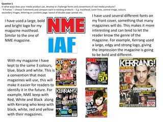
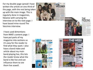
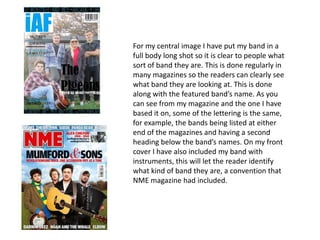
Question 1
In what ways does your media product use, develop or challenge forms and conventions of real media products?
-‘9 frames’ – choose 9 elements and compare each to existing products – E.g. masthead, cover lines, central image, colours,
secondary images, lettering on contents page, layout of double page spread, etc.
                                                                                         I have used several different fonts on
   I have used a large, bold                                                             my front cover, something that many
   and bright logo for my                                                                magazines will do. This makes it more
   magazine masthead.                                                                    interesting and can tend to let the
   Similar to the one of                                                                 reader know the genre of the
   NME magazine.                                                                         magazine. For example, Kerrang used
                                                                                         a large, edgy and strong logo, giving
                                                                                         the impression the magazine is going
                                                                                         to be bold and different.
     With my magazine I have
     kept to the same 3 colours,
     blue, black and white. This is
     a convention that most
     magazines will use, this will
     make it easier for readers to
     identify it in the future. For
     example, NME keep with
     Red, White and Black along
     with Kerrang who keep with
     black, white, red and yellow
     with their magazines.
For my double page spread I have
written the article on one third of
the page, with the rest being taken
up with the main image. This is
regularly done in magazines,
likewise with carrying the
interview on to the next page. I
have based mine round The
Vaccines interview.

I have used dimentions
from NME’s content page. I
have put parts of my
magazine into sections so
it’s easy for the reader to
find what they want. I also
have a band index and
article about my main
band playing live, this lets
the reader know what the
band is like live and can
influence them to see
them live aswell.
For my central image I have put my band in a
full body long shot so it is clear to people what
sort of band they are. This is done regularly in
many magazines so the readers can clearly see
what band they are looking at. This is done
along with the featured band’s name. As you
can see from my magazine and the one I have
based it on, some of the lettering is the same,
for example, the bands being listed at either
end of the magazines and having a second
heading below the band’s names. On my front
cover I have also included my band with
instruments, this will let the reader identify
what kind of band they are, a convention that
NME magazine had included.

Question 1

  • 1.
    Question 1 In whatways does your media product use, develop or challenge forms and conventions of real media products? -‘9 frames’ – choose 9 elements and compare each to existing products – E.g. masthead, cover lines, central image, colours, secondary images, lettering on contents page, layout of double page spread, etc. I have used several different fonts on I have used a large, bold my front cover, something that many and bright logo for my magazines will do. This makes it more magazine masthead. interesting and can tend to let the Similar to the one of reader know the genre of the NME magazine. magazine. For example, Kerrang used a large, edgy and strong logo, giving the impression the magazine is going to be bold and different. With my magazine I have kept to the same 3 colours, blue, black and white. This is a convention that most magazines will use, this will make it easier for readers to identify it in the future. For example, NME keep with Red, White and Black along with Kerrang who keep with black, white, red and yellow with their magazines.
  • 2.
    For my doublepage spread I have written the article on one third of the page, with the rest being taken up with the main image. This is regularly done in magazines, likewise with carrying the interview on to the next page. I have based mine round The Vaccines interview. I have used dimentions from NME’s content page. I have put parts of my magazine into sections so it’s easy for the reader to find what they want. I also have a band index and article about my main band playing live, this lets the reader know what the band is like live and can influence them to see them live aswell.
  • 3.
    For my centralimage I have put my band in a full body long shot so it is clear to people what sort of band they are. This is done regularly in many magazines so the readers can clearly see what band they are looking at. This is done along with the featured band’s name. As you can see from my magazine and the one I have based it on, some of the lettering is the same, for example, the bands being listed at either end of the magazines and having a second heading below the band’s names. On my front cover I have also included my band with instruments, this will let the reader identify what kind of band they are, a convention that NME magazine had included.