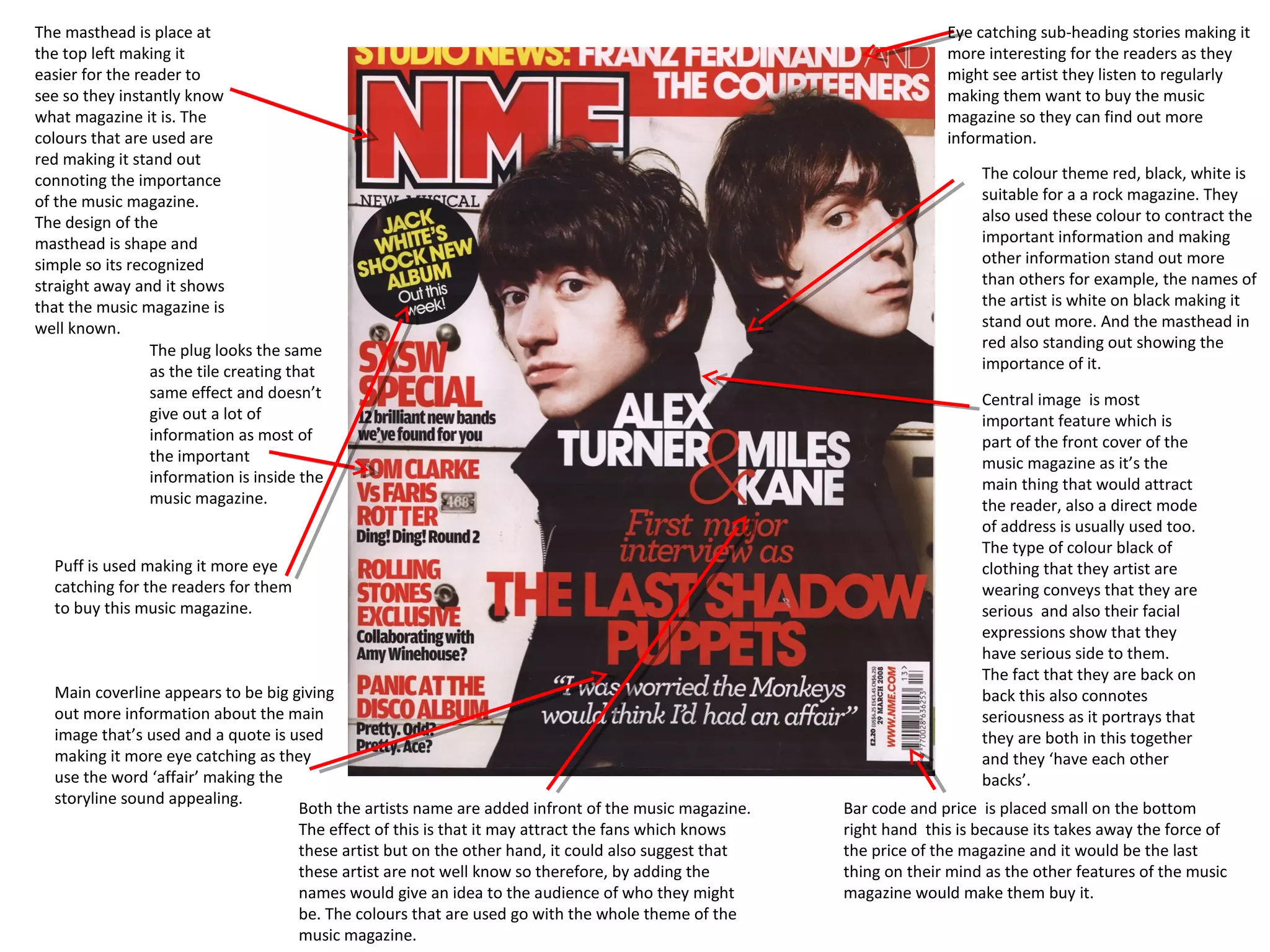
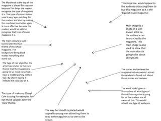
1. The masthead is place at Eye catching sub-heading stories making it
the top left making it more interesting for the readers as they
easier for the reader to might see artist they listen to regularly
see so they instantly know making them want to buy the music
what magazine it is. The magazine so they can find out more
colours that are used are information.
red making it stand out
connoting the importance The colour theme red, black, white is
of the music magazine. suitable for a a rock magazine. They
The design of the also used these colour to contract the
masthead is shape and important information and making
simple so its recognized other information stand out more
straight away and it shows than others for example, the names of
that the music magazine is the artist is white on black making it
well known. stand out more. And the masthead in
The plug looks the same red also standing out showing the
as the tile creating that importance of it.
same effect and doesn’t Central image is most
give out a lot of important feature which is
information as most of part of the front cover of the
the important music magazine as it’s the
information is inside the main thing that would attract
music magazine. the reader, also a direct mode
of address is usually used too.
The type of colour black of
Puff is used making it more eye clothing that they artist are
catching for the readers for them wearing conveys that they are
to buy this music magazine. serious and also their facial
expressions show that they
have serious side to them.
The fact that they are back on
Main coverline appears to be big giving back this also connotes
out more information about the main seriousness as it portrays that
image that’s used and a quote is used they are both in this together
making it more eye catching as they and they ‘have each other
use the word ‘affair’ making the backs’.
storyline sound appealing.
Both the artists name are added infront of the music magazine. Bar code and price is placed small on the bottom
The effect of this is that it may attract the fans which knows right hand this is because its takes away the force of
these artist but on the other hand, it could also suggest that the price of the magazine and it would be the last
these artist are not well know so therefore, by adding the thing on their mind as the other features of the music
names would give an idea to the audience of who they might magazine would make them buy it.
be. The colours that are used go with the whole theme of the
music magazine.
2. The masthead is behind the
main image this suggest that Puff is used to attract the readers
they music magazine is well more. By adding thing winning price it
known and doesn’t have to would make the readers want to buy
bee shown fully. The fact that the magazine even more. By placing it
the masthead is used in that at the top makes it more eyes
sort of edgy broken front catching and also the yellow yellow is
connotes the whole rock bright attracting the reader. The
theme of it colour yellow connotes happiness the
reader could feel as if they could be in
luck of winning.
Other image of a artist which
seems to be a old artist this The main image of green day is the
can attract the older readers biggest feature in the music
to buy the magazine. magazine. This would attract the
reader as they might know him
and may be a big fan so therefore
would consider buying the music
The colour theme white black blue
magazine. The main image is also
and yellow. Black and white connotes
the important feature as it givers
the whole rock theme. And the black
an idea of the main story line and
dark background makes the other
it would also show that he’s the
information stand out making them
main forces of the story line. The
seem important such as, the masthead
body position of the artist seems
and the main story.
to be leaned back conveying the
idea of how he’s not a serious
person and doesn’t really care. The
The bar code is small type of clothing he's wearing
and its surround by seems to simple and formal again
other information showing the side of him not really
such are the prices caring about his appearance. He's
that the audience can wearing black, black is a dark
win and other serious colour showing the whole
information this takes rock theme.
away the focus of the
price of the music
magazine.
More seal teams are added making the magazine The main story line appears to big and side of the forces centre. This shows the
stand out more for the readers. By including that importance of the magazine as it the main story that the readers would find
they can win for than one thing it would make inside the music magazine. It also gives a little quote giving idea of what the
them feel as if it would be worth buying the music main story may be about. By making the artist name bigger than the other
magazine. Also by adding the images of the front it shows he's the main important person about this magazine. The front
posters it can attract the readers as they might it seems to be similar to the masthead suggesting that he's just as important as
see the band they listen to. the masthead.
3. The Masthead at the top of the This strap line would appeal to
magazine is placed for a reason the audience attracting them to
because This helps the readers
buy this magazine as it is the
recognize the type of magazine
‘biggest music magazine’.
it is. The type of colours colour
used is very eyes catching for
the readers and also by making
the masthead one letter again
is more effective because the Main image is a
readers would be able to photo of a well
recognize that type of music known artist so
magazine it is. the audience can
be attacked to the
The main colours is used magazine. This
to link with the main main image is also
theme of the whole
used to show that
magazine. The
background being black
the main story is
makes everything else going to be about
stand out. Cheryl Cole.
The type of hair style that the
artist has relates to the rock
theme that the magazine is The stories and reviews the
going for as most rock chicks magazine includes would attract
have a middle parting in their the readers to found out about
hair. By Cheryl having it these stories and reviews.
reflects the rock side of it.
The word ‘rocks’ gives a
atmosphere of what type of
The type of make-up Cheryl theme the magazine is going
Cole is using for example, her for so the readers are all
eye make-up goes with the aware of this. This would
‘rock’ theme. attract one type of audience.
The way her mouth is placed would
appeal to young man attracting them to
read with magazine as its seen to be
sexual.
4. Masthead at the top
making it more eye Number page is next to
catching and also the the image this would
fact that its placed in make it easier for the
front of a red back reader to go to the page if
grounds while the they see their band/artist
front is white makes it that they enjoying
stand out more again listening to.
making it more eye
catching for the
readers.
Image of artist live
performance so the reader
The title big and bold to show the can be informed of what
importance of the magazine and could of gigs went on that
it also reminds the reader they might have missed .
remember what their reading
The contents page has
Sub-headings are used to more images with would
help the reader know attract the reader more
what the page is about than words as they might
just by reading the sub- see the artist/band they
heading what give them listen to regularly.
an idea of what kind of Because of this they
information is going to be would want to read
given. about them and see
what’s happening so
they can feel updated.
A regulars box for those who
read the magazine often and
read the pages they always
read. This would make the
The colours that used
read feel as if they are part of
through out this contents
the magazine team.
page is mostly, red, black
and white. These colour all
Issue date at the top so the readers know that this go with the whole rock
magazine has been updated so they can feel updated on theme.
the information that’s given.
5. The theme goes with all whole music magazine as they used
the same colours which go with the ‘rock’ theme. The masthead at the top of the
They also used black background making the other information top so the readers know what
stand out even more. page their on and also all in
capital letters and in white so its
out from the black background.
The title of magazine at
the top to portrays the Issue date under the masthead
importance of the so the readers know that the
name of the magazine music magazine is updated,
and also because the making them feel updated.
readers know that all
the information they
read it from ‘NME’. Sub-headings of what type of
information is given in each
page. It also makes it easier
for the readers to go quick to
what would like to read.
Image big so the readers
can recognize who the
band is and its shows Number pages beside the
what the bottom subheading easier for the
information is talking readers to go to the page they
about. want to read about.
Sub-heading sort intro of
what that page may be talking
about and mostly who they
are talking about.
Sell line included grabbing
more attention from the
readers.
Advertisements about the music magazine informing
them about different magazine they produced so the
readers can also get that copy. This would get more
audiences as they can save money and also people use
their smart phones to read about any type of updates.
6. The hair style that the artist has
is styled to fit the whole ‘rock’
theme also it can also been
The title of seem as a advertisement of a
magazine at the top hair style which some people
to portrays the would want to get after seeing
importance of the this image.
name of the
magazine and also Masthead at the top so the
because the readers reader knows what page their
know that all the on. The colours that are used
information they also makes it stand out to show
read it from ‘Q’. the importance of the page.
Image of a band which Image takes half of the
fits in what the story is space this could suggest
about. By including the that he’s well known and
image of the band it he he has a large fan base
would catch the reader
attention to find out
what the story is about.
The colour red, white
and black all goes with
Sub-headings would the Q theme of the
make its easier for the music magazine
readers to know what
the main story is about
just by reading the sub-
heading.
Website at the bottom
which can allow the reader
to have a digital copy if they
want it.
Page page next to the sub-
heading so the readers know
The issue date at the bottom so the
which page to turn to when they
reader know that the music
want to read about the story
magazine has been updated.
they chose to read.
7. The hair style that the artist has
is styled to fit the whole ‘rock’
theme also it can also been
The title of seem as a advertisement of a
magazine at the top hair style which some people
to portrays the would want to get after seeing
importance of the this image.
name of the
magazine and also Masthead at the top so the
because the readers reader knows what page their
know that all the on. The colours that are used
information they also makes it stand out to show
read it from ‘Q’. the importance of the page.
Image of a band which Image takes half of the
fits in what the story is space this could suggest
about. By including the that he’s well known and
image of the band it he he has a large fan base
would catch the reader
attention to find out
what the story is about.
The colour red, white
and black all goes with
Sub-headings would the Q theme of the
make its easier for the music magazine
readers to know what
the main story is about
just by reading the sub-
heading.
Website at the bottom
which can allow the reader
to have a digital copy if they
want it.
Page page next to the sub-
heading so the readers know
The issue date at the bottom so the
which page to turn to when they
reader know that the music
want to read about the story
magazine has been updated.
they chose to read.