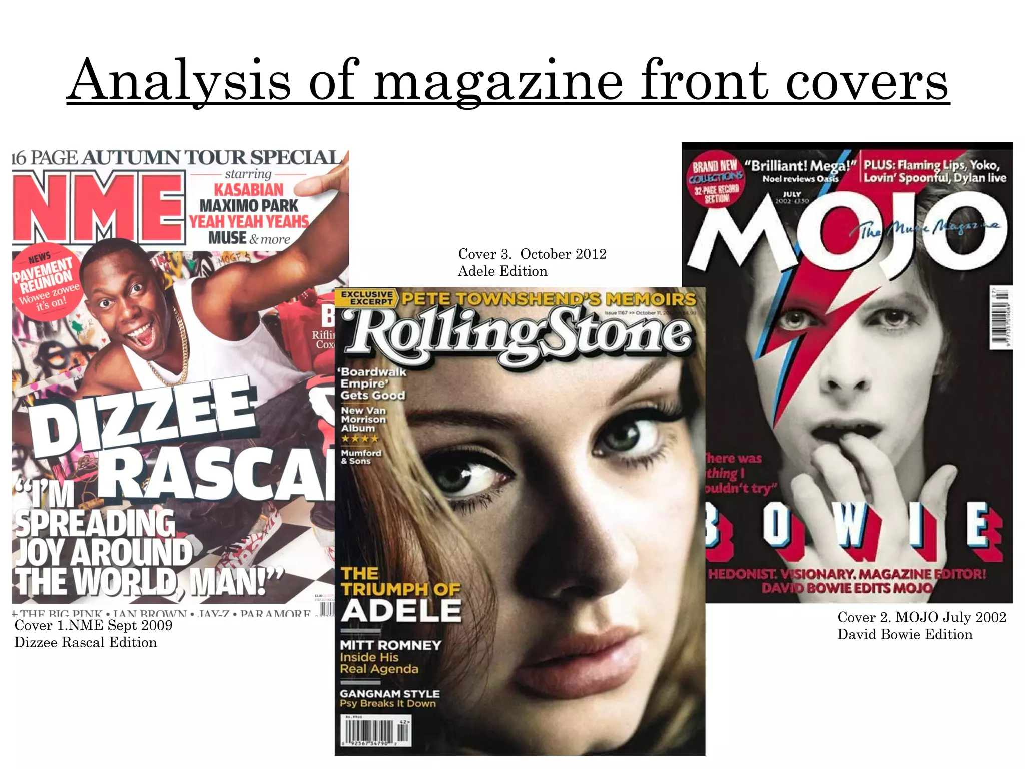
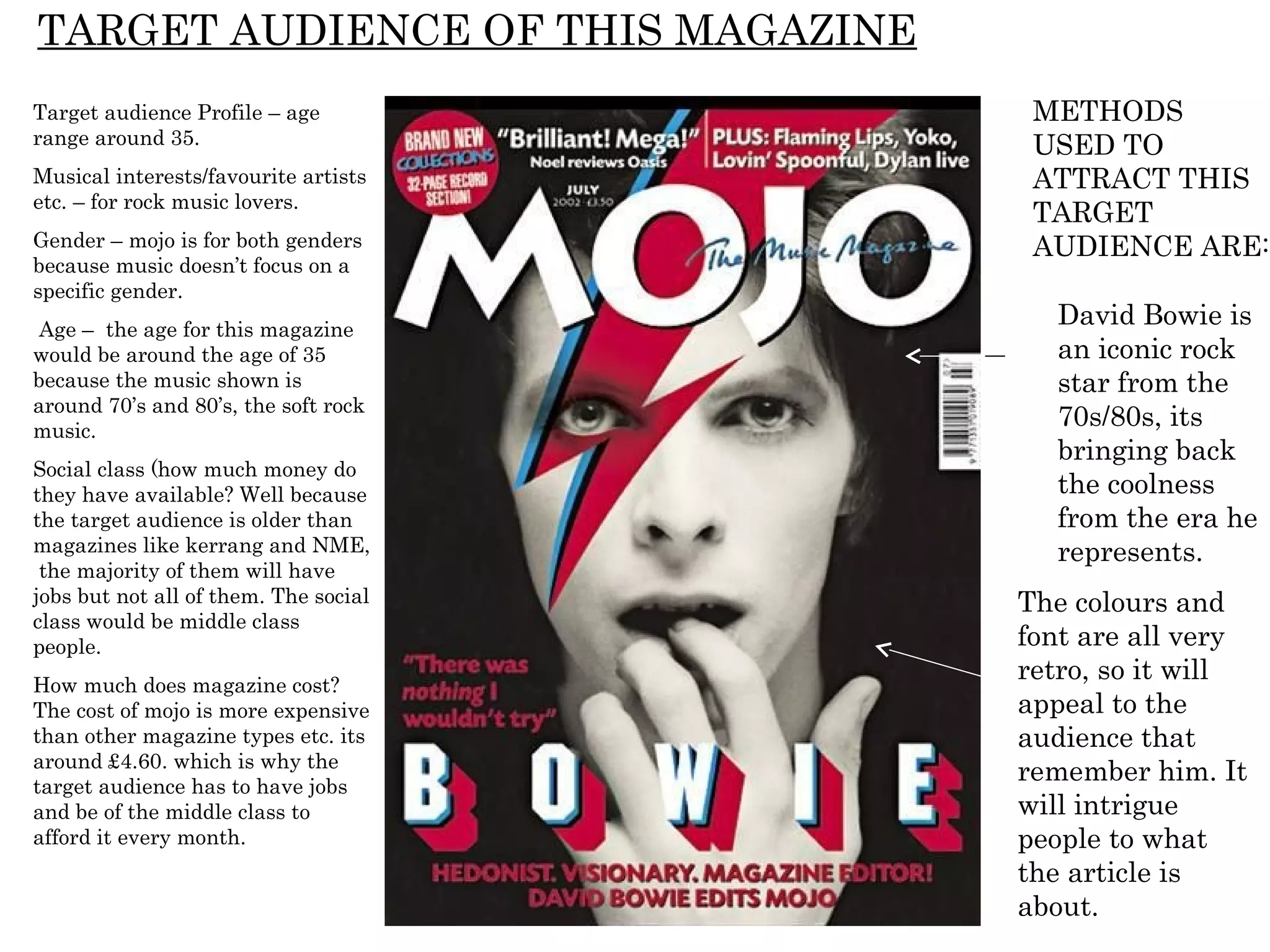
Analysis of magazine front covers

                        Cover 3. October 2012
                        Adele Edition


                                                Cover 2. MOJO July 2002
Cover 1.NME Sept 2009
                                                David Bowie Edition
Dizzee Rascal Edition
FRONT COVER ANALYSIS
THE MASTHEAD – uses bright                                                                                                             THE HEADER… gives the reader some
colours to attract the readers eye                                                                                                     more information on a story or page that
to the magazines name. NME                                                                                                             it exclusive to this magazine, or
sounds like enemy, which creates                                                                                                       something the magazine thought would
a rowdy theme, that you would                                                                                                          grab the readers attention. They have
usually link to the younger                                                                                                            made the writing bolder as it gets to the
generation of teenagers.                                                                                                               important section of the sentence and
                                                                                                                                       gives the page reference and what the
    USE OF A FLASH-(offering                                                                                                           page contains in only a few words.
    something extra to T.A) -
    this just gives the audience                                                                                                 THE SELL LINES/COVER LINES -
    that little bit more                                                                                                         gives the readers an insight to what will
    information, it also jumps                                                                                                   be included within the magazine, from
    out at the reader because                                                                                                    just looking at the front cover instead of
    of the good use of colour                                                                                                    having to flick through or look at the
    coding.                                                                                                                      contents page, which is time and effort.
                                                                                                                                 And will probably not make them want
 BACKGROUND – is very                                                                                                            to buy it because they have already
 colourful, creating a fun and                                                                                                   seen everything that’s in there, leaving
 younger atmosphere that                                                                                                         no surprise stories or interest.
 don’t take things too seriously.
 This will appeal to younger
                                                                                                                                    THE MAIN IMAGE …. Is of Dizzee
 generations because if the
                                                                                                                                    Rascal, a famous artist known for his
 outside is interesting the
                                                                                                                                    crazy music videos and energetic songs.
 inside will be the same.
                                                                                                                                    The photo of him is literally bulging out of
 Dizzee looks as if he is about
                                                                                                                                    the screen because of the use of colours
 to jump out of the page
                                                                                                                                    and action he is doing. Everything seems
 drawing you in. also the graffiti
                                                                                                                                    to feel as if its jumping out of the page at
 behind Dizzee represents a
                                                                                                                                    you.
 sense of what his music is like
 and who the magazine is for.
                                                                                                                                    THE MAIN COVER LINE – is Dizzee Rascals
  USE OF A PULL QUOTE –                                                                                                             name because he is NME cover man. They
  the informal wording of the                                                                                                       do this because although you can see his
  speech stops the magazine                                                                                                         face pretty clearly you still may not recognise
  looking sensible, and                                                                                                             him because photo’s now are so heavy
  lightening things up a bit. It                                                                                                    edited, another reason is you may not think
  also shows that its down to                                                                                                       about who it is when looking at the shelf of
  earth and this kind of                                                                                                            magazines, this way you will put the name to
  language is what the younger                                                                                                      the artist straight away because its bold from
  generation would use, not so                                                                                                      the darker parts of the image.
  much older people.
                                                                                                                                            BARCODE-date/issue/price – is
RULE OF THIRDS/THE LEFT THIRD              lost on the shelf against its competition.
                                                                                                                                            something that has to be featured on
– this gives the magazine a sense of       The quote in the bottom left third allows it   THE FOOTER – adds some more information           a magazine, for the obvious reason
structure so that it doesn’t get messy.    to be big and bold but not cover anything      on the front cover. Its not bothered about        of you cant purchase it.
The masthead is in the top left third so   important, and attracting the reader.          attracting the eye its just there if the person
its always on display and doesn’t get -                                                   notices it and wants to know more.
TARGET AUDIENCE OF THIS MAGAZINE
Target audience Profile – teenagers
from around 16 to early 20’s.                    METHODS
Musical interests/favourite artists etc. -
more alternative and indie music.
                                                 USED TO
Gender – is male and female, because             ATTRACT THIS
all the bands featured on the top next to
the masthead are all a mixture of both
                                                 TARGET
gendered bands or artists. The                   AUDIENCE
background image is of a man having
fun, and the colours and graffiti                ARE:
background represent a male style
image, which is why some people would
say its more a male magazine.                .      Dizzee helps
Age – the age would be around                       attract the
teenagers to late 20’s because you                  target audience
wouldn’t see a middle aged man/women                because his
reading this type of magazine, especially
due to the informal style speech on the             music relates to
front cover. The bands and music taste              that generation.
are more younger generations.
Social class (how much money do they
have available? Well they are targeting
it at younger people who have the
                                                 Colours – are fun
money to afford the gigs and festivals           and energetic which
they talk about, the magazine itself             attracts the
looks good quality.
                                                 younger audiences.
How much does magazine cost? The                 They use bright and
magazine costs around £2.20, which is
quite a lot compared to other magazines          a variety of
but less than other types of magazines           different colours.
like fashion.
NM E
WHO
PUBLISHES
THE
MAGAZINE-
Robert Tame
HOW MANY
SALES DOES
IT MAKE –
around 230,000
sales per year.
GENERAL
BACKGROUND –         WHAT GENRE/TYPE OF
first started in     MAGAZINE IS IT? Indie/ rock
march 1952. Then     DETAILS OF ITS TYPICAL
moved towards a      CONTENT AND THE
                     ARTISTS/BANDS IT
magazine format
                     CURRENTLY FEATURES –
in 1980, changing    Artic Monkeys, Lady Gaga,
from newsprint in    Muse, Radiohead, Coldplay,
1998.                Lily Allen etc.
THE MASTHEAD– is spread                                                                                                  HEADER – the use of this is to
across the top of the magazine,                                                                                          add more information just above
in a white bold font which stands                                                                                        or beside the masthead so it
out over the top of the                                                                                                  expands the magazine more
monochrome image and bright                                                                                              without cramping up the small
pink.                                                                                                                    space you already have on the
   BACKGROUND/MAIN IMAGE – the                                                                                           front cover. Its more tidy and
   original image is in monochrome                                                                                       structured this way.
   which means that David Bowie’s face
   stands out from the black backdrop.                                                                                    BARCODE – is something every
   This is more effective because it                                                                                      magazine must have otherwise
   allows his face to centre of attention                                                                                 you can not purchase it.
   and not get lost in the background of
   lots of colours. The editing on the                                                                                       DATE / PRICE – allows the
   image of the flash makes the front                                                                                        magazine to have some value in
   cover original and creative/eccentric                                                                                     the future and to see what music
   which is what artist/magazine want to                                                                                     was like in what years and
   get across, give it some character.                                                                                       months. The price has to be
                                                                                                                             featured as well.
USE OF FLASH – adds more information
onto the screen, without having anymore                                                                                  MAIN COVER LINE – this is the
cover lines and drawing the attention                                                                                    name of the artist on the front cover,
away from the cover photo and theme.                                                                                     for people that may not know what
                                                                                                                         David Bowie looks like it lets them
PULL QUOTE – is something                                                                                                understand, also the image may
someone has said that has had high                                                                                       have been edited quite heavily to
impact and may motivate readers to                                                                                       create this style and theme of image
try new things. This is also                                                                                             so people may not recognise him.
something that makes the audience                                                                                        Another reason for this cover line is
feel more respect for the artist                                                                                         when you walk past the magazine
because just from this one quote you                                                                                     your eye may not catch who it is, this
realise that he has worked hard for                                                                                      way having the name so bold and
what he has achieved and he                                                                                              bright over the dark background to
deserves it all. He relates to the                                                                                       notice the name and you instantly
audience much more they don’t see                                                                                        want to have a look. David Bowie is
him as just another celebrity.                                                                                           the man story in this magazine so its
 COLOURS – the bright pink and blue                                                                                      only fair to take full advantage of
 almost give the font and the lightening                                                                                 that.
 bolt a 3D effect. This is a very                                                                                         FOOTER – another way to add
 famous/memorable magazine cover                                                                                          in extra information without
 because of this. It doesn’t get lost in                                                                                  covering any of the main images
 the background and certainly not on                                                                                      and drawing attention away from
 the magazine shelf. Its stylish not tacky                                                                                the main areas.
 and allows the reader to have a feel of what the magazine will be like, and the artists personality, music and style.
TARGET AUDIENCE OF THIS MAGAZINE
Target audience Profile – age           METHODS
range around 35.                        USED TO
Musical interests/favourite artists     ATTRACT THIS
etc. – for rock music lovers.
                                        TARGET
Gender – mojo is for both genders       AUDIENCE ARE:
because music doesn’t focus on a
specific gender.
 Age – the age for this magazine
                                         David Bowie is
would be around the age of 35            an iconic rock
because the music shown is               star from the
around 70’s and 80’s, the soft rock
music.
                                         70s/80s, its
                                         bringing back
Social class (how much money do
they have available? Well because        the coolness
the target audience is older than        from the era he
magazines like kerrang and NME,          represents.
 the majority of them will have
jobs but not all of them. The social   The colours and
class would be middle class
people.                                font are all very
How much does magazine cost?
                                       retro, so it will
The cost of mojo is more expensive     appeal to the
than other magazine types etc. its     audience that
around £4.60. which is why the
target audience has to have jobs
                                       remember him. It
and be of the middle class to          will intrigue
afford it every month.                 people to what
                                       the article is
                                       about.
HEADER – adding more
MAIN IMAGE – is a close up of Adele's
                                                                                                                                      information without the layout
face. This means that nothing will take
                                                                                                                                      getting messy. Its bold and attract
the attention away that the issue
                                                                                                                                      the eyes.
features Adele. This could be
representing that she is taking over                                                                                                  COLOURS – the colours are calm,
because she is such a big hit in the UK                                                                                               yellows and whites with Adele’s skin
as well as all over the world, as if she                                                                                              tone. Its different to many music
is taking over the magazine cover.                                                                                                    magazine front covers at the
Adele is a very attractive women with                                                                                                 moment, keeping it bright and bold
beautiful eyes, they have played with                                                                                                 this helps give you an idea of Adele
this by making her eyes the main focus                                                                                                and her music its very clever.
as she is starring through the
magazine at you, you cant really miss                                                                                                  SELL LINES / COVER LINES –
the magazine from a shelf full of                                                                                                      are very small and discrete but still
magazines.                                                                                                                             don’t seem to get lost within the
                                                                                                                                       front cover because the whole
   THE MASTHEAD – is a white font
                                                                                                                                       theme of the front cover in this
   with black around the edges so it
                                                                                                                                       issue is very modest and relaxed, it
   stands out from the background.
                                                                                                                                       doesn’t need to be bold.
   The masthead spreads along the
   top of the magazine within the top                                                                                               BACKGROUND - the colours used in
   thirds so its noticeable although its                                                                                            the background image are very
   smaller than most magazine                                                                                                       neutral, not too bright, very natural
   mastheads.                                                                                                                       colours. Representing Adele's music
RULE OF THIRD - the cover lines                                                                                                     which is very original, not repetitive,
have been placed within the bottom                                                                                                  natural and calm, not too in your face.
left third, this allows the background                                                                                              Its showing her personality through
to not be overlapped by too many                                                                                                    the magazine, of elegance, beauty
cover lines, which may defeat the                                                                                                   and grace.
object of the layout chosen. The left
                                                                                                                                   FLASH – there is a mini sort of flash
hand side is where its darkest and
                                                                                                                                   in the top left third, its adding
there isn’t anything important, if they
                                                                                                                                   information that may normally get
put it on the right hand third then it
                                                                                                                                   lost of the cover if it was a cover line,
would cover up part of her face, it
                                                                                                                                   and although it has some importance
may also not stand out from the
                                                                                                                                   to be on the front cover it still isn’t as
lighter background colour there.
                                                                                                                                   important as a cover line should be.
BARCODE – is                                                                                                                       It sort of there to remind you of
something every                                                                                                                    something.
magazine needs              MAIN COVERLINE – is the ‘THE THRUMPH OF ADELE’ it’s not as big as other magazines main cover lines, but it still stands out by
otherwise you won’t be      the use of the colours and the fact that it is a little bit bigger and bolder than the other cover lines. The ‘ADELE’ part it bigger than the
able to purchase it. And it other words in the main cover lines, so you know who the main article is about. and even though you know that this is Adele some
won’t be allowed to be      people may not be aware of what she looks like, because the image is so close up people may struggle on recognising her, the
sold in stores.             reason for this cover line is it attracts the eye to the name.
TARGET AUDIENCE OF THIS MAGAZINE
                                    METHODS
Target audience Profile             USED TO
Musical
                                    ATTRACT THIS
interests/favourite artists         TARGET
etc. – indie genre.                 AUDIENCE
                                    ARE:
Gender – I have found
that around 60% of men               Adele is a big hit
read the magazine and                in the us and
40% of females buy it. It            across the world,
might because of the                 she keeps herself
taste in music.                      out of the
Age –Social class (how               spotlight most of
much money do they have              the time, so she
available? The age would             will have a big
be from the age of 18 to             demand.
20’s and then back in the
40’s. the social class
would be middle class               The colours will
with paid jobs because its          attract the
quite an expensive                  audience because
magazine for you to buy a           it showing the
every fortnight.                    music genre’s
How much does magazine              featured, and
cost? The cost is $4.52,            Adele’s
which means that it quite           personality and
a costly magazine.                  music.
Magazine double page spread
IMAGE - the photo has been       MAIN HEADING – isn’t very large and bold, because        STYLE / THEME – is
put in an black and white        the massive ‘L’ underneath the article and the image     very elegant and
effect. They have done this to   of Lady Gaga does the job of letting the audience        simple, its not using
make it look more classic and    know what/who the article is about and catching          too many colours
elegant, her hair style is       peoples attention so they don’t ignore and skip it. It   and throwing them at
similar to Marilyn Monroe        looks more interesting and makes you want to read        you to catch
giving the article a sense of    on and find out what its going to be about.              attention. In this case
style and sexiness.                                                                       and many others
                                                                                          ‘less is more’. The
                                                                                          theme and style is
                                                                                          giving you an idea
                                                                                          about the style lady
                                                                                          gaga is trying to
                                                                                          make now and what
                                                                                          her new music is
                                                                                          going to be like.

                                                                                COLOURS – even though
                                                                                the image isn’t colourful, the
                                                                                monotone effect emphasises
                                                                                the darker sections and
                                                                                catches the eye. The bright
                                                                                red ‘L’ is very effective
                                                                                because it draws people
                                                                                attention straight to the
                                                                                page/article, also the ‘L’ lets
                                                                                people know straight away
                                                                                who the article is about.
Magazine double page spread
MAIN HEADING – the main heading isn’t               COLOURS – the colours are very natural,            IMAGE - is of the
very bold, but they didn’t want the                 using green and yellows. The colours are           band having a bit of
heading to take any attention away from             energetic as well and bring out the fun of         festival fun and
the main image spread across the                    summer, by the use of softer colours like lilac,   wearing festival
double pages. Its still a big font and you          reds and blues etc. its like David Guetta using    fashion and their
still notice it, its not like it gets lost in the   more neon colours to represent his style           indie style, Shows
background.                                         music this is what Benjamin lee is doing here.     their music genre
                                                                                                       and personalities,
                                                                                                       giving their fans an
                                                                                                       idea what they like
                                                                                                       to do, other than
                                                                                                       making and
                                                                                                       preforming their
                                                                                                       music and songs.

                                                                                              STYLE / THEME - is
                                                                                              very cool and genuine, it
                                                                                              makes you feel like
                                                                                              going to a festival in the
                                                                                              summer, and just
                                                                                              having fun with your
                                                                                              friends. This makes you
                                                                                              want to listen to their
                                                                                              music. Its very simple,
                                                                                              with the image spread
                                                                                              across the two page
                                                                                              makes it noticeable and
                                                                                              different.

Analysing magazine cover

  • 1.
    Analysis of magazinefront covers Cover 3. October 2012 Adele Edition Cover 2. MOJO July 2002 Cover 1.NME Sept 2009 David Bowie Edition Dizzee Rascal Edition
  • 2.
    FRONT COVER ANALYSIS THEMASTHEAD – uses bright THE HEADER… gives the reader some colours to attract the readers eye more information on a story or page that to the magazines name. NME it exclusive to this magazine, or sounds like enemy, which creates something the magazine thought would a rowdy theme, that you would grab the readers attention. They have usually link to the younger made the writing bolder as it gets to the generation of teenagers. important section of the sentence and gives the page reference and what the USE OF A FLASH-(offering page contains in only a few words. something extra to T.A) - this just gives the audience THE SELL LINES/COVER LINES - that little bit more gives the readers an insight to what will information, it also jumps be included within the magazine, from out at the reader because just looking at the front cover instead of of the good use of colour having to flick through or look at the coding. contents page, which is time and effort. And will probably not make them want BACKGROUND – is very to buy it because they have already colourful, creating a fun and seen everything that’s in there, leaving younger atmosphere that no surprise stories or interest. don’t take things too seriously. This will appeal to younger THE MAIN IMAGE …. Is of Dizzee generations because if the Rascal, a famous artist known for his outside is interesting the crazy music videos and energetic songs. inside will be the same. The photo of him is literally bulging out of Dizzee looks as if he is about the screen because of the use of colours to jump out of the page and action he is doing. Everything seems drawing you in. also the graffiti to feel as if its jumping out of the page at behind Dizzee represents a you. sense of what his music is like and who the magazine is for. THE MAIN COVER LINE – is Dizzee Rascals USE OF A PULL QUOTE – name because he is NME cover man. They the informal wording of the do this because although you can see his speech stops the magazine face pretty clearly you still may not recognise looking sensible, and him because photo’s now are so heavy lightening things up a bit. It edited, another reason is you may not think also shows that its down to about who it is when looking at the shelf of earth and this kind of magazines, this way you will put the name to language is what the younger the artist straight away because its bold from generation would use, not so the darker parts of the image. much older people. BARCODE-date/issue/price – is RULE OF THIRDS/THE LEFT THIRD lost on the shelf against its competition. something that has to be featured on – this gives the magazine a sense of The quote in the bottom left third allows it THE FOOTER – adds some more information a magazine, for the obvious reason structure so that it doesn’t get messy. to be big and bold but not cover anything on the front cover. Its not bothered about of you cant purchase it. The masthead is in the top left third so important, and attracting the reader. attracting the eye its just there if the person its always on display and doesn’t get - notices it and wants to know more.
  • 3.
    TARGET AUDIENCE OFTHIS MAGAZINE Target audience Profile – teenagers from around 16 to early 20’s. METHODS Musical interests/favourite artists etc. - more alternative and indie music. USED TO Gender – is male and female, because ATTRACT THIS all the bands featured on the top next to the masthead are all a mixture of both TARGET gendered bands or artists. The AUDIENCE background image is of a man having fun, and the colours and graffiti ARE: background represent a male style image, which is why some people would say its more a male magazine. . Dizzee helps Age – the age would be around attract the teenagers to late 20’s because you target audience wouldn’t see a middle aged man/women because his reading this type of magazine, especially due to the informal style speech on the music relates to front cover. The bands and music taste that generation. are more younger generations. Social class (how much money do they have available? Well they are targeting it at younger people who have the Colours – are fun money to afford the gigs and festivals and energetic which they talk about, the magazine itself attracts the looks good quality. younger audiences. How much does magazine cost? The They use bright and magazine costs around £2.20, which is quite a lot compared to other magazines a variety of but less than other types of magazines different colours. like fashion.
  • 4.
    NM E WHO PUBLISHES THE MAGAZINE- Robert Tame HOWMANY SALES DOES IT MAKE – around 230,000 sales per year. GENERAL BACKGROUND – WHAT GENRE/TYPE OF first started in MAGAZINE IS IT? Indie/ rock march 1952. Then DETAILS OF ITS TYPICAL moved towards a CONTENT AND THE ARTISTS/BANDS IT magazine format CURRENTLY FEATURES – in 1980, changing Artic Monkeys, Lady Gaga, from newsprint in Muse, Radiohead, Coldplay, 1998. Lily Allen etc.
  • 6.
    THE MASTHEAD– isspread HEADER – the use of this is to across the top of the magazine, add more information just above in a white bold font which stands or beside the masthead so it out over the top of the expands the magazine more monochrome image and bright without cramping up the small pink. space you already have on the BACKGROUND/MAIN IMAGE – the front cover. Its more tidy and original image is in monochrome structured this way. which means that David Bowie’s face stands out from the black backdrop. BARCODE – is something every This is more effective because it magazine must have otherwise allows his face to centre of attention you can not purchase it. and not get lost in the background of lots of colours. The editing on the DATE / PRICE – allows the image of the flash makes the front magazine to have some value in cover original and creative/eccentric the future and to see what music which is what artist/magazine want to was like in what years and get across, give it some character. months. The price has to be featured as well. USE OF FLASH – adds more information onto the screen, without having anymore MAIN COVER LINE – this is the cover lines and drawing the attention name of the artist on the front cover, away from the cover photo and theme. for people that may not know what David Bowie looks like it lets them PULL QUOTE – is something understand, also the image may someone has said that has had high have been edited quite heavily to impact and may motivate readers to create this style and theme of image try new things. This is also so people may not recognise him. something that makes the audience Another reason for this cover line is feel more respect for the artist when you walk past the magazine because just from this one quote you your eye may not catch who it is, this realise that he has worked hard for way having the name so bold and what he has achieved and he bright over the dark background to deserves it all. He relates to the notice the name and you instantly audience much more they don’t see want to have a look. David Bowie is him as just another celebrity. the man story in this magazine so its COLOURS – the bright pink and blue only fair to take full advantage of almost give the font and the lightening that. bolt a 3D effect. This is a very FOOTER – another way to add famous/memorable magazine cover in extra information without because of this. It doesn’t get lost in covering any of the main images the background and certainly not on and drawing attention away from the magazine shelf. Its stylish not tacky the main areas. and allows the reader to have a feel of what the magazine will be like, and the artists personality, music and style.
  • 7.
    TARGET AUDIENCE OFTHIS MAGAZINE Target audience Profile – age METHODS range around 35. USED TO Musical interests/favourite artists ATTRACT THIS etc. – for rock music lovers. TARGET Gender – mojo is for both genders AUDIENCE ARE: because music doesn’t focus on a specific gender. Age – the age for this magazine David Bowie is would be around the age of 35 an iconic rock because the music shown is star from the around 70’s and 80’s, the soft rock music. 70s/80s, its bringing back Social class (how much money do they have available? Well because the coolness the target audience is older than from the era he magazines like kerrang and NME, represents. the majority of them will have jobs but not all of them. The social The colours and class would be middle class people. font are all very How much does magazine cost? retro, so it will The cost of mojo is more expensive appeal to the than other magazine types etc. its audience that around £4.60. which is why the target audience has to have jobs remember him. It and be of the middle class to will intrigue afford it every month. people to what the article is about.
  • 8.
    HEADER – addingmore MAIN IMAGE – is a close up of Adele's information without the layout face. This means that nothing will take getting messy. Its bold and attract the attention away that the issue the eyes. features Adele. This could be representing that she is taking over COLOURS – the colours are calm, because she is such a big hit in the UK yellows and whites with Adele’s skin as well as all over the world, as if she tone. Its different to many music is taking over the magazine cover. magazine front covers at the Adele is a very attractive women with moment, keeping it bright and bold beautiful eyes, they have played with this helps give you an idea of Adele this by making her eyes the main focus and her music its very clever. as she is starring through the magazine at you, you cant really miss SELL LINES / COVER LINES – the magazine from a shelf full of are very small and discrete but still magazines. don’t seem to get lost within the front cover because the whole THE MASTHEAD – is a white font theme of the front cover in this with black around the edges so it issue is very modest and relaxed, it stands out from the background. doesn’t need to be bold. The masthead spreads along the top of the magazine within the top BACKGROUND - the colours used in thirds so its noticeable although its the background image are very smaller than most magazine neutral, not too bright, very natural mastheads. colours. Representing Adele's music RULE OF THIRD - the cover lines which is very original, not repetitive, have been placed within the bottom natural and calm, not too in your face. left third, this allows the background Its showing her personality through to not be overlapped by too many the magazine, of elegance, beauty cover lines, which may defeat the and grace. object of the layout chosen. The left FLASH – there is a mini sort of flash hand side is where its darkest and in the top left third, its adding there isn’t anything important, if they information that may normally get put it on the right hand third then it lost of the cover if it was a cover line, would cover up part of her face, it and although it has some importance may also not stand out from the to be on the front cover it still isn’t as lighter background colour there. important as a cover line should be. BARCODE – is It sort of there to remind you of something every something. magazine needs MAIN COVERLINE – is the ‘THE THRUMPH OF ADELE’ it’s not as big as other magazines main cover lines, but it still stands out by otherwise you won’t be the use of the colours and the fact that it is a little bit bigger and bolder than the other cover lines. The ‘ADELE’ part it bigger than the able to purchase it. And it other words in the main cover lines, so you know who the main article is about. and even though you know that this is Adele some won’t be allowed to be people may not be aware of what she looks like, because the image is so close up people may struggle on recognising her, the sold in stores. reason for this cover line is it attracts the eye to the name.
  • 9.
    TARGET AUDIENCE OFTHIS MAGAZINE METHODS Target audience Profile USED TO Musical ATTRACT THIS interests/favourite artists TARGET etc. – indie genre. AUDIENCE ARE: Gender – I have found that around 60% of men Adele is a big hit read the magazine and in the us and 40% of females buy it. It across the world, might because of the she keeps herself taste in music. out of the Age –Social class (how spotlight most of much money do they have the time, so she available? The age would will have a big be from the age of 18 to demand. 20’s and then back in the 40’s. the social class would be middle class The colours will with paid jobs because its attract the quite an expensive audience because magazine for you to buy a it showing the every fortnight. music genre’s How much does magazine featured, and cost? The cost is $4.52, Adele’s which means that it quite personality and a costly magazine. music.
  • 10.
    Magazine double pagespread IMAGE - the photo has been MAIN HEADING – isn’t very large and bold, because STYLE / THEME – is put in an black and white the massive ‘L’ underneath the article and the image very elegant and effect. They have done this to of Lady Gaga does the job of letting the audience simple, its not using make it look more classic and know what/who the article is about and catching too many colours elegant, her hair style is peoples attention so they don’t ignore and skip it. It and throwing them at similar to Marilyn Monroe looks more interesting and makes you want to read you to catch giving the article a sense of on and find out what its going to be about. attention. In this case style and sexiness. and many others ‘less is more’. The theme and style is giving you an idea about the style lady gaga is trying to make now and what her new music is going to be like. COLOURS – even though the image isn’t colourful, the monotone effect emphasises the darker sections and catches the eye. The bright red ‘L’ is very effective because it draws people attention straight to the page/article, also the ‘L’ lets people know straight away who the article is about.
  • 11.
    Magazine double pagespread MAIN HEADING – the main heading isn’t COLOURS – the colours are very natural, IMAGE - is of the very bold, but they didn’t want the using green and yellows. The colours are band having a bit of heading to take any attention away from energetic as well and bring out the fun of festival fun and the main image spread across the summer, by the use of softer colours like lilac, wearing festival double pages. Its still a big font and you reds and blues etc. its like David Guetta using fashion and their still notice it, its not like it gets lost in the more neon colours to represent his style indie style, Shows background. music this is what Benjamin lee is doing here. their music genre and personalities, giving their fans an idea what they like to do, other than making and preforming their music and songs. STYLE / THEME - is very cool and genuine, it makes you feel like going to a festival in the summer, and just having fun with your friends. This makes you want to listen to their music. Its very simple, with the image spread across the two page makes it noticeable and different.