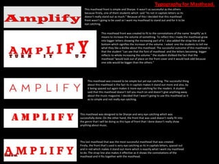
Typography for Masthead.
   This masthead front is simple and Sharpe. It wasn’t as successful as the others
   because firstly, one of them students which said “its not in capitals letters so its
   doesn’t really stand out as much.” Because of this I decided that this masthead
   front wasn’t going to be used as I want my masthead to stand out and for it to be
   eye catching,


                  This masthead front was created to fit to the connotations of the name ‘Amplify’ as it
                  means to increase the volume of something. To reflect this I made the masthead grow
                  into bigger letters showing the increasing part of it. I also added the strap line at the
                  bottom which signifies the increase of the volume. I asked one the students to tell me
                  what they like a dislike about this masthead. The successful outcome of this masthead is
                  that the student “can see that the font of masthead and the letters becoming bigger
                  reflects to whole increasing the volume.” the student disliked the fact that the
                  masthead “would look out of place on the front cover and it would look odd because
                  one side would be bigger than the others.”


      This masthead was creased to be simple but yet eye catching. The successful thing
      about this masthead is the fact its in capitals makes it stand out more and also, by
      it being spaced out again makes it more eye catching for the readers. A student
      said that this masthead doesn’t tell you much on and doesn’t give anything away
      about the music magazine. I decided that I wasn’t going to use this masthead as it
      as to simple and not really eye catching.


This masthead was designed to be Sharpe and very eye catching which was
successfully done. On the other hand, the front that was used doesn’t really fit into
the genre that I will be doing as this type of front that I done doesn’t really show
anything about music.


This last masthead that was the most successful masthead that was created.
Firstly, the front that’s used is very eye catching as its in capitals letters, spaced out
and in red which makes it stand out more which is exactly what I want my masthead
to do. The strap line also makes it effective as it shows the connotations of the
masthead and it fits together with the masthead.

Typography for masthead

  • 1.
    Typography for Masthead. This masthead front is simple and Sharpe. It wasn’t as successful as the others because firstly, one of them students which said “its not in capitals letters so its doesn’t really stand out as much.” Because of this I decided that this masthead front wasn’t going to be used as I want my masthead to stand out and for it to be eye catching, This masthead front was created to fit to the connotations of the name ‘Amplify’ as it means to increase the volume of something. To reflect this I made the masthead grow into bigger letters showing the increasing part of it. I also added the strap line at the bottom which signifies the increase of the volume. I asked one the students to tell me what they like a dislike about this masthead. The successful outcome of this masthead is that the student “can see that the font of masthead and the letters becoming bigger reflects to whole increasing the volume.” the student disliked the fact that the masthead “would look out of place on the front cover and it would look odd because one side would be bigger than the others.” This masthead was creased to be simple but yet eye catching. The successful thing about this masthead is the fact its in capitals makes it stand out more and also, by it being spaced out again makes it more eye catching for the readers. A student said that this masthead doesn’t tell you much on and doesn’t give anything away about the music magazine. I decided that I wasn’t going to use this masthead as it as to simple and not really eye catching. This masthead was designed to be Sharpe and very eye catching which was successfully done. On the other hand, the front that was used doesn’t really fit into the genre that I will be doing as this type of front that I done doesn’t really show anything about music. This last masthead that was the most successful masthead that was created. Firstly, the front that’s used is very eye catching as its in capitals letters, spaced out and in red which makes it stand out more which is exactly what I want my masthead to do. The strap line also makes it effective as it shows the connotations of the masthead and it fits together with the masthead.