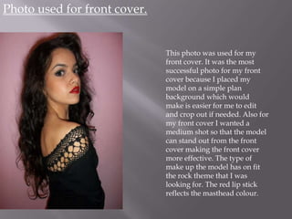
1. Photo used for front cover.
This photo was used for my
front cover. It was the most
successful photo for my front
cover because I placed my
model on a simple plan
background which would
make is easier for me to edit
and crop out if needed. Also for
my front cover I wanted a
medium shot so that the model
can stand out from the front
cover making the front cover
more effective. The type of
make up the model has on fit
the rock theme that I was
looking for. The red lip stick
reflects the masthead colour.
2. Edits done.
Before. After.
To make the main image fit into the rock genre I turned the photo into a
black and white photo making it look more effective. I left the red lipstick
visible so that it reflects the masthead colour and it also connotes power so
therefore the red lip stand outing can suggest that shes powerful and also
conveys the strap line ‘turn it up’. All these edits were done using
Photoshop.
3. Photos used for contexts page.
These two photos were used for my
context page because its in different
styles which fits into my genre that I
chose. These two photo show the
different type of camera shots that are
used. By including a medium close up
of the female model it allows the
readers to see her facial expression. The
medium long shot allows the readers to
see the drums and also the model at the
same time.
4. Edits done.
Both the photo were edited in black and white making them
fit into the rock genre.
Also, by making the photo in black and white it goes with the
whole music magazine theme creating flow through out the
music magazine.
5. Photos used for Double page spread.
Before. After.
This photo was used for double page spread as this shot allows
the rock sense to show through this picture. And it was a
perfect picture to use for a whole page in the double page
spread. By making it black and white it again goes with the
whole theme of the whole music magazine.
6. Example of rejected
photos.
These photos were rejected because
some parts were cropped out this
the photo was to be used in the
music magazine it would have
looked out of place. The other
photo were blurry this wouldn’t
look professional if they were to be
used in the music magazine. The
lighting used in the long shot of the
model was to dark to use, you're
not able to see her face.