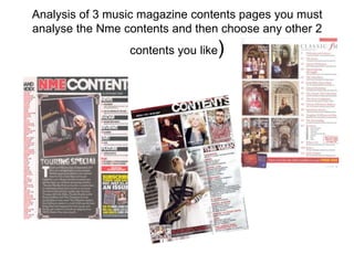
3. Contents page NME (SEPT 2009) ANALYSIS The banner at the
top has the
Masthead and
The NME masthead is again the “Contents page”
exact same on the front cover written on it. The
and using the same house style masthead is the
colours red, black and white exact same as the
which give a very rock and roll one on the front
feel those of a electric guitar. cover and will be
The main image used to through out all of
advertise the special in the magazine. The
The date tells the
the magazine this being words “contents”
“Touring”. The image is reader the day the
are in capital block
of the woman with a tour magazine was issued
and bold letters
bus behind her just in case they may
making it eye
supporting the special have already brought
catching for the
about “TOUR”. the magazine or to
reader.
On the left side of the make sure they
contents page bands and haven't missed an
artists are listed in red issue.
and next to them is the The sub headings are in
page number in black, white block capitals on a
these colours run through black strip making a contrast
out all of the magazine as of colours making them stand
it’s the house style, its out more. The numbers are
also an easy way for the in red again keeping to the
customer to find their house style of NME.
favourite artist without Rules of thirds.
flicking through the The right third has a black
magazine trying to find box advertising
the correct page. subscribing to the
The image is edited so that magazine. It includes a
it looks like a photograph BRIEF HEADING website to go on or phone
this creates a more +SUMMARY OF number to call if they
personal feel as if we are in The editors introduction to the want to subscribe. It’s an
the moment with them. It magazine makes the reader feel CONTENT WITH easier way for the
also shows that the special more welcome and included in the customer to get the
is worth reading because magazine. As a small introduction
PAGE NUMBER IN magazine every week
they were actually there the reader feels more apart of the RED when the issue comes out
and know all the gossip! magazine. for a better price.
4. The masthead and words contents are on the top of the
page in bold writing on a black banner. The masthead is
the exact same of what is on the front and what runs
through the magazine.
ANALYSIS OF LAYOUT/DESIGN FEATURES OF The date the
CONTENTS PAGE magazine was
issued.
A canted angled
image of a woman News
Band index next to a tour bus as the latest new from
( a list of bands if she is on holiday the magazine world.
with the page advertising the “Tour
number next to special” inside the Radar- about brand
them to locate magazine. The new music
The magazine easy in the imagine also looks
is set out in 3 magazine) like its on top of a
columns for speaker one of those
different bands take on tour.
things. Band
index, letter
from editor A introductory letter
and content of Live- About seeing
from the magazines the band “Coldplay”
the magazine.
editor introducing the live
audience to the
Feature- the main
magazine.
feature of the
magainze “Dizzee
Rascal who appears
on the front cover.
Plus- extras the
magazine is giving
out
In the bottom right,
information is there telling
the reader about
subscribing to the
magazine.
Either calling or applying
via internet.
5. The banner at the
top of the page has
The MASTHEAD is ANALYSIS OF CONTENTS PAGE 2 “contents” shown on
shown very small on the the left side of the
left side of the page, the (Title/date of magazine analysed) magazine, its bold,
mast head is there to black and has cracks
remind the reader of the in it giving the word
magazine they are an effect of music so
reading. By having the loud it brakes the
title very small it leaves words. Underneath
lots more room for the text “contents” is
information about what's the issue number so
to come on the magazine. the reader can keep
up too date and no if
Rules of thirds. they have missed
The bottom right third of any magazines.
the cover has
information about the The headings used are in
online website of the black sophisticated writing
magazine so readers with light blue sub-
are able the access the headings these colours are
magazine in other ways. shown in the “Billboard”
masthead, so its keeping
Rule of thirds. to the house style.
Here on the left side of
the cover page is the The text is separated into
charts list of albums and blocks of different themes
song shown in so its easy to look for
sophisticated writing, so various pages you want to
as soon as the reader read.
opens the magazine they The image used is of a young
are up to date with the girl laughing this shows a
music world. “fun” and “cute” side to the
magazine, which could mean
The date is found on the
the target audience are
bottom of the contents page
young girls , the image used
to remind reader of when the
links to that of what is
magazine was issued
including in the articles.
6. ANALYSIS OF LAYOUT
CONTENTS PAGE 2
The word contents page in a
bold cracking effect font. Big
so its easy to find when
flicking through the magazine.
3 images with page
numbers in the left bottom
A list of the latest corner so its easy for the
chart music of reader to locate.
singles and
albums. In order The content of magazine is An image of
an artist
number 1 being set out in 4 separate blocks included in
the best seller . for, upfront, features, music the
and every issue. These magazine
because she
make it easy for the reader is smiling it
to find what they are creates a
looking for. happy
energetic
Its set out with light blue feel to the
sub headings and black magazine.
sophisticated information.
Extra things to do apart from the
magazine for example go online
and enter exclusive competitions
or go to the latest events.
7. ANALYSIS OF CONTENTS PAGE 3
The banner at the top
of the magazine has
both the Masthead
(Title/date of magazine analysed
and title “ contents”
it. The masthead is Also in the banner the date of
again the exact same when the magazine was issued
of all the mastheads is included there.
that run through the This shows the reader when
magazine. the issue was brought out so
The house style they can keep up to date with
colours are used issues.
throughout the
magazine these are
red, white and black. The image used is of a band
These colours show a called “The Courteeners”
very rock/ punk feel who have an article/ interview
suggesting the target in the magazine this is used
audience are out to advertise the interview
going rockers.
The Rules of thirds is used and
on the left third there is a “Oasis
special” with its own mini At the bottom part of the
contents, so if the audience magazine a review of the
brought it just for that they have “Worlds biggest and best
an easy way to find it. music guide” it includes
Because it’s a special the words information about the studio,
“oasis special” have been new albums, dvds and books
coloured in gold to create it more
unique and important than your
average articles in a magazine.
8. Analysis of layout contents page 3
The word is in a simplicity The date the magazine was issued
font on a black banner
next to the masthead.
A large long shot image of “The
Courteeners” is shown with page
The contents list
number in the corner so its easy for
is shown with
the reader to locate the band in the
headings in white
magazine.
capital bold letters
The band are on top of a hill and
on a small red
looks like its been taken in the
banner linking to
country.
the house style of
Q.
Every month- what
appears in every
magazine the usual
information (email,
subscription and
crosswords)