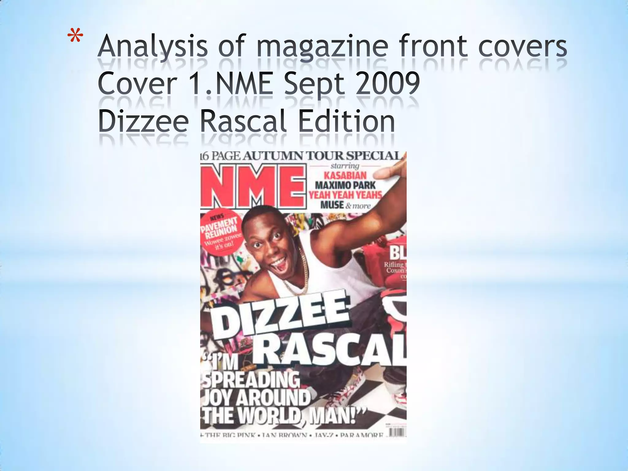
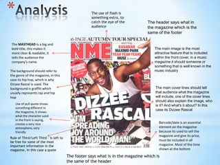
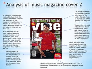
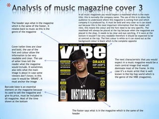
2. * The use of flash is
something extra, to
catch the eye of the The header says what in
audience the magazine which is the
same of the footer
The MASTHEAD is a big and
bold title, this makes it The main image is the most
more clear & readable, it attractive feature that is included
tells the audience the within the front cover, in a music
company’s name magazine it should someone or
something that is well known in the
The background should refer to music industry
the genre of the magazine, in this
case its hip hop, which is why
Dizzee Rascal is used. The
background is graffiti which The main cover lines should tell
usually represents rap and hip that audience what the magazine
hop will include, one of the cover lines
should also explain the image, who
Use of pull quote shows is it? And what's it about? In this
something different in
case its Dizzee Rascal
the magazine, it shows
what the character used
in the front is saying,
creates a very nice Barcode/date is an essential
atmosphere, very element on the magazine
friendly because its used to sell the
magazine and give its price,
Rule of Third/Left Third – is left to
be free for some of the most
must be included in all
important information in the magazine. Most of the time
magazine, in this case a quote shown at the bottom
The footer says what is in the magazine which is
the same of the header
3. *
Target audience Profile (possibly add
image)
The target audience would be young
urban audience, mainly teenagers who
are in to hip hop and rap.
METHODS USED TO ATTRACT THIS
TARGET AUDIENCE ARE:
Musical interests/favourite artists, etc. The main image which is a photo of Dizzee
The target audience would be Rascal who is well known in the music
interested in typical hip hop/rap music industry would be a method to attract the
as the audience would be very urban, audience, this is important as this is the
this is shown through the graffiti main attraction in the front cover of the
background. Dizzee Rascal is also a well magazine and it relates back to the genre
of the music magazine and audience.
known music artists (genre hip hop)
Another method used would be the type of
colours used in the front cover, the colours
Gender would be both female and male are mainly white, red, black, these are
but the use of the colours on the front dominate colours and catch the eye of the
audience. They are also used to make the
colour, red, black, white, etc. Portray a
image and important text stand out so they
masculine image.
are readable
Age would range from teenagers
possibly 15 to late 20’s so
How much would the magazine cost?
15-27
The magazine would cost from £2 - £4, the
reason for this would be that the magazine
I would believe that the social class of would be affordable for everyone including
the target audience would be low class lower class working people.
so its affordable for everyone, this is
also represented with the background of
the magazine
4. *
The header says what
in the magazine which
All magazines must include a is the same of the
masthead to illustrate to the footer, it relates back
audience the name of company to music as this is the
that has produced this genre of the magazine
magazine. It must be clear, in
this case its bold and is just
slightly behind the image, the The cover lines are bold
font colour is white so it can and outlined to attract
stand out the audience, in this
case it’s the name of
Music magazines include the singer which anchors
main images of a specific the image to emphasise
singer or musician who is what type of audience
well known in the music the magazine is aimed
world. In this case it’s Chris at. this is appropriate.
Brown. The image is mainly
portrayed in the centre, this
Use of pull quote shows
images gives a bad boy look,
something different in the
this represents that the
magazine, it shows what the
magazine is about hip hop
character used in the front
and rap
is saying, it creates an
Barcode/date is an effect straight away, in this
essential element on case its sexy as the quote
the magazine because says ‘Virgin’ which is
its used to sell the highlighted in red to
magazine and give its emphasise this
price, must be included
in all magazine. Most of
the time shown at the The footer says what is in the magazine which is the same of
bottom
the header, it relates back to music as this is the genre of the
magazine
5. * In all music magazines you would expect a masthead which is the main
title; this is normally the company name. The use of this is to allow the
audience to understand where this magazine is coming from and which
The header says what in the magazine company it is produced by. It must be bold and very clear so it can stand
which is the same of the footer, it out because this is the most important information that the reader will
view, this means the colour and the font need to be very specific. The
relates back to music as this is the
masthead will always be placed at the top because when the magazines are
genre of the magazine
placed in the shop, it needs to be clear and eye catching, if it were at the
bottom it wouldn’t be very readable therefore it should be expected to be
at centred at the top. The font colour is white so it can stand out as the
background colour is black which is the complete opposite
Cover/seller lines are clear
and bold, the use of the
font and colour allow the
information to be very
readable and clear. The use
The next characteristic that you would
of seller lines tell the
expect in a music magazine would be a
reader what the magazine
main central image that would
would include. It sometimes
dominate most of the frame. In this
also tells what the main
case it’s a music artist that is well
image is about in case some
known in the hip hop world which is
viewers don’t know; in this
the genre of the VIBE (magazine).
case it would be ‘DRAKE’, It
must anchor the image
Barcode/date is an essential
element on the magazine because
its used to sell the magazine and
give its price, must be included in
all magazine. Most of the time
shown at the bottom
The footer says what is in the magazine which is the same of the
header