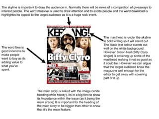
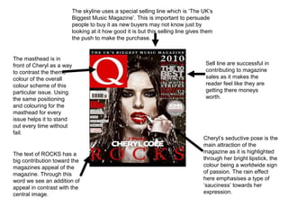
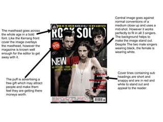
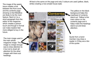
Your media product represents a particular social group in the following ways:
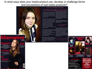
- Target demographic: Based on your market research, your target audience is 16-year-old girls who enjoy indie/alternative/rock music. This represents a specific youth demographic interested in this genre of music.
- Musical interests: The content and stories featured focus on indie/rock bands and artists that would appeal to this social group. Including a competition for a festival known for indie acts further signals the musical tastes represented.
- Visual style: The bright color scheme, use of a young female on the cover, and casual/individualistic dress and style depicted visually convey the fashion and aesthetic preferences of this social group.
- Topics covered: