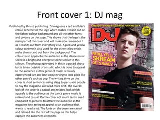
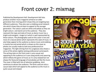
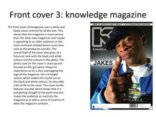
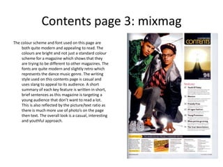
Biological screening of herbal drugs: Introduction and Need for
Phyto-Pharmacological Screening, New Strategies for evaluating
Natural Products, In vitro evaluation techniques for Antioxidants, Antimicrobial and Anticancer drugs. In vivo evaluation techniques
for Anti-inflammatory, Antiulcer, Anticancer, Wound healing, Antidiabetic, Hepatoprotective, Cardio protective, Diuretics and
Antifertility, Toxicity studies as per OECD guidelines
Embracing GenAI - A Strategic ImperativePeter Windle
Artificial Intelligence (AI) technologies such as Generative AI, Image Generators and Large Language Models have had a dramatic impact on teaching, learning and assessment over the past 18 months. The most immediate threat AI posed was to Academic Integrity with Higher Education Institutes (HEIs) focusing their efforts on combating the use of GenAI in assessment. Guidelines were developed for staff and students, policies put in place too. Innovative educators have forged paths in the use of Generative AI for teaching, learning and assessments leading to pockets of transformation springing up across HEIs, often with little or no top-down guidance, support or direction.
This Gasta posits a strategic approach to integrating AI into HEIs to prepare staff, students and the curriculum for an evolving world and workplace. We will highlight the advantages of working with these technologies beyond the realm of teaching, learning and assessment by considering prompt engineering skills, industry impact, curriculum changes, and the need for staff upskilling. In contrast, not engaging strategically with Generative AI poses risks, including falling behind peers, missed opportunities and failing to ensure our graduates remain employable. The rapid evolution of AI technologies necessitates a proactive and strategic approach if we are to remain relevant.
Francesca Gottschalk - How can education support child empowerment.pptxEduSkills OECD
Francesca Gottschalk from the OECD’s Centre for Educational Research and Innovation presents at the Ask an Expert Webinar: How can education support child empowerment?
How to Make a Field invisible in Odoo 17Celine George
It is possible to hide or invisible some fields in odoo. Commonly using “invisible” attribute in the field definition to invisible the fields. This slide will show how to make a field invisible in odoo 17.
Operation “Blue Star” is the only event in the history of Independent India where the state went into war with its own people. Even after about 40 years it is not clear if it was culmination of states anger over people of the region, a political game of power or start of dictatorial chapter in the democratic setup.
The people of Punjab felt alienated from main stream due to denial of their just demands during a long democratic struggle since independence. As it happen all over the word, it led to militant struggle with great loss of lives of military, police and civilian personnel. Killing of Indira Gandhi and massacre of innocent Sikhs in Delhi and other India cities was also associated with this movement.
2. Front cover 1: DJ mag
Published by thrust publishing. DJ mag uses a red and black
colour scheme for the logo which makes it stand out on
the lighter colour background and all the other fonts
and colours on the page. This shows that the logo is the
main part of the cover and will make you remember it
as it stands out from everything else. A pink and yellow
colour scheme is also used for the other titles which
make them stand out from the background. The
colours also appeal to the audience as the dance music
scene is a bright and energetic scene similar to this
colours. The photography used in this is a posed photo
but is taken outside of a studio which is done to appeal
to the audience as this genre of music is mainly
experienced live and isn't about trying to look good like
other genre’s such as pop. The writing style on the
cover is short sentences using slang to persuade people
to buy the magazine and read more of it. The overall
look of the cover is a casual and relaxed look which
appeals to the audience as the dance genre music is
relaxed and casual. On the cover not much text is used
compared to pictures to attract the audience as the
magazine isn't trying to appeal to an audience that
wants to read a lot. The fonts on the cover are casual
and relaxed like the rest of the page as this helps
capture the audiences attention.
3. Front cover 2: mixmag
Published by Development Hell. Development Hell also
produce another music magazine aimed at an older
generation than mixmag which shows they are targeting two
different audiences. They also own a clubbing social network
site which shows they are keen to appeal to the younger
generation. The colours used are white and yellow as they are
bright colours and stand out to the audience. They also
represent the type and style of music as dance music has a
bright and energetic image to it which is well represented by
these colours. The photography used on this cover is live and
more of a natural photo which represents this style of music. It
also helps appeal to the audience as dance music and clubbing
is mainly live and varied which is shown on this cover as
photos are usually made to look very professional on
magazines. The light shining from his sunglasses also shows a
sense of the photo slightly lacking professional camerawork .
The writing style on the front cover is very casual and
appealing to the audience as it uses slang words and swearing
which reflects the genre of music as it is very relaxed but not
always the favoured language of everybody just like the music.
The cover is filled with lots of attention grabbing short
sentences to attract the audience. The fonts used are also a
casual style which will appeal to the audience as the music is
quite casual and relaxed.
4. Front cover 3: knowledge magazine
The front cover of kmagazine uses a white and
black colour scheme for all the text. This
shows that the magazine is more serious
than the other two magazines and maybe
is appealing to an older audience or the
more technical minded dance music fans
such as the producers and dj’s. The
overall look of the cover also gives of a
futuristic look with the black and white
colours and the colours in the photo. The
photo used on the cover is close up and
focused on the gut which shows his
importance as he is also overlapping the
logo of the magazine. He is in bright
colours which makes him stand out on
the black and white colours, he also adds
a bit of life to the cover. The cover hardly
features any text which shows that it is
just getting straight to the point and also
makes the audience to read into the
magazine as it adds a sense of surprise of
what the magazine contains.
5. Double page spread 1: knowledge
The photo used
is posed and
magazine The colours
used in this
looks quite
professional. article are
The light has white and
been edited to black which
focus on their shows the
faces to seriousness of
emphasise who the magazine
they are. They and that is
are in an urban trying to
setting which appeal to a
represents the older dance
genre of music audience.
chase and status
make. It also
helps appeal to The writing style
the audience. used is informal
and brief which
will appeal to the
The text to target audience as
picture ratio is it is targeting an
roughly half of audience that
each which doesn't want to
shows that the spend a lot of time
magazine is reading articles.
trying to appeal
to a wide
audience that
enjoys an easy
read but not a
too much text. The overall look of the magazine is quite serious with the mainly black and white colours but contain s articles and information
suited to a more casual youth audience. I feel the overall style is wrong for the content of the magazine.
6. Double page spread 2: mixmag
The photo used is
The colour schemes in a posh looking
used in this double studio and posed.
page spread are red, The mise en scene
black and white shows that the
which show a bit of man in the chair
difference to the shouldn't be their
normal black and as he is in a posh
white, this could chair in a posh
represent the dj and room. He is
dance music scene as dressed quite
it came as a very casually and
different type of modern whereas
music when it first the setting is old
emerged. and posh. This
shows a contrast
The writing style used between him and
is short and easy to the room.
read. It is in interview
style and is quite a
relaxed informal The overall look
interview which will given by the
help appeal to the appearance of the
audience as the magazine is a
audience of this young, fresh
magazine are typically magazine that will
16-24 year old s who appeal to a
aren't particularly The fonts used are just a standard informal The text to picture ratio is split evenly which younger
interested in reading. helps the magazine appeal to a audience that generation. The
style. They are used because they are easy
Slang language is isn’t interested in pages full of writing and just language used and
to read and appeal to everyone. photography used
also used to help wants to read short interesting articles.
appeal to a younger help the magazine
audience. to do this.
7. Double page spread 3: Dj mag
The writing style
used in this article is
a casual style with a
use of slang. It is an
informal writing
style throughout the
article which will
appeal to a young,
teenage audience as
it is easy to read and
relate to which will
keep the readers
interested. Not too
much text is used as
the text to picture
ration is quite even
which means it is
appealing to an
audience that
doesn't want to read
a lot.
The overall look of this page The photo used is posed and looks to be quite
The colour scheme is a standard scheme
isn’t a typical page in a DJ professional. The photo is focused on the costumes
that doesn't stand out much more than
magazine but that is what helps usually but the font of the title has an that are being worn by the duo. The costumes of
grab the readers attention as effect that is trying to get you to read the duo is interesting as it isn't the typical clothes
they will want to know what the more of the article and is successfully you would see been worn by Dj’s. This has the
grabbing your attention. effect that it wants the reader to read the article as
article is about as it is unusual to they will want to know why they are in these
see this style in this type of clothes.
magazine
8. Contents page 1: knowledge magazine
The contents page of this magazine uses a plain standard
black and white colour scheme which just gives the
information straight to the point and isn't trying to make
a statement about anything or trying to get your
attention. This colour scheme is used to just deliver the
relevant information. The writing style used on the
contents page is informal but detailed as it is telling you
what is in the magazine. This targets the magazines
audience as it shows that its not as young and casual as
some other Dj magazines. The photography used on the
contents page is interesting as it helps grab your
attention as it is just a pair of legs which may want the
reader to find out what relevance this has and therefore
read the magazine. The overall look of the contents page
is quite formal and professional looking, this will make it
appeal to an older audience. The fonts used are also used
to help appeal to an older audience as it is a standard
font which is appealing to an older audience.
9. Contents page 2: Dj mag
The colour scheme used on this contents page is a mix of a
few bright colours that are used to grab attention such
as the use of black and white together. The other
colours on the right hand side are also bright colours
that will help appeal to the audience as the dance
music scene is linked with bright vivid colours. The
photography used on this page is a mix of live and
natural photos and then two professional photos. The
live photography is used to show the emotion and
reactions of the music. This will help appeal to the
audience as they will want to read why they are
reacting so shocked and excited. The writing style of
this page is short and casual using slang to get the
audience to read more into the magazine. The
language used in exciting and lively to grab attention.
The fonts used are a basic style and easy to read which
will appeal to the target audience more. The overall
look of the content page is modern and has a lot going
on like at a live dance music gig or rave, this will help
attract the audience as it shows that the producers
understand the music genre they are writing about.
10. Contents page 3: mixmag
The colour scheme and font used on this page are
both quite modern and appealing to read. The
colours are bright and not just a standard colour
scheme for a magazine which shows that they
are trying to be different to other magazines. The
fonts are quite modern and slightly retro which
represents the dance music genre. The writing
style used on this contents page is casual and
uses slang to appeal to its audience. A short
summary of each key feature is written in short,
brief sentences as this magazine is targeting a
young audience that don’t want to read a lot.
This is also reflected by the picture/text ratio as
there is much more use of photo’s on the page
then text. The overall look is a casual, interesting
and youthful approach.