Download to read offline
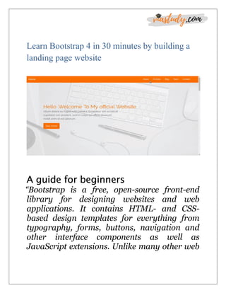
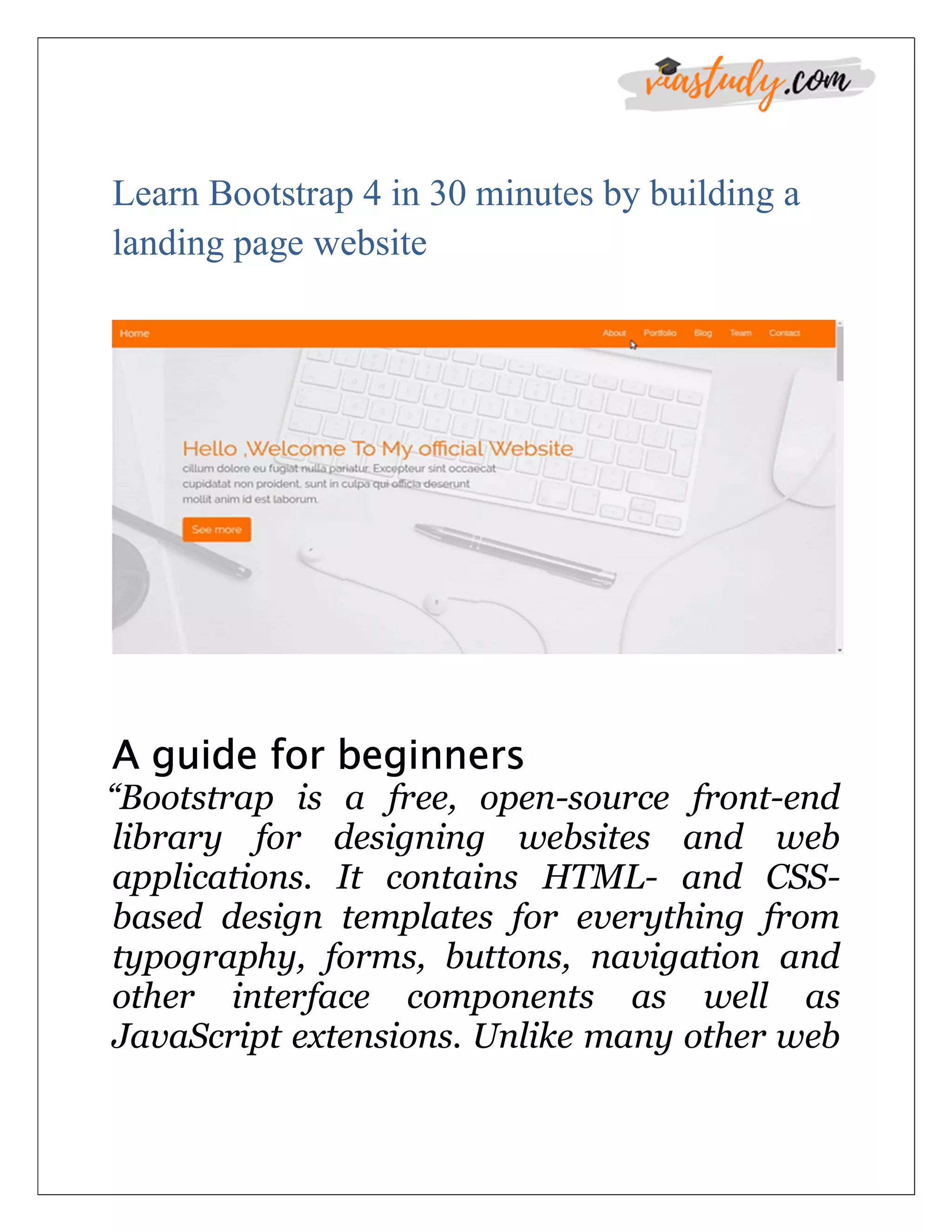


The document is a beginner's guide to building a landing page using Bootstrap 4 in 30 minutes, highlighting essential skills like HTML, CSS, and jQuery. It details the installation methods, new features of Bootstrap 4, and covers various components such as the grid system, navbar, and sections like about, portfolio, and blog with accompanying code examples. The guide emphasizes responsive design principles and customization through CSS.
![Bootstrap [part 2]](https://cdn.slidesharecdn.com/ss_thumbnails/javanik-170208155331-thumbnail.jpg?width=640&height=640&fit=bounds)


![[O'Reilly] HTML5 Design](https://cdn.slidesharecdn.com/ss_thumbnails/html5-workshop-111215160913-phpapp01-thumbnail.jpg?width=640&height=640&fit=bounds)
![Bootstrap [part 1]](https://cdn.slidesharecdn.com/ss_thumbnails/bootstrappart-11-170208154053-thumbnail.jpg?width=640&height=640&fit=bounds)