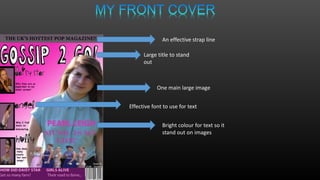
Large title to stand
out
Effective font to use for text
Bright colour for text so it
stand out on images
An effective strap line
One main large image
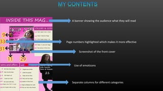
A banner showing the audience what they will read
Page numbers highlighted which makes it more effective
Separate columns for different categories
Screenshot of the front cover
Use of emoticons
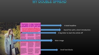
A big letter to start the article off
A bold headline
Stand first with a short introduction
Main image
Small text blocks
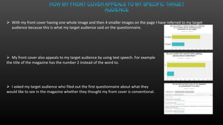
 With my front cover having one whole image and then 4 smaller images on the page I have referred to my target
audience because this is what my target audience said on the questionnaire.
 My front cover also appeals to my target audience by using text speech. For example
the title of the magazine has the number 2 instead of the word to.
 I asked my target audience who filed out the first questionnaire about what they
would like to see in the magazine whether they thought my front cover is conventional.
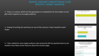
 There is a column which has free giveaways or competitions for the readers to win
gifts which appeals to my target audience.
 Instead of writing the word love on one of the columns I have inserted a heart
shape.
 I then asked the same target audience who previously did my questionnaire to see
whether they liked certain features about the content page.
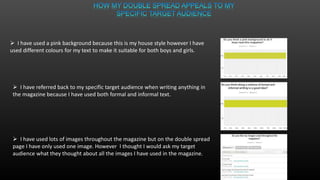
 I have used a pink background because this is my house style however I have
used different colours for my text to make it suitable for both boys and girls.
 I have referred back to my specific target audience when writing anything in
the magazine because I have used both formal and informal text.
 I have used lots of images throughout the magazine but on the double spread
page I have only used one image. However I thought I would ask my target
audience what they thought about all the images I have used in the magazine.

Question 5

  • 2.
    Large title tostand out Effective font to use for text Bright colour for text so it stand out on images An effective strap line One main large image
  • 3.
    A banner showingthe audience what they will read Page numbers highlighted which makes it more effective Separate columns for different categories Screenshot of the front cover Use of emoticons
  • 4.
    A big letterto start the article off A bold headline Stand first with a short introduction Main image Small text blocks
  • 5.
     With myfront cover having one whole image and then 4 smaller images on the page I have referred to my target audience because this is what my target audience said on the questionnaire.  My front cover also appeals to my target audience by using text speech. For example the title of the magazine has the number 2 instead of the word to.  I asked my target audience who filed out the first questionnaire about what they would like to see in the magazine whether they thought my front cover is conventional.
  • 6.
     There isa column which has free giveaways or competitions for the readers to win gifts which appeals to my target audience.  Instead of writing the word love on one of the columns I have inserted a heart shape.  I then asked the same target audience who previously did my questionnaire to see whether they liked certain features about the content page.
  • 7.
     I haveused a pink background because this is my house style however I have used different colours for my text to make it suitable for both boys and girls.  I have referred back to my specific target audience when writing anything in the magazine because I have used both formal and informal text.  I have used lots of images throughout the magazine but on the double spread page I have only used one image. However I thought I would ask my target audience what they thought about all the images I have used in the magazine.