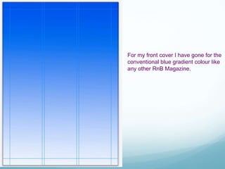
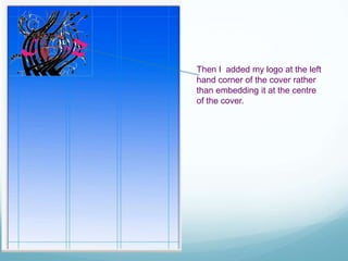
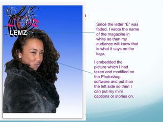
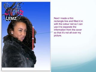
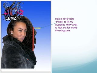
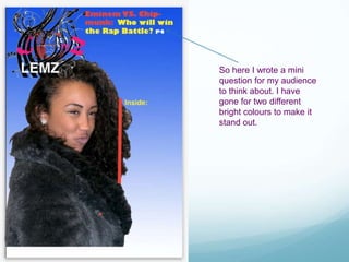
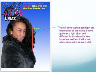
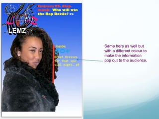
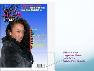
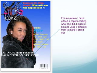
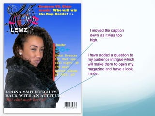
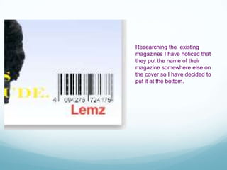
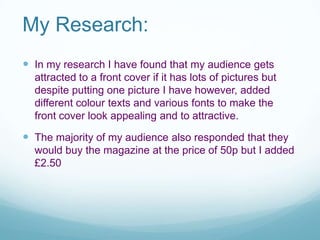
Creating my Front Page of
my Magazine
Emee
For my front cover I have gone for the
conventional blue gradient colour like
any other RnB Magazine.
Then I added my logo at the left
hand corner of the cover rather
than embedding it at the centre
of the cover.
Since the letter “E” was
faded, I wrote the name
of the magazine in
white so then my
audience will know that
is what it says on the
logo.
I embedded the
picture which I had
taken and modified on
the Photoshop
software and put it on
the left side so then I
can put my mini
captions or stories on.
Next I made a thin
rectangle line and filled it in
with the colour red so I can
use it to separate the
information from the cover
so that it’s not all over my
picture.
Here I have wrote
“Inside” to let my
audience know what
to look out for inside
the magazine.
So here I wrote a mini
question for my audience
to think about. I have
gone for two different
bright colours to make it
stand out.
Here I have started adding in the
information of the inside. I have
gone for a light blue and
different font to show it’s less
important so then it will show
other information is more vital.
Same here as well but
with a different colour to
make the information
pop out to the audience.
And again here
as well.
Like any other
magazines I have
gone for the
conventional barcode.
For my picture I have
added a caption stating
what she did. I made it
big and used a different
front to make it stand
out.
I have added a question to
my audience intrigue which
will make them to open my
magazine and have a look
inside.
I moved the caption
down as it was too
high.
Researching the existing
magazines I have noticed that
they put the name of their
magazine somewhere else on
the cover so I have decided to
put it at the bottom.
My Research:
 In my research I have found that my audience gets
attracted to a front cover if it has lots of pictures but
despite putting one picture I have however, added
different colour texts and various fonts to make the
front cover look appealing and to attractive.
 The majority of my audience also responded that they
would buy the magazine at the price of 50p but I added
£2.50

Creating the Front Cover

  • 1.
    Creating my FrontPage of my Magazine Emee
  • 2.
    For my frontcover I have gone for the conventional blue gradient colour like any other RnB Magazine.
  • 3.
    Then I addedmy logo at the left hand corner of the cover rather than embedding it at the centre of the cover.
  • 4.
    Since the letter“E” was faded, I wrote the name of the magazine in white so then my audience will know that is what it says on the logo. I embedded the picture which I had taken and modified on the Photoshop software and put it on the left side so then I can put my mini captions or stories on.
  • 5.
    Next I madea thin rectangle line and filled it in with the colour red so I can use it to separate the information from the cover so that it’s not all over my picture.
  • 6.
    Here I havewrote “Inside” to let my audience know what to look out for inside the magazine.
  • 7.
    So here Iwrote a mini question for my audience to think about. I have gone for two different bright colours to make it stand out.
  • 8.
    Here I havestarted adding in the information of the inside. I have gone for a light blue and different font to show it’s less important so then it will show other information is more vital.
  • 9.
    Same here aswell but with a different colour to make the information pop out to the audience.
  • 10.
  • 11.
    Like any other magazinesI have gone for the conventional barcode.
  • 12.
    For my pictureI have added a caption stating what she did. I made it big and used a different front to make it stand out.
  • 13.
    I have addeda question to my audience intrigue which will make them to open my magazine and have a look inside. I moved the caption down as it was too high.
  • 14.
    Researching the existing magazinesI have noticed that they put the name of their magazine somewhere else on the cover so I have decided to put it at the bottom.
  • 15.
    My Research:  Inmy research I have found that my audience gets attracted to a front cover if it has lots of pictures but despite putting one picture I have however, added different colour texts and various fonts to make the front cover look appealing and to attractive.  The majority of my audience also responded that they would buy the magazine at the price of 50p but I added £2.50