Preliminary Task – School Magazine 
By Eliza Chapman-Smith
To start this project I have been asked to create the 
front and contents pages of a school magazine. I 
intend to use the school’s colour of red, along with 
black and white, to create a simple and modern 
looking magazine. I plan to have a very consistent 
design as this tends to make a magazine look more 
professional. To make my magazine look more 
authentic I will research other school magazines to 
see what is commonly present, and I will also 
conduct some audience research to find out what 
readers expect/want to see.
Includes a competition 
to encourage students 
and parents to buy it, 
and also to get involved 
with the school/its 
magazine. 
No cost to purchase the 
magazine, makes it more 
accessible to students and 
adults. 
Consistent colour 
scheme ties in to the 
school, makes the 
magazine look more 
professional and also 
keeps it all in keeping 
Simple modern colour scheme (black, 
white and the school’s purple) keeps the 
overall presentation from looking tacky or 
cheap. 
Masthead, the most 
ornate thing on there 
due to font choice, 
draws eye and makes 
immediately apparent 
the name of the 
publication 
Directly addressing the 
audience, makes them 
more likely to read the 
magazine, and also 
shows that the writers 
want the readers to get 
involved and respond. 
School logo in the 
corner adds more 
reference to the school 
itself, but in a subtle 
way so that it still looks 
professional. 
The figures are very smartly 
dressed which gives the 
impression of a well 
established school with happy, 
polite students who follow the 
rules. This is further 
emphasised by their postures 
and facial expressions. 
This is the secondary story, 
emphasised by a slightly larger 
font and underlining. 
The main focus of this 
magazine cover is the 
central image. The figures 
are making eye contact 
with the camera and they 
are facing forward so the 
audience feels addressed. 
The fact that it is not too 
word heavy makes it more 
appealing to students 
rather than parents, but 
only subtly. 
Text Analysis
Bright primary colours 
used, implies that the 
school concerned is a 
primary school. 
An issue date has been 
included to allow the parents 
to keep up to date with the 
issues that have been 
published. 
Very few pictures have been 
used, only of the principle to 
relate to the direct address in 
the text. The fact that it is very 
word heavy implies that it is 
more aimed the parents. 
The contents are clear 
and easy to read, and 
help the reader navigate 
the newsletter. The text 
colour is very simple 
because it is not 
intended to be the main 
feature of the 
newsletter 
Some helpful websites for 
the students to practice 
reading, science and 
mathematics. This shows 
that the target audience is 
the students as well as the 
parents, because they are 
aiming to help with home 
study 
The school name is the head 
banner, in clear font to make it 
easy to read. 
Key upcoming dates and 
events, which helps inform 
the parents as to what is 
happening in the school. It 
has been highlighted with a 
coloured text box to draw 
attention and emphasise, as 
well as separating it from the 
rest of the text. 
Reminders about RSVPs for 
parents to join their kids at 
a Christmas lunch show 
that the target audience is, 
partly, parents. The 
children would not really be 
concerned with reply slips 
and dates for the diary, so 
we can see that the writers 
are trying to aim towards 
the parents.
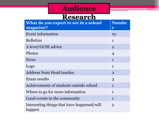
Audience 
Research 
What do you expect to see in a school 
magazine? 
Numbe 
r 
Event information 10 
Bulletins 1 
A level/GCSE advice 2 
Photos 4 
News 1 
Logo 1 
Address from Head teacher 2 
Exam results 3 
Achievements of students outside school 1 
Where to go for more information 1 
Local events in the community 1 
Interesting things that have happened/will 
2 
happen
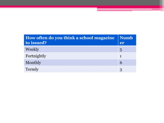
How often do you think a school magazine 
to issued? 
Numb 
er 
Weekly 5 
Fortnightly 1 
Monthly 6 
Termly 3
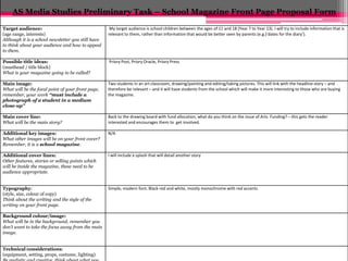
AS Media Studies Preliminary Task – School Magazine Front Page Proposal Form 
Target audience: 
(age range, interests) 
Although it is a school newsletter you still have 
to think about your audience and how to appeal 
to them. 
My target audience is school children between the ages of 11 and 18 (Year 7 to Year 13). I will try to include information that is 
relevant to them, rather than information that would be better seen by parents (e.g.)‘dates for the diary’). 
Possible title ideas: 
(masthead / title block) 
What is your magazine going to be called? 
Priory Post, Priory Oracle, Priory Press 
Main image: 
What will be the focal point of your front page, 
remember, your work “must include a 
photograph of a student in a medium 
close-up” 
Two students in an art classroom, drawing/painting and editing/taking pictures. This will link with the headline story – and 
therefore be relevant – and it will have students from the school which will make it more interesting to those who are buying 
the magazine. 
Main cover line: 
What will be the main story? 
Back to the drawing board with fund allocation, what do you think on the issue of Arts Funding? – this gets the reader 
interested and encourages them to get involved. 
Additional key images: 
What other images will be on your front cover? 
Remember, it is a school magazine. 
N/A 
Additional cover lines: 
Other features, stories or selling points which 
will be inside the magazine, these need to be 
audience appropriate. 
I will include a splash that will detail another story 
Typography: 
(style, size, colour of copy) 
Think about the writing and the style of the 
writing on your front page. 
Simple, modern font. Black red and white, mostly monochrome with red accents 
Background colour/image: 
What will be in the background, remember you 
don’t want to take the focus away from the main 
image. 
Technical considerations: 
(equipment, setting, props, costume, lighting) 
Be realistic and creative, think about what you
Preliminary exercise: produce a front page and contents page of a school magazine. Front covers 
must include a photograph of a student in a medium close-up with appropriately laid out text and 
use of an image manipulation program me (Photoshop). 
Below start to sketch what the front cover of your newsletter will look like. 
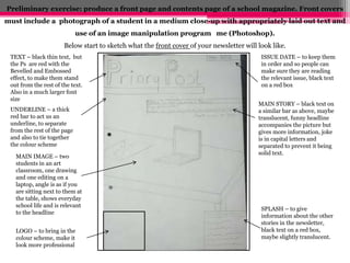
TEXT – black thin text, but 
the Ps are red with the 
Bevelled and Embossed 
effect, to make them stand 
out from the rest of the text. 
Also in a much larger font 
size 
ISSUE DATE – to keep them 
in order and so people can 
make sure they are reading 
the relevant issue, black text 
on a red box 
UNDERLINE – a thick 
red bar to act us an 
underline, to separate 
from the rest of the page 
and also to tie together 
the colour scheme 
MAIN STORY – black text on 
a similar bar as above, maybe 
translucent, funny headline 
accompanies the picture but 
gives more information, joke 
is in capital letters and 
separated to prevent it being 
solid text. 
SPLASH – to give 
information about the other 
stories in the newsletter, 
black text on a red box, 
maybe slightly translucent. 
MAIN IMAGE – two 
students in an art 
classroom, one drawing 
and one editing on a 
laptop, angle is as if you 
are sitting next to them at 
the table, shows everyday 
school life and is relevant 
to the headline 
LOGO – to bring in the 
colour scheme, make it 
look more professional
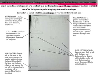
Preliminary exercise: produce a front page and contents page of a school magazine. Front covers 
must include a photograph of a student in a medium close-up with appropriately laid out text and 
use of an image manipulation programme (Photoshop). 
Below start to sketch what the contents page of your newsletter will look like. 
NEWSLETTER LOGO – 
simply and quickly gets 
across the theme, same 
font as on the cover, 
interlinked 
CONTENTS HEADING – 
underlined with the 
typical bar, stays in 
keeping with the rest of 
the magazine 
HEADTEACHER – a 
generic picture of the 
head teacher to stop it 
being too text heavy, the 
word in a bolder red font 
than main text to 
emphasise and separate, 
the text is just a general 
address, in simple black 
font 
REMINDERS – the title 
will be the same as the 
page numbers to stay in 
keeping with the design, 
the bar will be red with 
the Bevel and Emboss 
effects to add texture, the 
text will be black and each 
‘reminder’ will be 
separated by a big dot, 
also black 
PAGE INFORMATION – 
I want to have the P in red 
with the Bevel and 
Emboss effects, the rest 
will be just in regular red 
text, the information 
about the story will be in 
plain black text,
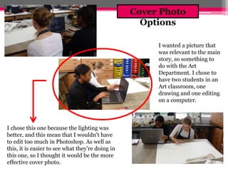
I wanted a picture that 
was relevant to the main 
story, so something to 
do with the Art 
Department. I chose to 
have two students in an 
Art classroom, one 
drawing and one editing 
on a computer. 
I chose this one because the lighting was 
better, and this mean that I wouldn’t have 
to edit too much in Photoshop. As well as 
this, it is easier to see what they’re doing in 
this one, so I thought it would be the more 
effective cover photo. 
Cover Photo 
Options
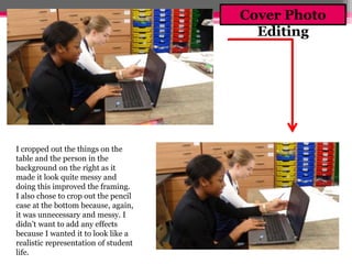
I cropped out the things on the 
table and the person in the 
background on the right as it 
made it look quite messy and 
doing this improved the framing. 
I also chose to crop out the pencil 
case at the bottom because, again, 
it was unnecessary and messy. I 
didn’t want to add any effects 
because I wanted it to look like a 
realistic representation of student 
life. 
Cover Photo 
Editing
Front Page 
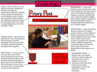
TITLE – the size of the Ps is very 
effective because it emphasises 
the title. I also like the 
combination of the red and black 
letters, because the black picks 
out the shadow on the Ps due to 
the result of the effects I added. 
The underline separates it from 
the main body of the text, which 
is a good thing because the title 
should be visible. 
SCHOOL LOGO – the logo fits in 
well with the rest of the magazine. 
This is because I used the 
Eyedropper Tool to pick out the 
red colour, and then used that 
throughout the magazine. 
ISSUE DATE – I chose to move 
the issue date down to this 
corner because the top was too 
cluttered if I place it there, and it 
fit quite neatly underneath the 
logo. I chose not to add effects to 
the bar because it is not a very 
important piece of information, 
so did not need emphasis. 
MAIN STORY – I used a bar 
similar in colour and texture as the 
title underline for the main story to 
ensure continuity throughout the 
magazine, and also a professional 
look. I made the headline slightly 
larger and in capitals to separate it 
from the information below. I 
thought black test would be best, 
as it would be legible. 
MAIN PHOTO – I chose this photo 
because it showed the subject 
clearly. I chose to crop it slightly so 
that the proportions were better, 
and the subjects took p more of the 
frame. I didn't edit it much 
because I wanted it to be relatively 
simple. I added thinning lines 
around the edge to add interest 
and to make it look more 
integrated into the magazine as a 
whole. 
SECONDARY STORY – I 
chose to use a very simple 
red box in which to place the 
secondary story, with no 
editing, as it is not as 
important as the main story. 
I chose to use similar 
typography as used in the 
main story, to keep 
continuity.
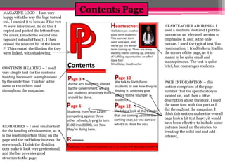
Contents Page MAGAZINE LOGO – I am very 
happy with the way the logo turned 
out. I wanted it to look as if the two 
Ps were interlinked. To do this I 
copied and pasted the letters from 
the cover. I made the second one 
regular (instead of bold) . I then 
erased the relevant bit of the lower 
P. This created the illusion the they 
were linked, with shadowing. 
CONTENTS HEADING – I used 
very simple text for the contents 
heading because it is emphasised 
by the underline. This bar is the 
same as the others used 
throughout the magazine. 
REMINDERS – I used smaller text 
for the heading of this section, as it 
is the least important thing on the 
page and the red below it draws the 
eye enough. I think the dividing 
dots make it look very professional, 
and the bar provides good 
structure to the page. 
HEADTEACHER ADDRESS – I 
used a medium shot and I put the 
picture on an ‘elevated’ section to 
emphasise it, as it is the only 
picture. I used the typical text/font 
combination. I tried to keep it all in 
the corner of the page, as it is 
meant to be quite small and 
inconspicuous. The text is quite 
brief, but encourages students. 
PAGE INFORMATION – this 
section comprises of the page 
number that the specific story is 
located on, and then a little 
description about the story. I used 
the same font with this part as I 
did throughout the magazine. I 
think this section makes the overall 
page look a bit text heavy, it would 
have been effective to include some 
pictures based on the stories, to 
break up the solid text and add 
interest,
What I’ve Learnt 
Through making this magazine have learnt how to 
conduct audience research, and then incorporate 
my findings into a product. I have become more 
familiar with Adobe Photoshop, and how to use 
it to create an authentic school magazine. I was 
already relatively familiar with it as a program, 
but doing this task helped me better understand 
the tools that would help me make a magazine 
specifically.

School Magazine - Preliminary Task

  • 1.
    Preliminary Task –School Magazine By Eliza Chapman-Smith
  • 2.
    To start thisproject I have been asked to create the front and contents pages of a school magazine. I intend to use the school’s colour of red, along with black and white, to create a simple and modern looking magazine. I plan to have a very consistent design as this tends to make a magazine look more professional. To make my magazine look more authentic I will research other school magazines to see what is commonly present, and I will also conduct some audience research to find out what readers expect/want to see.
  • 3.
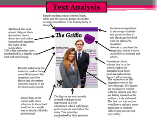
    Includes a competition to encourage students and parents to buy it, and also to get involved with the school/its magazine. No cost to purchase the magazine, makes it more accessible to students and adults. Consistent colour scheme ties in to the school, makes the magazine look more professional and also keeps it all in keeping Simple modern colour scheme (black, white and the school’s purple) keeps the overall presentation from looking tacky or cheap. Masthead, the most ornate thing on there due to font choice, draws eye and makes immediately apparent the name of the publication Directly addressing the audience, makes them more likely to read the magazine, and also shows that the writers want the readers to get involved and respond. School logo in the corner adds more reference to the school itself, but in a subtle way so that it still looks professional. The figures are very smartly dressed which gives the impression of a well established school with happy, polite students who follow the rules. This is further emphasised by their postures and facial expressions. This is the secondary story, emphasised by a slightly larger font and underlining. The main focus of this magazine cover is the central image. The figures are making eye contact with the camera and they are facing forward so the audience feels addressed. The fact that it is not too word heavy makes it more appealing to students rather than parents, but only subtly. Text Analysis
  • 4.
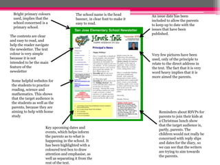
    Bright primary colours used, implies that the school concerned is a primary school. An issue date has been included to allow the parents to keep up to date with the issues that have been published. Very few pictures have been used, only of the principle to relate to the direct address in the text. The fact that it is very word heavy implies that it is more aimed the parents. The contents are clear and easy to read, and help the reader navigate the newsletter. The text colour is very simple because it is not intended to be the main feature of the newsletter Some helpful websites for the students to practice reading, science and mathematics. This shows that the target audience is the students as well as the parents, because they are aiming to help with home study The school name is the head banner, in clear font to make it easy to read. Key upcoming dates and events, which helps inform the parents as to what is happening in the school. It has been highlighted with a coloured text box to draw attention and emphasise, as well as separating it from the rest of the text. Reminders about RSVPs for parents to join their kids at a Christmas lunch show that the target audience is, partly, parents. The children would not really be concerned with reply slips and dates for the diary, so we can see that the writers are trying to aim towards the parents.
  • 5.
    Audience Research Whatdo you expect to see in a school magazine? Numbe r Event information 10 Bulletins 1 A level/GCSE advice 2 Photos 4 News 1 Logo 1 Address from Head teacher 2 Exam results 3 Achievements of students outside school 1 Where to go for more information 1 Local events in the community 1 Interesting things that have happened/will 2 happen
  • 6.
    How often doyou think a school magazine to issued? Numb er Weekly 5 Fortnightly 1 Monthly 6 Termly 3
  • 7.
    AS Media StudiesPreliminary Task – School Magazine Front Page Proposal Form Target audience: (age range, interests) Although it is a school newsletter you still have to think about your audience and how to appeal to them. My target audience is school children between the ages of 11 and 18 (Year 7 to Year 13). I will try to include information that is relevant to them, rather than information that would be better seen by parents (e.g.)‘dates for the diary’). Possible title ideas: (masthead / title block) What is your magazine going to be called? Priory Post, Priory Oracle, Priory Press Main image: What will be the focal point of your front page, remember, your work “must include a photograph of a student in a medium close-up” Two students in an art classroom, drawing/painting and editing/taking pictures. This will link with the headline story – and therefore be relevant – and it will have students from the school which will make it more interesting to those who are buying the magazine. Main cover line: What will be the main story? Back to the drawing board with fund allocation, what do you think on the issue of Arts Funding? – this gets the reader interested and encourages them to get involved. Additional key images: What other images will be on your front cover? Remember, it is a school magazine. N/A Additional cover lines: Other features, stories or selling points which will be inside the magazine, these need to be audience appropriate. I will include a splash that will detail another story Typography: (style, size, colour of copy) Think about the writing and the style of the writing on your front page. Simple, modern font. Black red and white, mostly monochrome with red accents Background colour/image: What will be in the background, remember you don’t want to take the focus away from the main image. Technical considerations: (equipment, setting, props, costume, lighting) Be realistic and creative, think about what you
  • 8.
    Preliminary exercise: producea front page and contents page of a school magazine. Front covers must include a photograph of a student in a medium close-up with appropriately laid out text and use of an image manipulation program me (Photoshop). Below start to sketch what the front cover of your newsletter will look like. TEXT – black thin text, but the Ps are red with the Bevelled and Embossed effect, to make them stand out from the rest of the text. Also in a much larger font size ISSUE DATE – to keep them in order and so people can make sure they are reading the relevant issue, black text on a red box UNDERLINE – a thick red bar to act us an underline, to separate from the rest of the page and also to tie together the colour scheme MAIN STORY – black text on a similar bar as above, maybe translucent, funny headline accompanies the picture but gives more information, joke is in capital letters and separated to prevent it being solid text. SPLASH – to give information about the other stories in the newsletter, black text on a red box, maybe slightly translucent. MAIN IMAGE – two students in an art classroom, one drawing and one editing on a laptop, angle is as if you are sitting next to them at the table, shows everyday school life and is relevant to the headline LOGO – to bring in the colour scheme, make it look more professional
  • 9.
    Preliminary exercise: producea front page and contents page of a school magazine. Front covers must include a photograph of a student in a medium close-up with appropriately laid out text and use of an image manipulation programme (Photoshop). Below start to sketch what the contents page of your newsletter will look like. NEWSLETTER LOGO – simply and quickly gets across the theme, same font as on the cover, interlinked CONTENTS HEADING – underlined with the typical bar, stays in keeping with the rest of the magazine HEADTEACHER – a generic picture of the head teacher to stop it being too text heavy, the word in a bolder red font than main text to emphasise and separate, the text is just a general address, in simple black font REMINDERS – the title will be the same as the page numbers to stay in keeping with the design, the bar will be red with the Bevel and Emboss effects to add texture, the text will be black and each ‘reminder’ will be separated by a big dot, also black PAGE INFORMATION – I want to have the P in red with the Bevel and Emboss effects, the rest will be just in regular red text, the information about the story will be in plain black text,
  • 10.
    I wanted apicture that was relevant to the main story, so something to do with the Art Department. I chose to have two students in an Art classroom, one drawing and one editing on a computer. I chose this one because the lighting was better, and this mean that I wouldn’t have to edit too much in Photoshop. As well as this, it is easier to see what they’re doing in this one, so I thought it would be the more effective cover photo. Cover Photo Options
  • 11.
    I cropped outthe things on the table and the person in the background on the right as it made it look quite messy and doing this improved the framing. I also chose to crop out the pencil case at the bottom because, again, it was unnecessary and messy. I didn’t want to add any effects because I wanted it to look like a realistic representation of student life. Cover Photo Editing
  • 12.
    Front Page TITLE– the size of the Ps is very effective because it emphasises the title. I also like the combination of the red and black letters, because the black picks out the shadow on the Ps due to the result of the effects I added. The underline separates it from the main body of the text, which is a good thing because the title should be visible. SCHOOL LOGO – the logo fits in well with the rest of the magazine. This is because I used the Eyedropper Tool to pick out the red colour, and then used that throughout the magazine. ISSUE DATE – I chose to move the issue date down to this corner because the top was too cluttered if I place it there, and it fit quite neatly underneath the logo. I chose not to add effects to the bar because it is not a very important piece of information, so did not need emphasis. MAIN STORY – I used a bar similar in colour and texture as the title underline for the main story to ensure continuity throughout the magazine, and also a professional look. I made the headline slightly larger and in capitals to separate it from the information below. I thought black test would be best, as it would be legible. MAIN PHOTO – I chose this photo because it showed the subject clearly. I chose to crop it slightly so that the proportions were better, and the subjects took p more of the frame. I didn't edit it much because I wanted it to be relatively simple. I added thinning lines around the edge to add interest and to make it look more integrated into the magazine as a whole. SECONDARY STORY – I chose to use a very simple red box in which to place the secondary story, with no editing, as it is not as important as the main story. I chose to use similar typography as used in the main story, to keep continuity.
  • 13.
    Contents Page MAGAZINELOGO – I am very happy with the way the logo turned out. I wanted it to look as if the two Ps were interlinked. To do this I copied and pasted the letters from the cover. I made the second one regular (instead of bold) . I then erased the relevant bit of the lower P. This created the illusion the they were linked, with shadowing. CONTENTS HEADING – I used very simple text for the contents heading because it is emphasised by the underline. This bar is the same as the others used throughout the magazine. REMINDERS – I used smaller text for the heading of this section, as it is the least important thing on the page and the red below it draws the eye enough. I think the dividing dots make it look very professional, and the bar provides good structure to the page. HEADTEACHER ADDRESS – I used a medium shot and I put the picture on an ‘elevated’ section to emphasise it, as it is the only picture. I used the typical text/font combination. I tried to keep it all in the corner of the page, as it is meant to be quite small and inconspicuous. The text is quite brief, but encourages students. PAGE INFORMATION – this section comprises of the page number that the specific story is located on, and then a little description about the story. I used the same font with this part as I did throughout the magazine. I think this section makes the overall page look a bit text heavy, it would have been effective to include some pictures based on the stories, to break up the solid text and add interest,
  • 14.
    What I’ve Learnt Through making this magazine have learnt how to conduct audience research, and then incorporate my findings into a product. I have become more familiar with Adobe Photoshop, and how to use it to create an authentic school magazine. I was already relatively familiar with it as a program, but doing this task helped me better understand the tools that would help me make a magazine specifically.