
Recommended
More Related Content
What's hot
What's hot (13)
Viewers also liked
Viewers also liked (16)
Similar to Mastheads
Similar to Mastheads (20)
More from AmyShields00
More from AmyShields00 (20)
Recently uploaded
Recently uploaded (20)
Mastheads
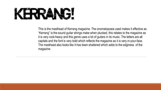
- 1. This is the masthead of Kerrang magazine. The onomatopoeia used makes it effective as “Kerrang” is the sound guitar strings make when plucked, this relates to the magazine as it is very rock-heavy and this genre uses a lot of guitars in its music. The letters are all capitals and the font is very bold which reflects the magazine as it is very in-your-face. The masthead also looks like it has been shattered which adds to the edginess of the magazine.
- 2. Q Magazine is an alternative/indie/pop magazine which has a very simplistic masthead but it could be argued that this is what makes it effective. The white Q on a red background makes it stand out from the crowd as red is a very bright colour and not many magazines have red in their colour scheme. Also it is easy to remember so when people see this they automatically know that it is for Q Magazine.
- 3. Rock Sound is a popular rock music magazine. It’s masthead is all in capitals and its is again black and bold, which is very eye- catching. The ‘R’ looks like it is in a volume/amplifier dial which relates to music/guitars.
- 4. Billboard is another popular music magazine and consists of all genres of music. The masthead is very bold and uses a lot of different colours which is different to most other mastheads (black, red, blue, green and yellow.) Also the word billboard has connotations of big and popular things as new albums/big brands are usually advertised on massive billboards.