Goa Call Girls 9316020077 Call Girls In Goa By Russian Call Girl in goa
Masthead Analysis
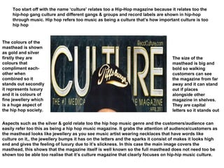
1. Too start off with the name ‘culture’ relates too a Hip-Hop magazine because it relates too the hip-hop gang culture and different gangs & groups and record labels are shown in hip-hop through music. Hip hop refers too music as being a culture that’s how important culture is too hip hop The size of the masthead is big and bold so walking customers can see the magazine from far away and it can stand out if places alongside other magazine in shelves. They are capital letters so it stands out The colours of the masthead is shown as gold and silver firstly they are colours that compliment each-other when combined so it stands out secondly it represents luxury and it is colours of fine jewellery which is a huge aspect of the hip hop society. Aspects such as the silver & gold relate too the hip hop music genre and the customers/audience can easily refer too this as being a hip hop music magazine. It grabs the attention of audience/customers as the masthead looks like jewellery as you see music artist wearing necklaces that have words like culture on it,, the jewellery bumps it has on the letters and the sparks it consist of makes it looks high end and gives the feeling of luxury due to it’s slickness. In this case the main image covers the masthead, this shows that the magazine itself is well known so the full masthead does not need too be shown too be able too realise that it’s culture magazine that clearly focuses on hip-hip music culture.
2. The size of the masthead is again big & bold so the audience is clearly able too see the magazine from far away and it would be able too stand out alongside other magazine if places in shelves together. The colour of the masthead is red so it may signify a stereotypical devil worshipers as one may think like that. Also it’s a bright red colour so the audience are able to realise what genre magazine is it. The masthead font is a very unique style as it consists of a lot of spikes and cracks, this connotates the genre of rock as it could portray a rock being a form of really loud music so cracks may be involved too represent the loudness in which a window may crack due too loud noise. Spikes are also used as some of the costumes a rock star wears consists of spikes etc and it may used too display that rock is a wild magazine itself. Also the use of the explanation mark is cleverly used too show the head busting volume of rock as a really loud form of music. And it’s tilted too show a type of rock ‘n’ roll affect that rock includes within their type of genre. Overall the audiences are able too realise that this is a rock magazine due too the type of colour palette that is used as well as the font of the masthead itself due too it’s wackiness. It creates an evil mood as stereotypically rock is related too the devil in some form or another. Also the cracked looking font can also display rock as being a crazy form of music as guitars are smashed and cracked as well. The mood the colours of the masthead creates is the mood of breaking things and too act wild.
3. The size of the masthead is big but not as bold as usual magazines, however it stands out because of the dark background colour of the magazine itself and connotates the actual genre of this type of music which is opera. The colour of the masthead is white which represents the purity of this genre which is opera music. Also used to help the magazine look older even though the font size is not thick in width. The title relates too the music as the name of the actual genre itself is included within the magazine. This is used too show the audience coherently what type of genre this music magazine focuses on. It grabs the attention of the audience as it includes a short & strong word which is the word ‘now’ this shows that every thing that is occurring in the opera industry is shown on this magazine. It also acts like a tool in which it forces the audience too pick up the magazine and it looks very appealing to the eyes of the audiences in which persuades them too buy it. The colour that is used for the masthead is white too display the elegance of opera and too show how peaceful and calm it actually is. Overall, this masthead on it’s own portrays various aspects in which relates too opera itself. From the colours too the font and the font size. Also, only the O & A of the masthead are capitals this could be used too increase fluidity and calmness like someone is reading a word in a relaxed manner. The colours set the mood of a calm surrounding in which opera is played with their strong and powerful voice which the masthead converys.
4. The font is firstly moved too a corner which makes the magazine look more different and unique too the audience. It gives a bit of a illusion effect so again it can look appealing and it gives the audience a reason too pick it up The colour palette of the magazine is black white and pink and purple, even though it looks feminine it is suppose too connotate bright exciting colours. Colours, that relates too pop and parties. The masthead relates too the genre as firstly the name of the masthead is the name of the genre itself. This again makes it simple for the customers/audience too identify what genre is this magazine based upon. This is good as it makes it easy for the readers too remember and also makes the masthead sound short yet catchy. The masthead on it’s own grabs the readers attention due too how the masthead is presented in this case it is moved too the far left side and the style of the font is very unique which creates excitement for the readers and the aspect of this grabs the readers attention Overall, due too the colours of the masthead it may only attract female readers who are interested in Pop and those who’d like too be interested in Pop due too the colour palette and the colour balance of the magazine which is black, pink, purple & white. This may be the target audience but it can just also represents colours of a bright, exciting party in which pop songs are always played. The colours set a type of party mood in which one should go out there and just party and have all the fun they can possible have.
5. The font style is big and bold so customers are able too easily see the magazine from far away and are able too pick it out even if it’s alongside many other magazines within in shelf. The colour of the masthead is white and it stands out from the whole magazine as the magazine background colour is back so it connotates jazz as a old yet classic music genre The masthead compliments/relates too the genre of the music magazine which is jazz as firstly it has the word jazz in there so audience can clearly recognize what genre music this magazine is about. Also, the colours black and white portray jazz as being old but very classical and vintage, a type of music that will never fade based on the colours used which is black & white, those are the colour palette of this magazine. It grabs the readers attention due too the word ‘wise’ for a jazz fan they would be persuaded that too become jazz-wise they must read this magazine. Also it grabs the readers attention due too the simplicity that it’s black and white so it doesn’t really look messy. Overall the colours used of the masthead sets the mood of peacefulness and soothing due too it’s innocent and simplistic use of black and white. The main image is in front of the masthead so this explains that the magazine is well known so the whole mast head does not have too be seen for the customers too realize this is Jazz-Wise magazine focusing on jazz music.