
Recommended
More Related Content
What's hot
What's hot (20)
Similar to Florence Double Page Spread Layout Analysis
Similar to Florence Double Page Spread Layout Analysis (20)
Recently uploaded
Recently uploaded (20)
Florence Double Page Spread Layout Analysis
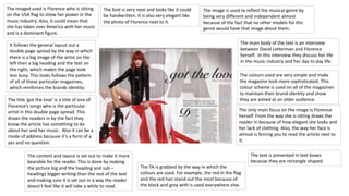
- 1. It follows the general layout out a double page spread by the way in which there is a big image of the artist on the left then a big heading and the text on the right, which makes the page look less busy. This looks follows the pattern of all of these particular magazines, which reinforces the brands identity. The title ‘got the love’ is a title of one of Florence’s songs who is the particular artist in this double page spread. This draws the readers in by the fact they know the article has something to do about her and her music. Also it can be a mode of address because it’s a form of a yes and no question. The font is very neat and looks like it could be handwritten. It is also very elegant like the photo of Florence next to it. The imaged used is Florence who is sitting on the USA flag to show her power in the music industry. Also, it could mean that she has taken over America with her music and is a dominant figure. The image is used to reflect the musical genre by being very different and independent almost because of the fact that no other models for this genre would have that image about them. The TA is grabbed by the way in which the colours are used. For example, the red in the flag and the red hair stand out the most because of the black and grey with is used everywhere else. The content and layout is set out to make it more bearable for the reader. This is done by making the picture big and the heading and sub – headings bigger writing than the rest of the text and making sure it is set out in a way the reader doesn’t feel like it will take a while to read. The main body of the text is an interview between David Letterman and Florence herself. In this interview they discuss her life in the music industry and her day to day life. The colours used are very simple and make the magazine look more sophisticated. This colour scheme is used on all of the magazines to maintain their brand identity and show they are aimed at an older audience. The only main focus on the image is Florence herself. From the way she is sitting draws the reader in because of how elegant she looks and her lack of clothing. Also, the way her face is almost is forcing you to read the article next to it. The text is presented in text boxes because they are rectangle shaped.