Model Call Girls In Velappanchavadi WhatsApp Booking 7427069034 call girl ser...
Magazines
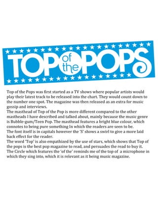
1. Top of the Pops was first started as a TV shows where popular artists would
play their latest track to be released into the chart. They would count down to
the number one spot. The magazine was then released as an extra for music
gossip and interviews.
The masthead of Top of the Pop is more different compared to the other
mastheads I have described and talked about, mainly because the music genre
is Bubble-gum/Teen Pop. The masthead features a bright blue colour, which
connotes to being pure something In which the readers are seen to be.
The font itself is in capitals however the ‘S’ shows a swirl to give a more laid
back effect for the reader.
The word ‘Top’ is also empathized by the use of stars, which shows that Top of
the pops is the best pop magazine to read, and persuades the read to buy it.
The Circle which features the ‘of the’ reminds me of the top of a microphone in
which they sing into, which it is relevant as it being music magazine.
2. Billboard magazine is a popular American music magazine, which features
music such as pop and R&B. The masthead features the font being Large and in
black however the circular lettering is coloured in ionic primary colours. This
allows the masthead to be easily recognisable to the reader. The circular
colours also remind me of old style disc, which would be played on record
players. This also related to music in which they feature by being known for
representing powerful musical legends.
The word ‘Billboard’ itself refers to the large adverts, which is shown around
the country, which the public can view and give their views on the topic. This
shows to me that billboard magazine is very popular and is known being the
music magazine you should read due to their chart success (being in the top
100).
3. The Kerrang masthead is featured in capital, black typography which displays
to the type of music rock is and the bold, distinctive sound. This captures the
reader’s interest of the masthead and the way in which it is displayed.
The masthead also features slashes in the text, which makes it look broken by
the connation of the magazine featuring loud rock music. Rock stars are also
known to smash their guitars, which also symbolises the shattered broken
effect.
The masthead is also consistently featured in this bold, capital font in black
however the rest of the magazine is featured in bright colours which connote
them being loud and striking something in which the music does. The colour
black is present due to the colour typically being associated with being a ‘goth’
and them listening to punk or rock music.
The word ‘Kerrang’ itself sounds like the sound of a guitar being played very
loudly and suddenly which produces the striking and bold sound which
kerrang is displaying and the music it is featuring.