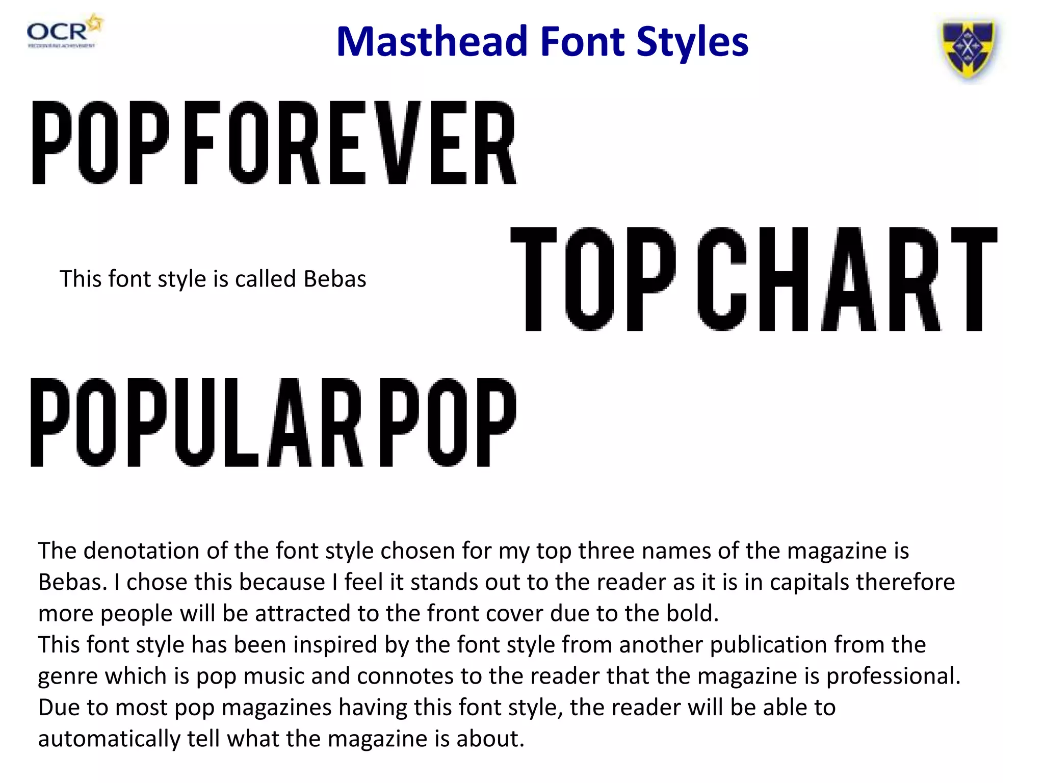
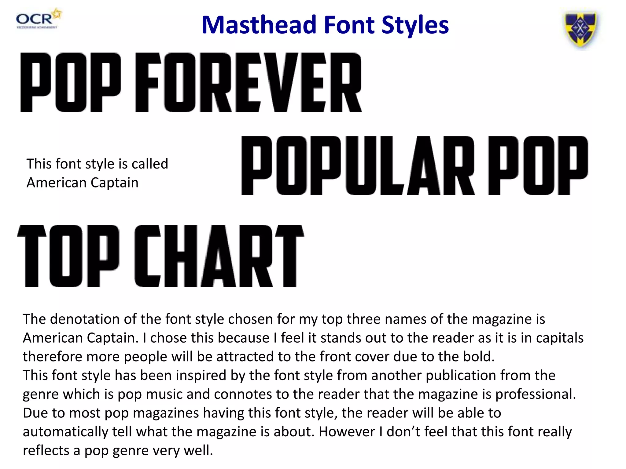
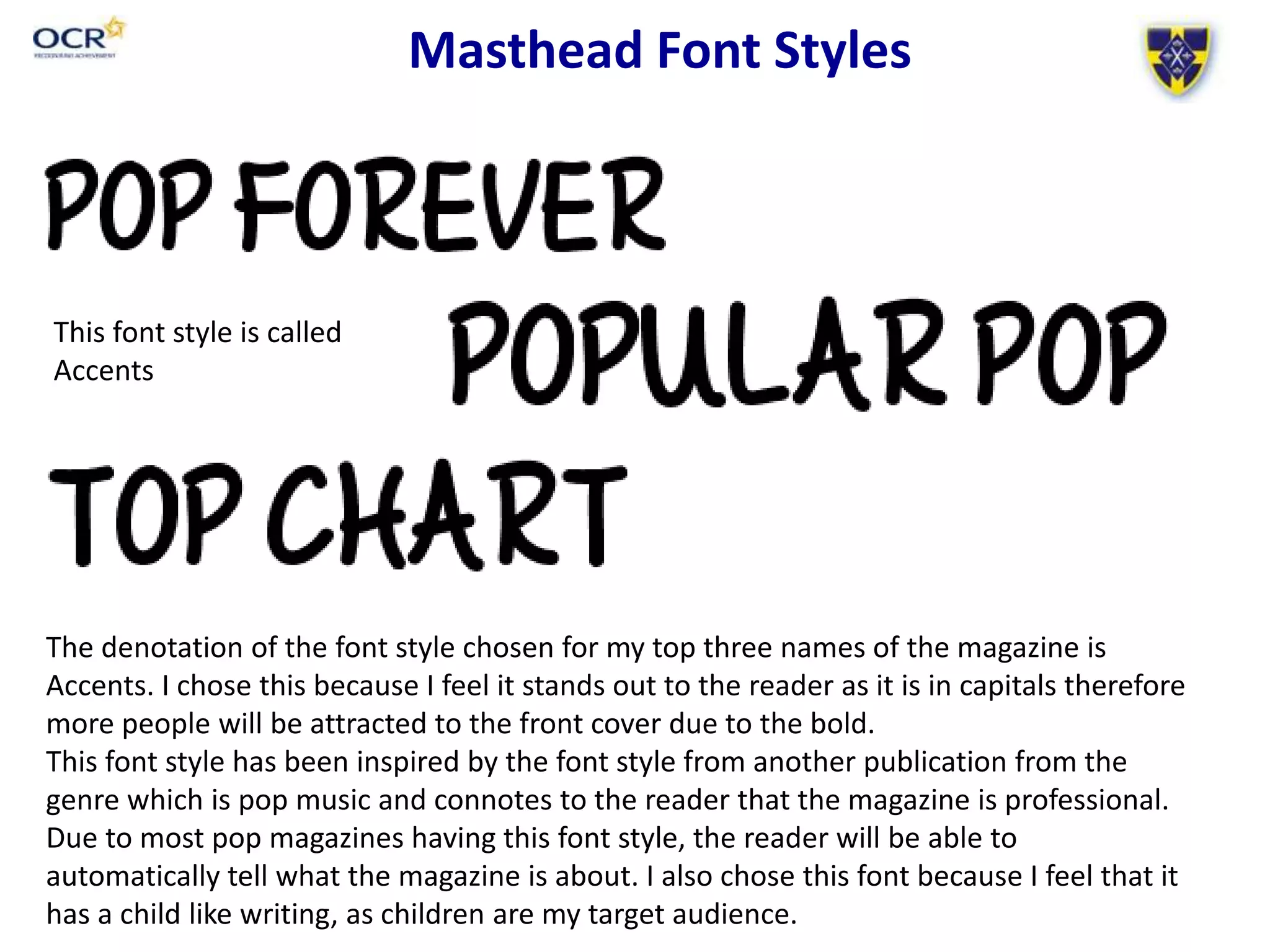
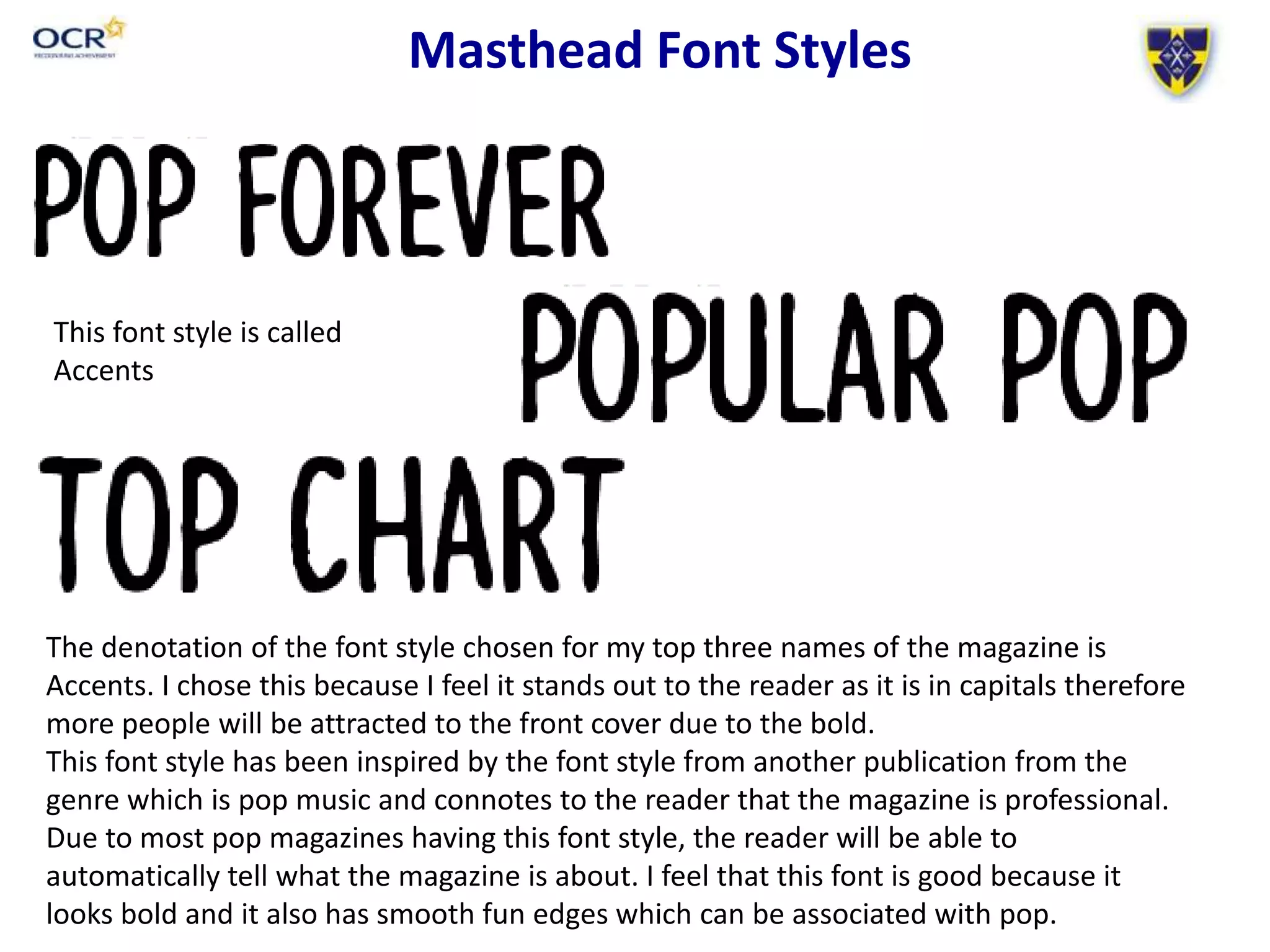
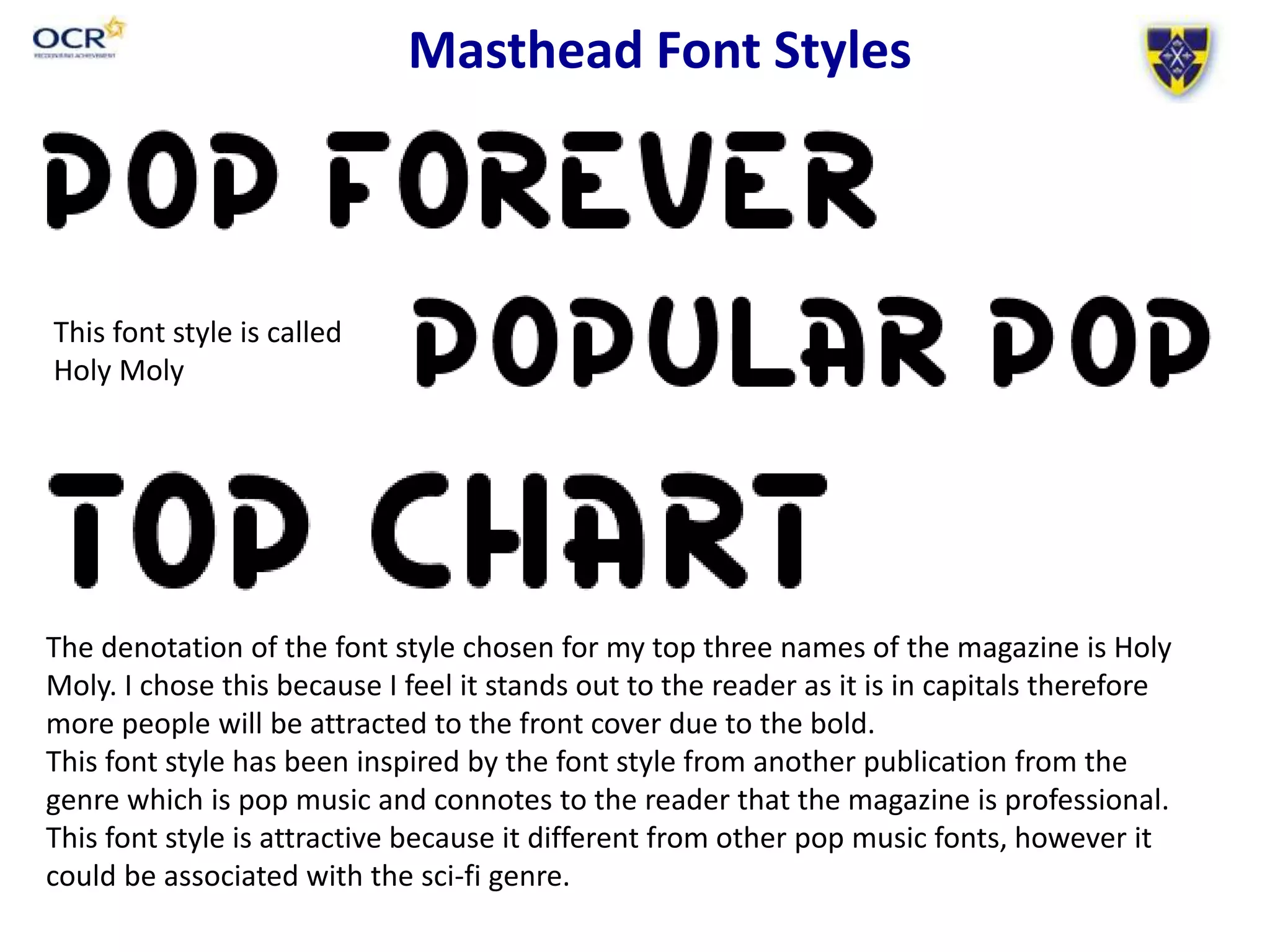
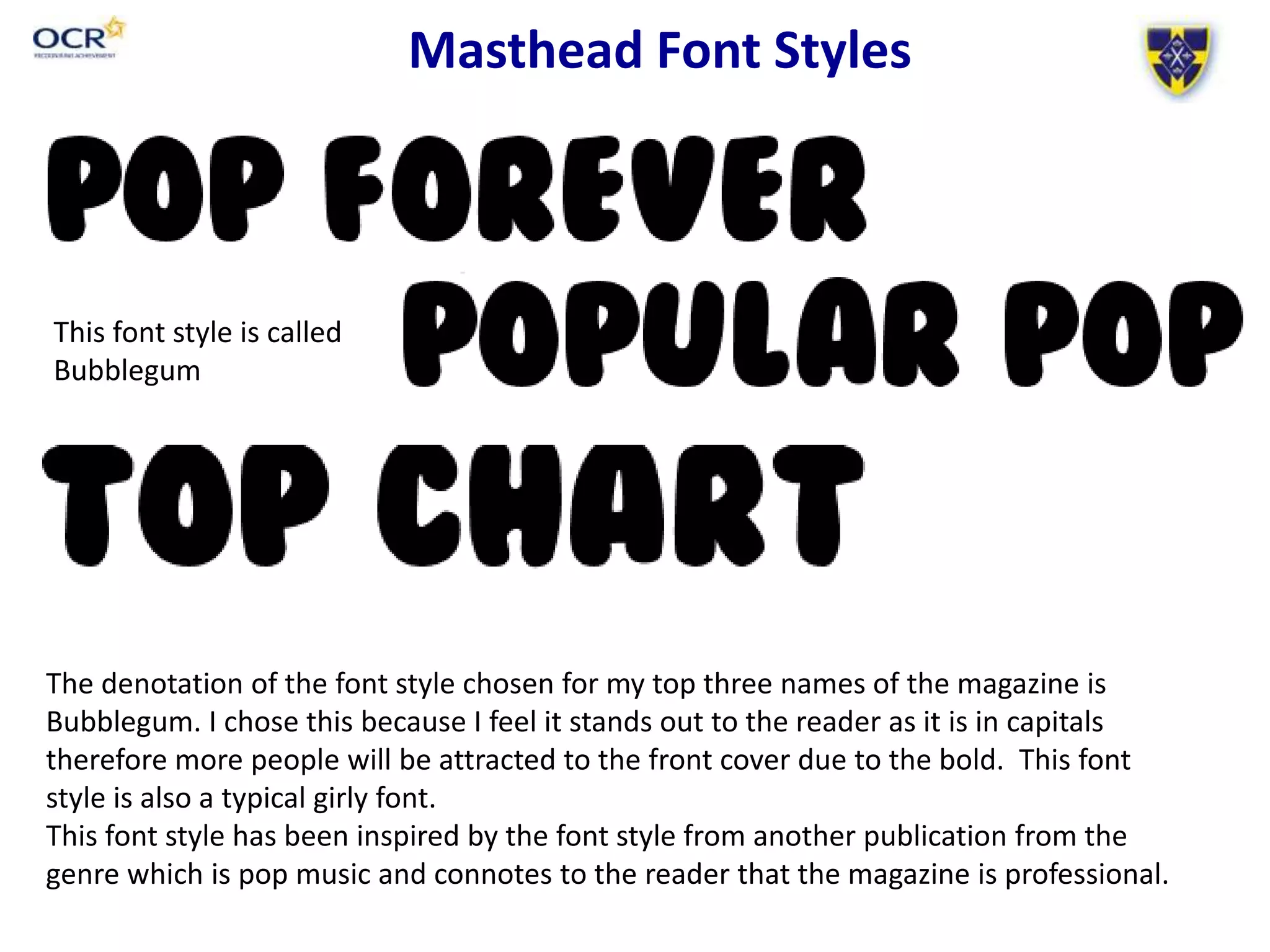
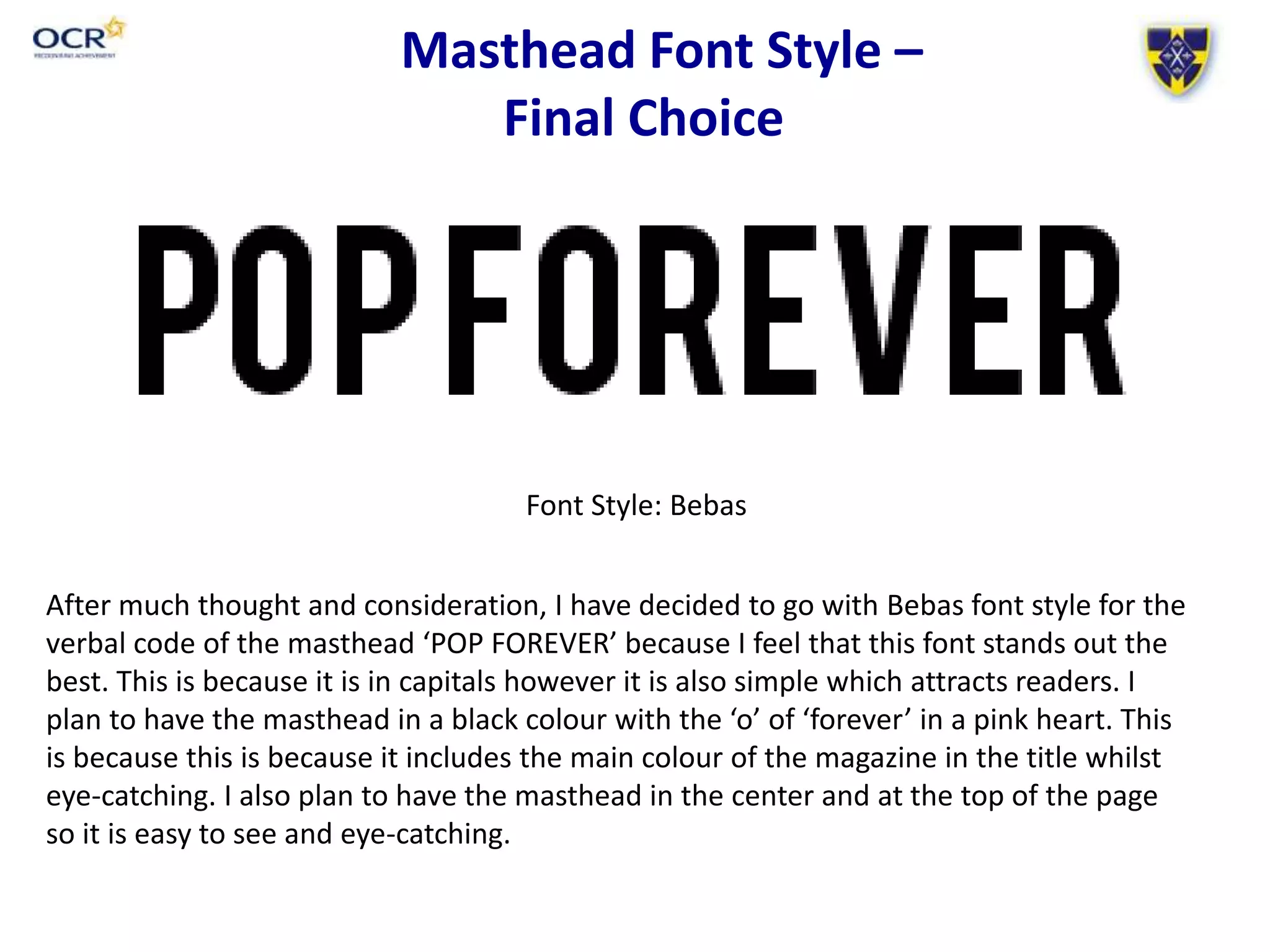
Masthead Font Styles
Candidate Name – Elizabeth Plumb
Candidate Number - 2049
Masthead Font Styles
The denotation of the font style chosen for my top three names of the magazine is
Bebas. I chose this because I feel it stands out to the reader as it is in capitals therefore
more people will be attracted to the front cover due to the bold.
This font style has been inspired by the font style from another publication from the
genre which is pop music and connotes to the reader that the magazine is professional.
Due to most pop magazines having this font style, the reader will be able to
automatically tell what the magazine is about.
This font style is called Bebas
Masthead Font Styles
The denotation of the font style chosen for my top three names of the magazine is
American Captain. I chose this because I feel it stands out to the reader as it is in capitals
therefore more people will be attracted to the front cover due to the bold.
This font style has been inspired by the font style from another publication from the
genre which is pop music and connotes to the reader that the magazine is professional.
Due to most pop magazines having this font style, the reader will be able to
automatically tell what the magazine is about. However I don’t feel that this font really
reflects a pop genre very well.
This font style is called
American Captain
Masthead Font Styles
The denotation of the font style chosen for my top three names of the magazine is
Accents. I chose this because I feel it stands out to the reader as it is in capitals therefore
more people will be attracted to the front cover due to the bold.
This font style has been inspired by the font style from another publication from the
genre which is pop music and connotes to the reader that the magazine is professional.
Due to most pop magazines having this font style, the reader will be able to
automatically tell what the magazine is about. I also chose this font because I feel that it
has a child like writing, as children are my target audience.
This font style is called
Accents
Masthead Font Styles
The denotation of the font style chosen for my top three names of the magazine is
Accents. I chose this because I feel it stands out to the reader as it is in capitals therefore
more people will be attracted to the front cover due to the bold.
This font style has been inspired by the font style from another publication from the
genre which is pop music and connotes to the reader that the magazine is professional.
Due to most pop magazines having this font style, the reader will be able to
automatically tell what the magazine is about. I feel that this font is good because it
looks bold and it also has smooth fun edges which can be associated with pop.
This font style is called
Accents
Masthead Font Styles
The denotation of the font style chosen for my top three names of the magazine is Holy
Moly. I chose this because I feel it stands out to the reader as it is in capitals therefore
more people will be attracted to the front cover due to the bold.
This font style has been inspired by the font style from another publication from the
genre which is pop music and connotes to the reader that the magazine is professional.
This font style is attractive because it different from other pop music fonts, however it
could be associated with the sci-fi genre.
This font style is called
Holy Moly
Masthead Font Styles
The denotation of the font style chosen for my top three names of the magazine is
Bubblegum. I chose this because I feel it stands out to the reader as it is in capitals
therefore more people will be attracted to the front cover due to the bold. This font
style is also a typical girly font.
This font style has been inspired by the font style from another publication from the
genre which is pop music and connotes to the reader that the magazine is professional.
This font style is called
Bubblegum
Masthead Font Style –
Final Choice
Font Style: Bebas
After much thought and consideration, I have decided to go with Bebas font style for the
verbal code of the masthead ‘POP FOREVER’ because I feel that this font stands out the
best. This is because it is in capitals however it is also simple which attracts readers. I
plan to have the masthead in a black colour with the ‘o’ of ‘forever’ in a pink heart. This
is because this is because it includes the main colour of the magazine in the title whilst
eye-catching. I also plan to have the masthead in the center and at the top of the page
so it is easy to see and eye-catching.

Masthead font styles for pop magazine

  • 1.
    Masthead Font Styles CandidateName – Elizabeth Plumb Candidate Number - 2049
  • 2.
    Masthead Font Styles Thedenotation of the font style chosen for my top three names of the magazine is Bebas. I chose this because I feel it stands out to the reader as it is in capitals therefore more people will be attracted to the front cover due to the bold. This font style has been inspired by the font style from another publication from the genre which is pop music and connotes to the reader that the magazine is professional. Due to most pop magazines having this font style, the reader will be able to automatically tell what the magazine is about. This font style is called Bebas
  • 3.
    Masthead Font Styles Thedenotation of the font style chosen for my top three names of the magazine is American Captain. I chose this because I feel it stands out to the reader as it is in capitals therefore more people will be attracted to the front cover due to the bold. This font style has been inspired by the font style from another publication from the genre which is pop music and connotes to the reader that the magazine is professional. Due to most pop magazines having this font style, the reader will be able to automatically tell what the magazine is about. However I don’t feel that this font really reflects a pop genre very well. This font style is called American Captain
  • 4.
    Masthead Font Styles Thedenotation of the font style chosen for my top three names of the magazine is Accents. I chose this because I feel it stands out to the reader as it is in capitals therefore more people will be attracted to the front cover due to the bold. This font style has been inspired by the font style from another publication from the genre which is pop music and connotes to the reader that the magazine is professional. Due to most pop magazines having this font style, the reader will be able to automatically tell what the magazine is about. I also chose this font because I feel that it has a child like writing, as children are my target audience. This font style is called Accents
  • 5.
    Masthead Font Styles Thedenotation of the font style chosen for my top three names of the magazine is Accents. I chose this because I feel it stands out to the reader as it is in capitals therefore more people will be attracted to the front cover due to the bold. This font style has been inspired by the font style from another publication from the genre which is pop music and connotes to the reader that the magazine is professional. Due to most pop magazines having this font style, the reader will be able to automatically tell what the magazine is about. I feel that this font is good because it looks bold and it also has smooth fun edges which can be associated with pop. This font style is called Accents
  • 6.
    Masthead Font Styles Thedenotation of the font style chosen for my top three names of the magazine is Holy Moly. I chose this because I feel it stands out to the reader as it is in capitals therefore more people will be attracted to the front cover due to the bold. This font style has been inspired by the font style from another publication from the genre which is pop music and connotes to the reader that the magazine is professional. This font style is attractive because it different from other pop music fonts, however it could be associated with the sci-fi genre. This font style is called Holy Moly
  • 7.
    Masthead Font Styles Thedenotation of the font style chosen for my top three names of the magazine is Bubblegum. I chose this because I feel it stands out to the reader as it is in capitals therefore more people will be attracted to the front cover due to the bold. This font style is also a typical girly font. This font style has been inspired by the font style from another publication from the genre which is pop music and connotes to the reader that the magazine is professional. This font style is called Bubblegum
  • 8.
    Masthead Font Style– Final Choice Font Style: Bebas After much thought and consideration, I have decided to go with Bebas font style for the verbal code of the masthead ‘POP FOREVER’ because I feel that this font stands out the best. This is because it is in capitals however it is also simple which attracts readers. I plan to have the masthead in a black colour with the ‘o’ of ‘forever’ in a pink heart. This is because this is because it includes the main colour of the magazine in the title whilst eye-catching. I also plan to have the masthead in the center and at the top of the page so it is easy to see and eye-catching.