Beyond Boundaries: Leveraging No-Code Solutions for Industry Innovation
Planning my magazine
1. Planning my magazine
Lesson Objective: To understand the requirements of the Production Portfolio.
Fonts
These are the fonts that I might use for my magazine, I chose these fonts as they appeal to my
target audience.
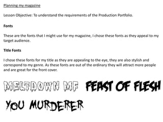
Title Fonts
I chose these fonts for my title as they are appealing to the eye, they are also stylish and
correspond to my genre. As these fonts are out of the ordinary they will attract more people
and are great for the front cover.
2. Heading Fonts
Heading fonts need to be easy to read but still have a stylish look about them. I have chosen
these fonts as they include all of these points and again relate to my genre, this is because
they are aggressive and bold.
Standard Text
The fonts that I will use for the main body will be either “Calibri” or “Arial”, this is because
they are extremely easy to read plus a lot of stylish fonts such as “Meltdown MF” make the
magazine look unprofessional and ugly.
Heading Fonts
3. Colour Scheme
The colours that I have chosen for my magazine are typical of a rock magazine red, black and
white.
The main reason why I have chose these colour as they represent the personality of a rock
audience, these colours generally appeal to a male audience . I think that these colours work
well with each other and do not clash, if I used colours such as red and green they would
clash and look horrible.
I think that these colours clash and do not look as good as red, black and white. This colour
scheme has been used on one of the magazines I researched and gave it a comic book feel
because of all of bright colours used. The bright colours such as the green make appealing to
just not men button women as well, this is a good factor as you can access a wider target
audience