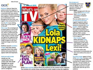
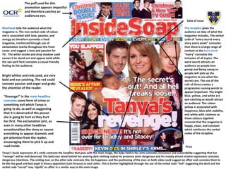
Soap Opera Genre –
Ancillary Product
Analysis
Name: Bethany Vaughan
Candidate Number: 4137
Center Name: St. Andrew’s Catholic School
Center Number: 64135
OCR Media Studies – A2 Level
Unit G324: Advanced Portfolio
Outlines around secondary
images and cover stories
separates them from other
stories and causes them to
appear bold and important.
Masthead ‘informs’ (Katz) the
audience what the magazine is.
The non-verbal code of colour red
is associated with love, passion,
and energy so therefore connotes a
loud magazine, reinforced through
use of exclamation marks
throughout the front cover, and
suggest a love and passion for TV.
Main Headline, bright
yellow with black stroke
causes it to stand out. The
capitalization of the verbal
code ‘KIDNAPS’ signifies it’s
importance and the word
connotes danger and crime.
Use of the verbal code
punctuation to sensationalize the
story and reinforce the sense of
danger.
Use of puffs is eye catching,
draws focus to the content
of the puff.
Date of issue Blue background
(consistently used in front
covers of ‘What’s on TV)
connotes stability, and is
effective in creating a
vibrant design.
Man in background in the non-
verbal code of mise-en-scene
black costume has the
connotation of bad/evil
intentions.
The non-verbal code of mise-
en-scene facial expression
suggests happiness, baby is
obviously comfortable with
woman so contrasts the main
headline, further suggesting
Phil’s negative intentions
through his dissatisfied facial
expression and the verbal code
puff text ‘Phil’s custody
victory!’ which suggests that he
is the antagonist.
Bold text with stroke
stands out, the
capitalisation of the
verbal code ‘EVIL PLAN’
highlights the words
significance and the
language suggests drama
and an antagonist.
Shows logos and text used to inform the audience on the content of the magazine.
The inclusion of a certain show could attract certain readers to buy the magazine.
Main image has no background
so heads appear in front of the
mast head causing it to stand
out, which is reinforced by the
outer glow effect used on the
image casing it to further stand
out against the magazines blue
background, which causes the
image to appear as the most
important image on the front
cover.
Secondary images appear in front
of the main image, framing it, with
a rounded edge bubble effect
causing them to appear attractive,
informal, and eye-catching. As
they appear in front of the main
image they stand out so would
could easily catch the eye of an
audience.
The strapline gives the
audience an idea of what the
magazine includes, The verbal
code of “every secret every
story every week” connotes
that there is a large range of
content as the buzz word
“every” connotes the
inclusion of all topics. The
word secret attracts an
audience as people love
gossip and being nosey so
people will pick up the
magazine to see what the
secrets are. The use of the
rule of three creates a
progression causing words to
appear important. The bright
blue, yellow, and white are
eye-catching so would attract
an audience. The colour
yellow is associated with
happiness, blue with stability,
and white with coolness so
these colours together
connote that the magazine is
happy, clean, and constant
which reinforces the verbal
codes of the strapline.
Date of issue
Price
Masthead tells the audience what the
magazine is. The non-verbal code of colour
red is associated with love, passion, and
energy so therefore connotes a loud
magazine, reinforced through use of
exclamation marks throughout the front
cover, and suggest a love and passion for
TV. The white stroke and drop shadow used
causes it to stand out and appear bold while
the san-serif font connotes a casual friendly
feeling to the audience.
Bright whites and reds used, are very
bold and eye catching. The red could
connote passion and anger and grabs
the attention of the reader.
“Revenge!” in the main headline
connotes some form of crime or
something evil which Tanya is
going to do, as well as suggesting
that it is deserved of the person
she is going to hurt as they hurt
her first. The exclamation pint, as
seen in many other headlines
sensationalises the story so causes
everything to appear dramatic and
get attention from the reader,
encouraging them to pick it up and
read inside.
The puff used for this
promotion appears impactful
and therefore catches an
audiences eye.
Tanya’s facial expression of a smile contrasts the headline that goes with the main image, the baby held in her arms connotes innocence and vulnerability suggesting that her
“revenge” will be well deserved. The bald man stood behind her wearing dark clothing makes his presence seem dangerous and his moody almost sinister expression connotes
dangerous intentions. The smiling man on the other side contrasts this, his happiness and the positioning of the men on both sides could suggest an affair and connotes them to
be like the good and bad angel in binary opposition (Levi Strauss) to each other. This is further highlighted through the use of the verbal code “hell” suggesting the devil and the
verbal code “secret” may ‘signify’ an affair in a similar way to the main image.
Conclusion
and
In my magazine I would ‘repeat’ (Steve Neale – 1980) the use of bright colors and a bold
background color. I would also repeat the use of exclamation marks and language to
sensationalize the story. Another thing I would repeat the use of puff promotions and
secondary images and headlines as they are eye catching and attractive.

Magazine Textual Analysis

  • 1.
    Soap Opera Genre– Ancillary Product Analysis Name: Bethany Vaughan Candidate Number: 4137 Center Name: St. Andrew’s Catholic School Center Number: 64135 OCR Media Studies – A2 Level Unit G324: Advanced Portfolio
  • 2.
    Outlines around secondary imagesand cover stories separates them from other stories and causes them to appear bold and important. Masthead ‘informs’ (Katz) the audience what the magazine is. The non-verbal code of colour red is associated with love, passion, and energy so therefore connotes a loud magazine, reinforced through use of exclamation marks throughout the front cover, and suggest a love and passion for TV. Main Headline, bright yellow with black stroke causes it to stand out. The capitalization of the verbal code ‘KIDNAPS’ signifies it’s importance and the word connotes danger and crime. Use of the verbal code punctuation to sensationalize the story and reinforce the sense of danger. Use of puffs is eye catching, draws focus to the content of the puff. Date of issue Blue background (consistently used in front covers of ‘What’s on TV) connotes stability, and is effective in creating a vibrant design. Man in background in the non- verbal code of mise-en-scene black costume has the connotation of bad/evil intentions. The non-verbal code of mise- en-scene facial expression suggests happiness, baby is obviously comfortable with woman so contrasts the main headline, further suggesting Phil’s negative intentions through his dissatisfied facial expression and the verbal code puff text ‘Phil’s custody victory!’ which suggests that he is the antagonist. Bold text with stroke stands out, the capitalisation of the verbal code ‘EVIL PLAN’ highlights the words significance and the language suggests drama and an antagonist. Shows logos and text used to inform the audience on the content of the magazine. The inclusion of a certain show could attract certain readers to buy the magazine. Main image has no background so heads appear in front of the mast head causing it to stand out, which is reinforced by the outer glow effect used on the image casing it to further stand out against the magazines blue background, which causes the image to appear as the most important image on the front cover. Secondary images appear in front of the main image, framing it, with a rounded edge bubble effect causing them to appear attractive, informal, and eye-catching. As they appear in front of the main image they stand out so would could easily catch the eye of an audience.
  • 3.
    The strapline givesthe audience an idea of what the magazine includes, The verbal code of “every secret every story every week” connotes that there is a large range of content as the buzz word “every” connotes the inclusion of all topics. The word secret attracts an audience as people love gossip and being nosey so people will pick up the magazine to see what the secrets are. The use of the rule of three creates a progression causing words to appear important. The bright blue, yellow, and white are eye-catching so would attract an audience. The colour yellow is associated with happiness, blue with stability, and white with coolness so these colours together connote that the magazine is happy, clean, and constant which reinforces the verbal codes of the strapline. Date of issue Price Masthead tells the audience what the magazine is. The non-verbal code of colour red is associated with love, passion, and energy so therefore connotes a loud magazine, reinforced through use of exclamation marks throughout the front cover, and suggest a love and passion for TV. The white stroke and drop shadow used causes it to stand out and appear bold while the san-serif font connotes a casual friendly feeling to the audience. Bright whites and reds used, are very bold and eye catching. The red could connote passion and anger and grabs the attention of the reader. “Revenge!” in the main headline connotes some form of crime or something evil which Tanya is going to do, as well as suggesting that it is deserved of the person she is going to hurt as they hurt her first. The exclamation pint, as seen in many other headlines sensationalises the story so causes everything to appear dramatic and get attention from the reader, encouraging them to pick it up and read inside. The puff used for this promotion appears impactful and therefore catches an audiences eye. Tanya’s facial expression of a smile contrasts the headline that goes with the main image, the baby held in her arms connotes innocence and vulnerability suggesting that her “revenge” will be well deserved. The bald man stood behind her wearing dark clothing makes his presence seem dangerous and his moody almost sinister expression connotes dangerous intentions. The smiling man on the other side contrasts this, his happiness and the positioning of the men on both sides could suggest an affair and connotes them to be like the good and bad angel in binary opposition (Levi Strauss) to each other. This is further highlighted through the use of the verbal code “hell” suggesting the devil and the verbal code “secret” may ‘signify’ an affair in a similar way to the main image.
  • 4.
    Conclusion and In my magazineI would ‘repeat’ (Steve Neale – 1980) the use of bright colors and a bold background color. I would also repeat the use of exclamation marks and language to sensationalize the story. Another thing I would repeat the use of puff promotions and secondary images and headlines as they are eye catching and attractive.