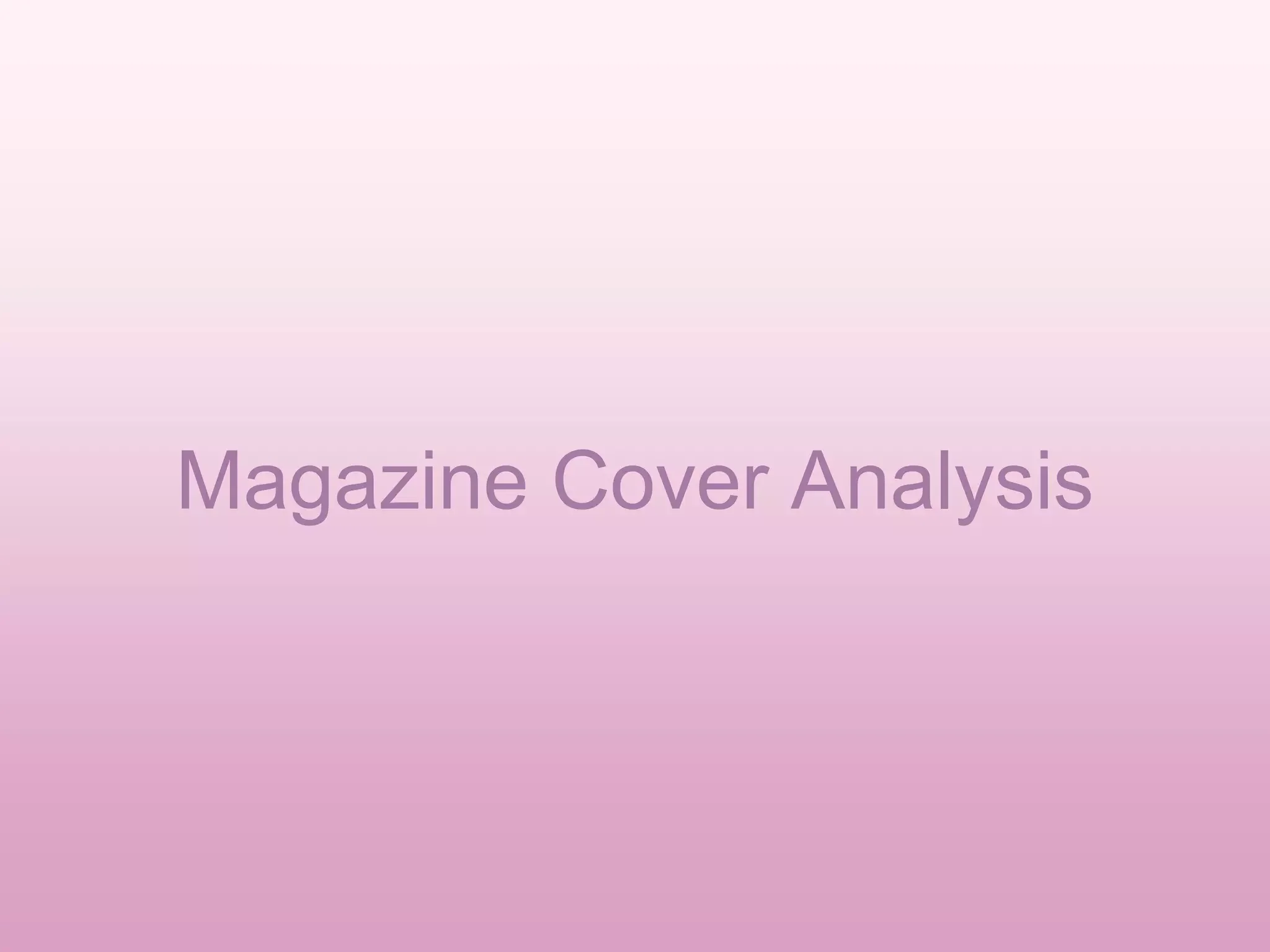
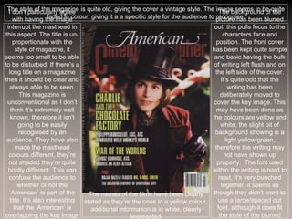
The document analyzes the cover of a magazine. It discusses several design elements of the cover:
- The main image interrupts the masthead to draw the eye, though the bright masthead maintains brand recognition.
- A secondary image and minimal text provide insights into additional content without overwhelming the eye.
- Unconventional formatting and varied colors create visual interest while maintaining clarity.
- Larger text, unique fonts and overlays draw attention to important stories and information.


![01 blogs[1]](https://cdn.slidesharecdn.com/ss_thumbnails/01blogs1-160413111747-thumbnail.jpg?width=640&height=640&fit=bounds)


