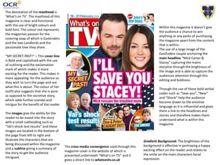
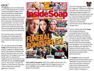
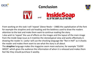
This document analyzes the cover of a soap opera magazine called Inside Soap. It discusses various design elements and techniques used on the cover to appeal to readers and sell magazines. These include the use of bright colors, bold fonts, capitalization, exclamation points, emotive language in headlines and pull quotes, and large central images to draw attention. It also notes design consistency with the repeated strapline in the same font and color scheme across issues. The analysis suggests the cover targets a working-class audience through its coverage of soap opera storylines and use of language evoking aggression and drama.


