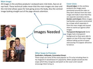
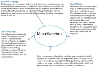
Organic Name Reactions for the students and aspirants of Chemistry12th.pptx
Soap Opera Weekly
1. OCR Media Studies – A2 Level
Unit G324: Advanced Portfolio
Mind Map and
Research
Name: Bethany Vaughan
Candidate Number: 4137
Center Name: St. Andrew’s Catholic School
Center Number: 64135
Generation of Ideas for Ancillary Product 1) –
TV Magazine Front Cover
2. Source of Inspiration
History of the Product
• First published in 1991 and went straight to number 1
where it still is at present date
Publisher
• TimeInc.UK
• Publishing Director: Angela O’Farrell
• Editor: Colin Tough
Circulation Figures – HOW many people read the magazine?
• 3.4 million readers a week
• Second largest actively purchased magazine in the UK
Price Range
• - 50p-60p
The target audience for this magazine can be identified by
the Socio-Economic Needs groups of C1, C2, D, and E as they
include supervisory, skilled and unskilled manual workers.
Although all groups could read the magazine the low price
makes it accessible for the lower groups and is less likely to
appear to the higher groups.
Source: http://www.timeincuk.com/brands/whats-on-tv/
3. Masthead
Ideas
Possible Mastheads:
Spot on Soap: The alliteration in this idea
would make the name easy to remember and
explicitly states what the focus of the
magazine is.
Spotlight!: Spotlight highlights a focus on
something and a spotlight is often associated
with TV or acting so connotes the content of
the magazine, the exclamation mark is typical
of the conventions of a soap opera magazine
and causes the magazine to seem exciting.
Weekly Soap: This idea is very simple and
basic but it tells you exactly what the
magazine is about and how often it comes
out.
Font styles:
Serif: In my analysis of ancillary
products there was very little serif
font used if it was used at all. This
is because it appears very formal
and fancy and is more expected of
a newspaper. This does not reflect
the casual tone I aim to convey
with the magazine and does not
consider the target audience.
Sans Serif: All of the products I
analysed used mostly Sans Serif
Font as it connotes a casual tone
and is informal. This considers the
working class target audience of
soap operas and the tone I aim to
achieve.
Bold: Bold font would cause the
masthead to appear dramatic and
loud, which is used in many other
soap magazines as it is eye
catching.
Verbal Codes:
Many magazines used words like inside in their mastheads, which ‘signifies’
(De Saussure) more information and the ‘Inside scoop’ which encourages
people to read on.
Soap: Soap was used in many magazines as it states to the reader the genre
and content of the magazine to them straight away.
Weekly: Weekly was also used often as it makes it explicit how often the
magazine is circulated.
Position on the page:
Top Left of page: Having the
masthead on the top left of the
page allows more space for the
main image on the page, this is
used in what’s on TV magazine
and allows more information to fit
on the page but does not look as
professional.
Top of page: Using a masthead
across the top of the page creates
a cleaner, more professional look
to the magazine, causing it to
appear easier to read and more
attractive, however it creates less
room for images on the page.
Colour:
Red: All of the ancillary products I analysed used
the colour red, which connotes love, anger and
passion so highlights the themes of soap operas.
The red is also bright and bold so is eye catching
and would therefore attract an audience.
White: The ancillary products also used the
colour white, this is likely to be because it is the
brightest colour and therefore can catch the eye
of the audience in a shop.
4. Main Headline
Ideas
Possible Headlines:
Love Triangle!: This highlights to the
audience the type of storyline which the
article inside will be about. ‘Love Triangle’
Suggests drama and conflict which is well
received by a soap opera audience and the
romance of ‘love’ will appeal to a younger
audience.
Love & Lust: This headline suggests a
conflict between to characters which can
be reinforced through the main image this
is suggested through the binary opposition
of love and lust. Furthermore romance is a
popular theme and would attract an
audience.
Stalking Shock!: This idea tells the
audience what the main storyline will be
as it ‘informs’ (Katz) them that it revolves
around a stalking, the use of alliteration
and the verbal code ‘shock’ causes it to
stand out and would encourage people to
read about the show.
Positioning:
Across the centre of the image:
The readers eye will be drawn to
the text as it is in the centre so it
is likely to be one of the first bits
of text they read. This will also
cause it to appear important and
means that the text will not cover
the faces of those in the image.
Tilted angle: This was used in
some of the ancillary products I
analysed and caused the text to
have an impact and appear bold.
This does not follow typical
magazine conventions so appears
different suggesting conflict in the
article the headline is about.
Other:
Exclamation points: This was used in all ancillary products I looked at
and is a device used to sensationalise the story. It causes the story to
appear important, exciting and bot to be missed.
Buzz words: Buzz words like shock, love, tragedy etc. were used in many
headlines to attract attention from an audience and encourages them to
read on. It makes the headlines appear more dramatic and interesting to
an audience.
5. Images Needed
Main Image:
All images in the ancillary products I analysed were mid shots, face on at
eye level. These technical codes mean that the main images are clear and
the mid shot allows space for text going across the body, Also the centred
image looking straight out of the page attracts attention.
Cover Lines:
Around edges: In the ancillary
products the images were
positioned around the sides so
they don’t distract from the main
image and make it clear that they
are separate secondary stories.
Borders and shapes: Many images
had borders and were constrained
by a shape which separates it
from the main image and caused
them to stand out against other
images.
Transparent Background: Some
images had a transparent
background so they were able to
appear on top of the main image
without taking up lots of space
and causing it to appear attractive
to look at.
Other Soaps to Promote:
EastEnders, Hollyoaks, Coronation Street:
These soaps are some of the most popular on TV so by including them in
my magazine it would boost it’s popularity. Other people would see the
soaps which they recognise and watch on the cover and it would
encourage them to buy it.
6. Miscellaneous
Strapline Language:
The language used in straplines is often to grab attention so uses buzz words and
devices like alliteration and puns to make them memorable and recognisable. This
creates a brand identity which is very important in a magazine. Words like WIN!,
Secrets!, EXLUSIVE, and, Gossip are often use as they grab attention from the
audience and suggest more on the inside of the magazine therefore encouraging
people to read on.
Social Media:
Many magazines had social media
logos or had their twitter handle
somewhere on the front cover.
This allows the reader to interact
with the magazine through their
social media, is a place to release
further information and
exclusives, and creates another
point of entry. Furthermore a
possible reader may see the social
media account posting and could
encourage them to buy the
magazine.
Price: In my research I found that most TV magazines ranged from 40-
80 pence and therefore I want my magazine to reflect this price. For this
reason I will be pricing my magazine at 52p, by choosing a price near the
middle of the range I am able to create an affordable product which is of
a good quality , therefore making it attractive to an audience.
Puff promotion:
The puff promotions, in a similar
way to the straplines use buzz
words as a device to grab
attention, they also use bubbles
surrounding the promotion to
grab attention as they are often
bright and eye catching,
standing out against the rest of
the magazine. Stroke is also
used on text to make it bold and
easily readable.
7. Mind Map - Conclusion
Name: Bethany Vaughan
Candidate Number: 4137
Center Name: St. Andrew’s Catholic School
Center Number: 64135
• I need to buy some examples of soap opera magazines for myself so that I can gain even
more inspiration, and have a hard copy to look at and study it’s conventions.
• In order to create my magazine I will need to arrange the people, locations, and props
which I will use for my magazine. I also need to source a suitable font to use and make
time to shoot the pictures for the images in the magazine when everyone is available.
• I will be using Photoshop to create my product as it allows me to create a professional
looking magazine using the tools available and is easy to understand and available for me
to use at any time.