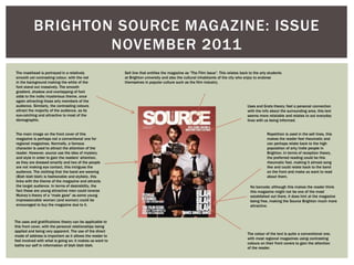
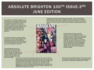
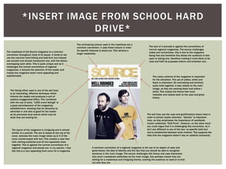
The document discusses the codes and conventions commonly found on the front covers of regional magazines. It provides examples from issues of magazines like The Source and Absolute Brighton to illustrate techniques used to attract readers' attention. These include mastheads in bold fonts, prominent images, high contrast colors, "sell lines" with snippets of content, and barcodes. However, it notes that The Source sometimes challenges conventions by using more subtle fonts, unfamiliar people as images, and omitting barcodes to signal its free status. The layouts, colors, and topics of images and text are designed to appeal to target demographics while intriguing broader audiences.