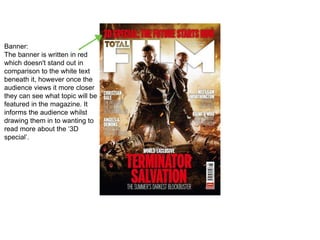
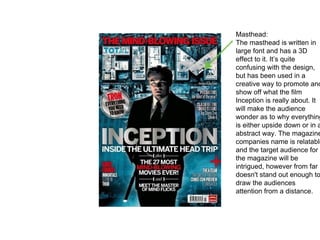
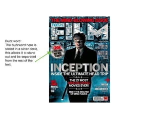
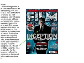
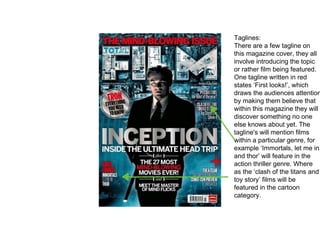
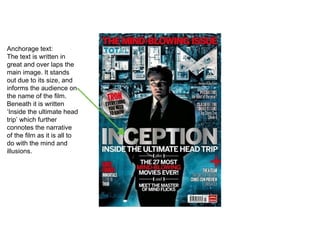
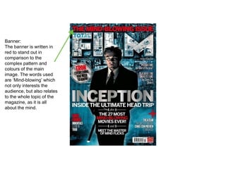
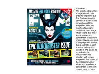
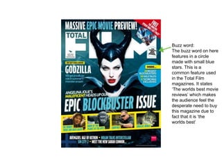
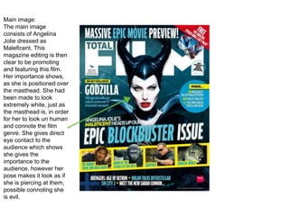
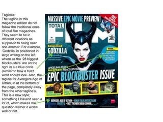
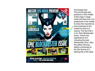
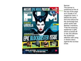
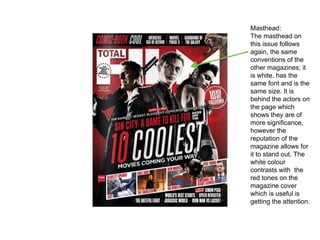
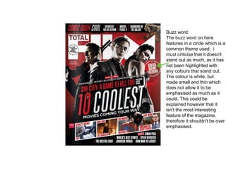
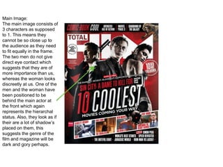
The document provides details on the typical conventions and features used on magazine front covers. It discusses the purpose of the front cover being to attract readers and entice them to purchase the magazine. Key elements typically included on covers are the masthead, main image, anchorage text, buzz words, taglines, and banners. These elements are used to showcase what content is inside and draw readers in. The document also examines specific examples of movie magazine covers, analyzing how effectively the different features are implemented in each case.
This document analyzes the key elements of three magazine covers. Magazine 1 features Ariana Grande and uses pink and black colors with numerous cover lines on the left side. Magazine 2 focuses on food with a main image of a burger and uses pugs and buzzwords to attract attention. Magazine 3 profiles Lana Del Rey holding a cat with its masthead in red and cover lines in white with the last words underlined in red.
1) The document outlines the key elements found on magazine front covers such as the masthead, price/issue details, main cover line, cover lines, plugs, and puffs.
2) It then analyzes an example front cover, noting how the large red masthead draws the eye to the featured photo and main cover line about an article.
3) Smaller cover lines below with accompanying photos advertise less important articles, and plugs on the bottom use puffs to attract attention in contrast to the small plain text of the plugs.
The document describes the layout and design elements commonly found on the cover of a magazine. It lists graphical components such as the masthead, cover lines, main image, barcode, price, and date. It also mentions common stylistic elements like color themes, straplines in the form of quotes, banners, and puff text. The cover is designed to attract readers with prominent images and text that highlight the key stories and selling points of the issue.
Pugs and puffs are short pieces of vital information placed on magazine covers. Pugs, located in the top corners, display the price, logo, and issue number to catch readers' eyes. Puffs are promotional stickers that make certain articles or contents stand out from the rest of the cover using shapes and text. They provide quick previews to entice readers and highlight articles inside the magazine.
This document provides a detailed analysis of magazine covers, examining various elements like the title, images, fonts, placement of information, and how these elements are used to promote the content and attract readers. It analyzes covers from Empire, Entertainment Weekly and Sight and Sound magazines. The covers all prominently feature images from films and celebrities as the main visual element. Additional text highlights stories, interviews and reviews to entice readers. Elements like mastheads, dates, barcodes and pull quotes are consistently placed in the house style to make the magazines recognizable.
Codes and conventions of a double page spreadLaurengibney
The document discusses codes and conventions commonly followed in double page spreads in music magazines. Some key elements include using a direct address celebrity image to entice readers, including quotes from interviews as headlines or within text, and bolding the celebrity's name. Introductions are provided for less recognizable celebrities. Text is usually 11pt aerial font in 2-4 columns. The main image is typically on the left page and relates to the article. Bylines credit photographers and writers. Headlines are short to intrigue readers while articles use an informal tone. Color schemes follow the magazine's style and may highlight celebrity names.
The generic conventions of magazines coverJenny McNulty
The front covers of magazines aim to attract buyers through eye-catching design elements. They establish a consistent house style through fonts, layout, color, and logos to build brand recognition and loyalty. Covers typically feature a central high-resolution celebrity image looking directly at viewers to create engagement. Additional cover lines advertise internal articles to entice purchases. Dates, prices, and web addresses round out the nonverbal communication on magazine fronts.
1) A masthead displays the magazine title to familiarize readers.
2) The main image typically features people or objects related to the main article.
3) A selling line below the masthead introduces the magazine's content.
The target audience of the magazine is primarily young women ages 18+ who have an interest in fashion, the fashion industry, celebrity gossip, beauty, and shopping. The magazine cover features Jessica Alba in the center wearing a red dress. Key elements of the cover layout include the masthead at the top center, different font styles and sizes to distinguish elements, and a color scheme of red and white. The genre of the magazine is fashion and beauty, as indicated by the fashionable cover image and sell lines about beauty products used by celebrities.
The document discusses conventions used in magazine design. It provides examples from magazine covers and interior pages. Some key conventions discussed include using a bold masthead font to identify the magazine, prominent cover images of celebrities related to the magazine's genre, and consistent color schemes throughout the magazine content and covers. Interior pages also employ techniques like quotes and large images of celebrities to draw reader attention, while keeping body text in an easy-to-read font. The consistent application of design elements and celebrities tied to the magazine's topic help create recognition and attract readership.
Codes and Conventions of a magazine contents pageliam-lim-horgan
The document describes the typical layout and design elements of a magazine contents page. It is usually arranged in columns, with the main image relating to a featured article. It contains the magazine name, issue date, contact information, and an editor's letter. The contents are divided into categories and headings to identify each section, using bold text and page numbers to entice readers. Photographers are credited and the bottom includes page numbers and publication details. Contents pages are typically one or two pages.
This document provides guidance for a magazine design assignment. It defines common magazine cover terminology like coverlines, masthead, and house style. It instructs students to research magazine genres, analyze cover design techniques, and create mock magazine covers with consistent house styles. Students are advised to plan thoroughly with mood boards and layout sketches before designing their magazine productions. Peer and self-review are also emphasized to refine the final works.
Codes and conventions of a magazine contents pageRachLou96
The document outlines the codes and conventions for magazine contents pages. Contents pages typically feature the magazine title in the largest text along with a main image. Sub-headings categorize articles and are usually in 14pt font. Articles are listed in chronological order with a brief description to entice readers. Contents pages have a simple white background for readability. The layout is usually single column or dog leg style and can include additional details like the issue date and cover photo credits.
The document analyzes and compares the key features of three magazines - ELLE, Cbeebies, and Q - including their target audiences, publishers, and design elements. It finds that ELLE targets women aged 18-35 with feminine colors and celebrity images, while Cbeebies targets children aged 2-6 with bright colors, pictures, and less text. Q magazine targets adults interested in music with red/black/white colors and images of music artists.
This document analyzes the magazine cover of Empire featuring Harry Potter. It summarizes that the close-up headshot of Harry Potter draws the audience's attention and eye contact makes it more personal. The serious expression and blood on his face convey danger and action. Blue tones and lighting create a fantasy atmosphere, while Harry's glasses make him instantly recognizable to fans. Additional details like the masthead, tagline, subheadings and images further attract audiences by highlighting exclusive content.
The magazine cover features Lady Gaga posing nude holding a bra in the shape of a gun. This controversial image draws attention and relates to Rolling Stone's history of featuring provocative covers. The placement of Lady Gaga covering the masthead suggests the magazine is still recognizable even when obscured. The tagline "Summer Double Issue" above the masthead draws the eye by looking out of place. This implies more content than a regular issue and could increase sales. The cover aims to attract both Lady Gaga's female fans who admire her artistry as well as adult men who may be drawn to the nude image.
The document analyzes several magazine covers:
- Harper's Bazaar is described as minimalistic with a large main image and little text as it is a high-profile magazine.
- LOVE magazine's cover features a colorful title across the top and a main image of Miley Cyrus to target her fans. Bright colors make it appealing to young people.
- ID magazine's sideways title is still visible from a distance. The iconic feature of models with one eye covered identifies it without reading the title. The main image of a young, alternative model suggests a target audience of girls aged 16+.
The front cover of Q magazine features singer Adele looking directly at the camera with her thumb against her lips in a slightly provocative pose. The large, bold "Q" masthead is prominently displayed against a striking red background at the top of the cover. Below Adele's image are the cover lines promoting other artists featured in the issue, such as Liam Gallagher. The issue number and tagline "Discover great music" also appear on the front cover. The layout, simple color scheme and fonts used project an image of Q as a sophisticated, music-focused publication targeting younger, affluent readers.
The document provides examples and templates for analyzing the graphic elements of magazine covers, including the masthead, cover lines, font types, color scheme, main cover line, main image, barcode/dateline, and other elements. It instructs the reader to analyze three magazine covers from different genres using the same format as the examples, which describe each graphic element and how they work together to convey information and attract the target audience.
This document provides an analysis of the layout and design elements used across multiple pages of a TV magazine. Key elements include:
1. Headings are prominently placed and use different fonts, sizes, and colors to stand out and attract readers' attention. Subheadings and quotes are also used to entice readers.
2. Articles are broken into multiple columns and use images, captions, and positioning relative to images to enhance readability and interest.
3. Consistent design elements like page numbers, magazine names, and color schemes are used across pages to provide order and cohesion.
4. Images, charts, and positioning of elements follow principles like the rule of thirds to create balanced and
The key terms of a magazine front cover include the masthead at the top center with the magazine name, tagline below describing the content, and a skyline or strip listing featured stories. The main cover line titles the main story or image, while the main image represents the featured story. Additional elements are cover lines describing content, thumbnail images supporting text, and a barcode with issue details at the bottom right.
Teen Vogue magazine was chosen as the basis for the double page spread because it features topics that align with the target audience such as fashion, celebrities, and discussions of serious issues like teen pregnancy. The magazine's style of using pink, red, and black along with its focus on reality television programming makes it well-suited to engage the target audience of females aged 14-19. Articles in Teen Vogue also comment on MTV reality shows about teen pregnancy, matching the subject of the documentary featured in the double page spread.
Codes and conventions are textual elements that commonly appear in music magazines. This document analyzes the codes and conventions of the front covers, contents pages, and double page spreads of Q Magazine and NME Magazine. Some common elements across magazines include using large logos and headlines to catch readers' attention, pictures of artists looking at the reader to create connection, and column formatting and pull quotes in articles. The layouts, colors, and features aim to intrigue and guide readers through the magazines in accessible and engaging ways.
This document analyzes the design elements of three magazine covers. Magazine 1 features Ariana Grande and uses pink tones with bolded and colored text for the cover lines. Magazine 2 focuses on food and uses pugs, buzzwords, and a blurred burger photo. Magazine 3 profiles Lana Del Rey with a hidden red masthead and cover lines ending in underlined red text. Common elements across magazines include the masthead, cover lines, main image, issue date, and use of color and font styles to attract readers.
This magazine cover uses various design elements to attract its target audience of PC gamers. These include a prominent red headline that stands out against the black background, along with other headlines in large bold fonts. Short phrases use exciting language to tease the contents within. The central image features two characters from the featured game in a pose that creates intrigue. Together, these visual and textual elements effectively entice readers to learn more about the magazine's gaming-related content.
This magazine cover uses Florence from Florence and the Machine as the central image. She is a popular musician, making her an engaging cover subject. Around her are landmarks from different cities, implying her music is spreading worldwide. The cover also promotes free music downloads from Florence to attract fans. Overall, the cover utilizes a popular artist and free music to generate interest in the magazine's music industry content.
The masthead is large and bold, as is typical. Only a few colors are used to keep the design clean. Cover lines advertise reviews and articles about bands and songs to appeal to the music-focused readership. Placement of elements like the barcode, price and date follow standard magazine layout conventions.
The document analyzes the front covers of two film magazines - Empire's issue on the film Interstellar and Total Film's issue on the film Maleficent. For the Interstellar cover, the summary discusses the use of stars in the masthead font to reflect the film's space theme. It also discusses how quotes and descriptions are used in the sell lines to attract audiences. For the Maleficent cover, the summary discusses how Angelina Jolie's image is used prominently as she is a famous actress, and how words like "epic" are used in the skyline and sell lines to attract audiences. Both covers effectively employ conventions like placement of elements and color schemes to market the featured films and attract
This document analyzes the design elements of different film magazine covers. It discusses how the placement of the headline, actor photo, background imagery, sell lines, and subtext are used strategically. For example, centering a famous actor makes them the clear focus to attract readers familiar with their work. Descriptive sell lines and subtext entice readers by previewing the magazine's content. Backgrounds are chosen to match the genre of the advertised film. Overall, the document examines how visual design choices on magazine covers are made to effectively promote both the publication and related films.
The document analyzes the key elements of a film poster for "The Others" and a film magazine cover featuring Benedict Cumberbatch as Sherlock Holmes. For the film poster, it discusses the dark colors, scared expression of the actress, and short tagline that set the horror genre tone and pique curiosity. It also examines the placement and styling of the film title, tagline, actor's name, and institutional information. For the magazine cover, it analyzes the direct eye contact of the actor image, masthead, film title, sell lines including one in bold capital letters, and skyline that uses persuasive language to entice readers.
The magazine cover features actor Johnny Depp dressed in character from an upcoming film, making him the central focus. Short descriptive text highlights what is inside the magazine, including articles about Depp's new movie. The magazine's title appears behind Depp to emphasize him as the draw for readers while still identifying the publication. The background color and imagery were likely chosen to match the film's genre and tone.
This magazine cover uses various design techniques to attract and intrigue readers. The main image is a close-up of the villain from the movie Scream, taking up most of the cover. The title "Scream Returns" stands out in a different color. There are also small sell lines but they are compacted at the bottom. The design prioritizes the villain's face to draw attention and leaves little blank space. Together, these visual elements promote the movie while breaking conventions of typical magazine cover design.
The document provides feedback on a student's media products created for a film called "Sweet Dreams". The products included a movie poster, magazine front cover, and film trailer. Audience feedback indicated the poster and magazine looked authentic but the poster background could be more attractive. Feedback also suggested adding narration and more dialogue to the trailer. Overall, the products were seen as consistent in theme and conveying the film's story of humor and emotions.
The magazine cover uses a close-up image of Daniel Craig as James Bond, with his eyes staring intensely and a gun partially obscuring his face to create a sense of tension and intrigue. The simple black and white color scheme matches the film's theme and makes Craig stand out. Only the film title, "Bond is back!" tagline, and James Bond logo are used to advertise the blockbuster in a clean, impactful way.
The document analyzes the cover of a magazine. It discusses several design elements of the cover:
- The main image interrupts the masthead to draw the eye, though the bright masthead maintains brand recognition.
- A secondary image and minimal text provide insights into additional content without overwhelming the eye.
- Unconventional formatting and varied colors create visual interest while maintaining clarity.
- Larger text, unique fonts and overlays draw attention to important stories and information.
The document analyzes and compares the magazine cover designs of Empire, Total Film, and Sight and Sound magazines. It finds that Empire's cover for a James Bond film uses tension-creating imagery and minimal text to effectively advertise the film and genre. Total Film's cover for a thriller overloads the audience with information, but uses color and text style to match the film's genre. Sight and Sound's simpler cover relies heavily on the central actor image with little other context, making the film seem boring.
This document summarizes and analyzes the cover designs of four film magazines: Total Film, Empire, Filmmaker, and Cineaste. It discusses elements like the magazine titles, images, fonts, color schemes, and how these visual components establish each magazine's identity, target audience, and tone. Key details that distinguish the magazines include Total Film having an exciting colorful background, Empire using a dark color scheme to match its coverage of dark films, Filmmaker employing a plain indie style with minimalist design, and Cineaste signaling its academic focus through a simple serif title and diverse article highlights. Overall, the document examines how magazine covers use visual cues to represent their brand and intended readership.
This document discusses and compares print and digital magazines. It notes that print magazines have stable technology but can be destroyed easily, while digital magazines can be accessed anywhere but have ads disrupting reading flow. It also discusses technical considerations for each format like size and layout for print, and colors/fonts, distribution, and zooming for digital. Distribution of print magazines is through stores targeted to the audience, while digital magazines are only available online through services like Amazon.
This magazine cover promotes the films "Once Upon a Time...In Hollywood" and "IT: Chapter Two" through the use of a Hollywood skyline. Key words like "World Exclusive" and mentions of exclusive content attract audiences interested in exclusive film information. The cover follows magazine conventions through elements like a bold masthead and direct character images while also appealing to audiences of different genres and ages through its featured films and content.
This document analyzes the conventions used in horror magazine covers. It examines three example magazine covers in detail, noting elements like the masthead style and placement, use of color, inclusion of film stills or promotional text, main image selection, and barcode placement. Key conventions highlighted include using a dark background, bold colors like red and white, positioning the film title below the main image, and including actor names. The document also discusses designing its own magazine cover, choosing to incorporate elements seen across the examples like the masthead, dark colors, barcode placement, promotional text, and additional film images.
The document analyzes and compares the covers of four different magazines - Little White Lies, Entertainment, Scream, and Fangoria. It finds that Little White Lies has a unique retro style and focuses on one main story to appeal to its niche, loyal audience. Entertainment aims for a mass audience with its large masthead and multiple teaser stories. Scream and Fangoria use horror imagery and references to popular franchises to attract fans of the genre. Fangoria in particular depicts gory images and previews to draw in readers interested in shocking horror content.
This magazine cover follows conventions for design elements like limited colors (black, white, yellow) and placement of the masthead (title). The masthead stands out by splitting the word "film" across the page. Daniel Craig's image as the protagonist of "Skyfall" is the central visual. Buzz words in different fonts and sizes around the cover are intended to attract readers. The barcode is positioned on the right side for visual balance.
Codes and conventions of film posters and magazinespelmes11
Film posters and magazine covers use similar conventions to advertise movies. Posters typically feature the movie title at the bottom, a central image showing main characters, and a dark background to make the image stand out. Magazines often place the title over main character images and use puffs to promote other films. Both aim to be memorable by highlighting stars and repeating consistent branding across formats. While posters provide more context about the plot, magazines focus close-ups of characters to attract readers.
This magazine front cover analysis document summarizes the key design elements and conventions used across two different movie magazine covers - Empire magazine's cover for the film Interstellar and Total Film magazine's cover for the film Maleficent. For the Interstellar cover, the masthead font reflects the space theme, different sell lines try to attract various audiences, and the color scheme matches the film's narrative. For the Maleficent cover, the masthead is partially covered allowing more focus on the main Angelina Jolie image, the background resembles the film's setting, and buzzwords like "epic" are used to promote the film. Both covers effectively utilize color, images, and text to relate to their featured films and
This magazine cover is promoting the film Inception, starring Leonardo DiCaprio. There is a large image of DiCaprio in the center holding a gun to emphasize he is the main character. The masthead "Empire" is at the top in red letters. Beneath the image is the film title "Inception" in red and bold letters. Additional information about the film and other articles in the issue are provided in text boxes and banners around the cover.
The Empire Masthead is prominently displayed at the top of the magazine cover in large capital letters to represent its importance. The main image features actor Leonardo DiCaprio in a close-up that aims to draw in his fans. DiCaprio is positioned to appear as though he is dominating the New York skyline, linking him and the magazine's title to themes of sophistication and dominance. The film title "Inception" is given equal prominence to the masthead through its large size and central positioning across the cover, ensuring attention is drawn to Leonardo's involvement in the film.
This magazine cover uses an unconventional layout focused on the main actor, Leonardo DiCaprio, to draw attention. It uses a limited color palette of black, red, and white, with red titles to emphasize key information. While breaking conventions by omitting side columns, this design aims to signal to audiences that the film, Inception, will be unique and engaging. The image features DiCaprio's stern expression to indicate the thriller genre. Text references to previous blockbusters like The Dark Knight and comparisons to The Matrix and 007 aim to generate interest by linking Inception to very popular and successful films.
Evaluation question 1: In what way does your media product use, develop or ch...Zainab1311
The document summarizes the key aspects of various media products created for a project and explains how they challenge or follow conventions. For the narrative, the true story was changed slightly to be fictional while keeping the theme. Title cards used earth tones related to the woods setting rather than the typical black background. The title design features a branch with dripping blood to link to the film in a unique way. Shot types follow common horror conventions. A female character takes on the hero role, challenging expectations. The production ident and poster generally follow conventions to be recognizable to audiences.
This document discusses how the media products challenge conventions of the horror genre in some ways but also follow conventions. It summarizes the key elements of the trailer, magazine, and film poster that were created for the project. The trailer challenges conventions by basing the story on a true crime but changing it, using unique title cards related to the story, and having blood drip on the title. Shot types and having a female hero/savior character also challenge norms. However, it follows conventions like having a female victim and including common magazine and poster elements.
The document describes the process of editing several photos for a film project. For the first photo, the artist drew red squiggly lines as a background and used smudge tool to blend it. They emphasized bruises and cuts on the main image using a low-opacity paint brush. The second photo involved creating a white and gray background and adding a blood stain effect. Levels and exposure were adjusted on the main image. The third photo required coloring in and adding details to a chair. Shadows and blood stains were added to subsequent backgrounds. The final photo focuses on a child's shoe and knife to hint that children are involved in the murders.
- The document discusses creating title cards for a horror film trailer. It provides examples of effective title cards from other horror films and trailers that inspire ominous and scary feelings. Potential title cards are listed that were tested through audience feedback. Based on the feedback, the filmmaker decided to use title cards such as "A Year Later", "From the Director of...", "Once you see her - She will never leave", and "Based on the true Vaur murder case" as they tested well with audiences.
The trailer begins with an establishing night shot of a house to set the horror tone. It then shows fast shots of murdered children to make the audience uncomfortable. The two murderers, Lyra and Kieran, are introduced through photos. Two sisters, Nora and Jessica, move into the house with contrasting personalities. Jessica finds disturbing DVDs and a diary in a locked cupboard. She watches one of the DVDs which shows Lyra and Kieran kidnapping a girl. Jessica panics and wakes Nora. They continue watching and get frightened when Lyra appears behind them. The sisters search the woods for answers and find a child's shoe, then come across Lyra crying, who screams when Nora taps her shoulder
The Horror Channel is a British television channel that broadcasts horror, science fiction, and cult films. It specializes in classic horror titles as well as more modern thrillers and television series. The channel was created in 2004 by Tony Hazell and airs a wide variety of horror subgenres to attract different audiences. Its purpose is entertainment and to meet the growing demand for horror content.
The document discusses initial ideas for a paranormal thriller film, including:
1) A married couple experiencing paranormal activity in their home, similar to other films.
2) A film featuring an abusive lesbian relationship and resulting psychological visions, which may challenge conventions but face issues with audience acceptance.
3) A film about two friends where one abuses the other, who then kills their friend and becomes mentally unstable, experiencing visions. This idea has potential as it follows a proven narrative of abusive friends seen in other films.
John Carpenter is an American film director known primarily for horror films such as Halloween, Escape from New York, and Starman. In 2010, Carpenter received a lifetime achievement award from the Freak Show Horror Film Festival. Carpenter's 2001 film The Ward featured psychological horror elements and influenced the creation of other films dealing with visions and mental health, such as portraying a woman in a psychiatric facility haunted by a dead patient, though it is ultimately revealed she has multiple personalities from past trauma.
John Carpenter is an American film director known primarily for horror films such as Halloween, Escape from New York, and Starman. In 2010, Carpenter received a lifetime achievement award from the Freak Show Horror Film Festival. Carpenter's 2001 film The Ward featured psychological horror themes and influenced the creation of other films dealing with visions and mental health, such as portraying a woman in a psychiatric facility haunted by a dead patient, though it is ultimately revealed she has multiple personalities from past trauma.
The document discusses costumes and props for characters in a film. It describes Justine's plain outfits in black and red as conveying vulnerability, while Jessica wears a variety of colors like red to portray control and authority. Jessica will wear black when she dies to symbolize death. Props include a "burn book" inspired by Mean Girls to show Jessica is hateful, and school supplies to depict the friends studying together before problems arose.
Sarah's outfits for the dates of 1/2/15 and 7/2/15 are described as fashionable yet comfortable, conveying a sophisticated and stylish image. Her black peplum top is paired with a blazer and black leggings and boots, keeping with the latest fashion trends. Jessica's outfits for the same dates consist of blue jeans and a long jacket with a black top and tall boots, intended to portray a casual yet fashionable style.
Sarah has a dream about her past relationship with Jessica. In the dream, they are walking together but Jessica seems depressed. Sarah later wakes up distressed after having a flashback about chasing Jessica. In the bathroom, Sarah has another flashback and sees Jessica running up a hill, with Sarah trying to stop her from doing something dangerous. Jessica jumps off the edge to her death. Later in the bathroom, the lights flicker on and off and Sarah sees Jessica's reflection, but she disappears when the lights turn back on, leaving Sarah scared and confused.
Thrillers are designed to provide tension and startle audiences, while horrors are aimed at creating intense fear and disgust. Thrillers typically involve crime and include subgenres like mystery, psychological, science, and supernatural thrillers. Horror subgenres are action, body, comedy, psychological, science fiction, and slasher. Both genres commonly feature protagonists facing death or loved ones' death, antagonists with more power, protagonists in difficult decisions, and protagonist-antagonist confrontations. Key characters include protagonists, antagonists, victims, and police/agents. Common techniques involve suspense, twists, scored soundtracks, and good vs. evil narratives.
Jonathan Demme was born in 1944 in New York. He graduated from the University of Florida and worked as a film critic before getting a job as a publicist through a film producer. Demme is best known for directing Silence of the Lambs and has directed many other films from the 1970s to the 2010s, including Philadelphia, Manchurian Candidate, and Rachel Getting Married. He currently serves on the board of the Friends of the Apollo Theatre in Ohio.
This document discusses the codes and conventions of film openings. It provides examples from the beginning of a psychological thriller film. The opening establishes the production companies and introduces the main characters. Mysterious fade ins/outs set the tone that it will be a horror or thriller genre. The first scene shows the characters in a relationship, using low key lighting. The next scene reveals something is wrong, drawing the audience in. It is then revealed a mentally disturbed man has broken in, establishing it as a psychological thriller. The ending of the sample opening leaves the audience wondering if the character will survive after being shot, engaging them to continue watching.
This document discusses thriller and horror genres in film. It outlines various subgenres of thrillers like crime, mystery, and psychological thrillers and provides examples. It also discusses subgenres of horror like body horror, comedy horror, and slasher horror along with examples. Finally, it identifies common themes, characters, and conventions found within both thriller and horror films.
Strategies for Effective Upskilling is a presentation by Chinwendu Peace in a Your Skill Boost Masterclass organisation by the Excellence Foundation for South Sudan on 08th and 09th June 2024 from 1 PM to 3 PM on each day.
How to Make a Field Mandatory in Odoo 17Celine George
In Odoo, making a field required can be done through both Python code and XML views. When you set the required attribute to True in Python code, it makes the field required across all views where it's used. Conversely, when you set the required attribute in XML views, it makes the field required only in the context of that particular view.
How to Fix the Import Error in the Odoo 17Celine George
An import error occurs when a program fails to import a module or library, disrupting its execution. In languages like Python, this issue arises when the specified module cannot be found or accessed, hindering the program's functionality. Resolving import errors is crucial for maintaining smooth software operation and uninterrupted development processes.
it describes the bony anatomy including the femoral head , acetabulum, labrum . also discusses the capsule , ligaments . muscle that act on the hip joint and the range of motion are outlined. factors affecting hip joint stability and weight transmission through the joint are summarized.
How to Add Chatter in the odoo 17 ERP ModuleCeline George
In Odoo, the chatter is like a chat tool that helps you work together on records. You can leave notes and track things, making it easier to talk with your team and partners. Inside chatter, all communication history, activity, and changes will be displayed.
A workshop hosted by the South African Journal of Science aimed at postgraduate students and early career researchers with little or no experience in writing and publishing journal articles.
How to Setup Warehouse & Location in Odoo 17 InventoryCeline George
In this slide, we'll explore how to set up warehouses and locations in Odoo 17 Inventory. This will help us manage our stock effectively, track inventory levels, and streamline warehouse operations.
This presentation was provided by Steph Pollock of The American Psychological Association’s Journals Program, and Damita Snow, of The American Society of Civil Engineers (ASCE), for the initial session of NISO's 2024 Training Series "DEIA in the Scholarly Landscape." Session One: 'Setting Expectations: a DEIA Primer,' was held June 6, 2024.
2. Purpose of the Front cover…
The main purpose of the front cover is to draw and attract the
audience in closer. The audience may see the magazine on a shelf
and want to take a closer look depending on how well the front
cover has achieved its conventions. The model, colour, and font
are all things that will catch the audiences eye; the text and what
the magazine includes, is what persuades the audience to then
open the magazine to read it. So to summarise, the front cover is
extremely important, as it is the main selling point to get the
audience to purchase it, by briefly showing what it will include.
3. Conventions of a front cover…
Image: The image is probably the most important feature of the front cover, because it is what stands out to the
audience. The image will consist of the main character of the film (tends to have the most fame) so that the
audience is drawn into looking at their picture. The image tens to be a midshot which portrays the type of role
the character plays within the new film they will be in.
Masthead: This will traditionally be placed at the top of the page, and shows the name of the magazine. It tends
to be the largest text on the page as it is what draws the target audience in. For example 'Empire', would need
to be seen clearly so that the target audience who are interested in films will be able to familiarise themselves
with it. It also sells the magazine, as well established magazines already have an audience to rely on.
Anchorage text: This text is over the image and tends to make a statement. It could involve a quote of what the
actor has said about the film or a sentence letting the audience know a bit about what will be featured in the
magazine. It's function is to pull the audience's interest even more so that they would want to read the
magazine and be interested in the film.
Buzz word: The buzz word will consist of the words 'Free' and 'Exclusive', which focuses on showing the
audience that they will be seeing something special and exclusive which influences them to purchase the
magazine.
Banner: This gives information about what the magazine will include and be about. It further interests the
audience.
Taglines: These involve short subheadings with a couple words as a description, to let the audience know on
some of the topics that will come up in the magazine. It gives a teaser to the audience as it draws them in to
wanting to read further.
4. Masthead:
‘Total Film’ is the name
of the company who
owns this magazine. It is
written in white large font
to stand out in
comparison to the dark
image. The target
audience will be able to
relate to the masthead of
knowing what type of
magazines they produce,
and they will be keen on
buying it if they are
regular customers to this
type. The masthead also
includes a small feature
where synergy is used to
advertise their own
website, which could
possibly lead to more
insight into the film being
featured.
5. Anchorage text:
The anchorage text
stands out, due to the
size of the text. It gives
information to the
audience about the
films name and a hint
of what it consists off.
For example beneath
the name of the film,
‘The summers darkest
block buster’ is written;
the words block buster
draw the audience in as
it already informs them
that the film must be
good.
6. Image:
The main image includes two men
who are the main characters in the
film. One is holding a gun pointing
towards the audience which shows
direct contact. The effect of this
shows he has the control and is
luring the audience in to the film.
The other man is turned to the side
which shows he isn't as interested
as he looks as if he is walking away.
It may suggest what his character is
like. They are positioned over the
Masthead which signifies that they
have more importance over the
magazine. They are seen as the
selling point rather than the name of
the magazine.
7. Buzzword:
The Buzzword here is
‘World Exclusive’ which
is written in white, the
same as the masthead
which means it needs to
stand out. Even though it
is small, it is on top of a
red larger text which
means that it will be
recognised and read. It
draws the audience into
believing they will come
across something that
wont be seen anywhere
else.
8. Taglines:
The taglines differentiate
whilst still staying on the
topic of relating to films.
One tagline includes
informing the audience on
‘Christian Bale’s interview.
This is common as
magazines usually feature
an interview with someone
who is rising in fame.
Another tagline mentions
about the film ‘Angels &
Demons’; magazines
usually advertise more
than one film to attract a
larger audience.
9. Banner:
The banner is written in red
which doesn't stand out in
comparison to the white text
beneath it, however once the
audience views it more closer
they can see what topic will be
featured in the magazine. It
informs the audience whilst
drawing them in to wanting to
read more about the ‘3D
special’.
10. Masthead:
The masthead is written in
large font and has a 3D
effect to it. It’s quite
confusing with the design,
but has been used in a
creative way to promote and
show off what the film
Inception is really about. It
will make the audience
wonder as to why everything
is either upside down or in a
abstract way. The magazine
companies name is relatable
and the target audience for
the magazine will be
intrigued, however from far i
doesn't stand out enough to
draw the audiences
attention from a distance.
11. Buzz word:
The buzzword here is
stated in a silver circle,
this allows it to stand
out and be separated
from the rest of the
text.
12. Image:
The main image used is
of Leonardo Dicaprio. He
is the selling point over
here as he is on the front
cover and is a well
respected actor. He does
not give direct address
and seems to be holding
a weapon looking the
other way. This shows
his direct attention is not
on the audience. This
could be slightly negative
as he isn't drawing the
audience in by giving
them that importance.
Also, there are shadows
on his face which makes
it slightly harder to
recognise him. This all
could be part of the mise
en sene for the film
however it effects the
magazine as it does not
fully draw the audience
in.
13. Taglines:
There are a few tagline on
this magazine cover, they all
involve introducing the topic
or rather film being featured.
One tagline written in red
states ‘First looks!’, which
draws the audiences attention
by making them believe that
within this magazine they will
discover something no one
else knows about yet. The
tagline's will mention films
within a particular genre, for
example ‘Immortals, let me in
and thor’ will feature in the
action thriller genre. Where
as the ‘clash of the titans and
toy story’ films will be
featured in the cartoon
category.
14. Anchorage text:
The text is written in
great and over laps the
main image. It stands
out due to its size, and
informs the audience on
the name of the film.
Beneath it is written
‘Inside the ultimate head
trip’ which further
connotes the narrative
of the film as it is all to
do with the mind and
illusions.
15. Banner:
The banner is written in
red to stand out in
comparison to the
complex pattern and
colours of the main
image. The words used
are ‘Mind-blowing’ which
not only interests the
audience, but also relates
to the whole topic of the
magazine, as it is all
about the mind.
16. Masthead:
The Masthead is written
in large white font in
order for t to stand out.
The Font remains the
same as it is part of the
conventions of this
magazine. Also, the
masthead appears
behind the main image
which shows that it is of
less importance in
comparison to the main
image. It takes up a third
of the page with its size;
this is so that it is seen
from far, helping it to
stand out and create its
impact with the
reputation of this
popular, well known
magazine. The colour of
the magazine further
allows it to stand out in
comparison to the dark
colours used on here.
17. Buzz word:
The buzz word on here
features in a circle
made with small blue
stars. This is a
common feature used
in the Total Film
magazines. It states
‘The worlds best movie
reviews’ which makes
the audience feel the
desperate need to buy
this magazine due to
fact that it is ‘the
worlds best’
18. Main image:
The main image
consists of Angelina
Jolie dressed as
Maleficent. This
magazine editing is then
clear to be promoting
and featuring this film.
Her importance shows,
as she is positioned over
the masthead. She had
been made to look
extremely white, just as
the masthead is, in order
for her to look un human
and connote the film
genre. She gives direct
eye contact to the
audience which shows
she gives the
importance to the
audience, however her
pose makes it look as if
she is piercing at them,
possible connoting she
is evil.
19. Taglines:
The tagline in this
magazine edition do not
follow the traditional ones
of total film magazines.
They seem to be in
different locations as
supposed to being near
one another. For example,
‘Godzilla’ in positioned in
large writing on the left,
where as the ‘28 biggest
blockbusters’ are on the
right in a a blue circle
(similar to how a buzz
word should look. Also, the
tagline for Avengers:Age of
Ultron, in at the bottom of
the page, completely away
from the other tagline’s.
This is a new style;
something I Haven't seen a
lot of, which makes me
question wether it works
well or not.
20. Anchorage text:
The Anchorage text
positions in the middle
of the page in large
white and blue font. It is
positioned in the middle
to show the importance
and emphasis to the
audience what it is
saying. The fact that it
is an ‘Epic Blockbuster
Issue’, shows the
significance of it
including the best
blockbuster films. Also
the yellow framing
bellow contributes to
the film theme of it
looking like a film tape.
21. Banner:
The banner is
positioned at the at
the top of the page
as it usually is on
magazine overs. It
follows the same
font and colours for
the anchorage text,
which works well.
Beside it mentions
‘Free the amazing
spiderman 2 gifts’
which is boxed off
in red; this attracts
the audiences
attention with using
a vibrant colour
against the ice blue
tones.
22. Masthead:
The masthead on
this issue follows
again, the same
conventions of the
other magazines; it
is white, has the
same font and is the
same size. It is
behind the actors on
the page which
shows they are of
more significance,
however the
reputation of the
magazine allows for
it to stand out. The
white colour
contrasts with the
red tones on the
magazine cover
which is useful is
getting the attention.
23. Buzz word:
The buzz word on here
features in a circle which is a
common theme used; i
must criticise that it doesn't
stand out as much, as it has
not been highlighted with
any colours that stand out.
The colour is white, but
made small and thin which
does not allow it to be
emphasised as much as it
could. This could be
explained however that it
isn't the most interesting
feature of the magazine,
therefore it shouldn't be over
emphasised.
24. Main Image:
The main image consists of
3 characters as supposed
to 1. This means they
cannot be so close up to
the audience as they need
to fit equally in the frame.
The two men do not give
direct eye contact which
suggests that they are of
more importance than us,
whereas the woman looks
discreetly at us. One of the
men and the woman have
been positioned to be
behind the main actor at
the front which again
represents the hierarchal
status. Also, they look as if
their are a lot of shadow’s
placed on them, this
suggests the genre of the
film and magazine will be
dark and gory perhaps.
25. Taglines:
The tagline again on
this magazine edition,
features the tagline’s
to be placed at the top
of the page as well as
the bottom, this shows
that this convention is
always changing. The
magazine seems to
feature films that
belong to the same
genre; Action-hero
ones. However the
way the tagline are
positioned are, I don't
think TotalFilm have
given the most
importance ot the
tagline as they do not
stand out.
26. Anchorage text:
The anchorage text is
given the most
significance and
importance on this issue,
due to it being centred
as well as being the
second largest text on
the page. It stats ‘sin
city: A dame to kill kicks
off the 10 coolest movies
coming your way’, this
suggests that the
magazine will includes
films that have not been
released yet, so that the
audience can get an
inside view. The colour
of this font consists of rd
and silver, which fits in
well with the rest of the
colour theme.
27. Banner:
The banner on this
page is not
emphasised a lot and
to be honest, does
not seem very
relevant. It consists of
‘Comic-book cool’
which doesn't have
much significance.
28. Key Features that I can
use…
From each magazine I have picked
out relevant features they include
that I can use on my Magazine. The
reason I have chosen these specific
features is because I feel it is unique
to the TotalFilm brand; for example
‘The worlds best movie reviews’ is
iconic to the brand. Also, the film
tape effects is cool to use to further
connote the magazine being a film
review magazine. In addition the
free gift included in one magazine
could be a possible feature I include.