Analysing contents pages
•Download as PPTX, PDF•
1 like•454 views
This document analyzes the contents pages of three music magazines: Q, Billboard, and Q again. It finds that they all follow typical conventions for magazine contents pages, including: having a large central image related to the main feature; smaller additional images and their corresponding page numbers; section headings and subheadings to categorize articles; listings of articles alongside their page numbers; placement of the magazine title; and consistency in house style colors, fonts and layout throughout the issue. The document examines how these conventions help make the contents pages visually appealing, informative, and easy for readers to navigate.
Report
Share
Report
Share

Recommended
Evaluation question 1
The document discusses the layout and conventions used in the author's music magazine called "The Symphony". It describes using typical magazine elements like the masthead, date, and bar code but with a unique font choice. The cover features a mid-shot of the main artist looking directly at the reader. Inside, it follows common magazine conventions for the contents page, double page spreads, and use of images, colors, pull quotes and page numbers but with some unconventional placements. The goal was to be recognizable while also having a distinct look from other existing rock magazines.
Contents Page Analysis
The document analyzes and compares the contents pages of two issues of Q magazine from 2008 and 2011 and an issue of NME. It finds that while the magazines have similar layout conventions like categories of content and page numbers, they each maintain distinct brand identities with their use of colors, images and fonts. All three magazines keep their contents pages simple and easy to read to help readers quickly find content. Over time, Q magazine updated its design to look less similar to NME and reduce potential confusion between the two publications.
Contents page anlysis
This contents page from Mojo magazine uses visual design elements to guide readers to the most important information. There is a single large image of the main artist featured in the issue. The image is modified to follow the shape of the text listings, with the artist's head aligned with the top feature to indicate its importance. The layout is simple with two clear sections and uses font styling and size to draw attention to key details. The goal is to make essential information easily accessible for readers.
Evaluation (Q1)
This document analyzes how the media product uses and challenges conventions of real magazines.
It summarizes how various elements on the cover, contents page, and double page spread follow typical magazine conventions like using a masthead, barcode, column of contents, headlines, photos and columns. However, it also challenges conventions by using a singular large cover image, graphic design elements, different placements of text, and unique layouts and designs. Overall, the analysis shows how the media product incorporates both traditional magazine forms but also develops them to create a distinctive style.
Contents page analysis
This document analyzes the contents pages of several indie rock magazines. It discusses design elements like layout, use of images and colors, placement of titles and dates. Key points include:
- Magazines typically use 1-4 columns and large central images on contents pages to attract readers.
- Color schemes, fonts, and placement of titles/dates/page numbers are consistent with the magazine's overall style.
- Contents pages include cover lines, band indexes, editor comments and self-advertising to promote issues and subscriptions.
- Page designs are carefully crafted to clearly present content sections and guide readers to find articles of interest.
House Style
Both magazine contents pages effectively attract their target audiences with large, engaging feature article photographs. They use a similar column layout and color scheme, and include pictures that relate to other articles to preview the magazine's content. Direct address is used in the Q magazine cover photo to further engage readers.
Contents Page Analysis
The document summarizes the contents page of a magazine. It discusses various design elements including the title, page numbers, headings, date and issue number, subscription information, photographs and layout. The title uses the magazine's house style and bold fonts to represent power for its male audience. Page numbers are in black font to aid navigation. Headings like "Features" and "Regulars" introduce article types in bold with red underlines. The main image is of band Take That in black and white to portray them as classic artists. Other images and summaries entice readers to learn more without revealing full details. The layout places text on the sides framing images in the middle.
Contents Page Analysis
The document provides details about the layout and design of a magazine contents page. It discusses several key elements including the title, page numbers, headings, subheadings, date and issue number, subscription information, photographs and layout.
The title is in the same house style as the rest of the magazine to ensure consistency. It uses bold fonts to appeal to the male target audience. The page numbers are in black bold font and help readers navigate. Headings and subheadings give an overview of articles in bold with red underlines. The date and issue number allow readers to know when the next issue will be released. Photographs of artists are included with the main one being the largest in size. The layout arranges text and images
My Music Magazine Conventions
Holly Peacock discusses the conventions used in her music magazine. On the front cover, she uses elements like the artist's name in a bold headline, the main feature photo in the center, and flashes and plugs to promote other content. For the contents page, she includes a masthead, subscription box, band index list, editorial, and navigation panel to guide readers. On the double page feature spread, she combines conventions from other magazines, including a border, dropped capital letter, artist splash, and white space to focus attention on the article. Throughout the magazine, her goal is to use typical magazine layouts and design elements to make the publication look professional and appeal to readers.
Evaluation
The document discusses the conventions and forms used in magazine design. It provides examples from a sample magazine cover, contents page, and article page. It labels and explains the different elements typically found on each page, such as the masthead, cover image, headlines, columns, etc. The document evaluates how well the sample magazine follows typical conventions for each part. Overall, the magazine adheres well to conventions, only differing slightly by keeping the cover lines neat instead of using varying fonts and colors.
Evaluation 1
The document discusses how the author's media coursework utilizes, develops, and challenges conventions of real media products. It provides examples from the cover, contents page, and double page spread of the author's mock music magazine. The cover follows conventions like skylines and mastheads but challenges others through design choices. The contents page incorporates standard features like columns and images but also includes unique elements. The double page spread adheres to conventions such as standfirsts and drop caps but challenges norms through an unconventional use of a large quotation.
Music magazine contents pages research
The document analyzes and summarizes characteristics of music magazine contents pages from publications like Q Magazine, NME, Mojo, and Rock Sound. Some common features identified include organized layouts split into sections, bold and colorful page numbers, headings and captions summarizing stories, and the use of images to illustrate content. The analyzed magazines generally featured simplistic designs with clearly organized text and elements like quotes, photos, and color schemes to attract readers' attention to the magazine's contents.
Drafting
The document discusses the design plans for a magazine cover and contents page. It will feature the masthead "Aspire" with a fireworks design to connect to the target audience. The cover will have the main artist posing large to be the main focus, with the strapline "Young, Solo, New." Typical magazine elements like date and barcode will also be included. The contents page will have a banner title and list articles on the left with bigger ones highlighted on the right. The main article image will be large in the center.
Exploring different layouts
This document summarizes the author's research on the layouts of four music magazines: Vibe, Clash, NME, and Q. The author analyzed the front cover, contents page, and double page spread layouts. Some common elements identified across magazine covers include the masthead in large, bold font at the top and a large headline associated with the main image. Contents pages typically include a feature list and large central image. Double page spreads usually have a large central image on one page and bodies of text in various sizes on the facing page. The research aims to help the author identify strengths in professional magazine layouts to apply to their own work.
Analysis of contents pages
This document analyzes the contents pages of four music magazines: NME, Q Magazine, We Love Pop, and The Fly. It finds that NME, Q Magazine, and We Love Pop follow standard conventions for music magazine contents pages, while The Fly deviates from these conventions. Key conventions included are mastheads, band indexes, images relating to main stories, issue dates, contents listings, and advertising banners. The document concludes it will model its own music magazine contents page after NME, following most conventions while also incorporating a band index sidebar for easy navigation.
Codes and Conventions of a Music Magazine.
The cover page is the most important part of a magazine as it attracts viewers to buy it. It uses eye-catching colors and themes along with the masthead and main image to give viewers a sense of what to expect without fully depicting the stories inside. The contents page lists the magazine's features through images and brief descriptions below along with subscription offers. A double page spread takes up two full pages with large pictures and a celebrity's name and quote as the title. The text can discuss either professional or personal aspects of the celebrity's life to keep viewers interested.
Annotations for Front Cover, Contents and Double Page Spread
This document provides annotations for the front cover, contents page, and double page spread of a mock music magazine. It describes design elements and conventions used, such as overlapping the masthead and cover image, using consistent fonts, including pull quotes and structuring the double page spread as an interview. The goal was to create an engaging magazine that would appeal to the target musical theatre audience.
Conventions of a contents page
The document outlines conventions for magazine contents pages, including:
- Structured layout with main categories and subheadings to easily navigate articles
- One larger main image related to a featured article alongside smaller images
- Page numbers next to images to reference article locations
- Magazine name, issue date and "Contents" heading at top
- Contact and subscription information may be included
- Contents are ordered chronologically so readers can find articles of interest
Analysis of double page spread
This double page spread from Billboard magazine features Nicki Minaj. The colors, fonts, and details in the spread represent Minaj's music genre and target female audience. While the text varies from formal to informal, maintaining a clean and classy tone, it also relates to Minaj's personality and fans. The large image of Minaj is the main focus, with the article providing context about her experiences and passion for music to help readers connect with her as an artist.
My music based magazine evaluation
The document summarizes a presentation analyzing the front cover, contents page, and double-page spread created for a music magazine. It discusses design elements and conventions used on each page. Key points include using bright colors to make the front cover stand out, including social media links and a lower panel on the front cover and contents page for organization, and placing the title and artist name prominently on the double-page spread to draw attention. Conventions from rap magazines were considered while also adding original and challenging elements.
Front Cover Analysis
The main image on the magazine cover is a mid-shot of Katy Perry that takes up the entire front cover. The photo aims to portray Katy as feminine, edgy, and colorful to appeal to both women and men readers. Additional details about Katy's costume, makeup, and floral props are meant to reflect her personality and music style. The masthead "Billboard" is written in a bold, simple font at the top of the cover though covered by Katy's image. Various cover lines about Katy and other artists are written in smaller fonts near the image to promote stories without distracting from Katy as the primary focus.
Evaluation question 1
The document provides an evaluation of the forms and conventions used in the student's media magazine product. It discusses several key conventions used in the front cover, contents page, and article page that align with real music magazines. This includes the masthead, cover lines, cover image, color scheme, columns, and page numbers. The student also discusses how they drew inspiration from existing magazines and developed some elements while maintaining the overall conventions. Finally, it analyzes some magazines that challenge conventions in their designs.
Evaluation question 1
The document provides an evaluation of the forms and conventions used in the student's media magazine product. It discusses several key conventions used in the front cover, contents page, and article page. The front cover uses conventions like the masthead, cover lines, selling line, and cover image. The contents page includes page numbers, columns, editor's letter, and context. The article page features a large cover image, columns for text, drop caps, pull quotes, and adheres to the color scheme. The student also drew inspiration from existing magazines and discussed how some magazines challenge conventions by not including cover lines or positioning the masthead differently.
Analysis of professional contents pages
This document analyzes the design elements used on the contents page of the magazine "Q". It discusses the main image featuring the band Arctic Monkeys and how it conveys the magazine's genre. It also describes the use of 3 columns to neatly present information, page numbers in bold colors to stand out, and the masthead with the magazine's logo and issue date. Color schemes, subsidiary images, and a consistent typography of two fonts and sizes are also analyzed for their role in making the page professional, organized and reader-friendly.
Q1
The layout and design of the magazine cover follows conventions of existing magazines, with cover lines and masthead placed in typical positions. However, it challenges conventions by featuring non-stereotypical representations of a rock band, including members of various ethnicities and a female band leader. The contents page similarly draws from typical magazine layouts but challenges expectations by featuring the band looking at the editor's note rather than working. The article obtains an exclusive interview that discusses an upcoming album and wedding in a question and answer format similar to real music interviews.
Q1final
The layout and design of the magazine cover follows conventions of existing magazines, with cover lines and masthead placed in typical positions. However, it challenges conventions by featuring non-stereotypical representations of a rock band on the cover. The contents page similarly draws from typical magazine layouts but challenges expectations by depicting the featured band in an unusual pose. While incorporating standard magazine sections, the article aims to provide an exclusive interview that would attract readers through its informal question and answer format.
Evaluation question 1
The document discusses conventions utilized and challenged in a mock music magazine layout. Some conventions followed include placing the main image in the center, using a medium long shot for images, including pull quotes and headlines on double page spreads. Some conventions challenged include not having additional smaller images, having a dark background on the contents page, and including more article information than typical. Overall, the goal was to create a professional-looking rock music magazine while experimenting with design conventions.
Analysing front covers, contents pages and double: Music Magazine
This document analyzes the front covers, contents pages, and spreads of various music magazines. It discusses elements like color schemes, images, text layout and their intended meanings and messages. For example, the pink and blue color scheme of one magazine suggests it targets both male and female readers. Another magazine stands out by having a singular bold letter "Q" for its title. Overall, the document examines visual design choices across different magazines and what they aim to communicate about the publication and content.
Magazine cover analysis of similar texts
this is for my coursework for A2 media. It is research to help me when I am creating my magazine front cover ancillary task.
Layout of magazine
The document discusses the layout of a magazine cover, including:
1) The masthead "Classroom" will be in Rockwell font to attract attention.
2) The main image will take up much of the cover to entice readers and promote sales.
3) The main cover line will be in a big, bold, colorful font like Arial Rounded MT Bold to sell the image as fascinating and interesting.
More Related Content
What's hot
My Music Magazine Conventions
Holly Peacock discusses the conventions used in her music magazine. On the front cover, she uses elements like the artist's name in a bold headline, the main feature photo in the center, and flashes and plugs to promote other content. For the contents page, she includes a masthead, subscription box, band index list, editorial, and navigation panel to guide readers. On the double page feature spread, she combines conventions from other magazines, including a border, dropped capital letter, artist splash, and white space to focus attention on the article. Throughout the magazine, her goal is to use typical magazine layouts and design elements to make the publication look professional and appeal to readers.
Evaluation
The document discusses the conventions and forms used in magazine design. It provides examples from a sample magazine cover, contents page, and article page. It labels and explains the different elements typically found on each page, such as the masthead, cover image, headlines, columns, etc. The document evaluates how well the sample magazine follows typical conventions for each part. Overall, the magazine adheres well to conventions, only differing slightly by keeping the cover lines neat instead of using varying fonts and colors.
Evaluation 1
The document discusses how the author's media coursework utilizes, develops, and challenges conventions of real media products. It provides examples from the cover, contents page, and double page spread of the author's mock music magazine. The cover follows conventions like skylines and mastheads but challenges others through design choices. The contents page incorporates standard features like columns and images but also includes unique elements. The double page spread adheres to conventions such as standfirsts and drop caps but challenges norms through an unconventional use of a large quotation.
Music magazine contents pages research
The document analyzes and summarizes characteristics of music magazine contents pages from publications like Q Magazine, NME, Mojo, and Rock Sound. Some common features identified include organized layouts split into sections, bold and colorful page numbers, headings and captions summarizing stories, and the use of images to illustrate content. The analyzed magazines generally featured simplistic designs with clearly organized text and elements like quotes, photos, and color schemes to attract readers' attention to the magazine's contents.
Drafting
The document discusses the design plans for a magazine cover and contents page. It will feature the masthead "Aspire" with a fireworks design to connect to the target audience. The cover will have the main artist posing large to be the main focus, with the strapline "Young, Solo, New." Typical magazine elements like date and barcode will also be included. The contents page will have a banner title and list articles on the left with bigger ones highlighted on the right. The main article image will be large in the center.
Exploring different layouts
This document summarizes the author's research on the layouts of four music magazines: Vibe, Clash, NME, and Q. The author analyzed the front cover, contents page, and double page spread layouts. Some common elements identified across magazine covers include the masthead in large, bold font at the top and a large headline associated with the main image. Contents pages typically include a feature list and large central image. Double page spreads usually have a large central image on one page and bodies of text in various sizes on the facing page. The research aims to help the author identify strengths in professional magazine layouts to apply to their own work.
Analysis of contents pages
This document analyzes the contents pages of four music magazines: NME, Q Magazine, We Love Pop, and The Fly. It finds that NME, Q Magazine, and We Love Pop follow standard conventions for music magazine contents pages, while The Fly deviates from these conventions. Key conventions included are mastheads, band indexes, images relating to main stories, issue dates, contents listings, and advertising banners. The document concludes it will model its own music magazine contents page after NME, following most conventions while also incorporating a band index sidebar for easy navigation.
Codes and Conventions of a Music Magazine.
The cover page is the most important part of a magazine as it attracts viewers to buy it. It uses eye-catching colors and themes along with the masthead and main image to give viewers a sense of what to expect without fully depicting the stories inside. The contents page lists the magazine's features through images and brief descriptions below along with subscription offers. A double page spread takes up two full pages with large pictures and a celebrity's name and quote as the title. The text can discuss either professional or personal aspects of the celebrity's life to keep viewers interested.
Annotations for Front Cover, Contents and Double Page Spread
This document provides annotations for the front cover, contents page, and double page spread of a mock music magazine. It describes design elements and conventions used, such as overlapping the masthead and cover image, using consistent fonts, including pull quotes and structuring the double page spread as an interview. The goal was to create an engaging magazine that would appeal to the target musical theatre audience.
Conventions of a contents page
The document outlines conventions for magazine contents pages, including:
- Structured layout with main categories and subheadings to easily navigate articles
- One larger main image related to a featured article alongside smaller images
- Page numbers next to images to reference article locations
- Magazine name, issue date and "Contents" heading at top
- Contact and subscription information may be included
- Contents are ordered chronologically so readers can find articles of interest
Analysis of double page spread
This double page spread from Billboard magazine features Nicki Minaj. The colors, fonts, and details in the spread represent Minaj's music genre and target female audience. While the text varies from formal to informal, maintaining a clean and classy tone, it also relates to Minaj's personality and fans. The large image of Minaj is the main focus, with the article providing context about her experiences and passion for music to help readers connect with her as an artist.
My music based magazine evaluation
The document summarizes a presentation analyzing the front cover, contents page, and double-page spread created for a music magazine. It discusses design elements and conventions used on each page. Key points include using bright colors to make the front cover stand out, including social media links and a lower panel on the front cover and contents page for organization, and placing the title and artist name prominently on the double-page spread to draw attention. Conventions from rap magazines were considered while also adding original and challenging elements.
Front Cover Analysis
The main image on the magazine cover is a mid-shot of Katy Perry that takes up the entire front cover. The photo aims to portray Katy as feminine, edgy, and colorful to appeal to both women and men readers. Additional details about Katy's costume, makeup, and floral props are meant to reflect her personality and music style. The masthead "Billboard" is written in a bold, simple font at the top of the cover though covered by Katy's image. Various cover lines about Katy and other artists are written in smaller fonts near the image to promote stories without distracting from Katy as the primary focus.
Evaluation question 1
The document provides an evaluation of the forms and conventions used in the student's media magazine product. It discusses several key conventions used in the front cover, contents page, and article page that align with real music magazines. This includes the masthead, cover lines, cover image, color scheme, columns, and page numbers. The student also discusses how they drew inspiration from existing magazines and developed some elements while maintaining the overall conventions. Finally, it analyzes some magazines that challenge conventions in their designs.
Evaluation question 1
The document provides an evaluation of the forms and conventions used in the student's media magazine product. It discusses several key conventions used in the front cover, contents page, and article page. The front cover uses conventions like the masthead, cover lines, selling line, and cover image. The contents page includes page numbers, columns, editor's letter, and context. The article page features a large cover image, columns for text, drop caps, pull quotes, and adheres to the color scheme. The student also drew inspiration from existing magazines and discussed how some magazines challenge conventions by not including cover lines or positioning the masthead differently.
Analysis of professional contents pages
This document analyzes the design elements used on the contents page of the magazine "Q". It discusses the main image featuring the band Arctic Monkeys and how it conveys the magazine's genre. It also describes the use of 3 columns to neatly present information, page numbers in bold colors to stand out, and the masthead with the magazine's logo and issue date. Color schemes, subsidiary images, and a consistent typography of two fonts and sizes are also analyzed for their role in making the page professional, organized and reader-friendly.
Q1
The layout and design of the magazine cover follows conventions of existing magazines, with cover lines and masthead placed in typical positions. However, it challenges conventions by featuring non-stereotypical representations of a rock band, including members of various ethnicities and a female band leader. The contents page similarly draws from typical magazine layouts but challenges expectations by featuring the band looking at the editor's note rather than working. The article obtains an exclusive interview that discusses an upcoming album and wedding in a question and answer format similar to real music interviews.
Q1final
The layout and design of the magazine cover follows conventions of existing magazines, with cover lines and masthead placed in typical positions. However, it challenges conventions by featuring non-stereotypical representations of a rock band on the cover. The contents page similarly draws from typical magazine layouts but challenges expectations by depicting the featured band in an unusual pose. While incorporating standard magazine sections, the article aims to provide an exclusive interview that would attract readers through its informal question and answer format.
Evaluation question 1
The document discusses conventions utilized and challenged in a mock music magazine layout. Some conventions followed include placing the main image in the center, using a medium long shot for images, including pull quotes and headlines on double page spreads. Some conventions challenged include not having additional smaller images, having a dark background on the contents page, and including more article information than typical. Overall, the goal was to create a professional-looking rock music magazine while experimenting with design conventions.
What's hot (19)
Annotations for Front Cover, Contents and Double Page Spread
Annotations for Front Cover, Contents and Double Page Spread
Viewers also liked
Analysing front covers, contents pages and double: Music Magazine
This document analyzes the front covers, contents pages, and spreads of various music magazines. It discusses elements like color schemes, images, text layout and their intended meanings and messages. For example, the pink and blue color scheme of one magazine suggests it targets both male and female readers. Another magazine stands out by having a singular bold letter "Q" for its title. Overall, the document examines visual design choices across different magazines and what they aim to communicate about the publication and content.
Magazine cover analysis of similar texts
this is for my coursework for A2 media. It is research to help me when I am creating my magazine front cover ancillary task.
Layout of magazine
The document discusses the layout of a magazine cover, including:
1) The masthead "Classroom" will be in Rockwell font to attract attention.
2) The main image will take up much of the cover to entice readers and promote sales.
3) The main cover line will be in a big, bold, colorful font like Arial Rounded MT Bold to sell the image as fascinating and interesting.
Codes and conventions of a magazine contents page
The document outlines the codes and conventions for magazine contents pages. Contents pages typically feature the magazine title in the largest text along with a main image. Sub-headings categorize articles and are usually in 14pt font. Articles are listed in chronological order with a brief description to entice readers. Contents pages have a simple white background for readability. The layout is usually single column or dog leg style and can include additional details like the issue date and cover photo credits.
Travel is people
Marketing travel content to consumers requires understanding people, not just destinations. Brands should know their audience and provide value by making people feel emotions through personal connections to the content. Social media should be used to showcase user-generated content and foster conversations. Training in niche markets like travel writing can provide opportunities for personalized learning, paid publishing and jobs. Mentor-based programs can create engaging content through student and editor collaboration, giving students productive experience. Effective marketing makes people feel emotionally connected to a brand through understanding the audience and studying what other organizations do well.
Codes and Conventions of a magazine contents page
The document describes the typical layout and design elements of a magazine contents page. It is usually arranged in columns, with the main image relating to a featured article. It contains the magazine name, issue date, contact information, and an editor's letter. The contents are divided into categories and headings to identify each section, using bold text and page numbers to entice readers. Photographers are credited and the bottom includes page numbers and publication details. Contents pages are typically one or two pages.
Contents Pages of Magazines
The document analyzes the contents page layout of three different magazines - NME, Spin, and Top of the Pops. For each magazine, key design elements of the contents page are identified such as mastheads, images, headings, and color schemes. The layouts are found to reinforce the brands and target audiences of the respective music magazines through stylistic choices and level of information provided.
[FW Invest] Près de 340 millions levés dans la Tech en novembre, un record en...
Si l'on exclut du calcul les 3 principales opérations du calcul, les montants investis dans la Tech sont en baisse de 35% par rapport à 2015.
Analysing magazine contents pages
The document analyzes the contents page of the magazine "vibe". It notes that the contents page is designed to attract a younger audience as the magazine focuses on hip hop and urban culture. The masthead is in white font against a dark background to stand out. The main image features a woman posing seductively, using sexuality to attract both male and female readers. Each article title uses a different font to add visual interest while maintaining a professional look. Overall, the contents page aims to simplistically showcase the magazine's content and grab reader attention through images and design.
Viewers also liked (9)
Analysing front covers, contents pages and double: Music Magazine
Analysing front covers, contents pages and double: Music Magazine
[FW Invest] Près de 340 millions levés dans la Tech en novembre, un record en...
[FW Invest] Près de 340 millions levés dans la Tech en novembre, un record en...
Similar to Analysing contents pages
Contents Page Analysis
The document analyzes the contents page of a magazine. It discusses various design elements including the title, editor's comment, use of images to highlight cover stories, colors used, subscription deals section, summaries of articles, fonts, and layout. Overall, the contents page follows typical magazine design conventions but also has some unique elements like starting columns halfway down and using the top half for images only. The analysis provides insights into how the contents page is effectively designed to engage and guide readers.
Contents analysis
The document summarizes the layout and design of a magazine contents page. It discusses various design elements including the use of color, images, headings, and page numbers. The main goals of the contents page are to attract readers, highlight important stories, and make navigation easy. A large black and white image of the band Take That is used as the main visual to appeal to a wide audience. Other images feature up-and-coming artists. Page numbers, headings, and article summaries help readers find stories that interest them.
Magazine analysis
The document provides an analysis of magazine design elements across several magazine covers and interior pages. Key elements discussed include use of color, images, headings and subheadings to draw attention to important content and guide the reader. Consistent branding elements like logos and mastheads are also examined. Overall the document analyzes how magazine design utilizes visual cues to effectively present information and engage the target audience.
Front covers, contents pages, double page spreads #5
The double page spread features an image of Liam Gallagher on the left page taking up the entire space. On the right page is a header "Beady Eye" in large text at the top with background information on the band below in a "kicker". The text article begins with a large "T" and uses a formal style aimed at an older, higher audience. The layout is simple with the image on one side and text on the other, following magazine conventions. The overall design provides information to readers about the featured artist through the use of images, text styles and placements.
Flat Plans
This document provides examples of potential magazine cover and contents page layouts. For the cover, it shows hand-drawn title fonts and sell line fonts, as well as flat plans of existing magazine covers with variations in image and text placement. For the contents pages, it displays flat plans of magazines with different column structures, use of images, and page number placements. The document concludes by showing the author's own magazine flat plans, which incorporate ideas from the existing magazine examples analyzed, such as placement of sell lines and skylines on the cover and use of scattered images and a separate text box on the contents page.
Conventions of a music magazine-AS media
The document outlines some key conventions of a music magazine, including the front cover, contents page, and double-page spreads. The front cover typically features a large masthead, celebrity image to attract readers, and barcode with price and issue date. The contents page clearly lists articles with subheadings and page numbers and highlights featured artists. Double-page spreads use bold headlines, drop caps, quotations, large main images relating to the article, and multiple smaller images along with the writer's name and page numbers. These elements provide consistency across issues and help readers navigate to find desired content.
Front covers, contents pages, double page spreads #5
The double page spread features the band Beady Eye. The large "T" at the start of the article gives it a professional look. The kicker provides background information on the band for readers who may not know them. The header "Beady Eye" appears at the top right in the largest text to draw the eye. The main image takes up the left page in black and white, showing the relaxed style of the band. The overall style uses pink, white, and grey colors and is aimed at an older, female audience.
Front covers, contents pages, double page spreads #5
- The main image takes up the entire left page and is in black and white, contrasting with the page. It does not have direct eye contact with the viewer.
- The kicker at the top right provides background information on the subject of the article, the band Beady Eye.
- The large header "Beady Eye" is the biggest text and draws the eye to learn what the article is about. Additional information and the continuation of the text are on the right page to complement the main image.
Kerrang cover deconstruction
The document summarizes the key elements of a magazine cover and their purposes. These include the masthead to brand the magazine, the dominant image to attract readers and advertise the main article, puffs that act as stickers to promote special editions, pugs that provide information on interior articles, sub-headings and images that support article descriptions, the main cover line advertising the primary focus, cover lines promoting other articles, and non-essential details like the issue number, barcode, date and straplines in brief, memorable text. Together, these elements are designed and positioned intentionally to attract readers and convey the magazine's content.
music magazine analysis 2
This document summarizes and analyzes aspects of a Rolling Stones music magazine issue. It discusses the magazine's masthead, which is typically printed in red to catch readers' attention. It also analyzes the cover story about artist Lorde, her image on the cover, and additional cover lines. The document then examines the content page of a different magazine issue, noting its layout and use of images. Finally, it summarizes a double-page spread from NME magazine, highlighting the article heading, band image, and unconventional two-column format.
Unit 30- LO2
Thank you for sharing the draft interview. A few suggestions:
- Add follow up questions to get more details on the artist's responses. For example, after they mention making fans happy, you could ask what their favorite fan interaction was.
- Vary the question types, such as asking about their creative process, influences, dreams for the future, etc. This makes the interview more interesting.
- Consider including a brief bio at the start to introduce the artist to readers who may not know them.
- Proofread for typos.
- Format the questions differently than answers, like making questions bold or a larger font size, to make it easy for readers to follow.
- Include an attention-
Contents analysis
The document summarizes the layout and design of the contents page of a magazine. Key elements include a large central image to draw the reader's eye, section headings in different colors and fonts to divide content and guide the reader, and page numbers by images to help readers easily find pages of interest. The consistent color scheme and placement of important information makes the page visually appealing and user-friendly.
music magazine analysis 1
This document analyzes the first issue of Q magazine, a UK music magazine published since 1986.
The summary analyzes key elements of the magazine's cover page layout, including the masthead, selling line, cover story about Lana Del Rey, her image in the center, additional cover lines and placement of other elements.
It also examines the continuity of design between the cover and content pages, including color scheme, images and masthead. Typography, page numbers, issue details and additional elements of the content page are described.
Media evaluation
The document provides information on the typical conventions and elements found on magazine covers and inside pages such as mastheads, barcodes, images, headlines, and columns of text. It also shows examples of a preliminary magazine cover and contents page created by the author and discusses what they learned about improving their magazine through the process of research and development.
Contents Page Analysis
This document analyzes several magazine contents pages. It finds that effective contents pages establish the brand identity through logos. They attract audiences through multiple images of artists from different genres. Features are usually listed on the side with page numbers to help readers find content they like. Headlines stand out through size, color and font to catch readers' attention.
Contents analysis
This contents page uses images, colors, and layout to attract readers. There are around 14 images of various artists spanning two pages. The images are primarily concert or performance shots and vary in size and shape. Article summaries are in small white boxes and include the page number, title, and brief description. Headings are in red to match the magazine logo and stand out. The layout balances images and text across four columns without being cluttered. The main focus is a large cartoon image advertised for the issue.
Analysis of Contents Pages
The document summarizes the contents pages of three different magazines - Q Magazine, Kerrang! Magazine, and a gothic/rock-focused magazine. Each magazine's contents page uses consistent branding elements like the magazine logo and date. They provide previews of articles through images and brief descriptions to entice readers. Common sections include editor's letters, reviews, and subscription information. Visual elements like fonts, images, and color schemes are tailored for each magazine's target audience and genre.
Analysis of Contents Pages
The document summarizes the contents pages of three different magazines - Q Magazine, Kerrang! Magazine, and a gothic/rock-focused magazine. Each magazine's contents page uses consistent branding elements like the magazine logo and date. They provide previews of articles through images and brief descriptions to entice readers. Common sections include editor's letters, reviews, and subscription information. Visual elements like fonts, colors, and layouts are tailored for each magazine's target audience and genre.
Analysis of Contents Page
The document summarizes the contents pages of three different magazines - Q Magazine, Kerrang! Magazine, and a gothic/rock-focused magazine. Each magazine's contents page uses consistent branding elements like the magazine logo and date. They provide previews of articles through images and brief descriptions to entice readers. Common sections include editor's letters, reviews, and subscription information. Visual elements like fonts, images, and color schemes are tailored for each magazine's target audience and genre.
Similar to Analysing contents pages (20)
Front covers, contents pages, double page spreads #5
Front covers, contents pages, double page spreads #5
Front covers, contents pages, double page spreads #5
Front covers, contents pages, double page spreads #5
Front covers, contents pages, double page spreads #5
Front covers, contents pages, double page spreads #5
Recently uploaded
原版制作(Mercer毕业证书)摩斯大学毕业证在读证明一模一样
学校原件一模一样【微信:741003700 】《(Mercer毕业证书)摩斯大学毕业证》【微信:741003700 】学位证,留信认证(真实可查,永久存档)原件一模一样纸张工艺/offer、雅思、外壳等材料/诚信可靠,可直接看成品样本,帮您解决无法毕业带来的各种难题!外壳,原版制作,诚信可靠,可直接看成品样本。行业标杆!精益求精,诚心合作,真诚制作!多年品质 ,按需精细制作,24小时接单,全套进口原装设备。十五年致力于帮助留学生解决难题,包您满意。
本公司拥有海外各大学样板无数,能完美还原。
1:1完美还原海外各大学毕业材料上的工艺:水印,阴影底纹,钢印LOGO烫金烫银,LOGO烫金烫银复合重叠。文字图案浮雕、激光镭射、紫外荧光、温感、复印防伪等防伪工艺。材料咨询办理、认证咨询办理请加学历顾问Q/微741003700
【主营项目】
一.毕业证【q微741003700】成绩单、使馆认证、教育部认证、雅思托福成绩单、学生卡等!
二.真实使馆公证(即留学回国人员证明,不成功不收费)
三.真实教育部学历学位认证(教育部存档!教育部留服网站永久可查)
四.办理各国各大学文凭(一对一专业服务,可全程监控跟踪进度)
如果您处于以下几种情况:
◇在校期间,因各种原因未能顺利毕业……拿不到官方毕业证【q/微741003700】
◇面对父母的压力,希望尽快拿到;
◇不清楚认证流程以及材料该如何准备;
◇回国时间很长,忘记办理;
◇回国马上就要找工作,办给用人单位看;
◇企事业单位必须要求办理的
◇需要报考公务员、购买免税车、落转户口
◇申请留学生创业基金
留信网认证的作用:
1:该专业认证可证明留学生真实身份
2:同时对留学生所学专业登记给予评定
3:国家专业人才认证中心颁发入库证书
4:这个认证书并且可以归档倒地方
5:凡事获得留信网入网的信息将会逐步更新到个人身份内,将在公安局网内查询个人身份证信息后,同步读取人才网入库信息
6:个人职称评审加20分
7:个人信誉贷款加10分
8:在国家人才网主办的国家网络招聘大会中纳入资料,供国家高端企业选择人才
From Teacher to OnlyFans: Brianna Coppage's Story at 28
At 28, Brianna Coppage left her teaching career to become an OnlyFans content creator. This bold move into digital entrepreneurship allowed her to harness her creativity and build a new identity. Brianna's experience highlights the intersection of technology and personal branding in today's economy.
The Future of Independent Filmmaking Trends and Job Opportunities
The landscape of independent filmmaking is evolving at an unprecedented pace. Technological advancements, changing consumer preferences, and new distribution models are reshaping the industry, creating new opportunities and challenges for filmmakers and film industry jobs. This article explores the future of independent filmmaking, highlighting key trends and emerging job opportunities.
University of Western Sydney degree offer diploma Transcript
澳洲UWS毕业证书制作西悉尼大学假文凭定制Q微168899991做UWS留信网教留服认证海牙认证改UWS成绩单GPA做UWS假学位证假文凭高仿毕业证申请西悉尼大学University of Western Sydney degree offer diploma Transcript
Sara Saffari: Turning Underweight into Fitness Success at 23
Uncover the remarkable journey of Sara Saffari, whose transformation from underweight struggles to being recognized as a fitness icon at 23 underscores the importance of perseverance, discipline, and embracing a healthy lifestyle.
Abraham Laboriel Records ‘The Bass Walk’ at Evergreen Stage
A legendary musician records an intricate song designed to show off his expert bass guitar chops at a historical Los Angeles studio.
Anasuya Sengupta Cannes 2024 Award Winner
Anasuya Sengupta, an Indian actress and designer, won the Best Actress Award at the Cannes Film Festival for the Bulgarian film 'The Shameless'.
The Evolution of the Leonardo DiCaprio Haircut: A Journey Through Style and C...
Leonardo DiCaprio, a name synonymous with Hollywood stardom and acting excellence. has captivated audiences for decades with his talent and charisma. But, the Leonardo DiCaprio haircut is one aspect of his public persona that has garnered attention. From his early days as a teenage heartthrob to his current status as a seasoned actor and environmental activist. DiCaprio's hairstyles have evolved. reflecting both his personal growth and the changing trends in fashion. This article delves into the many phases of the Leonardo DiCaprio haircut. exploring its significance and impact on pop culture.
DIGIDEVTV A New area of OTT Distribution
At Digidev, we are working to be the leader in interactive streaming platforms of choice by smart device users worldwide.
Our goal is to become the ultimate distribution service of entertainment content. The Digidev application will offer the next generation television highway for users to discover and engage in a variety of content. While also providing a fresh and
innovative approach towards advertainment with vast revenue opportunities. Designed and developed by Joe Q. Bretz
The Enigmatic Portrait, In the heart of a sleepy town
In the heart of a sleepy town nestled between rolling hills and whispering pines …
created with AI assistance…
原版制作(MUN毕业证书)纽芬兰纪念大学毕业证PDF成绩单一模一样
学校原件一模一样【微信:741003700 】《(MUN毕业证书)纽芬兰纪念大学毕业证》【微信:741003700 】学位证,留信认证(真实可查,永久存档)原件一模一样纸张工艺/offer、雅思、外壳等材料/诚信可靠,可直接看成品样本,帮您解决无法毕业带来的各种难题!外壳,原版制作,诚信可靠,可直接看成品样本。行业标杆!精益求精,诚心合作,真诚制作!多年品质 ,按需精细制作,24小时接单,全套进口原装设备。十五年致力于帮助留学生解决难题,包您满意。
本公司拥有海外各大学样板无数,能完美还原。
1:1完美还原海外各大学毕业材料上的工艺:水印,阴影底纹,钢印LOGO烫金烫银,LOGO烫金烫银复合重叠。文字图案浮雕、激光镭射、紫外荧光、温感、复印防伪等防伪工艺。材料咨询办理、认证咨询办理请加学历顾问Q/微741003700
【主营项目】
一.毕业证【q微741003700】成绩单、使馆认证、教育部认证、雅思托福成绩单、学生卡等!
二.真实使馆公证(即留学回国人员证明,不成功不收费)
三.真实教育部学历学位认证(教育部存档!教育部留服网站永久可查)
四.办理各国各大学文凭(一对一专业服务,可全程监控跟踪进度)
如果您处于以下几种情况:
◇在校期间,因各种原因未能顺利毕业……拿不到官方毕业证【q/微741003700】
◇面对父母的压力,希望尽快拿到;
◇不清楚认证流程以及材料该如何准备;
◇回国时间很长,忘记办理;
◇回国马上就要找工作,办给用人单位看;
◇企事业单位必须要求办理的
◇需要报考公务员、购买免税车、落转户口
◇申请留学生创业基金
留信网认证的作用:
1:该专业认证可证明留学生真实身份
2:同时对留学生所学专业登记给予评定
3:国家专业人才认证中心颁发入库证书
4:这个认证书并且可以归档倒地方
5:凡事获得留信网入网的信息将会逐步更新到个人身份内,将在公安局网内查询个人身份证信息后,同步读取人才网入库信息
6:个人职称评审加20分
7:个人信誉贷款加10分
8:在国家人才网主办的国家网络招聘大会中纳入资料,供国家高端企业选择人才
The Unbelievable Tale of Dwayne Johnson Kidnapping: A Riveting Saga
Introduction
The notion of Dwayne Johnson kidnapping seems straight out of a Hollywood thriller. Dwayne "The Rock" Johnson, known for his larger-than-life persona, immense popularity. and action-packed filmography, is the last person anyone would envision being a victim of kidnapping. Yet, the bizarre and riveting tale of such an incident, filled with twists and turns. has captured the imagination of many. In this article, we delve into the intricate details of this astonishing event. exploring every aspect, from the dramatic rescue operation to the aftermath and the lessons learned.
Follow us on: Pinterest
The Origins of the Dwayne Johnson Kidnapping Saga
Dwayne Johnson: A Brief Background
Before discussing the specifics of the kidnapping. it is crucial to understand who Dwayne Johnson is and why his kidnapping would be so significant. Born May 2, 1972, Dwayne Douglas Johnson is an American actor, producer, businessman. and former professional wrestler. Known by his ring name, "The Rock," he gained fame in the World Wrestling Federation (WWF, now WWE) before transitioning to a successful career in Hollywood.
Johnson's filmography includes blockbuster hits such as "The Fast and the Furious" series, "Jumanji," "Moana," and "San Andreas." His charismatic personality, impressive physique. and action-star status have made him a beloved figure worldwide. Thus, the news of his kidnapping would send shockwaves across the globe.
Setting the Scene: The Day of the Kidnapping
The incident of Dwayne Johnson's kidnapping began on an ordinary day. Johnson was filming his latest high-octane action film set to break box office records. The location was a remote yet scenic area. chosen for its rugged terrain and breathtaking vistas. perfect for the film's climactic scenes.
But, beneath the veneer of normalcy, a sinister plot was unfolding. Unbeknownst to Johnson and his team, a group of criminals had planned his abduction. hoping to leverage his celebrity status for a hefty ransom. The stage was set for an event that would soon dominate worldwide headlines and social media feeds.
The Abduction: Unfolding the Dwayne Johnson Kidnapping
The Moment of Capture
On the day of the kidnapping, everything seemed to be proceeding as usual on set. Johnson and his co-stars and crew were engrossed in shooting a particularly demanding scene. As the day wore on, the production team took a short break. providing the kidnappers with the perfect opportunity to strike.
The abduction was executed with military precision. A group of masked men, armed and organized, infiltrated the set. They created chaos, taking advantage of the confusion to isolate Johnson. Johnson was outnumbered and caught off guard despite his formidable strength and fighting skills. The kidnappers overpowered him, bundled him into a waiting vehicle. and sped away, leaving everyone on set in a state of shock and disbelief.
The Immediate Aftermath
The immediate aftermath of the Dwayne Johnson kidnappin
From Swing Music to Big Band Fame_ 5 Iconic Artists.pptx
Know about the five famous artists who have transitioned to Big Band Music from Swing Music. Here is a glimpse of their work and contributions.
一比一原版(AUT毕业证)奥克兰理工大学毕业证如何办理
AUT毕业证假文凭【微信95270640】购买(奥克兰理工大学毕业证成绩单硕士学历)Q微信95270640代办AUT学历认证留信网伪造奥克兰理工大学学位证书精仿奥克兰理工大学本科/硕士文凭证书补办奥克兰理工大学 diplomaoffer,Transcript购买奥克兰理工大学毕业证成绩单购买AUT假毕业证学位证书购买伪造奥克兰理工大学文凭证书学位证书,专业办理雅思、托福成绩单,学生ID卡,在读证明,海外各大学offer录取通知书,毕业证书,成绩单,文凭等材料:1:1完美还原毕业证、offer录取通知书、学生卡等各种在读或毕业材料的防伪工艺(包括 烫金、烫银、钢印、底纹、凹凸版、水印、防伪光标、热敏防伪、文字图案浮雕,激光镭射,紫外荧光,温感光标)学校原版上有的工艺我们一样不会少,不论是老版本还是最新版本,都能保证最高程度还原,力争完美以求让所有同学都能享受到完美的品质服务。
办国外奥克兰理工大学奥克兰理工大学毕业证文凭证书教育部学历学位认证留信认证大使馆认证留学回国人员证明修改成绩单信封申请学校offer录取通知书在读证明offer letter。
快速办理高仿国外毕业证成绩单:
1奥克兰理工大学毕业证+成绩单+留学回国人员证明+教育部学历认证(全套留学回国必备证明材料给父母及亲朋好友一份完美交代);
2雅思成绩单托福成绩单OFFER在读证明等留学相关材料(申请学校转学甚至是申请工签都可以用到)。
3.毕业证 #成绩单等全套材料从防伪到印刷从水印到钢印烫金高精仿度跟学校原版100%相同。
专业服务请勿犹豫联系我!联系人微信号:95270640诚招代理:本公司诚聘当地代理人员如果你有业余时间有兴趣就请联系我们。
国外奥克兰理工大学奥克兰理工大学毕业证文凭证书办理过程:
1客户提供办理信息:姓名生日专业学位毕业时间等(如信息不确定可以咨询顾问:我们有专业老师帮你查询);
2开始安排制作毕业证成绩单电子图;
3毕业证成绩单电子版做好以后发送给您确认;
4毕业证成绩单电子版您确认信息无误之后安排制作成品;
5成品做好拍照或者视频给您确认;
6快递给客户(国内顺丰国外DHLUPS等快读邮寄)。蜿蜒小溪一直都是山娃和小伙伴们盛夏的天然泳场水不深碎石底石缝里总有摸不尽的鱼虾活蹦乱跳的还有乌龟和王八贼头贼脑的倒也逗人喜爱日上三竿时山娃总爱窜进自家瓜棚里跟小伙伴们坐着聊天聊着聊着便忍不住往瓜田里逡巡一番抱起一只硕大的西瓜用石刀劈开抑或用拳头砸开每人抱起一大块就啃啃得满嘴满脸猴屁股般的红艳大家一个劲地指着对方吃吃地笑瓜裂得古怪奇形怪状却丝毫不影响瓜味甜丝丝的满嘴生津遍地都是瓜横七竖八的活像掷满这
定制(mu毕业证书)美国迈阿密大学牛津分校毕业证学历证书原版一模一样
原版定制【微信:bwp0011】《(mu毕业证书)美国迈阿密大学牛津分校毕业证学历证书》【微信:bwp0011】成绩单 、雅思、外壳、留信学历认证永久存档查询,采用学校原版纸张、特殊工艺完全按照原版一比一制作(包括:隐形水印,阴影底纹,钢印LOGO烫金烫银,LOGO烫金烫银复合重叠,文字图案浮雕,激光镭射,紫外荧光,温感,复印防伪)行业标杆!精益求精,诚心合作,真诚制作!多年品质 ,按需精细制作,24小时接单,全套进口原装设备,十五年致力于帮助留学生解决难题,业务范围有加拿大、英国、澳洲、韩国、美国、新加坡,新西兰等学历材料,包您满意。
【业务选择办理准则】
一、工作未确定,回国需先给父母、亲戚朋友看下文凭的情况,办理一份就读学校的毕业证【微信bwp0011】文凭即可
二、回国进私企、外企、自己做生意的情况,这些单位是不查询毕业证真伪的,而且国内没有渠道去查询国外文凭的真假,也不需要提供真实教育部认证。鉴于此,办理一份毕业证【微信bwp0011】即可
三、进国企,银行,事业单位,考公务员等等,这些单位是必需要提供真实教育部认证的,办理教育部认证所需资料众多且烦琐,所有材料您都必须提供原件,我们凭借丰富的经验,快捷的绿色通道帮您快速整合材料,让您少走弯路。
留信网认证的作用:
1:该专业认证可证明留学生真实身份
2:同时对留学生所学专业登记给予评定
3:国家专业人才认证中心颁发入库证书
4:这个认证书并且可以归档倒地方
5:凡事获得留信网入网的信息将会逐步更新到个人身份内,将在公安局网内查询个人身份证信息后,同步读取人才网入库信息
6:个人职称评审加20分
7:个人信誉贷款加10分
8:在国家人才网主办的国家网络招聘大会中纳入资料,供国家高端企业选择人才
【关于价格问题(保证一手价格)】
我们所定的价格是非常合理的,而且我们现在做得单子大多数都是代理和回头客户介绍的所以一般现在有新的单子 我给客户的都是第一手的代理价格,因为我想坦诚对待大家 不想跟大家在价格方面浪费时间
对于老客户或者被老客户介绍过来的朋友,我们都会适当给一些优惠。
Leonardo DiCaprio Super Bowl: Hollywood Meets America’s Favorite Game
Introduction
Leonardo DiCaprio is synonymous with Hollywood stardom and acclaimed performances. has a unique connection with one of America's most beloved sports events—the Super Bowl. The "Leonardo DiCaprio Super Bowl" phenomenon combines the worlds of cinema and sports. drawing attention from fans of both domains. This article delves into the multifaceted relationship between DiCaprio and the Super Bowl. exploring his appearances at the event, His involvement in Super Bowl advertisements. and his cultural impact that bridges the gap between these two massive entertainment industries.
Follow us on: Pinterest
Leonardo DiCaprio: The Hollywood Icon
Early Life and Career Beginnings
Leonardo Wilhelm DiCaprio was born in Los Angeles, California, on November 11, 1974. His journey to stardom began at a young age with roles in television commercials and educational programs. DiCaprio's breakthrough came with his portrayal of Luke Brower in the sitcom "Growing Pains" and later as Tobias Wolff in "This Boy's Life" (1993). where he starred alongside Robert De Niro.
Rise to Stardom
DiCaprio's career skyrocketed with his performance in "What's Eating Gilbert Grape" (1993). earning him his first Academy Award nomination. He continued to gain acclaim with roles in "Romeo + Juliet" (1996) and "Titanic" (1997). the latter of which cemented his status as a global superstar. Over the years, DiCaprio has showcased his versatility in films like "The Aviator" (2004). "Start" (2010), and "The Revenant" (2015), for which he finally won an Academy Award for Best Actor.
Environmental Activism
Beyond his film career, DiCaprio is also renowned for his environmental activism. He established the Leonardo DiCaprio Foundation in 1998, focusing on global conservation efforts. His commitment to ecological issues often intersects with his public appearances. including those related to the Super Bowl.
The Super Bowl: An American Institution
History and Significance
The Super Bowl is the National Football League (NFL) championship game. is one of the most-watched sporting events in the world. First played in 1967, the Super Bowl has evolved into a cultural phenomenon. featuring high-profile halftime shows, memorable advertisements, and significant media coverage. The event attracts a diverse audience, from avid sports fans to casual viewers. making it a prime platform for celebrities to appear.
Entertainment and Advertisements
The Super Bowl is not only about football but also about entertainment. The halftime show features performances by some of the biggest names in the music industry. while the commercials are often as anticipated as the game itself. Companies invest millions in Super Bowl ads. creating iconic and sometimes controversial commercials that capture public attention.
Leonardo DiCaprio's Super Bowl Appearances
A Celebrity Among the Fans
Leonardo DiCaprio's presence at the Super Bowl has noted several times. As a high-profile celebrity. DiCaprio attracts
The Gallery of Shadows, In the heart of a bustling city
In the heart of a bustling city, hidden away from the modern chaos …
created with AI assistance…
Divertidamente SLIDE muito lindo e criativo, pptx
Slide criativo e muito lindo, apenas editar, muito simples
Leonardo DiCaprio House: A Journey Through His Extravagant Real Estate Portfolio
Introduction
Leonardo DiCaprio, A name synonymous with Hollywood excellence. is not only known for his stellar acting career but also for his impressive real estate investments. The "Leonardo DiCaprio house" is a topic that piques the interest of many. as the Oscar-winning actor has amassed a diverse portfolio of luxurious properties. DiCaprio's homes reflect his varied tastes and commitment to sustainability. from retreats to historic mansions. This article will delve into the fascinating world of Leonardo DiCaprio's real estate. Exploring the details of his most notable residences. and the unique aspects that make them stand out.
Follow us on: Pinterest
Leonardo DiCaprio House: Malibu Beachfront Retreat
A Prime Location
His Malibu beachfront house is one of the most famous properties in Leonardo DiCaprio's real estate portfolio. Situated in the exclusive Carbon Beach. also known as "Billionaire's Beach," this property boasts stunning ocean views and private beach access. The "Leonardo DiCaprio house" in Malibu is a testament to the actor's love for the sea and his penchant for luxurious living.
Architectural Highlights
The Malibu house features a modern design with clean lines, large windows. and open spaces blending indoor and outdoor living. The expansive deck and patio areas provide ample space for entertaining guests or enjoying a quiet sunset. The house has state-of-the-art amenities. including a gourmet kitchen, a home theatre, and many guest suites.
Sustainable Features
Leonardo DiCaprio is a well-known environmental activist. whose Malibu house reflects his commitment to sustainability. The property incorporates solar panels, energy-efficient appliances, and sustainable building materials. The landscaping around the house is also designed to be water-efficient. featuring drought-resistant plants and intelligent irrigation systems.
Leonardo DiCaprio House: Hollywood Hills Hideaway
Privacy and Seclusion
Another remarkable property in Leonardo DiCaprio's collection is his Hollywood Hills house. This secluded retreat offers privacy and tranquility. making it an ideal escape from the hustle and bustle of Los Angeles. The "Leonardo DiCaprio house" in Hollywood Hills nestled among lush greenery. and offers panoramic views of the city and surrounding landscapes.
Design and Amenities
The Hollywood Hills house is a mid-century modern gem characterized by its sleek design and floor-to-ceiling windows. The open-concept living space is perfect for entertaining. while the cozy bedrooms provide a comfortable retreat. The property also features a swimming pool, and outdoor dining area. and a spacious deck that overlooks the cityscape.
Environmental Initiatives
The Hollywood Hills house incorporates several green features that are in line with DiCaprio's environmental values. The home has solar panels, energy-efficient lighting, and a rainwater harvesting system. Additionally, the landscaping designed to support local wildlife and promote
Recently uploaded (20)
From Teacher to OnlyFans: Brianna Coppage's Story at 28
From Teacher to OnlyFans: Brianna Coppage's Story at 28
The Future of Independent Filmmaking Trends and Job Opportunities
The Future of Independent Filmmaking Trends and Job Opportunities
University of Western Sydney degree offer diploma Transcript
University of Western Sydney degree offer diploma Transcript
Sara Saffari: Turning Underweight into Fitness Success at 23
Sara Saffari: Turning Underweight into Fitness Success at 23
Abraham Laboriel Records ‘The Bass Walk’ at Evergreen Stage
Abraham Laboriel Records ‘The Bass Walk’ at Evergreen Stage
The Evolution of the Leonardo DiCaprio Haircut: A Journey Through Style and C...
The Evolution of the Leonardo DiCaprio Haircut: A Journey Through Style and C...
The Enigmatic Portrait, In the heart of a sleepy town
The Enigmatic Portrait, In the heart of a sleepy town
The Unbelievable Tale of Dwayne Johnson Kidnapping: A Riveting Saga
The Unbelievable Tale of Dwayne Johnson Kidnapping: A Riveting Saga
From Swing Music to Big Band Fame_ 5 Iconic Artists.pptx
From Swing Music to Big Band Fame_ 5 Iconic Artists.pptx
Leonardo DiCaprio Super Bowl: Hollywood Meets America’s Favorite Game
Leonardo DiCaprio Super Bowl: Hollywood Meets America’s Favorite Game
The Gallery of Shadows, In the heart of a bustling city
The Gallery of Shadows, In the heart of a bustling city
Leonardo DiCaprio House: A Journey Through His Extravagant Real Estate Portfolio
Leonardo DiCaprio House: A Journey Through His Extravagant Real Estate Portfolio
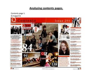
Analysing contents pages
- 1. Analysing contents pages. Contents page 1. Q magazine
- 2. This is the contents page of the music magazine Q. Q usually do double page contents pages, like this one…this is good as you can fit more on to the page without it looking to crammed. The magazine has most of the typical conventions: -The heading ‘ Contents’ and also the title of the magazine next to it. It has the main images big in the middle of the page. This makes the contents page look much better, this isn't too much writing which would make it look less interesting. The main images are usually linked too the main features in the magazine. The page numbers are on the pictures, this is another convention which will tell the audience where they can find the article about the person in the magazine. Doing this also helps reduce the amount of writing making the magazine more aesthetically pleasing to the audience. There are subheadings such as ‘exclusive’ listing the different articles and features the audience can find inside the magazine. Also with page numbers so that they know where they are. The writing is laid out in columns making the page look tidy and organised. Page numbers at the bottom of each page. Q Magazine There is an editors note on the first page of the contents page. It is before all of the subheadings. This is another typical convention usually found on contents pages. The editor of the magazine will usually quickly talk about thing the audience can find in that issue of the magazine or any quick and important news they want to share with the audience. There are other smaller images around the page other than the main images. These usually also link to people that will be featured in this issue of the magazine but are not the main feature. They also will have page numbers on the image. The contents page usually follows the same house style than the rest of the magazine. In this case this is what they have done. The colour scheme for Q is red white and black…they use these colours on the contents page,front cover and any other pages. They also use the same fonts throughout so that the magazine looks organised and matches.
- 3. Magazine 2 – billboard.
- 4. This contents page is from the music magazine Billboard. It also follows the typical conventions of a magazine. There is a central image in the middle of the page. Usually the central image is linked to the main feature in that issue of the magazine. There are smaller images on the page as well as the main image, these also link to artists or anyone that is going to be in that issue of the magazine. The images also have page numbers in the corner of them. This is a typical contents page convention and is used to tell people what page the article about that person will be. Having images to tell people what is going to be in the magazine makes it look much better and more interesting than if it was just text. There is the main title ‘contents’ at the top of the page in bold letters. Most magazines will have the title big and bold so it stands out on the page, like this magazine for example. After the main title there are subheadings, which put the articles in the magazine in to categories. In this magazine there are ‘UPFRONT’ , ‘FEATURE’ and ‘MUSIC’ for example. Underneath the subheadings on the page, the articles that are in the magazine are listed, along with page numbers, this is used so that it is easy for the audience to find articles that they want. The title of the magazine is usually mentioned somewhere on the contents page. Billboard The house style for any magazine is when the pages use the same colours and texts throughout the magazine. In billboard the colours in the house style are usually red ,yellow, blue, black and white. In this case the contents page follows the same house style as the front cover and the rest of the magazine. This makes the magazine look much neater and everything matches. Subscription and contact information is normally mentioned somewhere on the page. This gives the readers any information they need to get in contact with the magazine or anything else. In this magazine they have put the information at the bottom of the page along with information the audience might need for upcoming events. This contents page provides all of the information the audience might need.
- 5. Magazine 3 - Q
- 6. This contents page is from the music magazine Q. It also uses most of the contents page conventions to insure their contents page looks good and also has all of the information the reader might need. There is a central image on the contents page. This image is usually quite large and eye catching. It also is usually linked with the main feature artist in this issue. At the top of the page is the title ‘Q Contents’ this is another typical contents page convention. Sometimes the title will only be ‘Contents’ and the title of the magazine will be mentioned somewhere else on the page but Q have put them together. Around the edge of the pages the articles are listed underneath subheadings which split them into different categories, for example ‘ features’. This makes the articles easy for the audience to find. Q magazine This is a double page contents page, this means there is plenty of room for all of the information that there needs to be and also there is lots of room for images to make the page look better and less boring. In this case they have placed lots of smaller images, also in the middle of the page near the main image. These smaller images also link with people that are going to be featured in this issue of the magazine. Next to the articles name listed underneath the subheadings will the number of the page it will be on. This also makes it easier for the audience to find without having to look through the entire magazine if they just want to see one specific article. There will usually be page numbers on the edge of the images, this shows the audience where they will be able to find the article about that artist in the magazine, or if there isnt a whole article on them, where they can find any news on the aritst. The house style for Q is usually red white and black. They follow this colour scheme throughout their magazine using it on the front cover, contents page and sometimes the double page depending on the artist etc. The house style usually means that the same fonts will be used throughout the magazine. This makes the magazine look much neater and aesthetically pleasing.