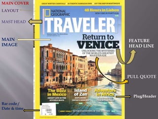
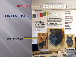
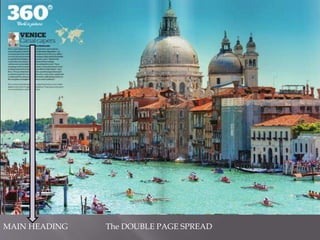
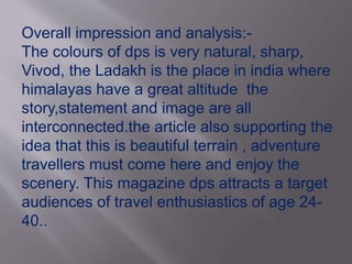
COVER PAGE,CONTENT PAGE 
& 
DOUBLE PAGE SPREAD
 Women magazines 
 Mens magazines 
 Travel magazines 
 Fashion magazines 
 Car magazine 
 Motorcycle magazine 
 Fishing magazine 
 Sports magazines 
 Food magazines
The Genre,s i have choosen for my magazine analysis are 
TRAVEL 
GAMING 
BIKES
First of all the travel 
magazines 
NATIONAL 
GEOGRAPHIC TRAVELER 
LONELY PLANET 
TRAVELER
MAIN COVER 
LAYOUT 
MAST HEAD 
MAIN 
IMAGE 
FEATURE 
HEAD LINE 
PULL QUOTE 
Plug/Header 
Bar code / 
Date & time
Description of cover 
LAYOUT : 
The margin of the magazine it is in nat geo logo shape in light 
yellow colour and the context written inside it is easily readable 
MAIN IMAGE: 
The main image of cover is of venice(city of italy) evening scene . The image 
Showing one of the canal of venice ,boats,old european structure buildings,A 
Dome shape temple in the back,and a clear blue sky. This main image is 
Clearly giving a proper scene of venice in evening. It can attract many tourists 
To choose venice as their travel destination. 
MAST HEAD: 
It uses the national geographic logo and traveller to show that it is national 
Geographic travell magazine . It is easily recognizable magazine internationally 
The font in which traveller is written is sans serif , clear , bold and formal .
Feature head line: 
“Return to venice “ is a feature head line in cover . The heading is written above 
buildings and infront of skyin clear black and Bold serif Font. So that any one 
Can easily easily understand that magazine is primiraly more focused on Venice 
Rather than any other topics in magazine like mexico,island of zen,adventure in 
Africa. 
Pull quote: 
“UNLOCKING THE MYSTERIES ....“ 
It give us a clear idea about what the magazine inside have . In easy words mysteries 
And secrets of venice... 
Plug headers: 
Small headings to draw some extra attention to audience. For ex in this cover .” 
Buzz in mexico” “adventure in africa “....
Bar code/ time and date: 
A common convection in all magazines need in order to purchase magazine. 
4.99$ price is not too much everyone can easily buy it specially the middle 
Class and high class audience. 
OVER ALL IMPRESSION OF COVER PAGE: 
THIS IS A TRAVEL MAGAZINE . IT IS PRIMIRALY MORE FOCUSED ON 
LIFESTYLE,CULTURE,TRAVELLING,FOOD, NATURE ETC. IT ATTRACTS A 
TARGET AUDIENCE OF 24-60 YEAR OLD AGES.
HEADING 
CONTENT PAGE 
SUB -IMAGES
Description of content page: 
Heading:- The content heading is written in bold white colour 
over a light dim brown colour which make it formal at the top of the 
page. 
SUB-IMAGES:-There is only few colourfull flages and some 
sketches (pictures) are used in content page this tells about the article 
inside it . The main image used a simple black tiger face sketch. Each 
image show a sketch of a deer, tiger and rhina face placed in a house. 
Colour Scheme:- It is very simple, it uses only 2-3 ;light dim 
colours for example white,yellow ,brown,and touch of black. It is the 
best idea to represent content page.
Layout:- The Layout is very simple easily readable and understandable 
And splited into 3 sectors. Main topics,content department, Routine topics 
and sub-images. Apart from the main topics the minor topics are listed in a 
section called “DEPARTMENTS”.. 
NOW WE TALK ABOUT THE DOUBLE SPREAD OF NATIONAL 
GEOGRAPHIC TRAVELLER MAGAZINE .........
MAIN HEADING The DOUBLE PAGE SPREAD
Description of double page spread:- 
Main Heading:- “Venice canal capers “ It describe about venice 
canal capers. The language used is informal,small to attract all young and old 
ages audience. 
COLOUR SCHEME:- the colour scheme is very bright . Sky blue, light blue, 
white and dim light brown. It looks almost natural. 
The image now giving a clear indication what is the heading on main cover 
printed. The image is in landscape mood . It shows life style of venice , the 
canal capers, buildings,and the dome shape temple in the cover is now can 
clearly and easily seen in a full landscape mode.The main focus in this image 
is venice canal capers(main mean of transport in venice) and canal. The 
picture will definately attract as much as travelling oriented people also 
holiday spenders because of the extreme beauty of venice is shown in image.
Travel magazine 
(2) 
Name of 
magzine: 
Lonely planet 
Layout 
Mast Head 
MAIN IMAGE 
FEATURE HEAD 
LINE 
PULL QUOTE 
PLUG HEADER
LAYOUT: layout is dark blue with Articles of magazines printed 
on it with “discover the magazine “ statement. Lonely planet 
Logo is also present on the top of lay out. 
MAIN IMAGE :- Main image is of the great wall of china but 
magazine is of UAE Special edition and using the image of great 
wall of china what makes the sense ? It tells the audience that 
magazine main article is on CHINA also the main plug header 
supporting it by “CHINA PERFECT TRIP” 
MAST HEAD:-the mast head consists of BOLD san serif fonts (as 
like nat geo traveller ) with lonely planet logo and edition date 
and country. 
PLUG-HEADERS :- the plug headers are very unique and simple 
Each plug header had its own importance for ex david 
attenborough famous and favourite travel destinations.
overall the cover is simple as like nat geo 
traveller . It is also showing the Locally uae 
produced stamp and the 6 free mini guides 
It will attract more audience than nat geo 
traveller magazine because of its vast 
features and free guides.
Content page
LAYOUT:The layout is very simple it is in 
plain white colour and lonely planet logo 
printed on it with edition date. 
SUB IMAGES:- the sub images are of beautiful 
landscapes and a inside view of a palace they 
surely attract more than enough audience bcz 
in nat geo traveller there is no images like these 
this is the best idea to post landscape images 
on a travell magazine to attract as much 
audience as the author can.combition of beach, 
island,mountain with snow, park scene and a 
palace scene is just perfect.
Headings:- in the content page there are 
many headings like post cards,our planet,5 
easy trips, arm chair traveller,etc. 
COLOUR SCHEME:- the colour scheme 
except the sub images is totally white which 
is good and use of dark colours for fonts is 
also a realiable idea .
DOUBLE PAGE SPREAD
MAIN HEADING :” ON THIN ICE” this 
statement clearly giving a meaning that article 
is about a place where ice is thin or just few 
Centimeter above ground level. If we see 
clearly the main image of double page spread 
clearly indicating the place LADAKH (india) 
and supporting the statement “on thin ice” 
Colour scheme:- The colour scheme is white, 
brown and light black (water in lake) the 
colour scheme is consists oftotally natural 
colours and sunlight.
Overall impression and analysis:- 
The colours of dps is very natural, sharp, 
Vivod, the Ladakh is the place in india where 
himalayas have a great altitude the 
story,statement and image are all 
interconnected.the article also supporting the 
idea that this is beautiful terrain , adventure 
travellers must come here and enjoy the 
scenery. This magazine dps attracts a target 
audiences of travel enthusiastics of age 24- 
40..

Magzine analysis

  • 1.
    COVER PAGE,CONTENT PAGE & DOUBLE PAGE SPREAD
  • 2.
     Women magazines  Mens magazines  Travel magazines  Fashion magazines  Car magazine  Motorcycle magazine  Fishing magazine  Sports magazines  Food magazines
  • 3.
    The Genre,s ihave choosen for my magazine analysis are TRAVEL GAMING BIKES
  • 4.
    First of allthe travel magazines NATIONAL GEOGRAPHIC TRAVELER LONELY PLANET TRAVELER
  • 5.
    MAIN COVER LAYOUT MAST HEAD MAIN IMAGE FEATURE HEAD LINE PULL QUOTE Plug/Header Bar code / Date & time
  • 6.
    Description of cover LAYOUT : The margin of the magazine it is in nat geo logo shape in light yellow colour and the context written inside it is easily readable MAIN IMAGE: The main image of cover is of venice(city of italy) evening scene . The image Showing one of the canal of venice ,boats,old european structure buildings,A Dome shape temple in the back,and a clear blue sky. This main image is Clearly giving a proper scene of venice in evening. It can attract many tourists To choose venice as their travel destination. MAST HEAD: It uses the national geographic logo and traveller to show that it is national Geographic travell magazine . It is easily recognizable magazine internationally The font in which traveller is written is sans serif , clear , bold and formal .
  • 7.
    Feature head line: “Return to venice “ is a feature head line in cover . The heading is written above buildings and infront of skyin clear black and Bold serif Font. So that any one Can easily easily understand that magazine is primiraly more focused on Venice Rather than any other topics in magazine like mexico,island of zen,adventure in Africa. Pull quote: “UNLOCKING THE MYSTERIES ....“ It give us a clear idea about what the magazine inside have . In easy words mysteries And secrets of venice... Plug headers: Small headings to draw some extra attention to audience. For ex in this cover .” Buzz in mexico” “adventure in africa “....
  • 8.
    Bar code/ timeand date: A common convection in all magazines need in order to purchase magazine. 4.99$ price is not too much everyone can easily buy it specially the middle Class and high class audience. OVER ALL IMPRESSION OF COVER PAGE: THIS IS A TRAVEL MAGAZINE . IT IS PRIMIRALY MORE FOCUSED ON LIFESTYLE,CULTURE,TRAVELLING,FOOD, NATURE ETC. IT ATTRACTS A TARGET AUDIENCE OF 24-60 YEAR OLD AGES.
  • 9.
  • 10.
    Description of contentpage: Heading:- The content heading is written in bold white colour over a light dim brown colour which make it formal at the top of the page. SUB-IMAGES:-There is only few colourfull flages and some sketches (pictures) are used in content page this tells about the article inside it . The main image used a simple black tiger face sketch. Each image show a sketch of a deer, tiger and rhina face placed in a house. Colour Scheme:- It is very simple, it uses only 2-3 ;light dim colours for example white,yellow ,brown,and touch of black. It is the best idea to represent content page.
  • 11.
    Layout:- The Layoutis very simple easily readable and understandable And splited into 3 sectors. Main topics,content department, Routine topics and sub-images. Apart from the main topics the minor topics are listed in a section called “DEPARTMENTS”.. NOW WE TALK ABOUT THE DOUBLE SPREAD OF NATIONAL GEOGRAPHIC TRAVELLER MAGAZINE .........
  • 12.
    MAIN HEADING TheDOUBLE PAGE SPREAD
  • 13.
    Description of doublepage spread:- Main Heading:- “Venice canal capers “ It describe about venice canal capers. The language used is informal,small to attract all young and old ages audience. COLOUR SCHEME:- the colour scheme is very bright . Sky blue, light blue, white and dim light brown. It looks almost natural. The image now giving a clear indication what is the heading on main cover printed. The image is in landscape mood . It shows life style of venice , the canal capers, buildings,and the dome shape temple in the cover is now can clearly and easily seen in a full landscape mode.The main focus in this image is venice canal capers(main mean of transport in venice) and canal. The picture will definately attract as much as travelling oriented people also holiday spenders because of the extreme beauty of venice is shown in image.
  • 14.
    Travel magazine (2) Name of magzine: Lonely planet Layout Mast Head MAIN IMAGE FEATURE HEAD LINE PULL QUOTE PLUG HEADER
  • 15.
    LAYOUT: layout isdark blue with Articles of magazines printed on it with “discover the magazine “ statement. Lonely planet Logo is also present on the top of lay out. MAIN IMAGE :- Main image is of the great wall of china but magazine is of UAE Special edition and using the image of great wall of china what makes the sense ? It tells the audience that magazine main article is on CHINA also the main plug header supporting it by “CHINA PERFECT TRIP” MAST HEAD:-the mast head consists of BOLD san serif fonts (as like nat geo traveller ) with lonely planet logo and edition date and country. PLUG-HEADERS :- the plug headers are very unique and simple Each plug header had its own importance for ex david attenborough famous and favourite travel destinations.
  • 16.
    overall the coveris simple as like nat geo traveller . It is also showing the Locally uae produced stamp and the 6 free mini guides It will attract more audience than nat geo traveller magazine because of its vast features and free guides.
  • 17.
  • 18.
    LAYOUT:The layout isvery simple it is in plain white colour and lonely planet logo printed on it with edition date. SUB IMAGES:- the sub images are of beautiful landscapes and a inside view of a palace they surely attract more than enough audience bcz in nat geo traveller there is no images like these this is the best idea to post landscape images on a travell magazine to attract as much audience as the author can.combition of beach, island,mountain with snow, park scene and a palace scene is just perfect.
  • 19.
    Headings:- in thecontent page there are many headings like post cards,our planet,5 easy trips, arm chair traveller,etc. COLOUR SCHEME:- the colour scheme except the sub images is totally white which is good and use of dark colours for fonts is also a realiable idea .
  • 21.
  • 22.
    MAIN HEADING :”ON THIN ICE” this statement clearly giving a meaning that article is about a place where ice is thin or just few Centimeter above ground level. If we see clearly the main image of double page spread clearly indicating the place LADAKH (india) and supporting the statement “on thin ice” Colour scheme:- The colour scheme is white, brown and light black (water in lake) the colour scheme is consists oftotally natural colours and sunlight.
  • 23.
    Overall impression andanalysis:- The colours of dps is very natural, sharp, Vivod, the Ladakh is the place in india where himalayas have a great altitude the story,statement and image are all interconnected.the article also supporting the idea that this is beautiful terrain , adventure travellers must come here and enjoy the scenery. This magazine dps attracts a target audiences of travel enthusiastics of age 24- 40..