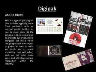
The document discusses the design of various materials to promote an indie artist, including a digipak, magazine advertisement, and their analysis. It examines examples from other artists and incorporates conventions of the indie genre. The final designs chosen for the digipak and magazine ad utilize consistent imagery, fonts, and colors to create recognition and brand identity while maintaining an indie aesthetic focused on the music over the individual artist.
My evaluation question 2, talking about how my my digipak and poster fit the conventions of something or other. Basically done it so that I can complete the A-level and hopefully get something out of my life which probably won't happen as I have no idea of what I am doing but hey, lets live in the moment and not worry about the future until you're there. Then you can break down and cry as you still haven't figured out what you're doing!
Here is a word document on the second evaluation point which focuses on the brand and identity of my media products, as well as how I have shown the genre.
SEO as the Backbone of Digital MarketingFelipe Bazon
In this talk Felipe Bazon will share how him and his team at Hedgehog Digital share our journey of making C-Levels alike, specially CMOS realize that SEO is the backbone of digital marketing by showing how SEO can contribute to brand awareness, reputation and authority and above all how to use SEO to create more robust global marketing strategies.
The What, Why & How of 3D and AR in Digital CommercePushON Ltd
Vladimir Mulhem has over 20 years of experience in commercialising cutting edge creative technology across construction, marketing and retail.
Previously the founder and Tech and Innovation Director of Creative Content Works working with the likes of Next, John Lewis and JD Sport, he now helps retailers, brands and agencies solve challenges of applying the emerging technologies 3D, AR, VR and Gen AI to real-world problems.
In this webinar, Vladimir will be covering the following topics:
Applications of 3D and AR in Digital Commerce,
Benefits of 3D and AR,
Tools to create, manage and publish 3D and AR in Digital Commerce.
janani Digital Marketer|Digital Marketing consultant|Marketing Promotion|Coim...janudm24
Myself Janani Digital marketing consultant located in coimbatore I offer all kinds of digital marketing services for your business requirements such as SEO SMO SMM SMO CAMPAIGNS content writing web design for all your business needs with affordable cost
Digital Marketing Services | Techvolt Software :
Digital Marketing is a latest method of Marketing techniques widely used across the Globe. Digital Marketing is an online marketing technique and methods used for all products and services through Search Engine and Social media advertisements. Previously the marketing techniques were used without using the internet via direct and indirect marketing strategies such as advertising through Telemarketing,Newspapers,Televisions,Posters etc.
List of Services offered in Digital Marketing |Techvolt Software :
Techvolt Software offers best Digital Marketing services for promoting your products and services through online platform on the below methods of Digital marketing
1. Search Engine Optimization (SEO)
2. Search Engine Marketing (SEM)
3. Social Media Optimization (SMO)
4. Social Media Marketing (SMM)
5. Campaigns
Importance | Need of Digital Marketing (Online Promotions) :
1. Quick Promotions through Online
2. Generation of More leads and Business Enquiries via Search Engine and Social Media Platform
3. Latest Technology development vs Business promotions
4. Creation of Social Branding
5. Promotion with less investment
Benefits Digital Marketing Services at Techvolt software :
1. Services offered with Affordable cost
2. Free Content writing
3. Free Dynamic Website design*
4. Best combo offers on website Hosting,design along with digital marketing services
5. Assured Lead Generation through Search Engine and Social Media
6. Online Maintenance Support
Free Website + Digital Marketing Services
Techvolt Software offers Free website design for all customer and clients who is availing the digital marketing services for a minimum period of 6 months.
With Regards
Janani Digital Marketer
Coimbatore,Tamilnadu.
Come learn how YOU can Animate and Illuminate the World with Generative AI's Explosive Power. Come sit in the driver's seat and learn to harness this great technology.
Elevate your trade show game with our comprehensive guide on creating an interactive booth that captures attention and drives engagement! In this presentation, Blue Atlas Marketing shares practical tips and creative strategies to transform your trade show presence. Learn how to use digital displays, interactive demos, and engaging activities to attract visitors and make lasting impressions. Whether you're a trade show veteran or a newcomer, these insights will help you stand out from the crowd and maximize your event success. Dive into our slides to discover how to turn your booth into a dynamic and interactive experience!
In today's digital world, customers are just a click away. "Grow Your Business Online: Introduction to Digital Marketing" dives into the exciting world of digital marketing, equipping you with the tools and strategies to reach new audiences, expand your reach, and ultimately grow your business.
website = https://digitaldiscovery.institute/
address = C 210 A Industrial Area, Phase 8B, Sahibzada Ajit Singh Nagar, Punjab 140308
Mastering Dynamic Web Designing A Comprehensive Guide.pdfIbrandizer
Dynamic Web Designing involves creating interactive and adaptable web pages that respond to user input and change dynamically, enhancing user experience with real-time data, animations, and personalized content tailored to individual preferences.
What’s “In” and “Out” for ABM in 2024: Plays That Help You Grow and Ones to L...Demandbase
Delve into essential ABM ‘plays' that propel success while identifying and leaving behind tactics that no longer yield results. Led by ABM Experts, Jon Barcellos, Head of Solutions at Postal and Tom Keefe, Principal GTM Expert at Demandbase.
Monthly Social Media News Update May 2024Andy Lambert
TL;DR. These are the three themes that stood out to us over the course of last month.
1️⃣ Social media is becoming increasingly significant for brand discovery. Marketers are now understanding the impact of social and budgets are shifting accordingly.
2️⃣ Instagram’s new algorithm and latest guidance will help us maintain organic growth. Instagram continues to evolve, but Reels remains the most crucial tool for growth.
3️⃣ Collaboration will help us unlock growth. Who we work with will define how fast we grow. Meta continues to evolve their Creator Marketplace and now TikTok are beginning to push ‘collabs’ more too.
Trust Element Assessment: How Your Online Presence Affects Outbound Lead Gene...Martal Group
Learn how your business's online presence affects outbound lead generation and what you can do to improve it with a complimentary 13-Point Trust Element Assessment.
First Things First: Building and Effective Marketing Strategy
Too many companies (and marketers) jump straight into activation planning without formalizing a marketing strategy. It may seem tedious, but analyzing the mindset of your targeted audiences and identifying the messaging points most likely to resonate with them is time well spent. That process is also a great opportunity for marketers to collaborate with sales leaders and account managers on a galvanized go-to-market approach. I’ll walk you through the methods and tools we use with our clients to ensure campaign success.
Key Takeaways:
-Recognize the critical role of strategy in marketing
-Learn our approach for building an actionable, effective marketing strategy
-Receive templates and guides for developing a marketing strategy
The Secret to Engaging Modern Consumers: Journey Mapping and Personalization
In today's digital landscape, understanding the customer's journey and delivering personalized experiences are paramount. This masterclass delves into the art of consumer journey mapping, a powerful technique that visualizes the entire customer experience across touchpoints. Attendees will learn how to create detailed journey maps, identify pain points, and uncover opportunities for optimization. The presentation also explores personalization strategies that leverage data and technology to tailor content, products, and experiences to individual customers. From real-time personalization to predictive analytics, attendees will gain insights into cutting-edge approaches that drive engagement and loyalty.
Key Takeaways:
Current consumer landscape; Steps to mapping an effective consumer journey; Understanding the value of personalization; Integrating mapping and personalization for success; Brands that are getting It right!; Best Practices; Future Trends
It's another new era of digital and marketers are faced with making big bets on their digital strategy. If you are looking at modernizing your tech stack to support your digital evolution, there are a few can't miss (often overlooked) areas that should be part of every conversation. We'll cover setting your vision, avoiding siloes, adding a democratized approach to data strategy, localization, creating critical governance requirements and more. Attendees will walk away with actions they can take into initiatives they are running today and consider for the future.
Gokila digital marketing| consultant| Coimbatoredmgokila
Myself Gokila digital marketing consultant located in Coimbatore other various types of digital marketing services such as SEM
SEO SMO SMM CAMPAIGNS content writing web design for all your business needs with affordable cost
Digital Marketing Services | Techvolt Software :
Digital Marketing is a latest method of Marketing techniques widely used across the Globe. Digital Marketing is an online marketing technique and methods used for all products and services through Search Engine and Social media advertisements. Previously the marketing techniques were used without using the internet via direct and indirect marketing strategies such as advertising through Telemarketing,Newspapers,Televisions,Posters etc.
List of Services offered in Digital Marketing |Techvolt Software :
Techvolt Software offers best Digital Marketing services for promoting your products and services through online platform on the below methods of Digital marketing
1. Search Engine Optimization (SEO)
2. Search Engine Marketing (SEM)
3. Social Media Optimization (SMO)
4. Social Media Marketing (SMM)
5. Campaigns
Importance | Need of Digital Marketing (Online Promotions) :
1. Quick Promotions through Online
2. Generation of More leads and Business Enquiries via Search Engine and Social Media Platform
3. Latest Technology development vs Business promotions
4. Creation of Social Branding
5. Promotion with less investment
Benefits Digital Marketing Services at Techvolt software :
1. Services offered with Affordable cost
2. Free Content writing
3. Free Dynamic Website design*
4. Best combo offers on website Hosting,design along with digital marketing services
5. Assured Lead Generation through Search Engine and Social Media
6. Online Maintenance Support
Free Website + Digital Marketing Services
Techvolt Software offers Free website design for all customer and clients who is availing the digital marketing services for a minimum period of 6 months.
With Regards
Gokila digital marketer
Coimbatore
[Google March 2024 Update] How To Thrive: Content, Link Building & SEOSearch Engine Journal
March 2024 disrupted the SEO industry. Websites were deindexed, and manual penalties were delivered—all to produce more helpful, more trustworthy search results.
How did your website fare?
Watch us as we delve into the seismic shifts brought about by Google's March 2024 updates and explore strategies to not just survive, but thrive in this dynamic digital landscape.
You’ll learn:
- How to create content that is valuable to users (not just search engines) using E-E-A-T.
- How to build links that can boost rankings and withstand algorithm updates.
- Best practices for content creation and link building so you can thrive during algorithm updates.
With Vince Ramos, we'll examine the implications of the latest algorithm changes on content creation, link building, and SEO practices, and offer actionable insights from businesses like yours that have remained steadfast amidst the volatility.
Using real-life case studies, we’ll also show you the effectiveness of manual link building techniques and person-first content strategies.
Whether you're a seasoned SEO professional, a budding content creator, or anyone in between, this webinar will help you weather the changes in Google's algorithms and capitalize on them for sustained success.
Check out this webinar and unlock the secrets to thriving in the new Google era.
2. Digipak
What is a digipak?
This is a type of packing for
CD’s or DVD’s, typically made
from cardboard with an
internal plastic holder for
one or more discs. As the
aim goal is to create our own
to promote our artists album
alongside the music video,
I’m going to look at examples
to gather an idea on what
we should aim to create;
something that will reflect
back on the indie music
genre and will allow us more
recognition within the
industry.
3. Indie Digipak Analysis: Lana Del Rey
This digipak for Lana Del Rey is both
focusing on the indie genre and the
pop genre. This is a key example to
focus on due to our artist being
indie/rock. While it moves away from
the typical mainstream ideas within
the music industry, it still adheres to
it in a way of focusing on the ‘pop’
side of music.
The cover is bold due to the chosen colours, the background being a simple blue due to the sky and the artist wearing a white top, allowing
her to stand out brightly compared to the blue. This has proved affective as with the text, it has used the same blue and white colours, but
in contrast of the other colours (e.g. blue on white & white on blue); this has proved effective with allowing the cover to have an overall
calm and smooth appearance; this can be seen to link in with the indie style due to how calm and ‘mellow’ that style of music can be
portrayed to be. The clothes the artist is wearing can be seen to be more mainstream, allowing the cover to stand out more to the
mainstream audience as something relatable that a woman with similar style would wear. The back of the cover is plain and focuses simply
on the track list, in the same font, showing a repetitive style which helps the whole didpak’s design to work and stand out. The disc itself is
plain white but has images of roses on it; they can be said to be the same colour as the artists lipstick, once again focusing on minor details
to allow the whole image and design to work in a creative but simplistic way. The idea of using roses can be seen to link in with the CD’s title
being ‘Born to Die’; showing the idea that the flowers may link in to the theme of death or focusing on the romanticism that the artist
portrays, the roses symbolising love and lust (due to the red) standing out against the white (symbolising virginity). The symbolism of
flowers can be seen to be a typical indie genre trait due to focusing on objects and meanings rather than the artist themselves.
4. Indie Digipak Analysis: Arctic Monkeys
The digipak for the Arctic
Monkeys typically adheres to the
stereotype of the indie genre with
dismissing mainstream views. The
font used for the artists name is
used in a unique way, allowing it
to be clear of the original style
that the artist is adapting for
themselves.
The front of the digipak shows all of the band rather than just the ‘frontman’ which most
artists tend to do, the photo has a purple tint to it, something which could be described to
be aesthetically pleasing for the indie genre due to the big influence of social media sites
such as Tumblr, where this sort of imagery is greatly appreciated; this proves to be efficient
as it will eye catching for the artists target audience. The dull colouring effect is more
typical of the indie genre as most mainstream artists focus on using bright eye catching
colours to attract their target audience.
5. Digipak Design 1
For this design we chose a piece of artwork on the front cover instead of a picture
of our artist as this has proven to be an effective technique, as shown by The
Killers. Although I haven't chosen to use a picture of our artist, I have kept the
picture relevant as the imagery of a woman crying reoccurs within our music
video, as well as it reinforcing the theme of heartbreak. Black, white and light
pinks seemed to be the most fitting for this particular design as they give the
cover a sense of ‘softness’; which again reinforces the idea of a vulnerability that
comes with the lyrics of the song on the album.
6. Digipak Design 2
The second design is a complete contrast to the first with focusing on the idea of using a photo shoot that
links in with the artist and an advertisement for future work for the artist. I chose to adhere to the indie
convention of using dark colours (predominantly black and white) and this has proved effective with linking
back to our video which is also in black and white’ allowing a common theme to be repeated and become
memorable to the audience with looking at consistency. We decided to focus on using album art rather
than an image of our artist as we will be able to incorporate this with the magazine advert as well. I was
able to create an individualistic font for the bands name, which again will be consistent over all works to
do with the artist. “Poltergeist” has a different font to “Transparence” and although this isn't consistent as
a result, I believe it works well as the font for the song title is more fitting.
7. Final Design
In the end, after weighing out certain pro’s and con’s, we decided to go with the second
design due to the fact we believe it is best fitting to promote and portray our artist
‘Transparence’.
Our research into Digipak’s showed that there are codes and conventions to the indie
genre and artists that typically follows these conventions are successful within the genre.
A main feature of the indie genre however is to be individual and different, and I feel
that we have achieved this individuality whilst not completely deviating from the genre’s
norms and expectations from the audience.
If we were to change one thing, I feel that incorporating our artist onto the front cover of
our Digipak would be effective as this is what we have chosen for our magazine advert
and by doing so on our Digipak we would be creating a consistent image for our
audience.
9. Indie Magazine Advert Analysis 1
The artist’s name is plastered largely above her in a bold font, identical
to her digipak cover. This allows the audience to easily recognise the
continuous pattern the artist has set up for her marketing; this is a
positive aspect due to the fact of how easily it will gain the attention
of fans.
The photo used is the same as the digipak as well, however edited to
fit the magazine advert in an effect way; the use of using the same
image once again shows the repetition of the influence of the digipak.
Using the image of the artist allows it to be clear to fans and others
who she is straight away, allowing her to be easily recognised from
her album cover.
The colour is still simple with the use of blue and white to surround
the entire image, still focusing on a smooth, calm appeal to the
audience; thus holding onto the idea of an indie artist – nothing too
bright and eye catching, but still holding onto the key features of a pop
artist with the fact of focusing on the main image being of the artist.
However, the font used to display the information within the bottom
half of the advert is used with the same blue, but the font is in a
cursive style, allowing it to appear too faint against the white and hard
to read – this could prove to be a disadvantage for the artists
marketing.
10. Indie Magazine Advert Analysis 2
This artist has used the same font that they have used for their band logo, in
order to create the same sense of recognition within their fans that the other
artist has done. However, the font isn't as bold or predominant within the
poster, so this causes it to hold less focus within the advert.
Although, with a large focus of the advert being used to show the artist, once
again using the same image from their album, this allows her to stand out
thoroughly. This artist has taken a more conceptual way of showing her
album by wearing a necklace of sorts showing ‘lungs’ on her chest; the idea
of focusing on the title of the album in such a peculiar way, grabs the
attention of others – unused to mainstream artists carrying out a feature
such as this. With certain artists being quite famous within the industry due o
their style, just using their image of themselves and focusing less on the
artists name allows them to receive the recognition form fans that they know
they will attract. Certain artists are unable to do this due to the lack of
recognition they receive within the industry.
The albums name is located right under the imagery of the ‘lungs’, the use of
a larger, bolder font allows this to become eye catching . While the font is
white, which can be seen as a typical, dull colour, it allows both fonts to stand
out easily, due to the background of the image being surrounded with dark
and dull colours. This can be seen to incorporate the idea of ‘lungs’ being
‘gory’ and dark.
On this advert, they have also included, in a bold font, the multiple different
ways the album will be distributed. This is effective due to how different ways
fans may appreciate listening to music. For example, with vinyl's coming back
into style as a ‘vintage/retro’ trend, the idea of being able to purchase and
listen to this album on vinyl will be beneficial for fans and the artist.
11. Magazine Advert Design 1
In order to create synergy between the magazine advert design
and the digipak design we decided to use the same images and
font. This can be seen as effective due to seeing how other artists
have carried this out and had successful results; it will enable the
audience to recognise the imagery they will know from the
digipak.
With looking at other artists, we decided to give simple limited
information in a different font at the bottom of the advert,
however I believe the font is too simple and can be seen as
unprofessional in some ways.
We were inspired by Florence and The Machine with how they
decided to advertise how they would distribute their album and
decided this would be a wise move with releasing a new,
upcoming artist.
With not focusing on the artist herself, this can allow us create an
image for our artist, focusing on the indie context within the
music industry, not focusing on everything to be about looks. W
e hope this will be effective enough to help gather an audience
for our artist. I feel this is effective as it enables the audience to
recognise the image we’re trying to put out about our artist and
therefore hopefully gain an interest into it.
12. Magazine Advert Design 2
With our second design, we decided to focus on the chosen
digipak style. This would allow us to follow out in a similar way to
successful artist who repeated their imagery and style from their
digipak to create a sense of recognition and familiarity within
their audience; this allows the artist to create a style and
branding for themselves with using certain features such as same
font and images. This was done to ensure that we created
synergy.
We were able to create this design within Photoshop to try and
use different font styles and edit the photo-shoot from the
digipak into a different way that make it similar but more
intriguing for the audience. For example, with using Photoshop,
we were able to create an edit of smoke appearing to cover the
artists face.
We believe this is effective due to the fact that while we have
decided to show our artist on the poster, something not typically
focused on within indie artists magazine adverts, we have
changed it into a way where we have left a sense of mystery; we
were able to it in the theme of the album and the ingle
‘Poltergeist’ to the advert by creating a mysterious, supernatural
effect.
13. Final Magazine Advert Design
In the end, we decided to stay with the second design due to the fact of
how it was so similar to our digipak. By using this synergism within our
products, we’re creating a consistent and professional image for our artist
and for our audience to perceive. Our artist is also shown to be playing
the guitar which adheres to the indie genre conventions of the focus on
the music rather than the individual artist.
In white font at the bottom of the poster is the relevant details of the
album and its release, this is typical of an advert poster as this is the
primary purpose of the poster. With the font being white we have kept
our colour scheme consistent throughout the digipak, album and music
video, as well as emphasising the most relevant information to catch the
audience’s eye. With being inspired by other artists use of information,
the total display of the albums distribution is effective with ensuring the
success of an upcoming artists career within the music industry.
The idea of using the date July8th will prove to be effective due to the
artist being an advocate for LGBT, within being a lesbian herself, the idea
of the album, including a music video featuring a gay couple, being
released on the day of London Gay Pride can be seen as effective with
broadcasting their music to particular key audiences.
Overall, I believe we have made a relevant and effective magazine advert
poster for Transparence’s album and song “Poltergeist” due to the
consistency of colour schemes, adhering to several indie genres and
creating synergy between all products surrounding the band.