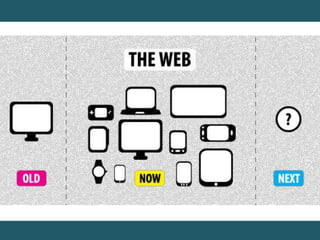
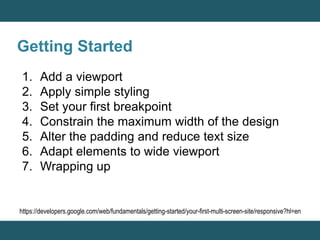
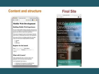
LAB#13 Responsive Web Design 
By Yaowaluck Promdee, Sumonta Kasemvilas 322432 Web Design Technology
What is “Responsive Web Design” ?
Getting Started 
1. Add a viewport 
2. Apply simple styling 
3. Set your first breakpoint 
4. Constrain the maximum width of the design 
5. Alter the padding and reduce text size 
6. Adapt elements to wide viewport 
7. Wrapping up 
https://developers.google.com/web/fundamentals/getting-started/your-first-multi-screen-site/responsive?hl=en
Content and structure Final Site
Add a viewport 
<meta name content="width=device-width, 
initial-scale=1"> 
Using the meta viewport value width=device-width instructs 
the page to match the screen’s width in device independent 
pixels. This allows the page to reflow content to match 
different screen sizes, whether rendered on a small mobile 
phone or a large desktop monitor.
Apply simple styling
Constrain the maximum width of the design
Adjusting Screen Resolution 
This shows the the most significant screen 
sizes, from the smallest to the largest.
Relative Fluid Layouts (%) 
Example 
http://learn.shayhowe.com/advanced-html-css/responsive-web-design
Set your first breakpoint
Meta Viewport
Apply media queries based on viewport size 
@media (query) { 
/* CSS Rules used when query matches */ 
} 
Example 
@media screen and (min-width: 800px) and (max-width: 
1200px) { .test { font-size: 14pt; } } 
http://www.designil.com/what-is-responsive-web-design-1.html
Media queries 
attribute Result 
min-width 
Rules applied for any browser width over the value defined in the 
query. 
max-width 
Rules applied for any browser width below the value defined in the 
query. 
min-height 
Rules applied for any browser height over the value defined in the 
query. 
max-height 
Rules applied for any browser height below the value defined in the 
query. 
orientation=portrait 
Rules applied for any browser where the height is greater than or 
equal to the width. 
orientation=landscape Rules for any browser where the width is greater than the height.
Assignment#13 
Create a Web page to present 
“Search Engine Optimization” 
from information provided using HTML5 and 
CSS can be Responsive on mobile screen 
In hours time
Q / A? 
Email:322432webdesign@gmail.com

Lab#13 responsive web

  • 1.
    LAB#13 Responsive WebDesign By Yaowaluck Promdee, Sumonta Kasemvilas 322432 Web Design Technology
  • 2.
    What is “ResponsiveWeb Design” ?
  • 4.
    Getting Started 1.Add a viewport 2. Apply simple styling 3. Set your first breakpoint 4. Constrain the maximum width of the design 5. Alter the padding and reduce text size 6. Adapt elements to wide viewport 7. Wrapping up https://developers.google.com/web/fundamentals/getting-started/your-first-multi-screen-site/responsive?hl=en
  • 5.
  • 6.
    Add a viewport <meta name content="width=device-width, initial-scale=1"> Using the meta viewport value width=device-width instructs the page to match the screen’s width in device independent pixels. This allows the page to reflow content to match different screen sizes, whether rendered on a small mobile phone or a large desktop monitor.
  • 7.
  • 8.
    Constrain the maximumwidth of the design
  • 9.
    Adjusting Screen Resolution This shows the the most significant screen sizes, from the smallest to the largest.
  • 10.
    Relative Fluid Layouts(%) Example http://learn.shayhowe.com/advanced-html-css/responsive-web-design
  • 11.
    Set your firstbreakpoint
  • 12.
  • 13.
    Apply media queriesbased on viewport size @media (query) { /* CSS Rules used when query matches */ } Example @media screen and (min-width: 800px) and (max-width: 1200px) { .test { font-size: 14pt; } } http://www.designil.com/what-is-responsive-web-design-1.html
  • 14.
    Media queries attributeResult min-width Rules applied for any browser width over the value defined in the query. max-width Rules applied for any browser width below the value defined in the query. min-height Rules applied for any browser height over the value defined in the query. max-height Rules applied for any browser height below the value defined in the query. orientation=portrait Rules applied for any browser where the height is greater than or equal to the width. orientation=landscape Rules for any browser where the width is greater than the height.
  • 15.
    Assignment#13 Create aWeb page to present “Search Engine Optimization” from information provided using HTML5 and CSS can be Responsive on mobile screen In hours time
  • 16.
    Q / A? Email:322432webdesign@gmail.com

Editor's Notes

  • #5 ออกแบบให้เรียบง่าย เริ่มที่หน้าจอเล็กสุดเสมอ กำหนดขนาดแบบ Relative Fluid Layouts (%) หา Breakpoints แล้วเขียน Media Queries กำหนด Meta Viewport เช็คกับ Device
  • #6 เริ่มที่หน้าจอเล็กสุดเสมอ Following the principles of Mobile First web development, we start with a narrow viewport — similar to a mobile phone — and build for that experience first. Then we scale up to larger device classes. We can do this by making our viewport wider and making a judgment call on whether the design and layout look right. Earlier we created a couple of different high-level designs for how our content should be displayed. Now we need make our page adapt to those different layouts. We do this by making a decision on where to place our breakpoints — a point where the layout and styles change — based on how the content fits the screen-size.
  • #7 Even for a basic page, you must always include a viewport meta tag. The viewport is the most critical component you need for building multi-device experiences. Without it, your site will not work well on a mobile device. The viewport indicates to the browser that the page needs to be scaled to fit the screen. There are many different configurations that you can specify for your viewport to control the display of the page. As a default, we recommend:
  • #14 @media screen and (กฏ 1) and (กฏ 2) and ... { /* CSS ที่ต้องการใส่ถ้าเครื่องตรงตามกฏด้านบน */ }