Download as PDF, PPTX


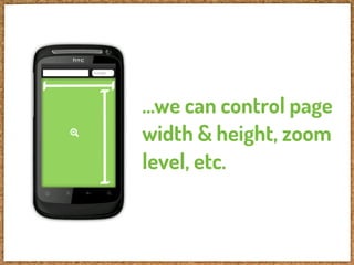


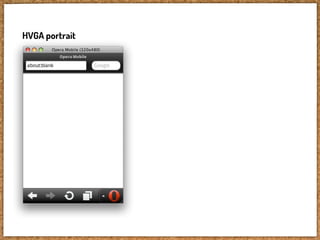

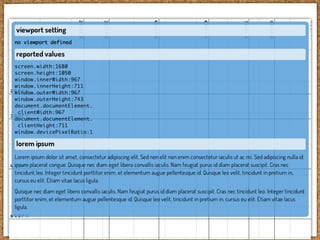
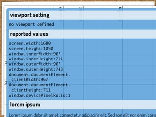
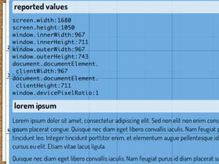
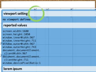

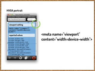
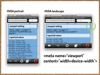
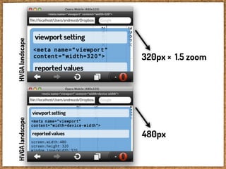
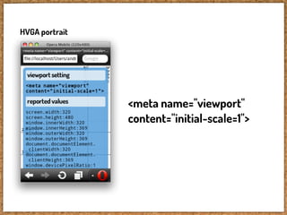

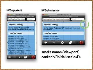
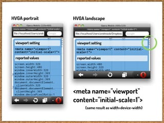
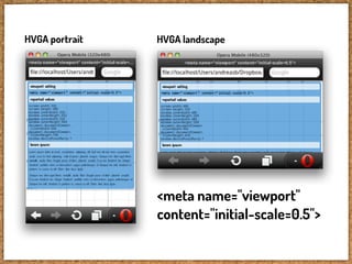
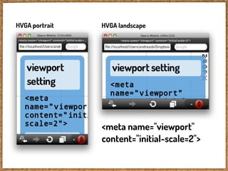


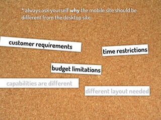
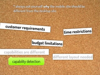
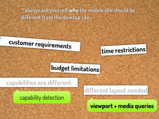


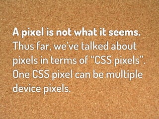
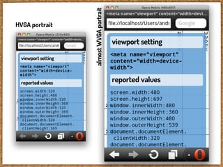
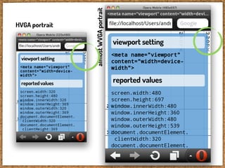
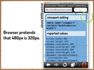


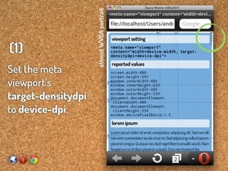
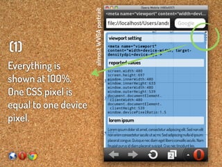
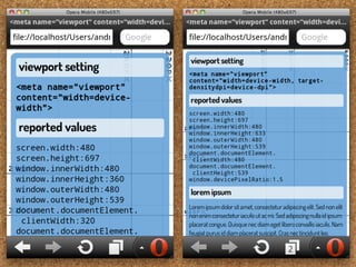
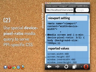


The document discusses responsive design techniques essential for optimizing websites for various screen sizes and devices. It emphasizes the importance of using viewport meta tags and media queries to ensure a coherent and functional user experience across platforms. Additionally, it addresses the challenges of high-resolution screens and provides best practices for creating adaptable content layouts.


![There Are No “Buts” in Progressive Enhancement [Øredev 2015]](https://cdn.slidesharecdn.com/ss_thumbnails/therearenobutsinprogressiveenhancementredev-151106102141-lva1-app6892-thumbnail.jpg?width=640&height=640&fit=bounds)


![Crafting Rich Experiences with Progressive Enhancement [Beyond Tellerrand 2011]](https://cdn.slidesharecdn.com/ss_thumbnails/craftingrichexperienceswithprogressiveenhancementbeyondtellerrand2011-111121152053-phpapp01-thumbnail.jpg?width=640&height=640&fit=bounds)