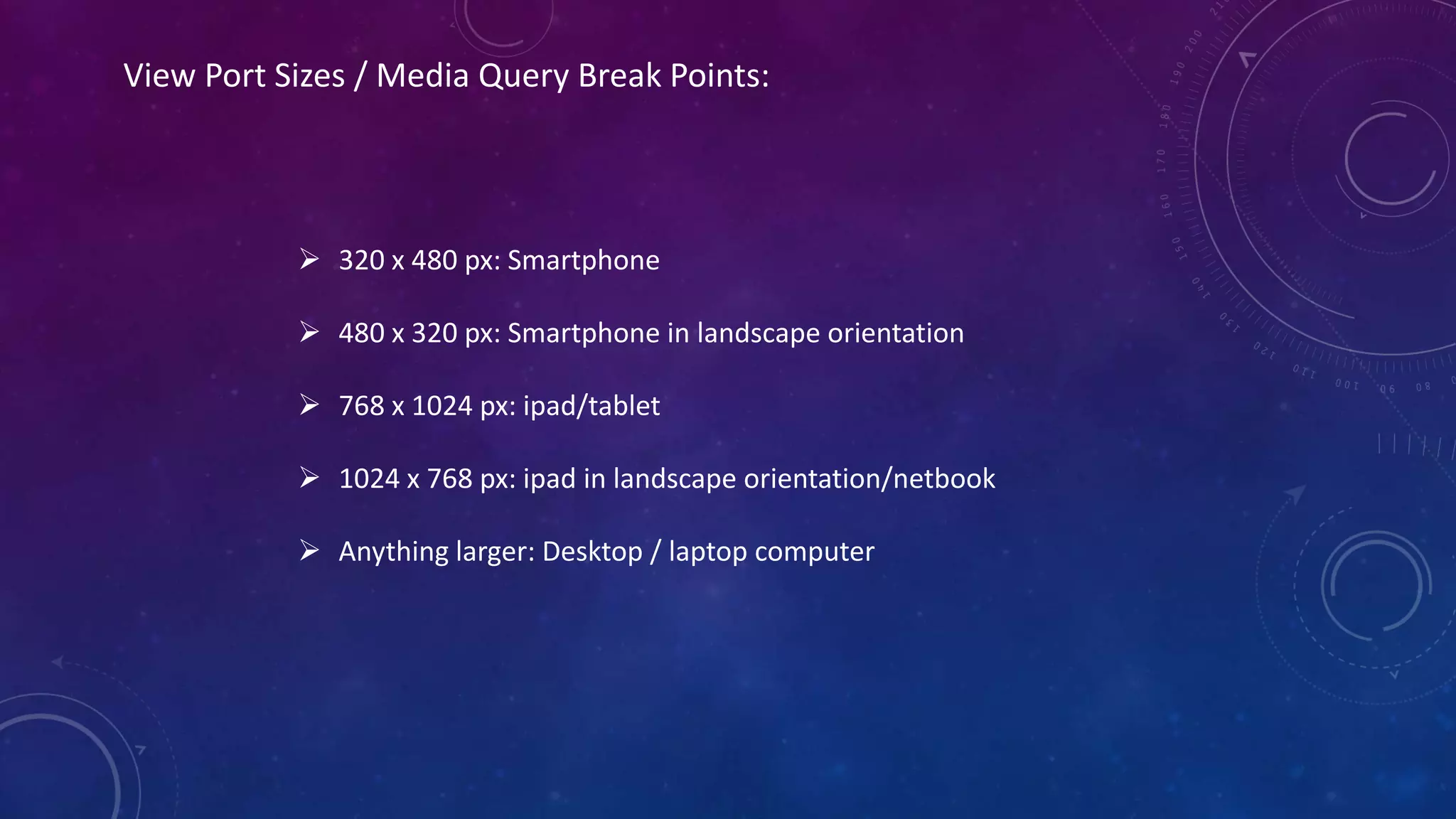
Responsive
Web
Design
What is Responsive Web Design?
RWD is a process of designing a single website to be used and
compatible on different portable or handy electronic devices with
different Screen size, platform and orientation.
Advantages:
 Flexible
 User Experience
 Cost Effective
 It is Recommended By Google
 Very Easy to manage
How RWD works?
 View Port
The viewport is the user's visible area of a web page.
<meta name="viewport" content="width=device-width, initial-scale=1.0">
It sets the browser's layout viewport, relative to which CSS declarations such as
width: 20% are calculated, to the device width.
 Media Queries
The @media rule is used to define different style rules for different media types/devices.
<link rel="stylesheet" href="this.css" media="(min-width: 960px)">
@media only screen and (max-width: 500px) {
.gridmenu {
width:100%;
}
}
View Port Sizes / Media Query Break Points:
 320 x 480 px: Smartphone
 480 x 320 px: Smartphone in landscape orientation
 768 x 1024 px: ipad/tablet
 1024 x 768 px: ipad in landscape orientation/netbook
 Anything larger: Desktop / laptop computer
Frameworks:
 Bootstrap
 Foundation
 960 grid
 Semantic UI
 Pure by Yahoo!
 W3.CSS
Bootstrap
Bootstrap is a free front-end framework (HTML and CSS) for faster and easier web development
In other words, bootstrap is a collection of CSS classes and JavaScript functions the you get ready to use
We will need to include three files:
• bootstrap.min.css
• bootstrap.min.js
<!-- Latest compiled and minified CSS -->
<link rel="stylesheet" href="https://maxcdn.bootstrapcdn.com/bootstrap/3.3.7/css/bootstrap.min.css"
integrity="sha384-BVYiiSIFeK1dGmJRAkycuHAHRg32OmUcww7on3RYdg4Va+PmSTsz/K68vbdEjh4u" crossorigin="anonymous">
<!-- Optional theme -->
<link rel="stylesheet" href="https://maxcdn.bootstrapcdn.com/bootstrap/3.3.7/css/bootstrap-theme.min.css"
integrity="sha384-rHyoN1iRsVXV4nD0JutlnGaslCJuC7uwjduW9SVrLvRYooPp2bWYgmgJQIXwl/Sp" crossorigin="anonymous">
<!-- Latest compiled and minified JavaScript -->
<script src="https://maxcdn.bootstrapcdn.com/bootstrap/3.3.7/js/bootstrap.min.js"
integrity="sha384-Tc5IQib027qvyjSMfHjOMaLkfuWVxZxUPnCJA7l2mCWNIpG9mGCD8wGNIcPD7Txa" crossorigin="anonymous"></script>
Grids
Bootstrap includes a responsive, mobile first fluid grid system that appropriately scales up to 12
columns as the device or viewport size increases. It includes predefined classes for easy layout
options, as well as powerful mixins for generating more semantic layouts.
In the bellow example, we divide the space inside the container in 1 row and this row in 3 columns
with the same side. 4+4+4 = 12
• You can use any combination that the sum be equal to 12.
<h2>Bootstrap Grid</h2>
<div class=“row”>
<div class=“col-sm-4”>Division 1</div>
<div class=“col-sm-4”>Division 2</div>
<div class=“col-sm-4”>Division 3</div>
</div>
Tables
4 main classes:
• .table
• .table-striped
• .table-bordered
• .table-hover
Classes:
• img-responsive
• img-rounded
• img-circle
• img-thumbnail
Images
5 contextual classes:
• .active
• .success
• .info
• .warning
• .danger
<img src="cinqueterre.jpg" class="img-rounded"
alt="Cinque Terre">
Alerts
• .alert-success • .alert-info • .alert-warning • .alert-dange
<div class=“alert alert-success”>
<strong>Success!</strong> Your message has been sent successfully.
</div>
Alerts are created with the .alert class, followed by one of the four contextual classes
Buttons
Buttons are created with the .btn class, followed by one of the below contextual classes
• .btn-default • .btn-primary • .btn-success • .btn-info • .btn-warning • .btn-danger • .btn-link
<button type="button" class="btn">Basic</button>
<button type="button" class="btn btn-default">Default</button>
<button type="button" class="btn btn-primary">Primary</button>
<button type="button" class="btn btn-success">Success</button>
<button type="button" class="btn btn-info">Info</button>
<button type="button" class="btn btn-warning">Warning</button>
<button type="button" class="btn btn-danger">Danger</button>
<button type="button" class="btn btn-link">Link</button>
Glyphicons
Bootstrap provides 260 glyphicons from the Glyphicons Halflings set.
Glyphicons can be used in text, buttons, toolbars, navigation, forms, etc.
<span class="glyphicon glyphicon-name"></span>
Thank You
- Bala

ResponsiveWebDesign

  • 1.
  • 2.
    What is ResponsiveWeb Design? RWD is a process of designing a single website to be used and compatible on different portable or handy electronic devices with different Screen size, platform and orientation.
  • 3.
    Advantages:  Flexible  UserExperience  Cost Effective  It is Recommended By Google  Very Easy to manage
  • 4.
    How RWD works? View Port The viewport is the user's visible area of a web page. <meta name="viewport" content="width=device-width, initial-scale=1.0"> It sets the browser's layout viewport, relative to which CSS declarations such as width: 20% are calculated, to the device width.  Media Queries The @media rule is used to define different style rules for different media types/devices. <link rel="stylesheet" href="this.css" media="(min-width: 960px)"> @media only screen and (max-width: 500px) { .gridmenu { width:100%; } }
  • 5.
    View Port Sizes/ Media Query Break Points:  320 x 480 px: Smartphone  480 x 320 px: Smartphone in landscape orientation  768 x 1024 px: ipad/tablet  1024 x 768 px: ipad in landscape orientation/netbook  Anything larger: Desktop / laptop computer
  • 6.
    Frameworks:  Bootstrap  Foundation 960 grid  Semantic UI  Pure by Yahoo!  W3.CSS
  • 7.
    Bootstrap Bootstrap is afree front-end framework (HTML and CSS) for faster and easier web development In other words, bootstrap is a collection of CSS classes and JavaScript functions the you get ready to use We will need to include three files: • bootstrap.min.css • bootstrap.min.js <!-- Latest compiled and minified CSS --> <link rel="stylesheet" href="https://maxcdn.bootstrapcdn.com/bootstrap/3.3.7/css/bootstrap.min.css" integrity="sha384-BVYiiSIFeK1dGmJRAkycuHAHRg32OmUcww7on3RYdg4Va+PmSTsz/K68vbdEjh4u" crossorigin="anonymous"> <!-- Optional theme --> <link rel="stylesheet" href="https://maxcdn.bootstrapcdn.com/bootstrap/3.3.7/css/bootstrap-theme.min.css" integrity="sha384-rHyoN1iRsVXV4nD0JutlnGaslCJuC7uwjduW9SVrLvRYooPp2bWYgmgJQIXwl/Sp" crossorigin="anonymous"> <!-- Latest compiled and minified JavaScript --> <script src="https://maxcdn.bootstrapcdn.com/bootstrap/3.3.7/js/bootstrap.min.js" integrity="sha384-Tc5IQib027qvyjSMfHjOMaLkfuWVxZxUPnCJA7l2mCWNIpG9mGCD8wGNIcPD7Txa" crossorigin="anonymous"></script>
  • 8.
    Grids Bootstrap includes aresponsive, mobile first fluid grid system that appropriately scales up to 12 columns as the device or viewport size increases. It includes predefined classes for easy layout options, as well as powerful mixins for generating more semantic layouts.
  • 9.
    In the bellowexample, we divide the space inside the container in 1 row and this row in 3 columns with the same side. 4+4+4 = 12 • You can use any combination that the sum be equal to 12. <h2>Bootstrap Grid</h2> <div class=“row”> <div class=“col-sm-4”>Division 1</div> <div class=“col-sm-4”>Division 2</div> <div class=“col-sm-4”>Division 3</div> </div>
  • 10.
    Tables 4 main classes: •.table • .table-striped • .table-bordered • .table-hover Classes: • img-responsive • img-rounded • img-circle • img-thumbnail Images 5 contextual classes: • .active • .success • .info • .warning • .danger <img src="cinqueterre.jpg" class="img-rounded" alt="Cinque Terre">
  • 11.
    Alerts • .alert-success •.alert-info • .alert-warning • .alert-dange <div class=“alert alert-success”> <strong>Success!</strong> Your message has been sent successfully. </div> Alerts are created with the .alert class, followed by one of the four contextual classes
  • 12.
    Buttons Buttons are createdwith the .btn class, followed by one of the below contextual classes • .btn-default • .btn-primary • .btn-success • .btn-info • .btn-warning • .btn-danger • .btn-link <button type="button" class="btn">Basic</button> <button type="button" class="btn btn-default">Default</button> <button type="button" class="btn btn-primary">Primary</button> <button type="button" class="btn btn-success">Success</button> <button type="button" class="btn btn-info">Info</button> <button type="button" class="btn btn-warning">Warning</button> <button type="button" class="btn btn-danger">Danger</button> <button type="button" class="btn btn-link">Link</button>
  • 13.
    Glyphicons Bootstrap provides 260glyphicons from the Glyphicons Halflings set. Glyphicons can be used in text, buttons, toolbars, navigation, forms, etc. <span class="glyphicon glyphicon-name"></span>
  • 14.