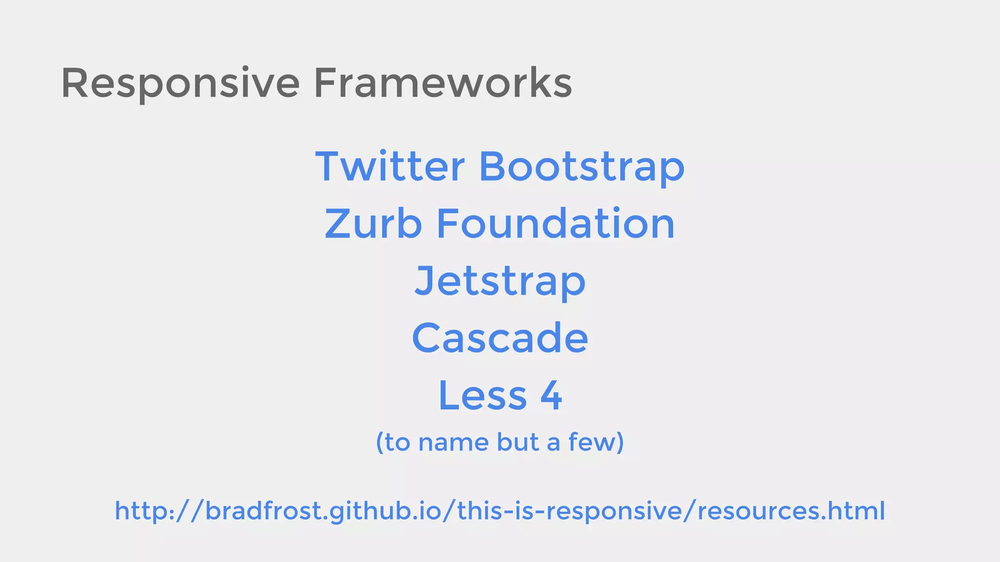
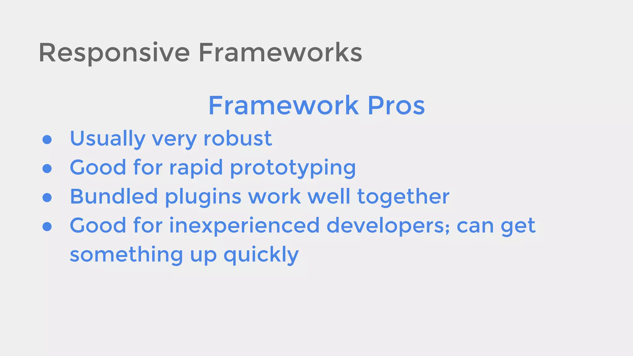
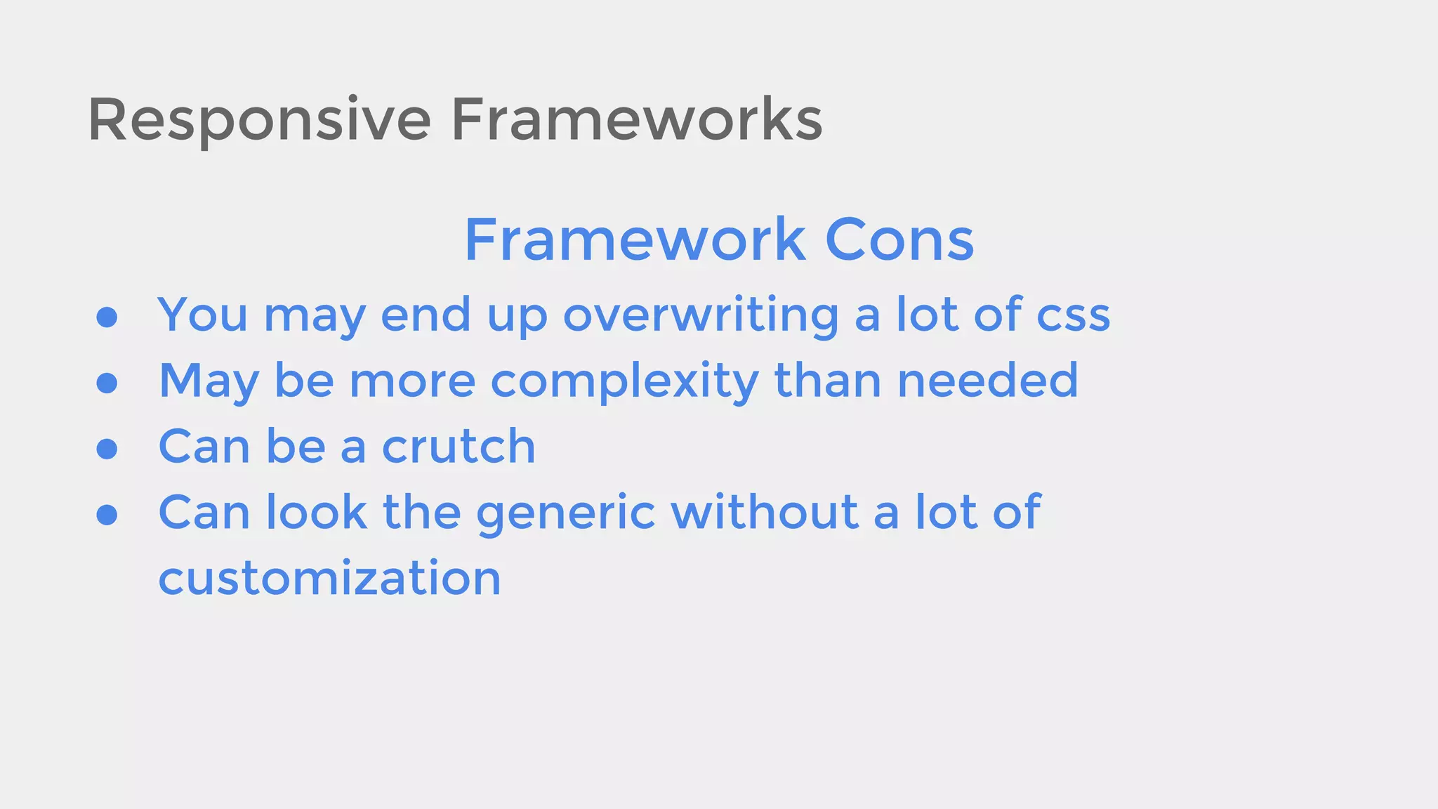
Download as PDF, PPTX


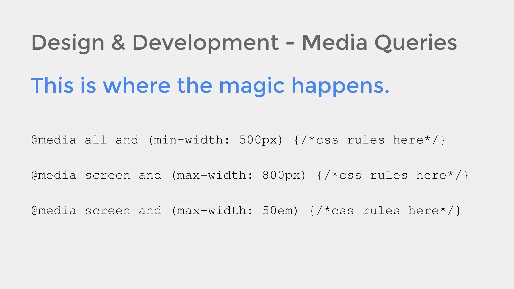
![Design & Development - The Flow
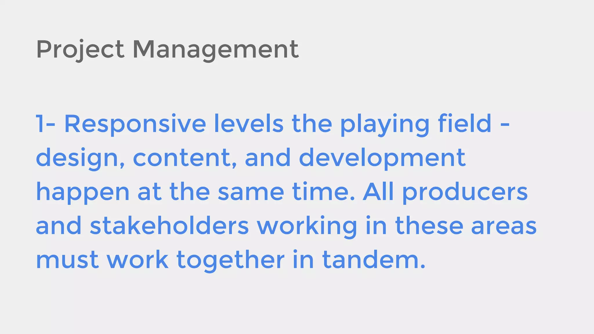
Allow for content to flow in a logical manner as the
screen gets bigger/smaller. [e.g., you normally
wouldn’t want the header to flow under main
content, so you need to set up your columns so as
they collapse or expand, the page makes sense
from top to bottom as you scroll].](https://image.slidesharecdn.com/responsivedesign-131206134420-phpapp01/75/How-to-Project-Manage-and-Implement-a-Responsive-Website-24-2048.jpg)


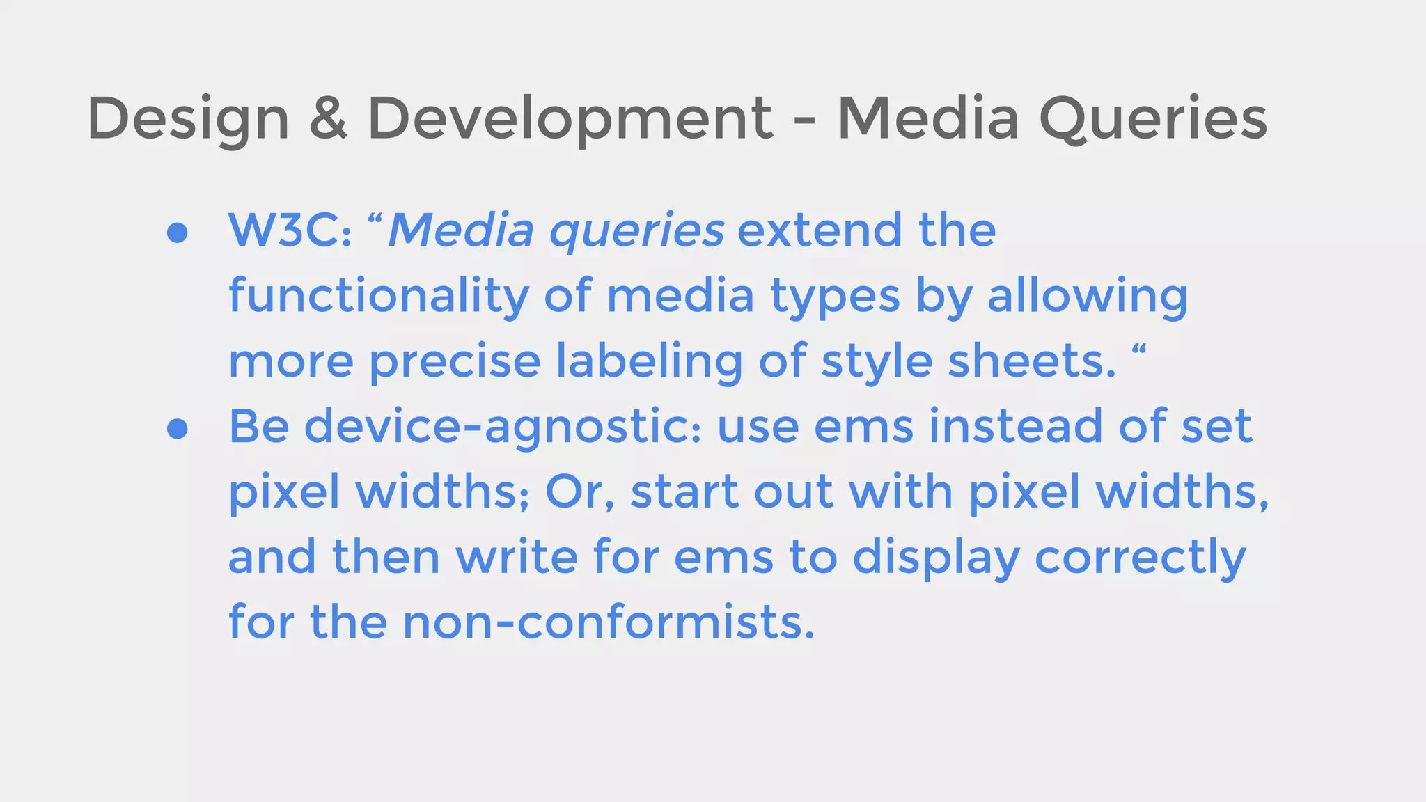


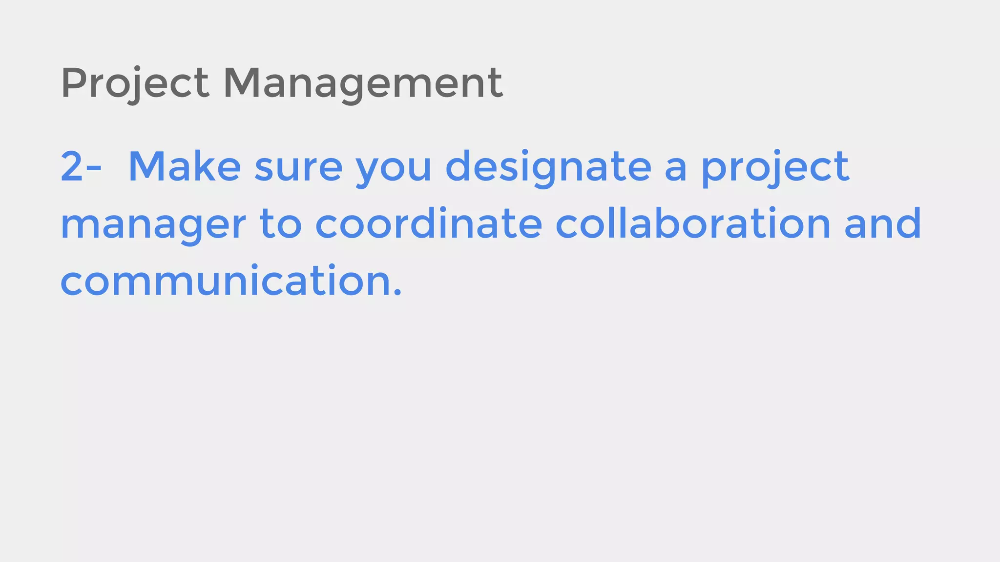
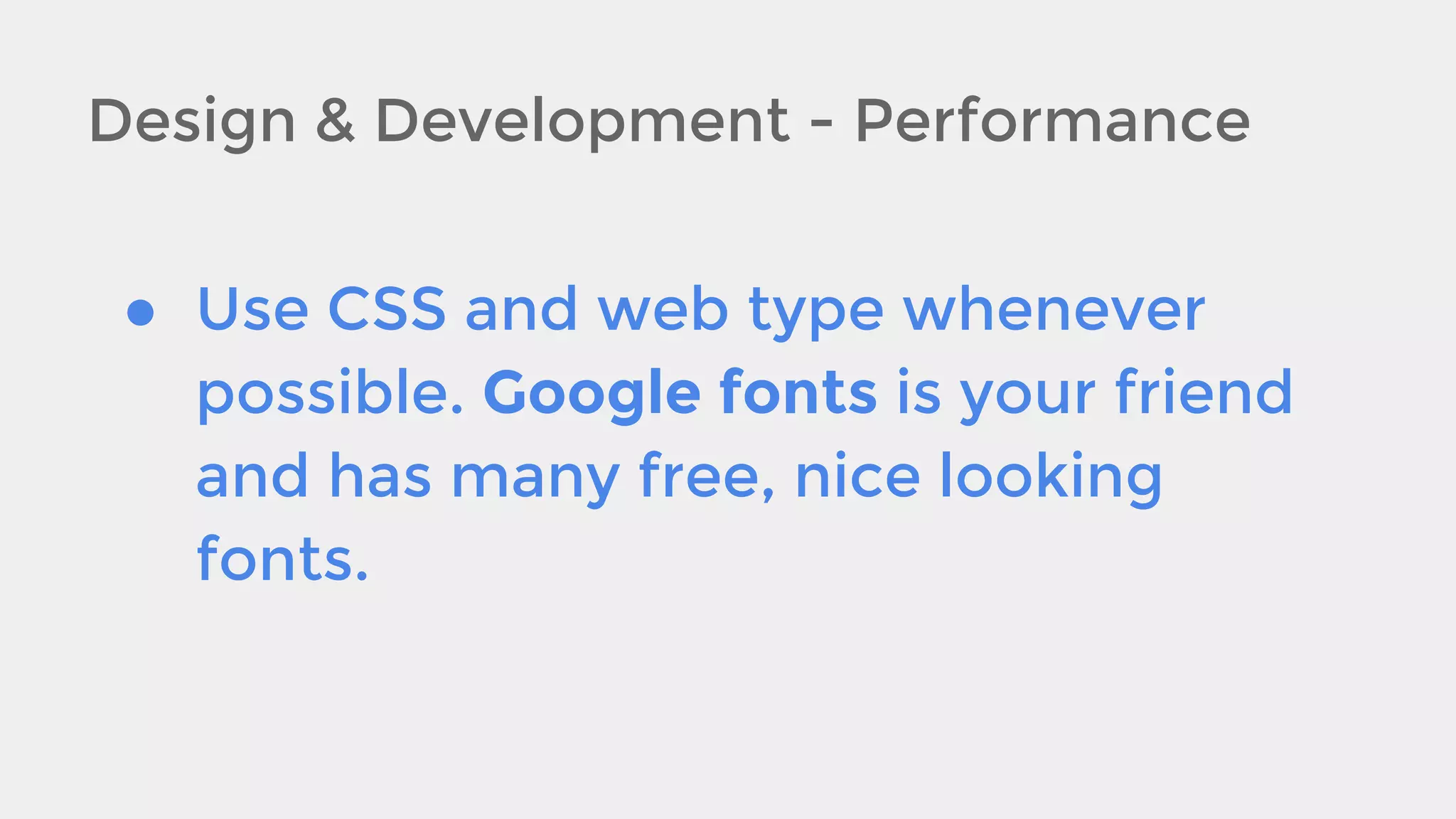
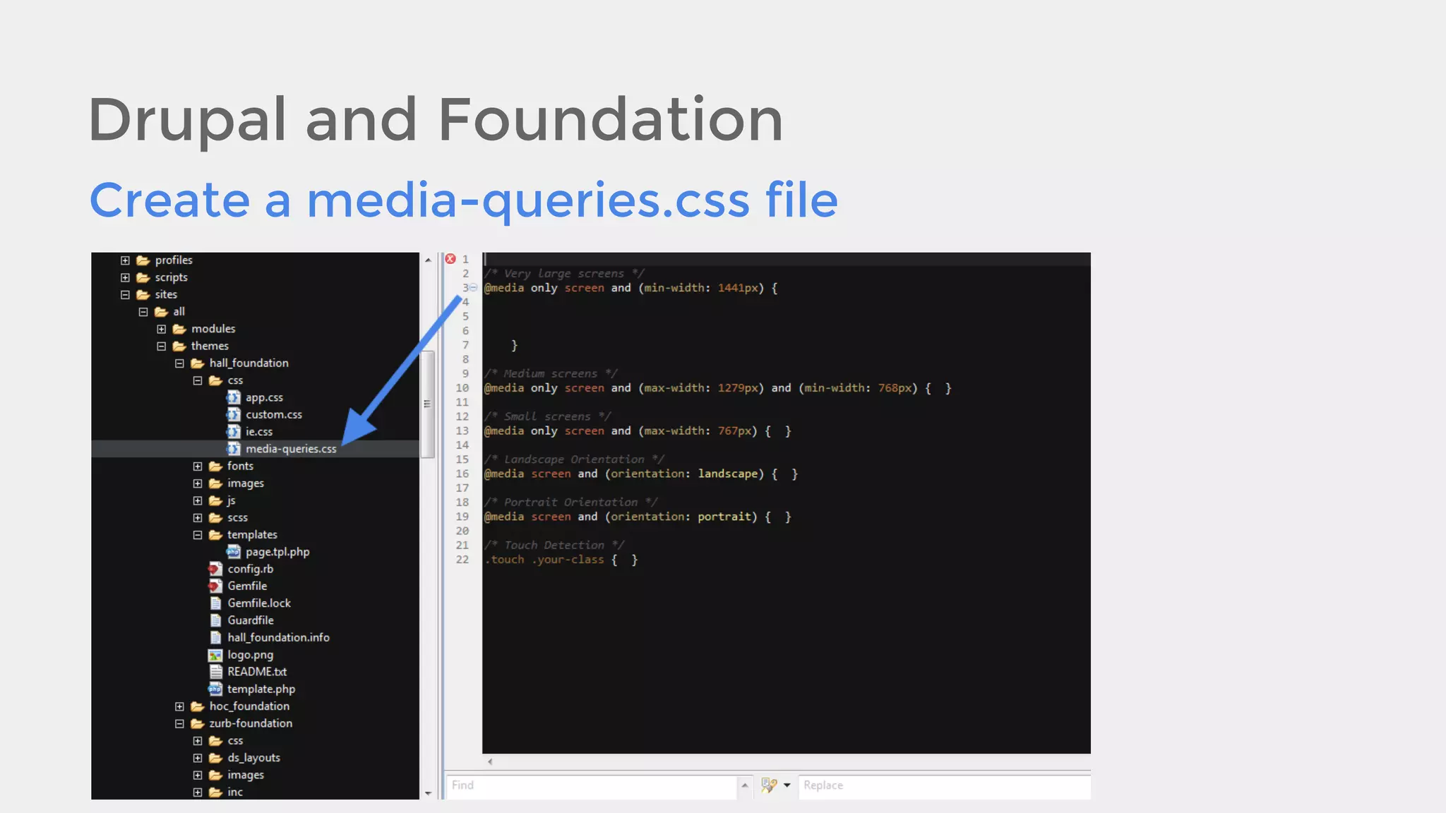
![Design & Development - Performance
● Minify your scripts and CSS to make
page load quicker. If you use a
preprocessor like Sass you may need
to make extra accommodations for
the media-queries [e.g., you can’t
use a variable as a breakpoint].](https://image.slidesharecdn.com/responsivedesign-131206134420-phpapp01/75/How-to-Project-Manage-and-Implement-a-Responsive-Website-35-2048.jpg)

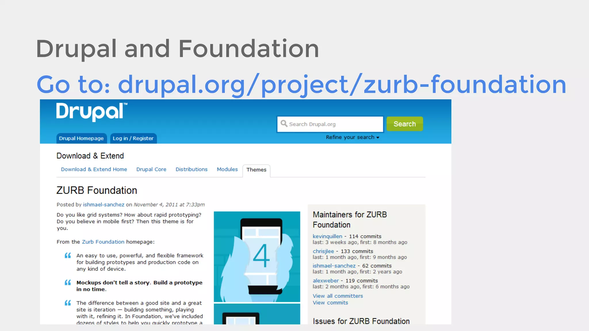
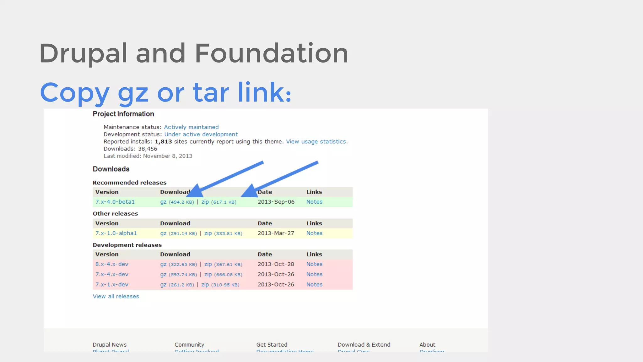
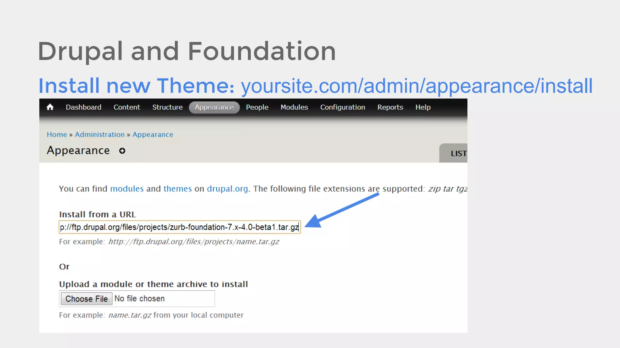
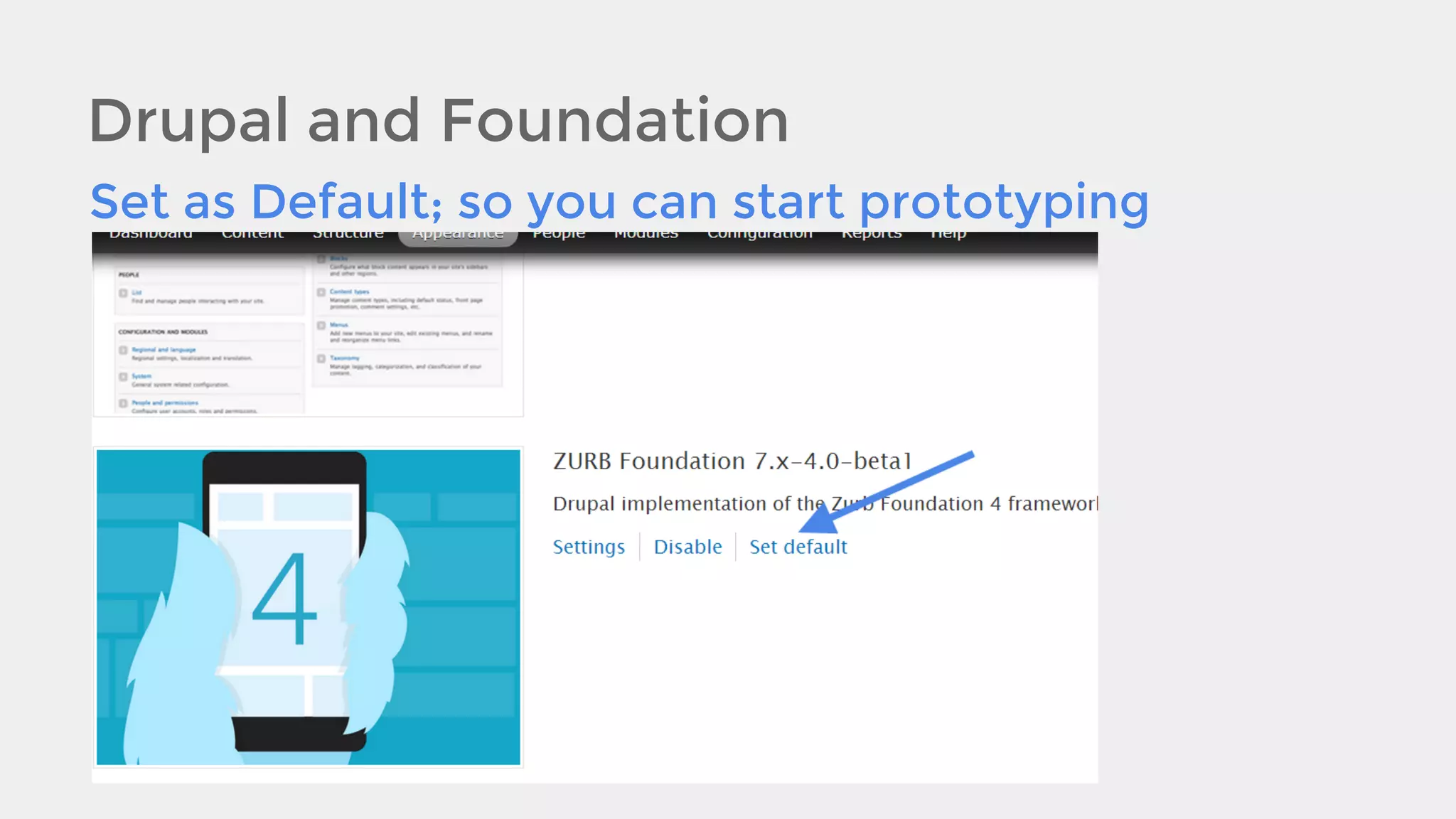
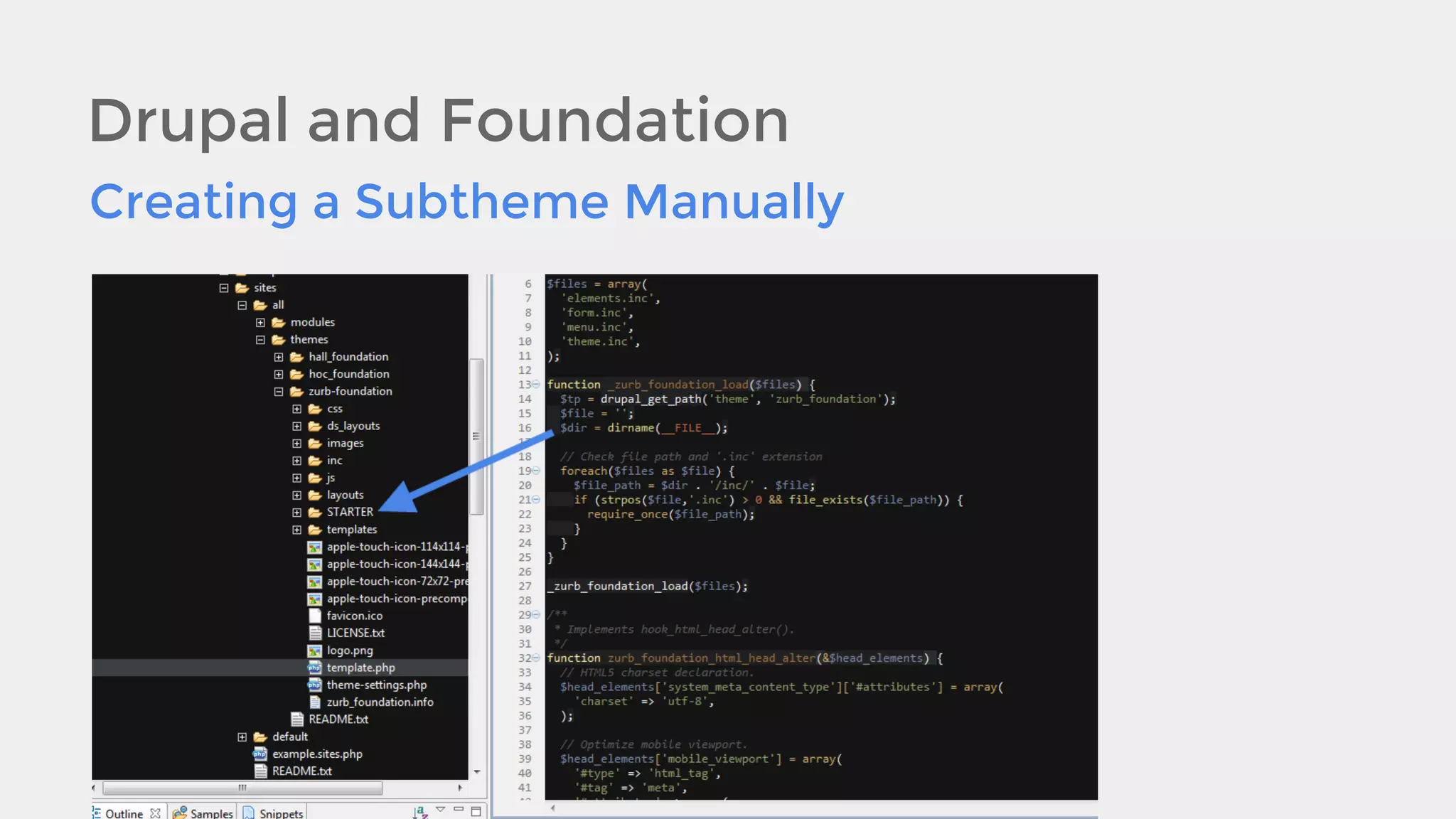
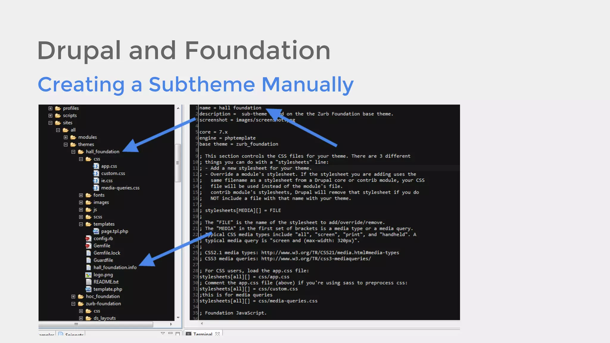
![Drupal and Foundation
Creating a Subtheme with Drush:
The command to do this is simply:
drush fst [THEMENAME] [Description !
Optional]](https://image.slidesharecdn.com/responsivedesign-131206134420-phpapp01/75/How-to-Project-Manage-and-Implement-a-Responsive-Website-46-2048.jpg)


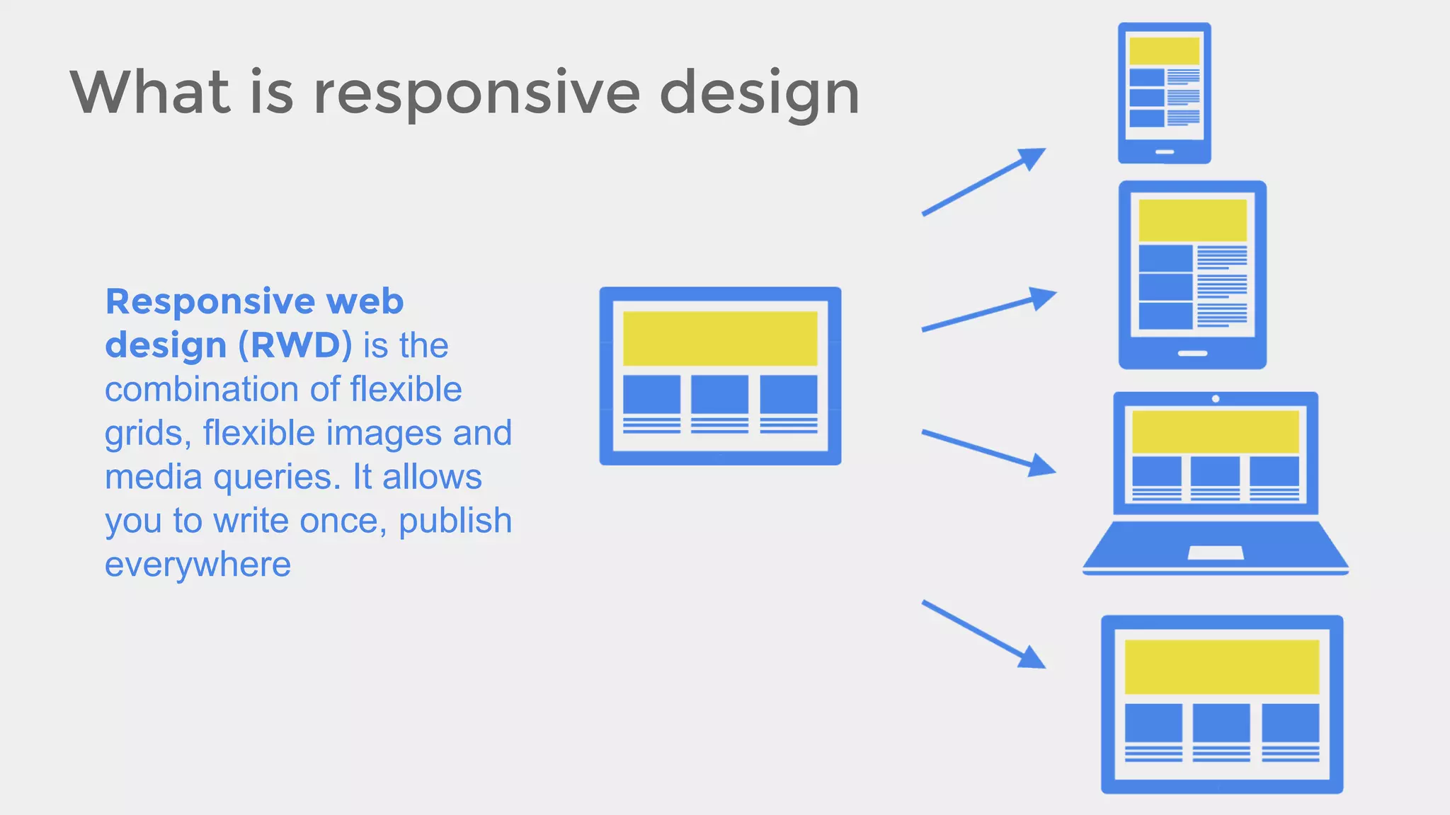
The document outlines the importance of responsive web design (RWD) in today's mobile-dominated environment, detailing its benefits such as cost reduction, increased reach, and improved user experience. It covers project management strategies for implementing RWD, emphasizing collaboration among teams and mobile-first design principles. Additionally, the document provides technical guidelines on layout flexibility, media queries, performance optimization, and various responsive frameworks to enhance website responsiveness.


![[BDD 2025 - Full-Stack Development] PHP in AI Age: The Laravel Way. (Rizqy Hi...](https://cdn.slidesharecdn.com/ss_thumbnails/fs-phpinaiagethelaravelway-251125012602-ef9d330e-thumbnail.jpg?width=640&height=640&fit=bounds)


![[BDD 2025 - Full-Stack Development] Agentic AI Architecture: Redefining Syste...](https://cdn.slidesharecdn.com/ss_thumbnails/fs-agenticaiarchitectureredefiningsystemcommunication-251124030838-e6c70cc2-thumbnail.jpg?width=640&height=640&fit=bounds)