Downloaded 24 times


![CSS Syntax of @media property
The syntax of a media query is the same no matter if you use it inside
a link element, after an @import instruction, or inside a CSS style
sheet. Media queries follow this syntax:
[logic] [media] [and (condition)] [and (condition)] ...](https://image.slidesharecdn.com/mediaqueries-150219045601-conversion-gate02/85/Media-queries-A-to-Z-7-320.jpg)
![ Logic : only, not
The value only means that this media query only matches a certain media type
The value not means that this media query matches all other than a certain media type
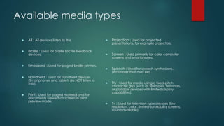
Media : screen, projection, print
Screen: Matches all computer screens. Both on desktop computers, laptops, tablets, smart
phones and TVs.
Projection: Matches projection devices (projectors used in meeting rooms etc.).
Matches when a user clicks "print" for the page.
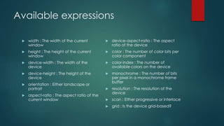
and (condition) : The [and (condition)] blocks set conditions for the screen. For instance,
you can use these properties inside a condition block:
Width, min-width, max-width, height, min-height, max-height, device-width, min-device-width,
max-device-width, device-height, min-device-height, max-device-height, orientation, aspect-
ratio, device-aspect-ratio, -webkit-device-pixel-ratio, -webkit-max-device-pixel-ratio, -webkit-min-
device-pixel-ratio
As you might have spotted, the condition properties fall into two groups:
The first group is related to the width and height of the browser window.
The second group is related to the width and height of the physical device screen.](https://image.slidesharecdn.com/mediaqueries-150219045601-conversion-gate02/85/Media-queries-A-to-Z-8-320.jpg)


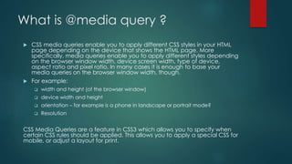
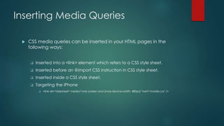
The document explains CSS media queries, allowing the application of different styles based on device characteristics like screen size, type, and orientation. It describes various methods to insert media queries into HTML and CSS files, and outlines the syntax, including conditions for applying specific CSS rules. Additionally, it covers supported browser versions and the necessity of using fallbacks for older browsers, alongside an explanation of media types and features for responsive design.