Download as PDF, PPTX


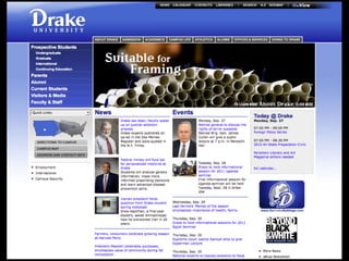
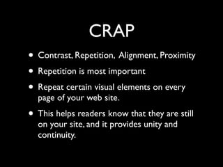
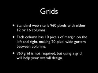
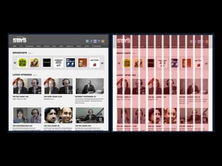


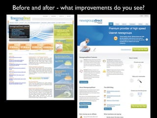

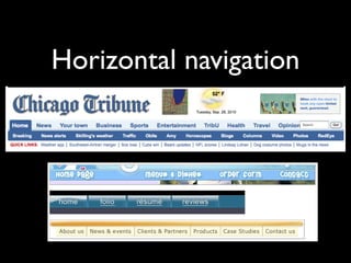
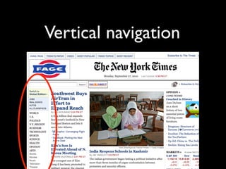
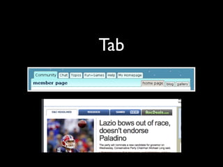


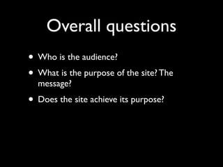
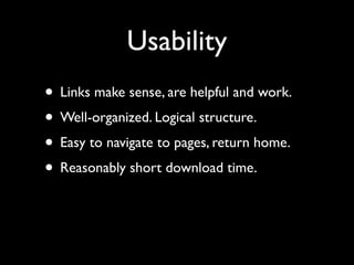
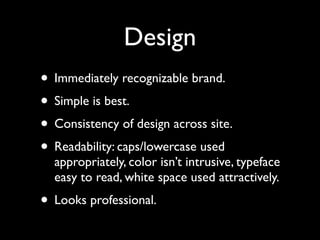
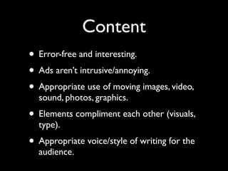


The document provides an overview of key principles of web design including keeping designs simple, prioritizing the user experience, using grids and standard ad sizes, and analyzing site architecture, usability, design, and content. It discusses designing for how people use the web by scanning and being impatient. Readability, findability, and usability are important to consider. The design process involves sketching wireframes and mockups before coding.


