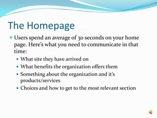
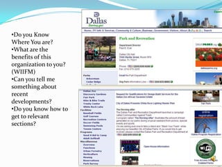
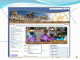
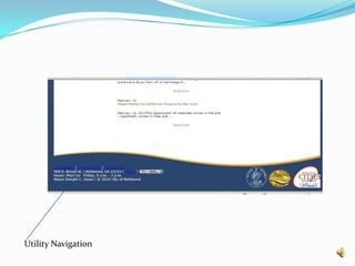
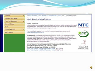
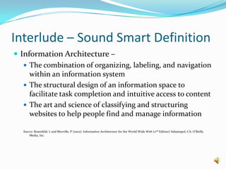
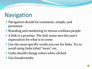
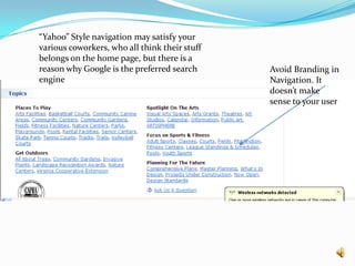
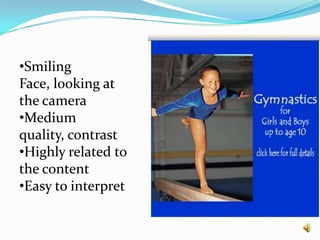
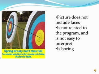
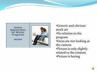
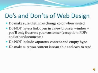
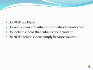
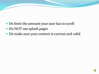
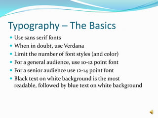
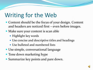
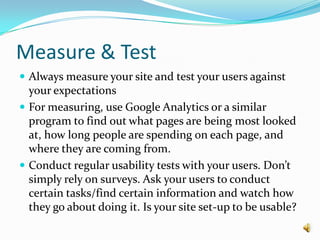
Website DesignUnderstanding the Basics
Core PrinciplesKnow your audience and why they are coming to your site
Think usability above all else.
No one is reading your website.
Measure your results.The HomepageUsers spend an average of 30 seconds on your home page. Here’s what you need to communicate in that time:What site they have arrived onWhat benefits the organization offers themSomething about the organization and it’s products/servicesChoices and how to get to the most relevant section
Do you Know Where You are?
What are the benefits of this organization to you? (WIIFM)
Can you tell me something about recent developments?
Do you know how to get to relevant sections?Page Elements	Basic Page Elements that Users Look For:
Perceptible menus, with some graphic or color delineation, across the top and usually on the left
A Home button in or near the menu on the far left of all pages except the homepage
A logo in the upper-left corner of all pages (clickable to the home page)
An open search field in the upper-right corner of all pages
A shopping cart icon in the upper-right corner of all pages
A login/out feature in the upper-right corner of all pages.
Utility navigation at the very top or very bottom of pages that is subtle and visually weaker than the main/global navigation
Utility Navigation
Sections and Headings Save TimeHeadings that describe the information below them save users timeOffer white space, borders, and color to help users see the sections and the topicsChunk informationProvide headings for each section Be careful not to make the headings look so big or colorful that they look like an add or promotion
Interlude – Sound Smart DefinitionInformation Architecture – The combination of organizing, labeling, and navigation within an information systemThe structural design of an information space to facilitate task completion and intuitive access to contentThe art and science of classifying and structuring websites to help people find and manage informationSource: Rosenfeld, L and Morville, P (2002). Information Architecture for the World Wide Web (2nd Edition) Sebastapol, CA: O’Reilly Media, Inc.
NavigationNavigation should be consistent, simple, and persistentBranding and marketing in menus confuses peopleA link is a promise. The link name sets the user’s expectation for what is to comeUse the most specific words you can for links. Try to avoid using links titled “more”, etc.Links should change colors when clicked Use breadcrumbs
“Yahoo” Style navigation may satisfy your various coworkers, who all think their stuff belongs on the home page, but there is a reason why Google is the preferred search engineAvoid Branding in Navigation. It doesn’t make sense to your user
Fundamental (and boring) elementsContact Us – only 2% of users ever look at the contact us section of a website. However, contact adds credibility to your organization, and helps users who can’t find the information they are looking forPrivacy Policy – users almost never look at the privacy policy, but it adds to your credibility and should be included in the utility navigation
Images
Characteristics of “Good” ImagesHigh contrast and high qualityCropped, rather than overly reduced, when necessary to fit a small spaceNot excessively detailed; easy to interpretHighly related to the content on the page, excitingSmiling and approachable facesPeople looking at (or at least facing) the cameraClear instructions or information

Website Design Part 1

  • 1.
  • 2.
    Core PrinciplesKnow youraudience and why they are coming to your site
  • 3.
  • 4.
    No one isreading your website.
  • 5.
    Measure your results.TheHomepageUsers spend an average of 30 seconds on your home page. Here’s what you need to communicate in that time:What site they have arrived onWhat benefits the organization offers themSomething about the organization and it’s products/servicesChoices and how to get to the most relevant section
  • 6.
    Do you KnowWhere You are?
  • 7.
    What are thebenefits of this organization to you? (WIIFM)
  • 8.
    Can you tellme something about recent developments?
  • 9.
    Do you knowhow to get to relevant sections?Page Elements Basic Page Elements that Users Look For:
  • 10.
    Perceptible menus, withsome graphic or color delineation, across the top and usually on the left
  • 11.
    A Home buttonin or near the menu on the far left of all pages except the homepage
  • 12.
    A logo inthe upper-left corner of all pages (clickable to the home page)
  • 13.
    An open searchfield in the upper-right corner of all pages
  • 14.
    A shopping carticon in the upper-right corner of all pages
  • 15.
    A login/out featurein the upper-right corner of all pages.
  • 16.
    Utility navigation atthe very top or very bottom of pages that is subtle and visually weaker than the main/global navigation
  • 17.
  • 18.
    Sections and HeadingsSave TimeHeadings that describe the information below them save users timeOffer white space, borders, and color to help users see the sections and the topicsChunk informationProvide headings for each section Be careful not to make the headings look so big or colorful that they look like an add or promotion
  • 20.
    Interlude – SoundSmart DefinitionInformation Architecture – The combination of organizing, labeling, and navigation within an information systemThe structural design of an information space to facilitate task completion and intuitive access to contentThe art and science of classifying and structuring websites to help people find and manage informationSource: Rosenfeld, L and Morville, P (2002). Information Architecture for the World Wide Web (2nd Edition) Sebastapol, CA: O’Reilly Media, Inc.
  • 21.
    NavigationNavigation should beconsistent, simple, and persistentBranding and marketing in menus confuses peopleA link is a promise. The link name sets the user’s expectation for what is to comeUse the most specific words you can for links. Try to avoid using links titled “more”, etc.Links should change colors when clicked Use breadcrumbs
  • 22.
    “Yahoo” Style navigationmay satisfy your various coworkers, who all think their stuff belongs on the home page, but there is a reason why Google is the preferred search engineAvoid Branding in Navigation. It doesn’t make sense to your user
  • 23.
    Fundamental (and boring)elementsContact Us – only 2% of users ever look at the contact us section of a website. However, contact adds credibility to your organization, and helps users who can’t find the information they are looking forPrivacy Policy – users almost never look at the privacy policy, but it adds to your credibility and should be included in the utility navigation
  • 24.
  • 25.
    Characteristics of “Good”ImagesHigh contrast and high qualityCropped, rather than overly reduced, when necessary to fit a small spaceNot excessively detailed; easy to interpretHighly related to the content on the page, excitingSmiling and approachable facesPeople looking at (or at least facing) the cameraClear instructions or information