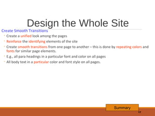
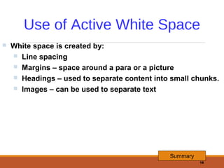
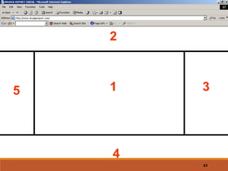
Web Site
Design
Principles
1
Design For The Medium
A Web site is designed for the computer – not paper
Look and Feel:
1. The interface that the user must navigate often is called the look
and feel of the Web site.
2. Users look & feel when they explore the info design of the site.
3. Look and feel implies the personality that the Web site conveys
to the user and the way it works.

Summary
2
Design For The Medium
Make your Design Portable:
1.

The Web site must be portable across different browsers, OS and computer
platforms (hardware).

2.

Test the website in different browsers such as Internet Explorer, FireFox,
Google Chrome, Opera, etc.

3.

Certain features of HTML like cascading style sheets cannot be interpreted
properly by certain browsers.

4.

If necessary, design separate websites for different types of browsers; detect
the user’s browser and direct him to appropriate version of the Web site

5.

Check website in different browsers; a website designed for a desktop PC may
not be usable on a mobile device.
Summary
3
Design For The Medium
Design for Low Bandwidth:
1. Different types of Internet connections are used – dial-up,
broadband, cable, etc.
2. Plan your pages so that they are accessible at different
connection speeds.
3. Avoid large images, complicated animations, movies as these
take time to download.
4. Provide alternate text (by using the ALT tag of HTML)
5. Design an alternate page that uses less graphics so that it will
download quickly for users with a slow connection.
Summary
4
Design For The Medium
Plan for Clear Presentation of Information:
1. Information design (ID) means the presentation and organisation
of your information. ID is the most important factor in
determining the success of a Web site.
2. Don’t use too many fonts & colors as this distracts the user.
3. Provide direct links to the areas in the Web site that you think are
the most in demand.

Summary

5
Design For The Medium
Plan for Clear Presentation of Information:
1.
2.
3.
4.

Break large paragraphs into smaller paras.
Provide a suitable headings so that users can find the info quickly.
Break up long text into columns.
Link text with hyperlinks

Summary
6
Screen Resolutions
Horizontal and Vertical Dimensions
640 x 480, 800 x 600, 1024 x 768
Fixed Resolution Designs
Flexible Resolution Designs
800 x 600

640 x 480

640 x 480

800 x 600

1024 x 768

1024 x 768

1152 x 864

Summary
7
Next Slide
8
9
10
11
12
13
14
Design For The Medium
Summary

◦ Look and Feel
◦ Make Your Design Portable
◦ Design for Low Bandwidth
◦ Clear Presentation, Easy Access
◦ Design for Different Screen Resolutions

Summary
15
Design the Whole Site

When designing the site, plan the unifying themes and structure that will hold the
pages together.
The theme should reflect the personality of your organization

Summary
16
Design the Whole Site

Create Smooth Transitions

◦ Create a unified look among the pages
◦ Reinforce the identifying elements of the site
◦ Create smooth transitions from one page to another – this is done by repeating colors and
fonts for similar page elements.
◦ E.g., all para headings in a particular font and color on all pages
◦ All body text in a particular color and font style on all pages.

Summary
17
Use of Active White Space


White space is created by:
 Line spacing
 Margins – space around a para or a picture
 Headings – used to separate content into small chunks.
 Images – can be used to separate text

Summary
18
Design the Whole Site
Summary

◦ Unifying Themes and Structures
◦ Smooth Transitions
◦ Use White Space

Summary
19
2

5

1

3

4
23
Design for the User
Guide the User’s Eye

25
Design for the User
Summary

◦ Design for Interaction
◦ Design for Location
◦ Guide the User’s Eye
◦ Keep a Flat Hierarchy
◦ Use the Power of Hypertext Linking
◦ Resist Overload

Summary
29
Design For The Screen
Summary

◦ Shape Of The Screen
◦ Source Of Light
◦ Monitor Resolution
◦ A Screen Is Not A Page

Summary
31
Web Design Principles
Summary
Design for

◦ Medium
◦ Whole Site
◦ User
◦ Screen

32

Website design principles

  • 1.
  • 2.
    Design For TheMedium A Web site is designed for the computer – not paper Look and Feel: 1. The interface that the user must navigate often is called the look and feel of the Web site. 2. Users look & feel when they explore the info design of the site. 3. Look and feel implies the personality that the Web site conveys to the user and the way it works. Summary 2
  • 3.
    Design For TheMedium Make your Design Portable: 1. The Web site must be portable across different browsers, OS and computer platforms (hardware). 2. Test the website in different browsers such as Internet Explorer, FireFox, Google Chrome, Opera, etc. 3. Certain features of HTML like cascading style sheets cannot be interpreted properly by certain browsers. 4. If necessary, design separate websites for different types of browsers; detect the user’s browser and direct him to appropriate version of the Web site 5. Check website in different browsers; a website designed for a desktop PC may not be usable on a mobile device. Summary 3
  • 4.
    Design For TheMedium Design for Low Bandwidth: 1. Different types of Internet connections are used – dial-up, broadband, cable, etc. 2. Plan your pages so that they are accessible at different connection speeds. 3. Avoid large images, complicated animations, movies as these take time to download. 4. Provide alternate text (by using the ALT tag of HTML) 5. Design an alternate page that uses less graphics so that it will download quickly for users with a slow connection. Summary 4
  • 5.
    Design For TheMedium Plan for Clear Presentation of Information: 1. Information design (ID) means the presentation and organisation of your information. ID is the most important factor in determining the success of a Web site. 2. Don’t use too many fonts & colors as this distracts the user. 3. Provide direct links to the areas in the Web site that you think are the most in demand. Summary 5
  • 6.
    Design For TheMedium Plan for Clear Presentation of Information: 1. 2. 3. 4. Break large paragraphs into smaller paras. Provide a suitable headings so that users can find the info quickly. Break up long text into columns. Link text with hyperlinks Summary 6
  • 7.
    Screen Resolutions Horizontal andVertical Dimensions 640 x 480, 800 x 600, 1024 x 768 Fixed Resolution Designs Flexible Resolution Designs 800 x 600 640 x 480 640 x 480 800 x 600 1024 x 768 1024 x 768 1152 x 864 Summary 7 Next Slide
  • 8.
  • 9.
  • 10.
  • 11.
  • 12.
  • 13.
  • 14.
  • 15.
    Design For TheMedium Summary ◦ Look and Feel ◦ Make Your Design Portable ◦ Design for Low Bandwidth ◦ Clear Presentation, Easy Access ◦ Design for Different Screen Resolutions Summary 15
  • 16.
    Design the WholeSite When designing the site, plan the unifying themes and structure that will hold the pages together. The theme should reflect the personality of your organization Summary 16
  • 17.
    Design the WholeSite Create Smooth Transitions ◦ Create a unified look among the pages ◦ Reinforce the identifying elements of the site ◦ Create smooth transitions from one page to another – this is done by repeating colors and fonts for similar page elements. ◦ E.g., all para headings in a particular font and color on all pages ◦ All body text in a particular color and font style on all pages. Summary 17
  • 18.
    Use of ActiveWhite Space  White space is created by:  Line spacing  Margins – space around a para or a picture  Headings – used to separate content into small chunks.  Images – can be used to separate text Summary 18
  • 19.
    Design the WholeSite Summary ◦ Unifying Themes and Structures ◦ Smooth Transitions ◦ Use White Space Summary 19
  • 20.
  • 21.
    Design for theUser Guide the User’s Eye 25
  • 22.
    Design for theUser Summary ◦ Design for Interaction ◦ Design for Location ◦ Guide the User’s Eye ◦ Keep a Flat Hierarchy ◦ Use the Power of Hypertext Linking ◦ Resist Overload Summary 29
  • 23.
    Design For TheScreen Summary ◦ Shape Of The Screen ◦ Source Of Light ◦ Monitor Resolution ◦ A Screen Is Not A Page Summary 31
  • 24.
    Web Design Principles Summary Designfor ◦ Medium ◦ Whole Site ◦ User ◦ Screen 32