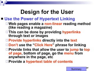
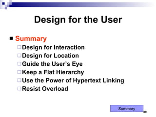
Web Site Design Principles Mukesh N. Tekwani [email_address]
Design For The Medium A Web site is designed for the computer – not paper Look and Feel: The  interface  that the user must navigate often is called the  look and feel   of the Web site. Users look & feel when they explore the info design of the site. Look and feel implies the  personality  that the Web site conveys to the user and the  way  it works. Summary
Design For The Medium Make your Design Portable: The Web site must be  portable  across different browsers, OS and computer platforms (hardware). Test the website in  different browsers  such as Internet Explorer, FireFox, Google Chrome, Opera, etc. Certain features of HTML like  cascading style sheets  cannot be interpreted properly by certain browsers. If necessary,  design separate websites  for different types of browsers; detect the user’s browser and direct him to appropriate version of the Web site  Check website in different browsers; a website designed for a desktop PC may not be usable on a  mobile device . Summary
Design For The Medium Design for Low Bandwidth: Different  types of Internet connections are used – POTS (dial-up), broadband, cable, etc. Plan your pages so that they are accessible at  different connection speeds . Avoid   large   images , complicated animations, movies as these take time to download. Provide  alternate   text  (by using the ALT tag of HTML)  Design an  alternate   page  that uses  less   graphics  so that it will download quickly for users with a slow connection. Summary
Design For The Medium Plan for Clear Presentation of Information: Information design  (ID) means the presentation and organisation of your information. ID is the most important factor in determining the success of a Web site. Don’t use too many fonts & colors as this distracts the user. Provide direct links to the areas in the Web site that you think are the most in demand. Use contrasting colors so that the text is easy to read. On the computer screen, users tend to scan rather than read the whole page. Summary
Design For The Medium Plan for Clear Presentation of Information: Break  large  paragraphs into  smaller  paras. Provide a suitable  headings  so that users can find the info quickly. Break up long text into columns. Link text with  hyperlinks Summary
Screen Resolutions Horizontal and Vertical Dimensions 640 x 480, 800 x 600, 1024 x 768 Fixed Resolution Designs Flexible Resolution Designs Next Slide Summary 800 x 600 1024 x 768 640 x 480 640 x 480 800 x 600 1024 x 768 1152 x 864


Design For The Medium Summary Look and Feel Make Your Design Portable Design for Low Bandwidth Clear Presentation, Easy Access Design for Different Screen Resolutions Summary
Design the Whole Site When designing the site, plan the  unifying   themes  and  structure  that will  hold  the  pages  together. The theme should reflect the personality of your organization E.g., consider the Web site of ESA – sober, subdued colors If designing a site for children, consider use of visuals, bright colors, and lively animations, big font Summary
 
 
Design the Whole Site Create Smooth Transitions Create a  unified  look among the pages Reinforce  the  identifying  elements of the site Create  smooth   transitions  from one page to another – this is done by  repeating   colors  and  fonts  for similar page elements. E.g., all para headings in a particular font and color on all pages All body text in a  particular  color and font style on all pages. Summary
Design the Whole Site Create Smooth Transitions All pages must have same color scheme, navigation icons, & graphics which create a smooth transition from one page to another. Reinforce  the  identifying  elements of the site Create  smooth   transitions  from one page to another – by  repeating   colors  and  fonts  for similar page elements. All para headings in a particular font and color  All body text in a particular color and font style  Summary
Design the Whole Site Use of Grid to Provide a Visual Structure: A  grid  is a way of  organising  a page into rows and columns. A  grid  can provide a  uniform   look  ( consistency ) to all the pages of a site. The  TABLE  element of HTML can be used to build the grid for pages. Another way of creating a grid is by using the concept of frames ( FRAMESET  tag) Summary
Design the Whole Site Use of Active White Space: White  spaces are the  blank   areas  of a page. White space is the area between text, images, paragraphs, etc White space  defines  the areas of the page White use that is used  deliberately  is called  active   white   space . Passive  white spaces are the blank areas that appear on the border of the screen due to screen resolution problems Summary
Use of Active White Space
Use of Active White Space A lack of white space creates the impression that the page contains  too   much  information It is  difficult  to  find   information  on a page that does not have sufficient active white space. Plenty of active white space reduces clutter. Provide  navigation   elements  on the  same   position  in all pages – this provides uniformity and ease of use. Summary
Use of Active White Space White space is created by: Line spacing Margins – space around a para or a picture Headings – used to separate content into small chunks. Images – can be used to separate text  Summary
Use of Active White Space
Design the Whole Site Summary Unifying Themes and Structures Smooth Transitions Use A Grid Use White Space Summary
Design for the User Keep in mind the  user Why  has the user come to your Web site? What  type of  information  does the user want? Is the site for  information ,  entertainment , ..? Summary
Design for the User Design for Interaction Think about how the  user  will  interact  with the Web page If the page is a  collection  of  links , interaction will be  clicking  on the content and  scrolling Pointing  to  graphics  and clicking on images to reach another page. Design page into  separate   groups, e.g., links  for pages of physics, maths, comp sc., … Summary
Design for the User Design for Location Difficult to predict the user’s exact  viewing   path However, research has shown that the areas of importance are as shown in the next slide Put most  important  info in the  middle , next most important at the top, and so on. Summary
1 2 3 4 5
Design for the User Guide the User’s Eye A user may  scan  a page in many ways.  One of the ways is to scan a page from left to right, and then down to next line Summary
Design for the User Guide the User’s Eye
Design for the User Keep a Flat Hierarchy Don’t make users navigate through too many layers to find the information they want Provide a  simple menu  for navigation Use the  same  navigation  menu  on all pages for uniformity Provide a  site   map  that shows the  user’s   location  in the Web site Summary
 
The Web site shows all the individual pages and the section in which they appear.
Design for the User Use the Power of Hypertext Linking Web pages enable a  non-linear  reading method  (like reading a magazine) This can be done by providing  hyperlinks  through text or images Provide   hyperlinks  directly into the  text Don’t  use the “ Click Here ” phrase for linking Provide links that allow the user to  jump  to  top   of page , bottom of page, go the  menu  from anywhere in the page, etc Provide a  hypertext table of contents Summary
Design for the User How much Content is Enough? Don’t overload  the user with too much information on a single page Compare the websites of Google, Yahoo, Times Of India Provide  short paragraphs  and  links  to more info for each topic. Summary
Design for the User Summary Design for Interaction Design for Location Guide the User’s Eye Keep a Flat Hierarchy Use the Power of Hypertext Linking Resist Overload Summary
Design for the Screen Differences between screen and printed page Shape of screen – landscape, paper – portrait Paper reflects   light   but   screen   passes   light   from behind Provide enough   contrast   on page – light   background and dark font Avoid light text on light background Screen  has a  lower   resolution  than paper Summary
Design For The Screen Summary Shape Of The Screen Source Of Light Monitor Resolution A Screen Is Not A Page Summary
Web Design Principles Summary Design for Medium Whole Site User Screen
Worst Site

Web Site Design Principles

  • 1.
    Web Site DesignPrinciples Mukesh N. Tekwani [email_address]
  • 2.
    Design For TheMedium A Web site is designed for the computer – not paper Look and Feel: The interface that the user must navigate often is called the look and feel of the Web site. Users look & feel when they explore the info design of the site. Look and feel implies the personality that the Web site conveys to the user and the way it works. Summary
  • 3.
    Design For TheMedium Make your Design Portable: The Web site must be portable across different browsers, OS and computer platforms (hardware). Test the website in different browsers such as Internet Explorer, FireFox, Google Chrome, Opera, etc. Certain features of HTML like cascading style sheets cannot be interpreted properly by certain browsers. If necessary, design separate websites for different types of browsers; detect the user’s browser and direct him to appropriate version of the Web site Check website in different browsers; a website designed for a desktop PC may not be usable on a mobile device . Summary
  • 4.
    Design For TheMedium Design for Low Bandwidth: Different types of Internet connections are used – POTS (dial-up), broadband, cable, etc. Plan your pages so that they are accessible at different connection speeds . Avoid large images , complicated animations, movies as these take time to download. Provide alternate text (by using the ALT tag of HTML) Design an alternate page that uses less graphics so that it will download quickly for users with a slow connection. Summary
  • 5.
    Design For TheMedium Plan for Clear Presentation of Information: Information design (ID) means the presentation and organisation of your information. ID is the most important factor in determining the success of a Web site. Don’t use too many fonts & colors as this distracts the user. Provide direct links to the areas in the Web site that you think are the most in demand. Use contrasting colors so that the text is easy to read. On the computer screen, users tend to scan rather than read the whole page. Summary
  • 6.
    Design For TheMedium Plan for Clear Presentation of Information: Break large paragraphs into smaller paras. Provide a suitable headings so that users can find the info quickly. Break up long text into columns. Link text with hyperlinks Summary
  • 7.
    Screen Resolutions Horizontaland Vertical Dimensions 640 x 480, 800 x 600, 1024 x 768 Fixed Resolution Designs Flexible Resolution Designs Next Slide Summary 800 x 600 1024 x 768 640 x 480 640 x 480 800 x 600 1024 x 768 1152 x 864
  • 8.
  • 9.
  • 10.
  • 11.
  • 12.
  • 13.
  • 14.
  • 15.
    Design For TheMedium Summary Look and Feel Make Your Design Portable Design for Low Bandwidth Clear Presentation, Easy Access Design for Different Screen Resolutions Summary
  • 16.
    Design the WholeSite When designing the site, plan the unifying themes and structure that will hold the pages together. The theme should reflect the personality of your organization E.g., consider the Web site of ESA – sober, subdued colors If designing a site for children, consider use of visuals, bright colors, and lively animations, big font Summary
  • 17.
  • 18.
  • 19.
    Design the WholeSite Create Smooth Transitions Create a unified look among the pages Reinforce the identifying elements of the site Create smooth transitions from one page to another – this is done by repeating colors and fonts for similar page elements. E.g., all para headings in a particular font and color on all pages All body text in a particular color and font style on all pages. Summary
  • 20.
    Design the WholeSite Create Smooth Transitions All pages must have same color scheme, navigation icons, & graphics which create a smooth transition from one page to another. Reinforce the identifying elements of the site Create smooth transitions from one page to another – by repeating colors and fonts for similar page elements. All para headings in a particular font and color All body text in a particular color and font style Summary
  • 21.
    Design the WholeSite Use of Grid to Provide a Visual Structure: A grid is a way of organising a page into rows and columns. A grid can provide a uniform look ( consistency ) to all the pages of a site. The TABLE element of HTML can be used to build the grid for pages. Another way of creating a grid is by using the concept of frames ( FRAMESET tag) Summary
  • 22.
    Design the WholeSite Use of Active White Space: White spaces are the blank areas of a page. White space is the area between text, images, paragraphs, etc White space defines the areas of the page White use that is used deliberately is called active white space . Passive white spaces are the blank areas that appear on the border of the screen due to screen resolution problems Summary
  • 23.
    Use of ActiveWhite Space
  • 24.
    Use of ActiveWhite Space A lack of white space creates the impression that the page contains too much information It is difficult to find information on a page that does not have sufficient active white space. Plenty of active white space reduces clutter. Provide navigation elements on the same position in all pages – this provides uniformity and ease of use. Summary
  • 25.
    Use of ActiveWhite Space White space is created by: Line spacing Margins – space around a para or a picture Headings – used to separate content into small chunks. Images – can be used to separate text Summary
  • 26.
    Use of ActiveWhite Space
  • 27.
    Design the WholeSite Summary Unifying Themes and Structures Smooth Transitions Use A Grid Use White Space Summary
  • 28.
    Design for theUser Keep in mind the user Why has the user come to your Web site? What type of information does the user want? Is the site for information , entertainment , ..? Summary
  • 29.
    Design for theUser Design for Interaction Think about how the user will interact with the Web page If the page is a collection of links , interaction will be clicking on the content and scrolling Pointing to graphics and clicking on images to reach another page. Design page into separate groups, e.g., links for pages of physics, maths, comp sc., … Summary
  • 30.
    Design for theUser Design for Location Difficult to predict the user’s exact viewing path However, research has shown that the areas of importance are as shown in the next slide Put most important info in the middle , next most important at the top, and so on. Summary
  • 31.
    1 2 34 5
  • 32.
    Design for theUser Guide the User’s Eye A user may scan a page in many ways. One of the ways is to scan a page from left to right, and then down to next line Summary
  • 33.
    Design for theUser Guide the User’s Eye
  • 34.
    Design for theUser Keep a Flat Hierarchy Don’t make users navigate through too many layers to find the information they want Provide a simple menu for navigation Use the same navigation menu on all pages for uniformity Provide a site map that shows the user’s location in the Web site Summary
  • 35.
  • 36.
    The Web siteshows all the individual pages and the section in which they appear.
  • 37.
    Design for theUser Use the Power of Hypertext Linking Web pages enable a non-linear reading method (like reading a magazine) This can be done by providing hyperlinks through text or images Provide hyperlinks directly into the text Don’t use the “ Click Here ” phrase for linking Provide links that allow the user to jump to top of page , bottom of page, go the menu from anywhere in the page, etc Provide a hypertext table of contents Summary
  • 38.
    Design for theUser How much Content is Enough? Don’t overload the user with too much information on a single page Compare the websites of Google, Yahoo, Times Of India Provide short paragraphs and links to more info for each topic. Summary
  • 39.
    Design for theUser Summary Design for Interaction Design for Location Guide the User’s Eye Keep a Flat Hierarchy Use the Power of Hypertext Linking Resist Overload Summary
  • 40.
    Design for theScreen Differences between screen and printed page Shape of screen – landscape, paper – portrait Paper reflects light but screen passes light from behind Provide enough contrast on page – light background and dark font Avoid light text on light background Screen has a lower resolution than paper Summary
  • 41.
    Design For TheScreen Summary Shape Of The Screen Source Of Light Monitor Resolution A Screen Is Not A Page Summary
  • 42.
    Web Design PrinciplesSummary Design for Medium Whole Site User Screen
  • 43.