Download to read offline


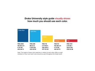


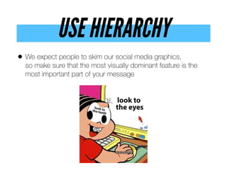


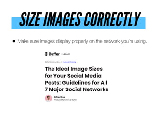
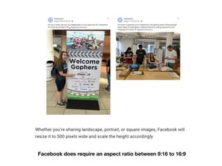


Chris Snider, an associate professor at Drake University, emphasizes the importance of compelling visuals in social media to enhance engagement and memory retention. He provides design tips such as using high-quality images, maintaining simplicity, and ensuring proper contrast and hierarchy in graphics. Snider encourages businesses to integrate effective visuals into their social media strategies for improved success.


