Download to read offline
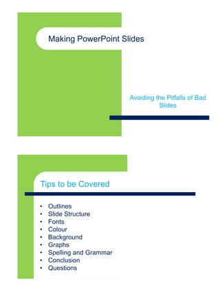
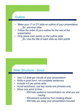
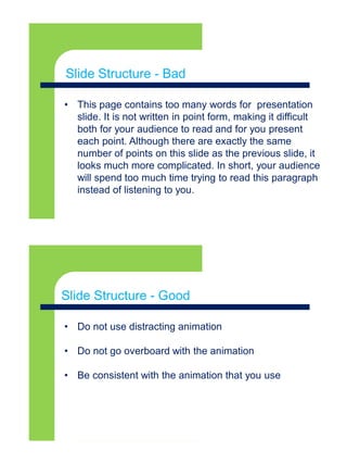
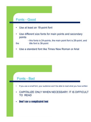
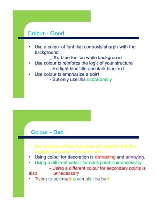


The document provides tips for creating effective PowerPoint presentations including using outlines and point form on slides, consistent formatting of fonts, colors and backgrounds, properly structuring graphs and slides, and avoiding common pitfalls like distracting animations or too many words on a slide. It emphasizes keeping presentations clear, focused and easy for the audience to understand through visually appealing design and concise content.