Download to read offline

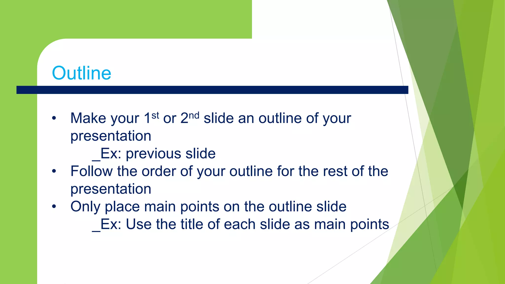
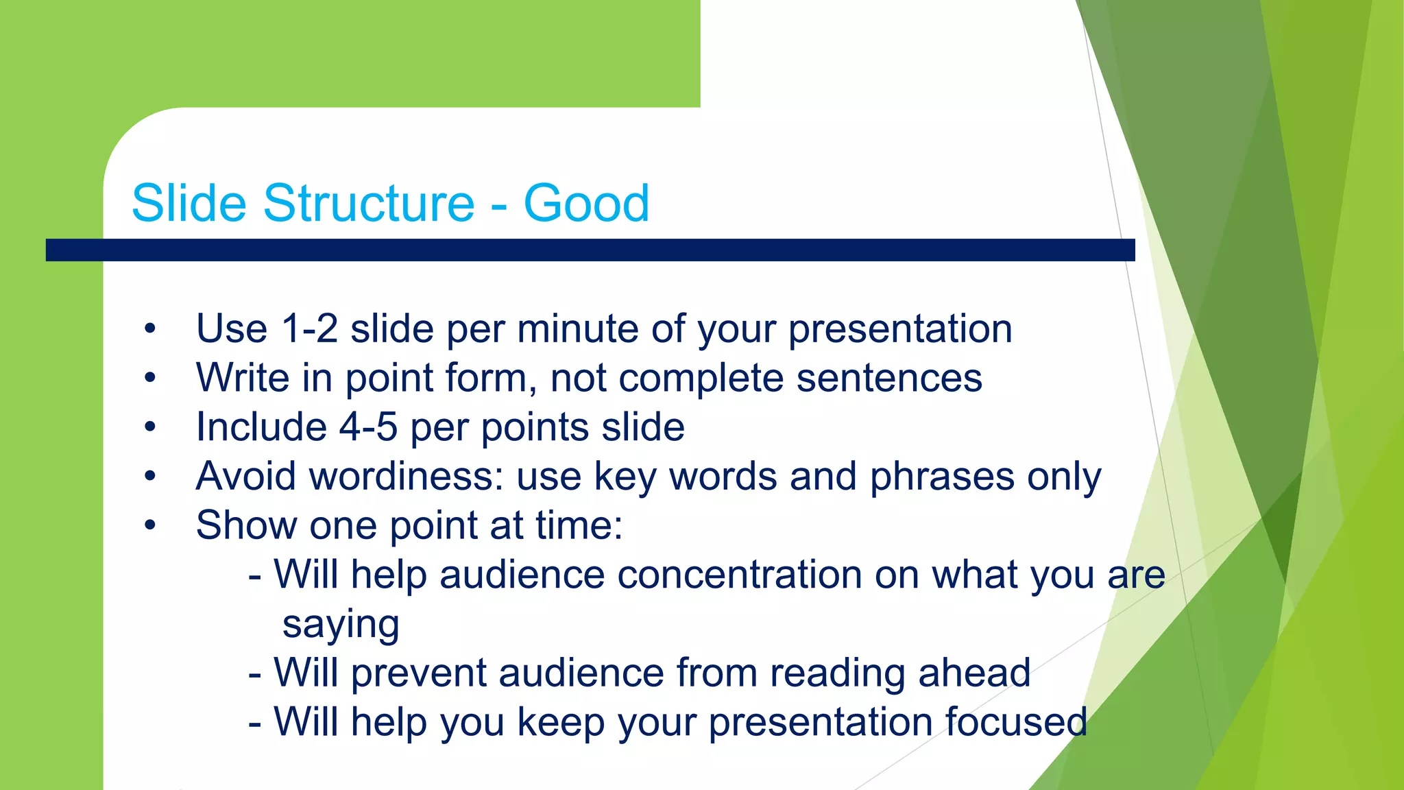

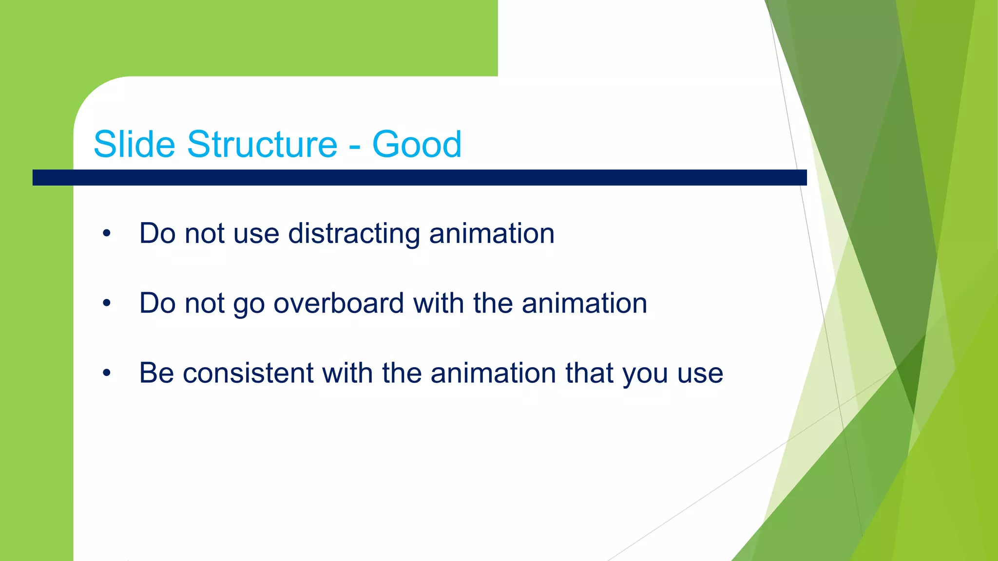
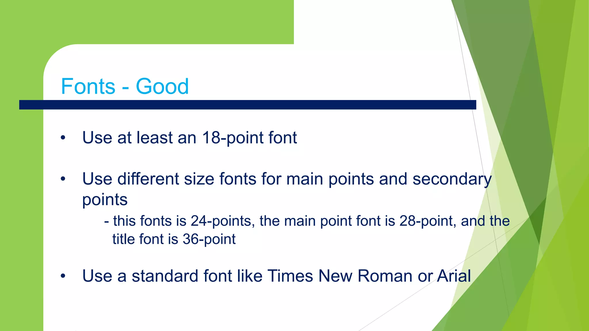
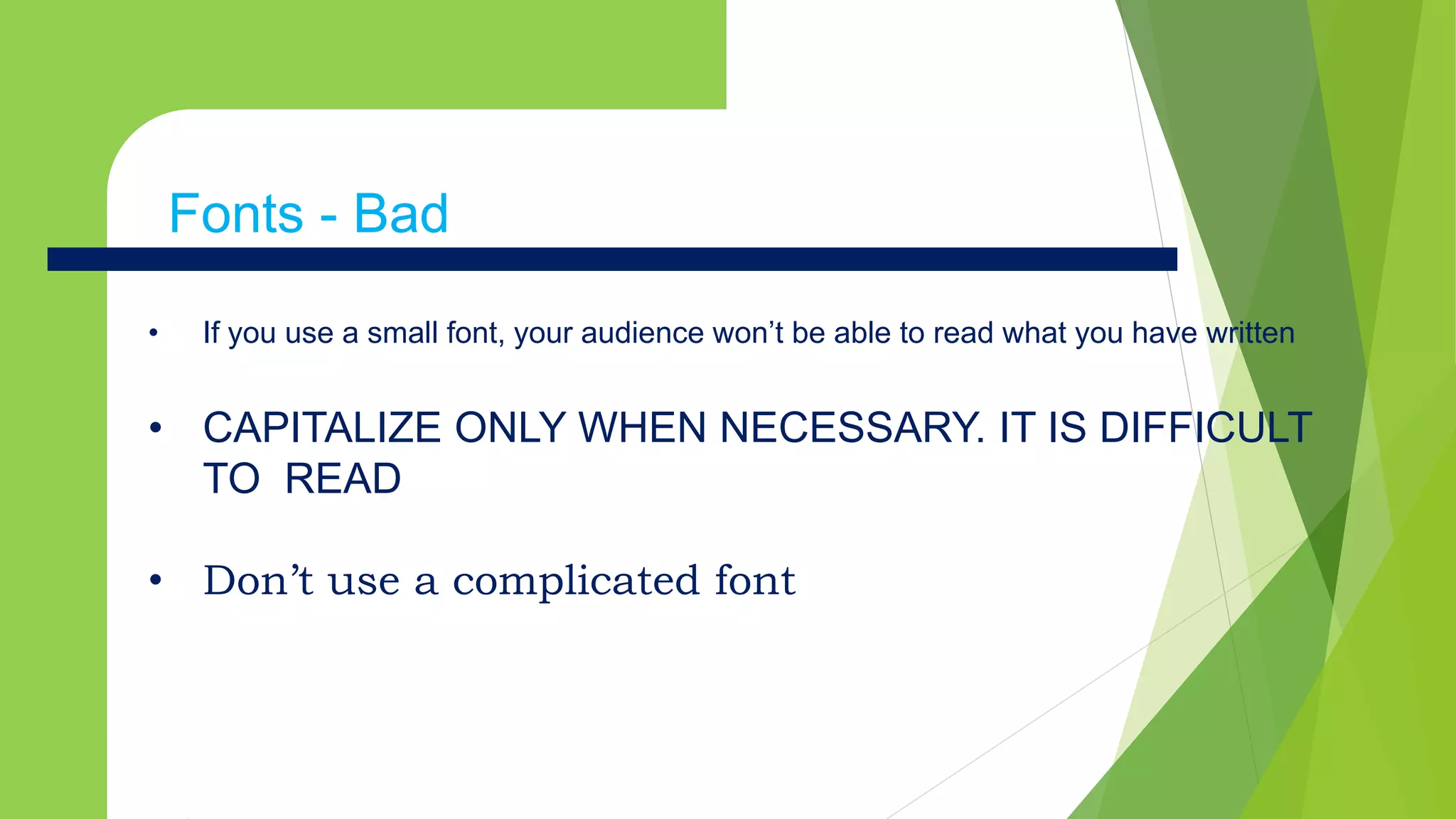
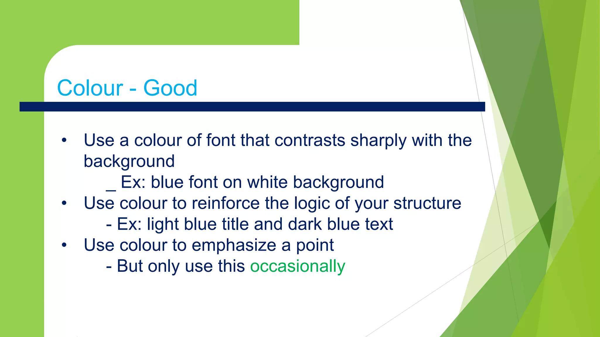

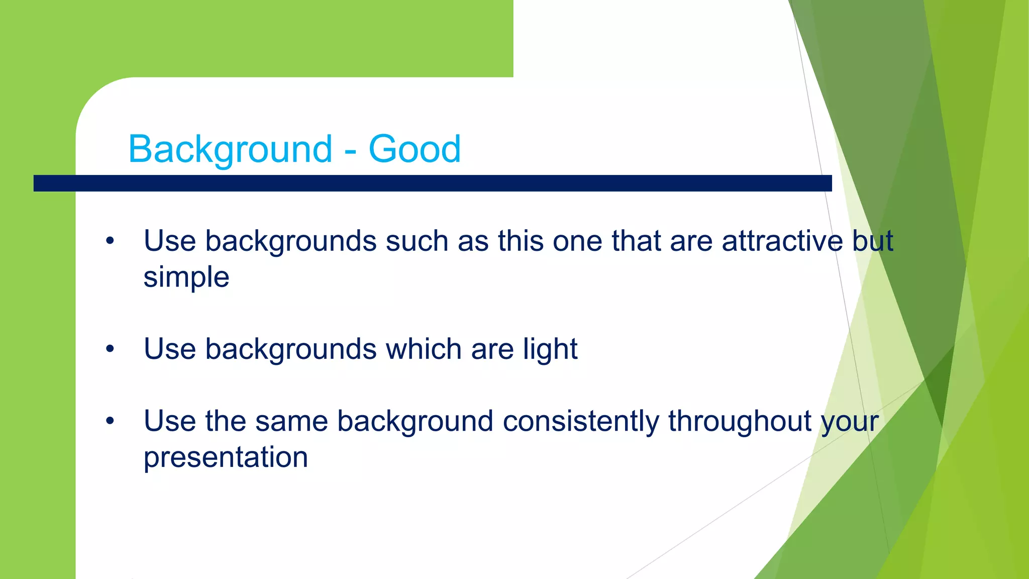


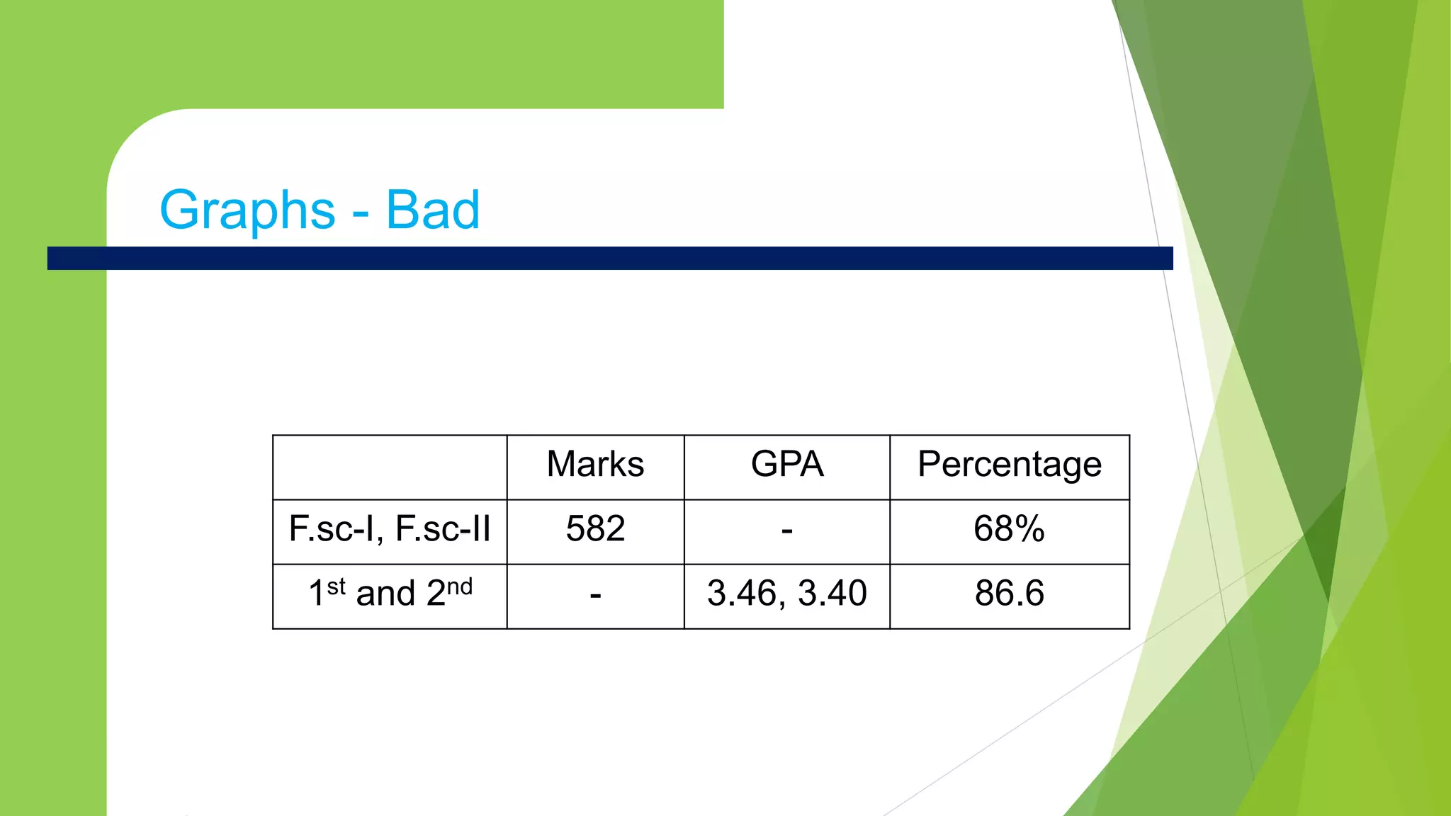


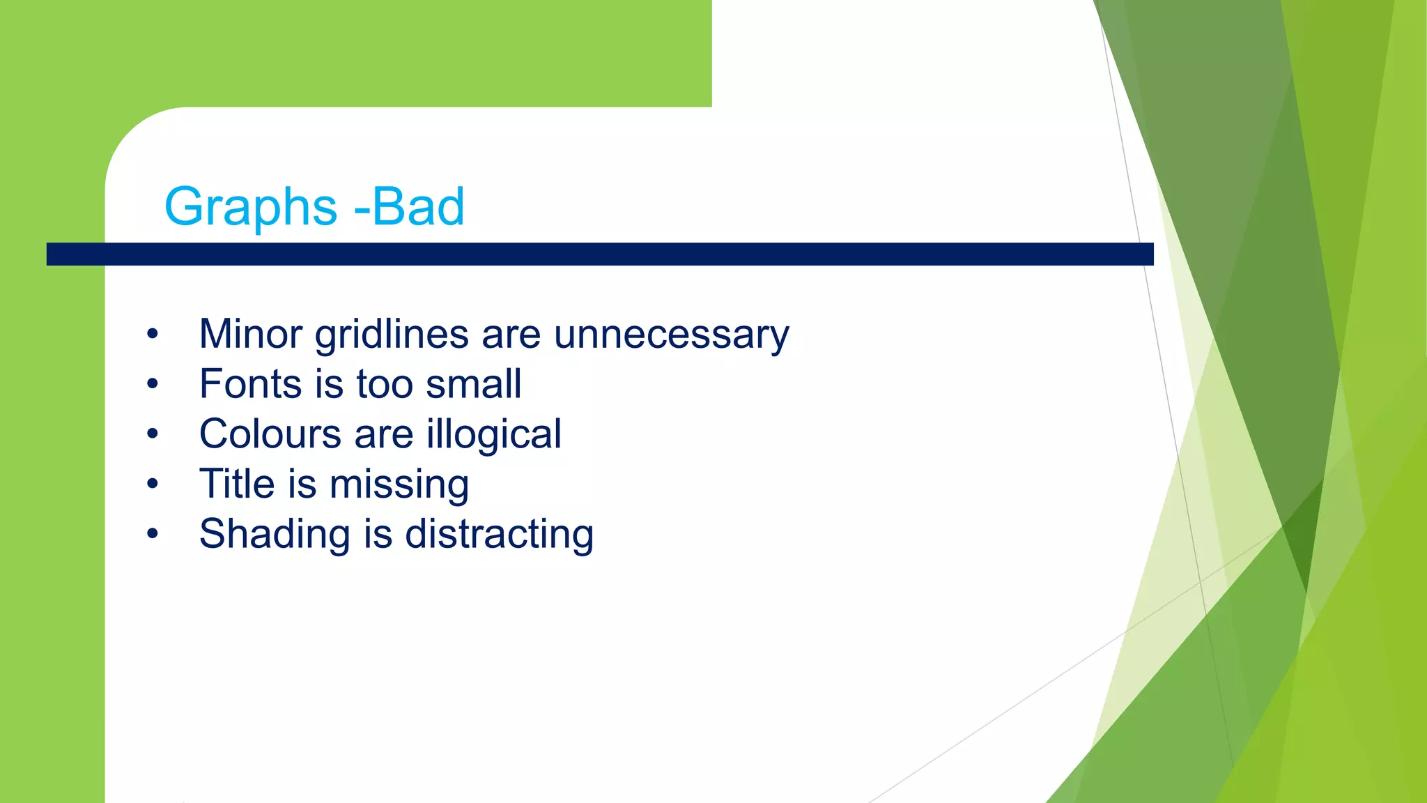


This document provides tips for creating effective PowerPoint presentations. It discusses avoiding pitfalls like bad slide structure through using outlines, point form, and limiting content per slide. Other tips include using readable fonts, high-contrast color combinations, simple backgrounds, well-designed graphs and proofreading for errors. The document emphasizes keeping content concise and focused to maintain audience attention and understanding.